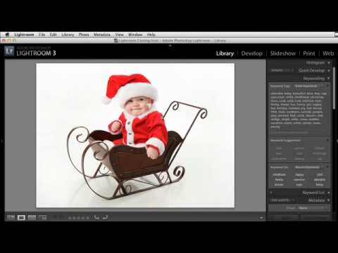
Every December I get the same texts from photographer friends: “Hey, do you have a holiday card template I can borrow?” For years I pointed them toward whatever Canva had on offer, which always felt like handing someone a gas station sandwich. The real answer is that you can build something far better yourself, and it starts before you ever open Lightroom.
In this KelbyOne tutorial, educator Scott Kelby walks through a workflow for creating holiday-themed photo templates by pulling stock graphics into Photoshop, isolating them properly, and setting them up so Lightroom can use them with any client photo you drop in. The technique is seasonal in name only. Once you understand the prep steps, you can apply this same approach to graduation overlays, sports composites, newborn announcements, or anything else that needs a graphic element layered over a photo. I’ve been adapting this exact method since I first saw it, and it’s become one of the more useful things in my regular toolkit.
Watch the full tutorial on YouTube
Step 1: Source Your Stock Graphic
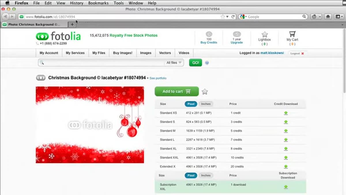 Stock Christmas graphic open on white background in browser
Start by finding a holiday graphic on a stock site like Adobe Stock, iStock, or Shutterstock. You are looking for something with a clean white background and enough visual interest to frame a portrait. Kelby pulls a Christmas wreath-style graphic that costs just a few dollars at a small web resolution. For most holiday card output sizes, that low-cost download holds up fine. Download it as a JPEG and open it in Photoshop.
Stock Christmas graphic open on white background in browser
Start by finding a holiday graphic on a stock site like Adobe Stock, iStock, or Shutterstock. You are looking for something with a clean white background and enough visual interest to frame a portrait. Kelby pulls a Christmas wreath-style graphic that costs just a few dollars at a small web resolution. For most holiday card output sizes, that low-cost download holds up fine. Download it as a JPEG and open it in Photoshop.
The key criteria here: high enough resolution for your output size, a solid white background (not textured), and a shape that naturally creates a window or frame where a face can sit. A wreath, ornamental border, or holiday frame graphic all work. Abstract snowflake patterns are trickier to work with.
Step 2: Select and Remove the White Background
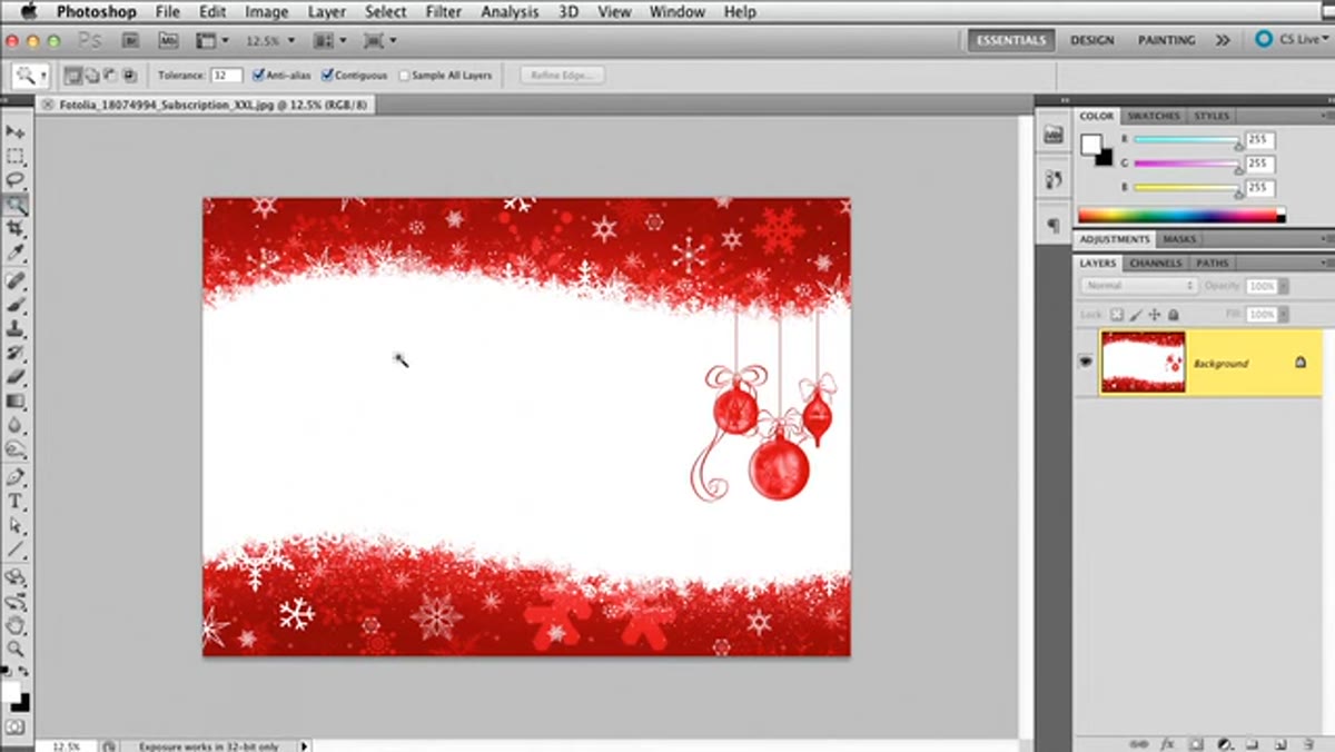 Magic Wand tool clicking the white background area
Grab the Magic Wand tool and click anywhere on the white background. Lightroom has no native way to handle transparency in a stock JPEG, so you need Photoshop to do this removal first. Once the selection is active, go to Select > Inverse to flip the selection so the graphic itself is selected instead of the background.
Magic Wand tool clicking the white background area
Grab the Magic Wand tool and click anywhere on the white background. Lightroom has no native way to handle transparency in a stock JPEG, so you need Photoshop to do this removal first. Once the selection is active, go to Select > Inverse to flip the selection so the graphic itself is selected instead of the background.
Press Command+J on Mac (Control+J on PC) to copy the graphic onto its own new layer. You now have the original background layer beneath and a clean graphic layer on top. Before deleting the background, temporarily fill it with 50% gray using Edit > Fill. That neutral gray lets you see exactly how clean your extraction is before you commit. Any areas where the selection got messy will be obvious against the gray.
Step 3: Clean Up Problem Areas with the Eraser
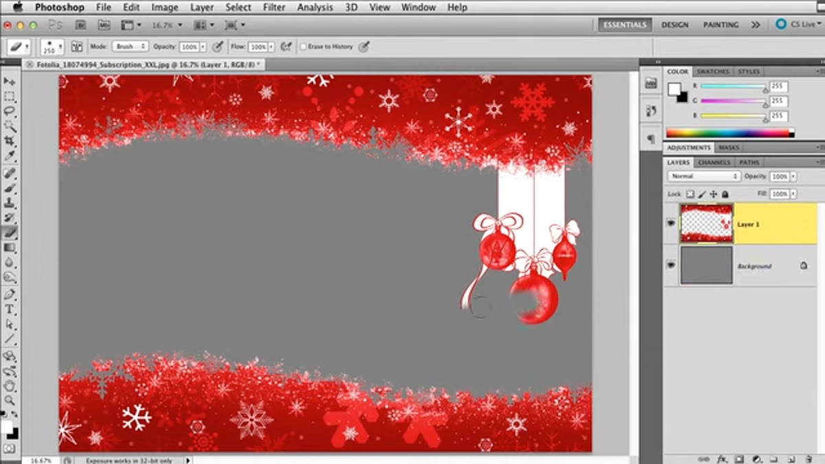 Eraser tool removing stray graphic elements at image edge
Most stock graphics have stray elements at the edges. In Kelby’s example, there are pieces of the design hanging off to one side that will look awkward in the final composite. With the graphic layer selected, grab the Eraser tool and paint over anything that doesn’t serve the composition. Work at a medium-to-large brush size for big sections, then reduce it for detail areas.
Eraser tool removing stray graphic elements at image edge
Most stock graphics have stray elements at the edges. In Kelby’s example, there are pieces of the design hanging off to one side that will look awkward in the final composite. With the graphic layer selected, grab the Eraser tool and paint over anything that doesn’t serve the composition. Work at a medium-to-large brush size for big sections, then reduce it for detail areas.
Don’t overthink this. You are essentially art-directing the graphic, deciding what framing shape you actually want. A slightly imperfect edge in a decorative element reads as intentional. A rogue snowflake floating three inches from anything else reads as a mistake.
Step 4: Remove the White Fringe
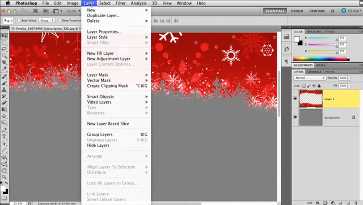 Layer menu open showing Matting > Remove White Matte option
After any Magic Wand selection on a white background, you almost always end up with a thin white halo clinging to the edges of your subject. It is subtle but looks bad the moment you put a dark or colorful photo behind it. The fix is fast: with your graphic layer selected, go to Layer > Matting > Remove White Matte. Lightroom doesn’t have this tool, which is another reason this prep has to happen in Photoshop first.
Layer menu open showing Matting > Remove White Matte option
After any Magic Wand selection on a white background, you almost always end up with a thin white halo clinging to the edges of your subject. It is subtle but looks bad the moment you put a dark or colorful photo behind it. The fix is fast: with your graphic layer selected, go to Layer > Matting > Remove White Matte. Lightroom doesn’t have this tool, which is another reason this prep has to happen in Photoshop first.
Compare the edges before and after. The difference is especially visible on fine details like thin branches, text, or any element with a lot of edge surface area. Run this step every single time you extract from a white background. Make it a reflex.
Step 5: Add a Drop Shadow Layer Style
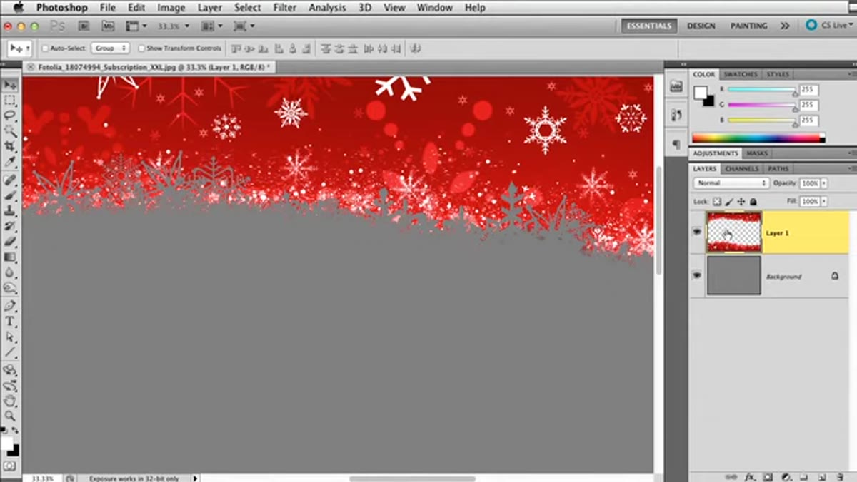 Layer Style dialog open with drop shadow settings visible
Double-click the graphic layer’s thumbnail to open the Layer Style dialog. Add a drop shadow and move the angle to the upper left so the light source reads naturally for a portrait. Increase the Size value to soften the shadow edge. A hard, small drop shadow reads as clip art. A larger, softer shadow makes the graphic feel like it occupies the same space as the photo behind it.
Layer Style dialog open with drop shadow settings visible
Double-click the graphic layer’s thumbnail to open the Layer Style dialog. Add a drop shadow and move the angle to the upper left so the light source reads naturally for a portrait. Increase the Size value to soften the shadow edge. A hard, small drop shadow reads as clip art. A larger, softer shadow makes the graphic feel like it occupies the same space as the photo behind it.
Reduce the opacity to somewhere around 40-60%. You want the shadow present enough to separate the graphic from the photo, but not so heavy that it competes with your subject. You won’t be able to judge it perfectly here since the photo isn’t placed yet, but these settings give you a solid starting point to adjust later.
Step 6: Save as a PNG to Preserve Transparency
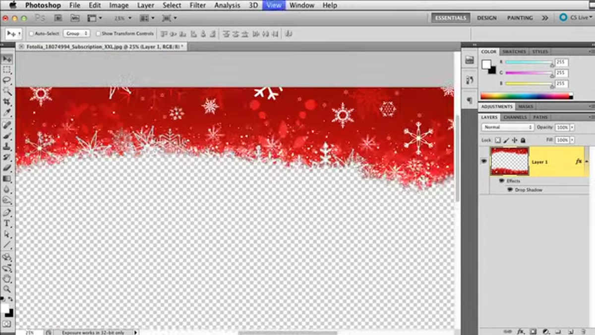 Background layer being dragged to trash leaving transparent canvas
Delete the gray background layer by dragging it to the trash. What remains is your graphic floating on a transparent canvas, indicated by the gray and white checkerboard pattern. This transparency is exactly what you need Lightroom to receive.
Background layer being dragged to trash leaving transparent canvas
Delete the gray background layer by dragging it to the trash. What remains is your graphic floating on a transparent canvas, indicated by the gray and white checkerboard pattern. This transparency is exactly what you need Lightroom to receive.
Save the file as a PNG, not a JPEG. JPEG cannot hold transparency. When Lightroom or your print template references this file, the transparent areas will let whatever sits behind show through, which is where your client’s photo will live. Name the file something you’ll recognize in six months. I name mine after the season and the shape, like “winter-wreath-frame-2024.png.”
Beyond the Holidays: How I Actually Use This Year-Round
The seasonal framing in this tutorial is just the entry point. I keep a folder of PNG overlays built with this exact method organized by category: florals for spring minis, fall foliage borders, graduation cap graphics, sports team overlays. Any time a client asks for something themed, I have a clean transparent asset ready to drop into a Lightroom print template or a new Photoshop composite.
One adjustment I make to Kelby’s workflow: I also save a version without the drop shadow baked in, because sometimes I want to add the shadow in Lightroom’s print module or adjust it based on the specific photo behind it. Having both versions adds about 30 seconds of extra work in Photoshop and saves real time later when a photo doesn’t cooperate with a pre-baked shadow angle.
The single most transferable idea here is that Lightroom’s power with graphics depends entirely on how well you prepare those graphics beforehand. Clean extraction, fringe removal, and proper PNG export are the invisible foundation everything else stands on. Do that prep right and your templates will feel polished. Skip it and no amount of Lightroom adjustment will cover the seams.
Watch the full tutorial on YouTube and follow along with the KelbyOne channel for more practical, no-filler technique breakdowns.
Comments (2)
Tried this technique this morning. Game changer for real.
Finally someone explains this in a way that actually makes sense.
Leave a Comment