Video Tutorials
The RAW Preprocessing Step I Kept Skipping (And Why That Was a Mistake)
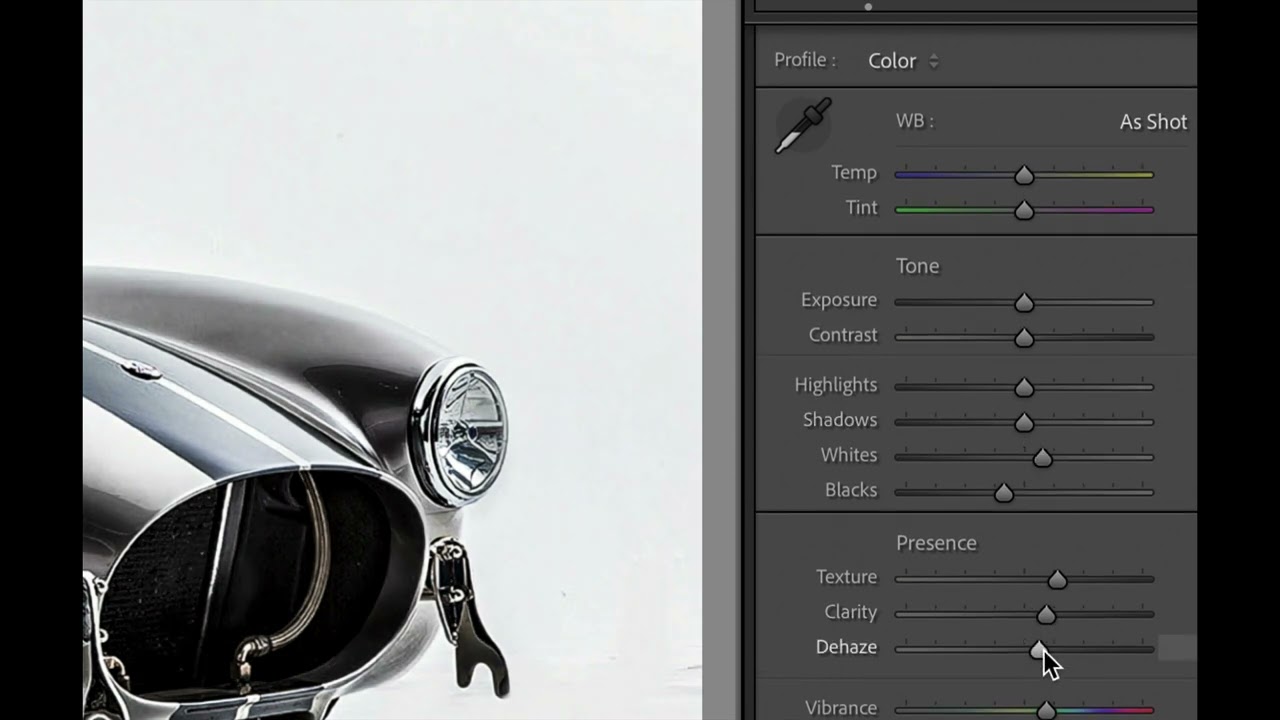
I’ve been editing photos in Lightroom long enough to have opinions about it that could fill a book nobody asked me to write. My presets are named after songs. My cat ISO knocked my camera off a shelf at 12800. I know this software the way some people know their hometown streets. So when photographers kept telling me I was sleeping on a preprocessing step before I even opened Lightroom, I did what any overconfident editor does: I smiled, nodded, and kept doing things my way.