How to Change Any Color in Lightroom Using Masks (No Photoshop Required)

How to Change Any Color in Lightroom Using Masks (No Photoshop Required)

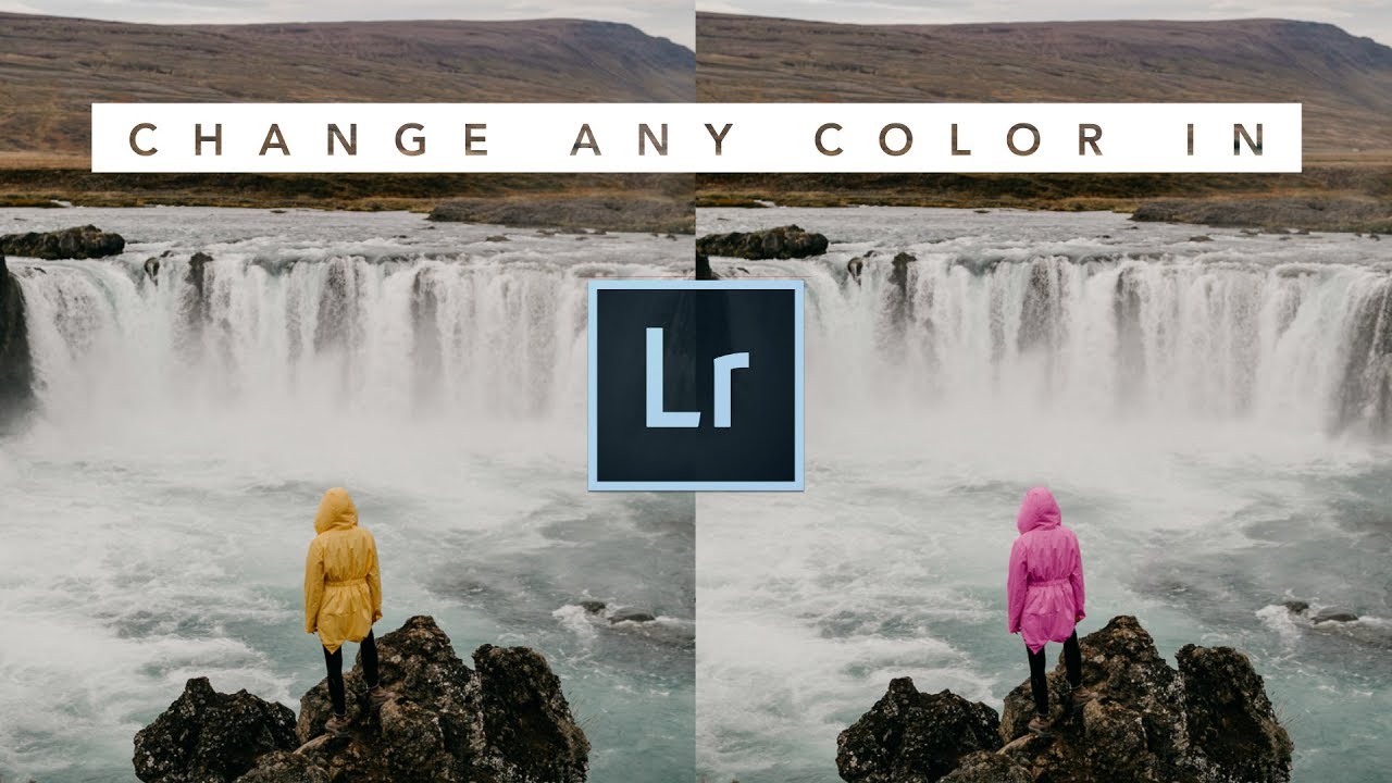
Most of my clients have no idea how much color work happens after the shutter clicks. A jacket that photographs as a muddy burgundy. A sky that came out flat and grey when it was golden in real life. A product shot where the background color just isn’t sitting right against the subject. These are the kinds of problems I used to punt to Photoshop, fire up a Select and Mask workflow, and spend twenty minutes fixing what should have taken five.

HSL Adjustments Are the Most Underused Tool in Lightroom — Here's How to Actually Use Them

HSL Adjustments Are the Most Underused Tool in Lightroom — Here's How to Actually Use Them

The Edit That Made Me Stop Ignoring HSL A few years ago I was editing press shots for my band on a borrowed laptop, trying to make a dingy rehearsal space look like somewhere a real band would actually want to be. I’d done my usual thing: pushed the whites, pulled the blacks, added a little warmth in the tone curve. It looked fine. But “fine” doesn’t book shows. The problem was the walls.

Building a Dramatic Portrait Edit in Lightroom: A Step-by-Step Breakdown

Building a Dramatic Portrait Edit in Lightroom: A Step-by-Step Breakdown

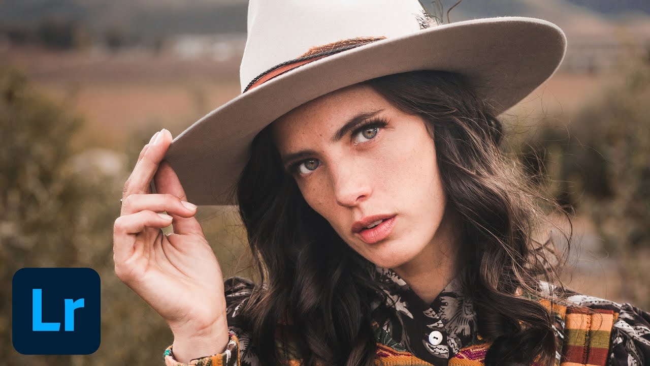
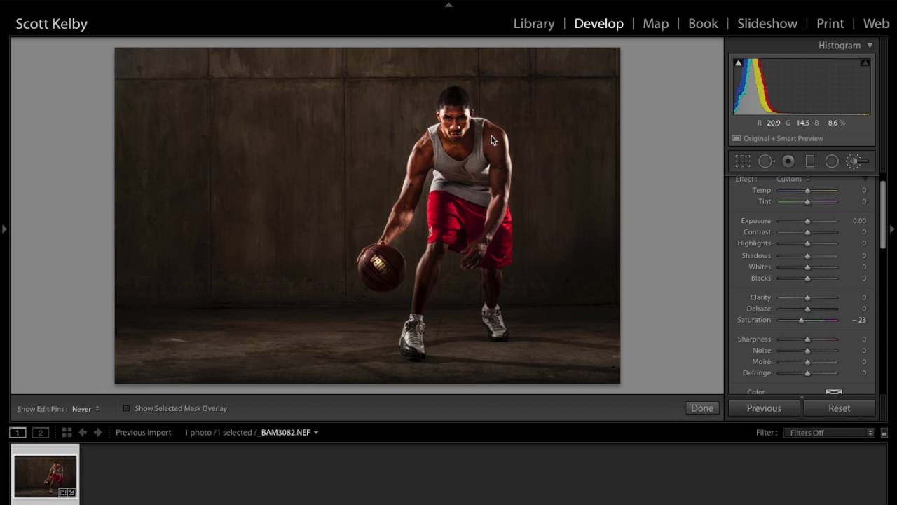
There’s a specific kind of portrait edit I used to avoid because I couldn’t figure out how to make it feel intentional rather than accidental. That gritty, high-contrast, slightly desaturated look you see on album covers and editorial shoots. I knew the ingredients existed somewhere in Lightroom’s panels, I just didn’t know how to combine them without wrecking the skin tones. Scott Kelby’s tutorial changed that for me. Watch the full tutorial on YouTube and follow along here while I break down every move.

Edit Your Subject and Background Like They're on Separate Layers - Without Leaving Lightroom

Edit Your Subject and Background Like They're on Separate Layers - Without Leaving Lightroom

One problem that used to send me into Photoshop almost every single shoot was this: the subject looks great but the background is flat, or the background has beautiful color and the subject is overexposed. Treating them as one image and dragging sliders around never actually solves it. You end up compromising both. For a long time, the clean solution meant round-tripping to Photoshop, painting masks by hand, and praying your selection held up at 100%.

Before You Touch a Slider: What Nigel Danson's Landscape Workflow Taught Me About Seeing First

Before You Touch a Slider: What Nigel Danson's Landscape Workflow Taught Me About Seeing First

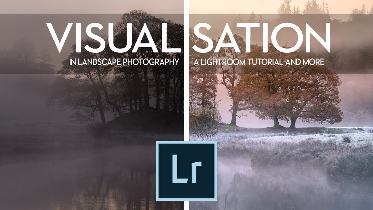
Most of my worst edits share the same root cause. I opened a raw file, started dragging sliders, and hoped something good would happen. The file looked flat, so I’d crank contrast. The sky looked pale, so I’d push blues. Thirty minutes later I had something technically processed and emotionally empty. It looked edited. It didn’t look felt. That’s the exact problem that Nigel Danson addresses head-on in this landscape Lightroom tutorial.

How to Get a Warm, Film-Toned Look in Photoshop Using Four Adjustment Layers

How to Get a Warm, Film-Toned Look in Photoshop Using Four Adjustment Layers

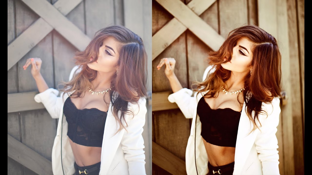
Most of my workflow lives inside Lightroom. That’s no secret. But every once in a while, a Photoshop technique comes along that makes me stop what I’m doing, close my preset panel, and actually pay attention. This is one of those techniques. Watch the full tutorial on YouTube In this Jessica Kobeissi tutorial, she walks through a warm-toned color grading effect using just four adjustment layers in Photoshop. No plugins, no complicated masking, no frequency separation rabbit holes.

From Familiar to Extraordinary: Thomas Heaton's One-Shot Workflow (Location to Lightroom)

From Familiar to Extraordinary: Thomas Heaton's One-Shot Workflow (Location to Lightroom)

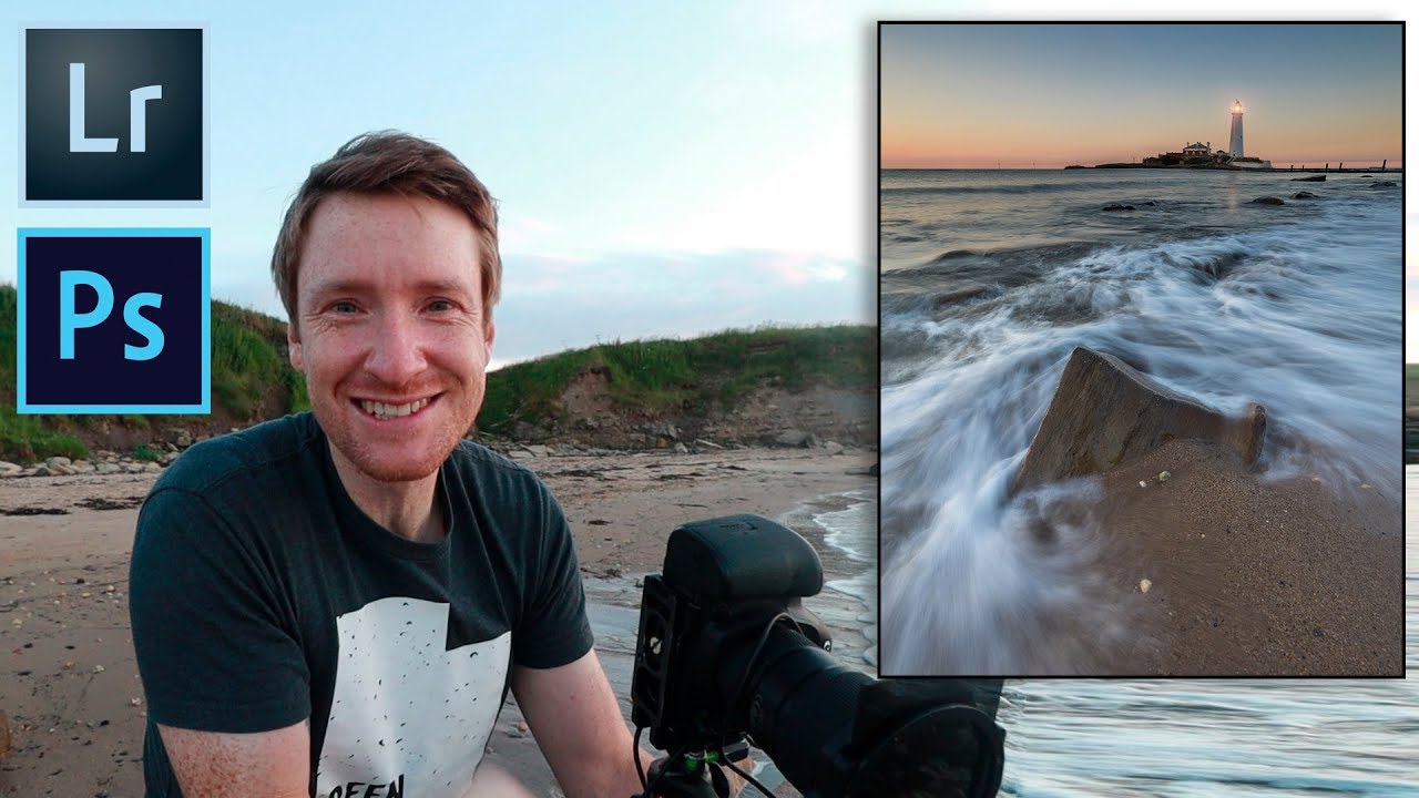
There’s a trap I fell into early in my editing career, and I see it constantly in the forums. People assume great landscape photography requires a passport, a red-eye flight, and a location they’ve never seen before. Thomas Heaton dismantles that assumption in about ten minutes of footage. In this Thomas Heaton tutorial, he heads out to St. Mary’s Lighthouse in Northumberland, a place he’s photographed so many times he almost talks himself out of going.

The Lightroom Edit That Changed How I Think About Adjustment Brushes

The Lightroom Edit That Changed How I Think About Adjustment Brushes

There’s a specific kind of edit I used to dread: a portrait with a blown-out background, slightly flat skin, and hair that reads as a muddy brownish-yellow on screen. It’s not a ruined photo. It’s a fixable photo. But the path from “fixable” to “finished” always felt like it had too many decision points, and I’d end up over-editing my way into something worse than what I started with. That changed when I started paying close attention to how photographers with a clear visual instinct move through Lightroom — not what buttons they press, but why and in what order.

Why Your Color Grades Fall Apart (And the Lightroom Workflow That Fixed Mine)

Why Your Color Grades Fall Apart (And the Lightroom Workflow That Fixed Mine)

The Problem Shows Up at the Worst Possible Moment I was culling a 340-image wedding gallery last spring, halfway through a cup of coffee, when I realized my color grade looked completely different on the shaded reception shots than it did on the golden hour portraits. Same preset. Same camera. Same shooting conditions, more or less. But the images looked like they came from two different photographers with two different aesthetic philosophies.

The Photoshop Color Grading Stack That Actually Makes Flat Photos Look Cinematic

The Photoshop Color Grading Stack That Actually Makes Flat Photos Look Cinematic

There’s a specific kind of photo that ends up in my reject pile not because it’s technically bad, but because it’s just… flat. Good light, decent composition, nothing wrong with it, and yet nothing is happening. For years I threw processing power at that problem. More contrast, more vibrance, heavier presets. The results were always a little blunt. What I actually needed was a stacked adjustment layer approach that builds color gradually, the way a good mix engineer layers frequencies instead of just cranking the volume.

Crop, Color, and Dodge: A Portrait Editing Walkthrough That Actually Holds Up

Crop, Color, and Dodge: A Portrait Editing Walkthrough That Actually Holds Up

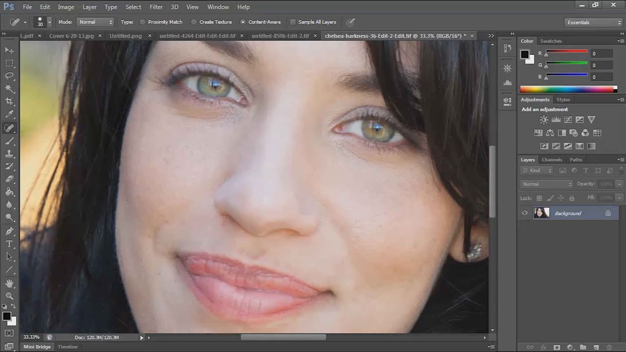
Portrait editing is one of those things where the gap between “technically correct” and “actually good” is enormous. I spent years closing that gap by watching tutorials, breaking them down, and rebuilding the techniques in my own workflow. One tutorial that keeps earning its place in my rotation is Chelsea Northrup’s portrait editing walkthrough from the Tony & Chelsea Northrup channel. It’s a practical, no-fluff demonstration that covers Lightroom color work and a couple of targeted Photoshop moves that make a real difference on skin and hair.

The Painterly Edit: How Nigel Danson Uses Lightroom to Make Photos Look Like Oil Paintings

The Painterly Edit: How Nigel Danson Uses Lightroom to Make Photos Look Like Oil Paintings

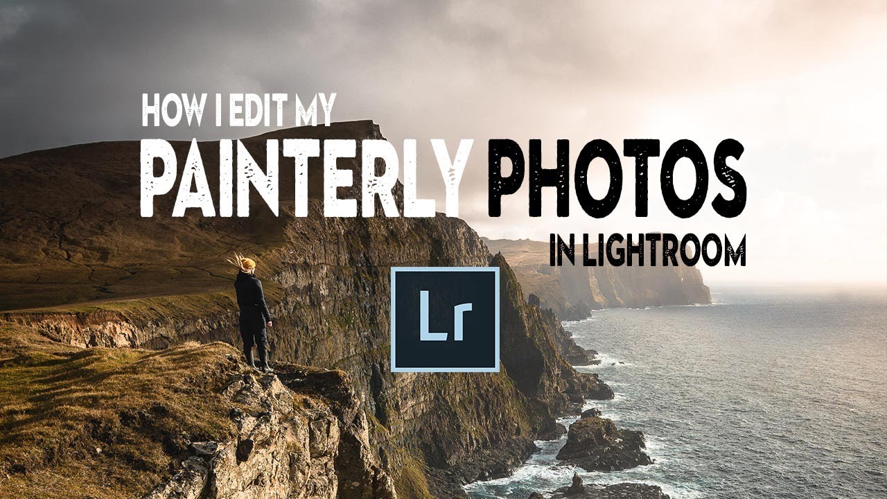
There’s a specific kind of photo that stops you mid-scroll. It doesn’t look like a photograph exactly. The light feels considered, the colors feel warm and unified, and there’s a softness to it that makes you think of a painting hanging in a gallery rather than a JPEG sitting in a Dropbox folder. I’ve been chasing that look for years, and I’ll be honest – most of my early attempts just looked like I’d cranked the fade slider and called it done.