Stop Squinting at Your Filmstrip: How Lightroom's Survey Mode Finds Your Winner Faster

Stop Squinting at Your Filmstrip: How Lightroom's Survey Mode Finds Your Winner Faster

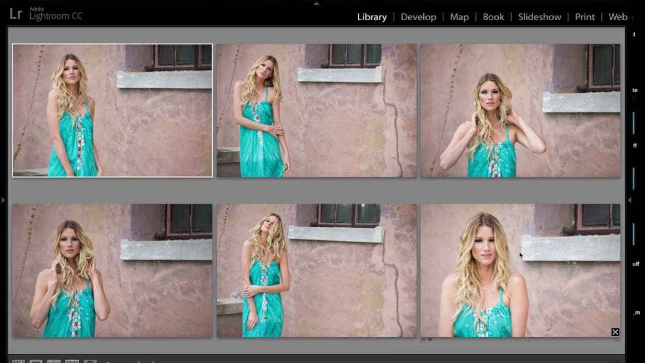
Culling is the part of my workflow that used to eat the most time and give me the least confidence. I’d sit there clicking through similar frames in the filmstrip, second-guessing every pick, and eventually just choosing the one that felt right in the moment, which is not exactly a repeatable system. The problem isn’t taste. The problem is that comparing eight nearly identical shots inside your own head, one at a time, is genuinely hard.

Blend If in Photoshop: The Color Toning Trick That Leaves Lightroom's Split Toning in the Dust

Blend If in Photoshop: The Color Toning Trick That Leaves Lightroom's Split Toning in the Dust

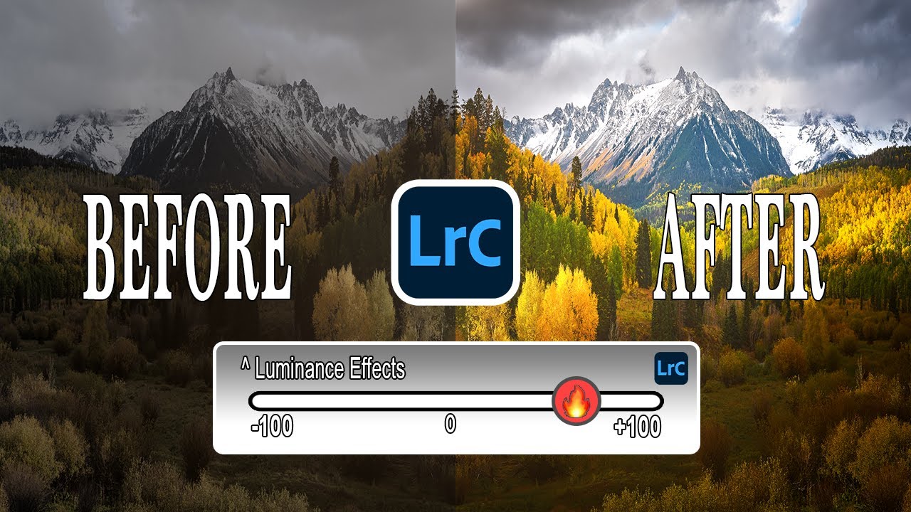
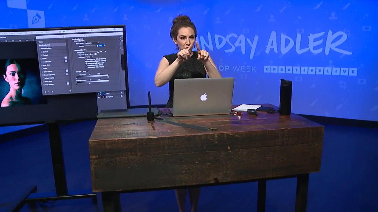
I have a complicated relationship with split toning in Lightroom. I use it constantly, I’ve named half my presets after it, and I also quietly resent how little control it gives me. You set a hue for the highlights, a hue for the shadows, and then Lightroom just… does it. Everywhere. On skin, on backgrounds, on the whites of someone’s eyes. There’s no telling it where to apply and where to back off.

The Tone Curve Isn't a Mystery — You're Just Using It Wrong

The Tone Curve Isn't a Mystery — You're Just Using It Wrong

The Tone Curve Isn’t a Mystery — You’re Just Using It Wrong I had a folder of band press shots that looked like they were taken inside a fluorescent-lit dentist office. Flat, cold, lifeless. I’d shot them myself because we couldn’t afford to hire anyone, and I remember sitting at my desk, dragging the Exposure and Contrast sliders around like I was trying to fix a broken engine with a butter knife.

Brand Your Shots on the Spot: How to Add Logos and Textures in Lightroom Mobile

Brand Your Shots on the Spot: How to Add Logos and Textures in Lightroom Mobile

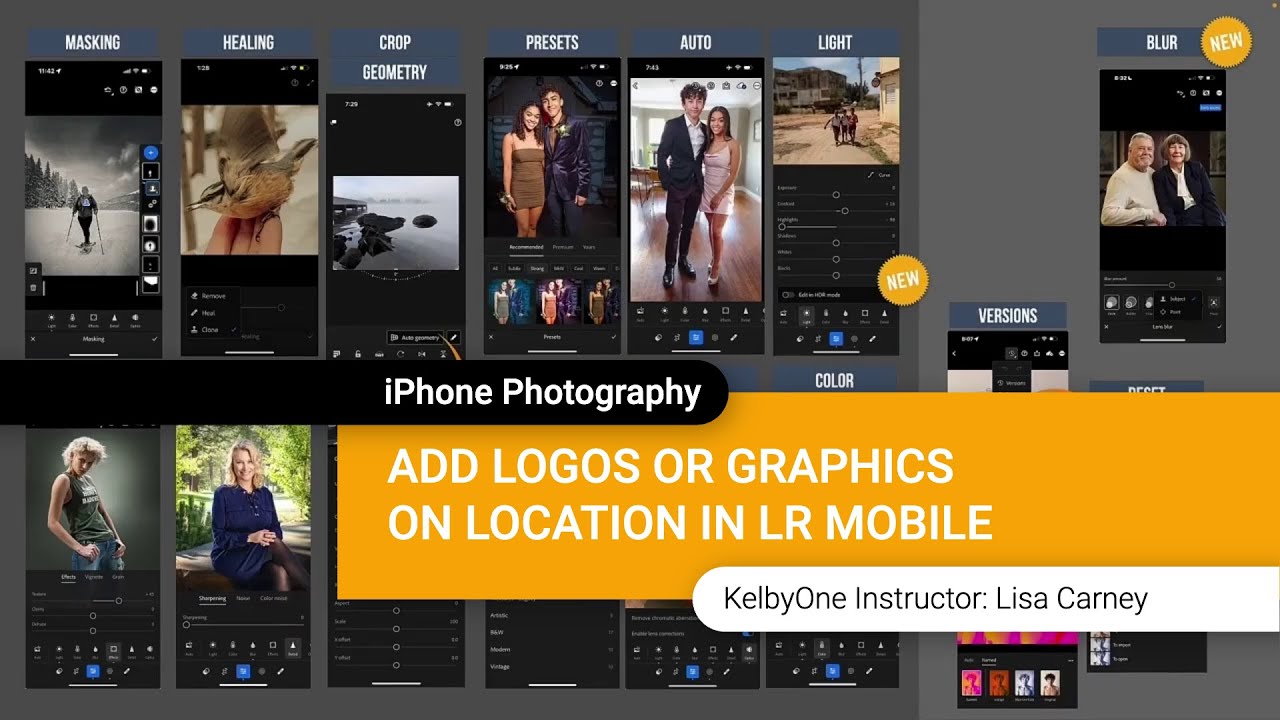
There’s a specific kind of chaos that happens when you’re shooting on location and a client texts asking for a watermarked preview image before you’ve even packed up your gear. I used to handle that by saying “I’ll send it when I’m back at my desk,” which is a perfectly reasonable answer that also makes you look slightly less impressive than the photographer who sends a branded image before they leave the parking lot.

The Lightroom Histogram Isn't Just for Looking At — Here's How to Edit With It

The Lightroom Histogram Isn't Just for Looking At — Here's How to Edit With It

There’s a certain kind of Lightroom knowledge that separates people who edit photos from people who understand what they’re doing to photos. For a long time, I was firmly in the first camp. I’d drag sliders around in the Basic panel until things looked good, occasionally glancing at the histogram like it was a car dashboard warning light I didn’t fully understand. It was decoration. Background noise. I knew it mattered, but I treated it like I treat the fine print on a software license.

Beginner, Intermediate, or Pro? Here's How Your Lightroom Edit Actually Gives You Away

Beginner, Intermediate, or Pro? Here's How Your Lightroom Edit Actually Gives You Away

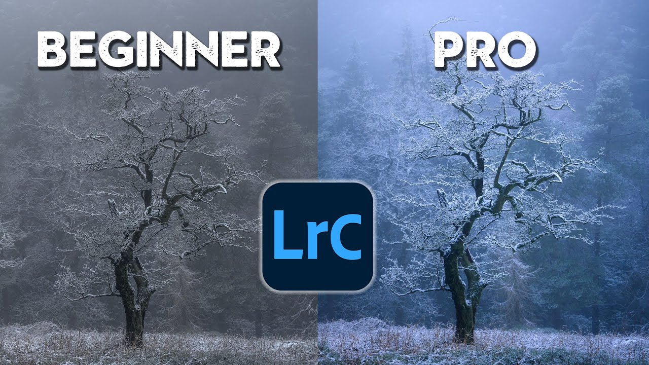
Every once in a while, a tutorial reframes something I thought I already understood. I’ve been editing in Lightroom long enough that I named my first preset pack after a Wilco album, but watching Nigel Danson work through the same two photos at three different skill levels made me pause and audit my own habits. Not because the tools were unfamiliar. Because the thinking behind them was. The premise of Watch the full tutorial on YouTube is deceptively simple: take two landscape photos and edit each one the way a beginner, intermediate, and pro would approach them.

One Gel, One White Balance Shift, and Your Background Turns a Completely Different Color

One Gel, One White Balance Shift, and Your Background Turns a Completely Different Color

There’s a lighting problem I kept running into during studio portrait sessions: I wanted a cool, moody background behind a warm, well-lit subject, but I didn’t want to wrestle a gel onto every single background light in the setup. If you’re running two or three lights on a backdrop, that’s a lot of fiddling between shots, and the color consistency gets messy fast. I started wondering if there was a smarter way to create that warm-cool contrast without touching the background lights at all.

Reference View in Lightroom CC 2015.8: How to Reverse Engineer Any Photo's Look

Reference View in Lightroom CC 2015.8: How to Reverse Engineer Any Photo's Look

There’s a specific kind of frustration I know too well. You’re staring at a JPEG you edited on your phone six months ago, the tones are exactly right, the contrast sits perfectly, and you have absolutely no idea what you did to get there. No develop history. No settings to copy. Just a finished photo mocking you from across the catalog. For a long time, my only move was to squint at it and try to rebuild it from memory, which is about as reliable as it sounds.

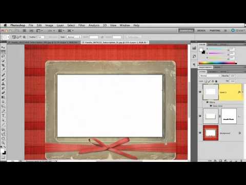
Turn Stock Holiday Graphics Into Pro Lightroom Print Templates (With a Little Photoshop Prep)

Turn Stock Holiday Graphics Into Pro Lightroom Print Templates (With a Little Photoshop Prep)

Every December I get the same question from readers: “How do I make my holiday cards look like something other than a Walgreens kiosk special?” The answer I keep coming back to involves Lightroom’s Print module, which is genuinely one of the most underused tools in the whole application. Most people think of it as the thing you click when you just want to send a file to a printer. It’s actually a surprisingly powerful layout engine, and when you feed it a well-prepared graphic, the results look custom without requiring a graphic design degree.

The Tone Curve Is Not a Brightness Slider (Here's What It Actually Does)

The Tone Curve Is Not a Brightness Slider (Here's What It Actually Does)

I used to drag the Contrast slider up to about +40 on every single photo and call it a day. This was around the time I was shooting my band’s press photos in a parking garage with a borrowed Nikon, editing everything myself because hiring a photographer was not in the budget. The photos looked punchy in a vague, everything-kind-of-glows way. I thought that was good. Then someone showed me the tone curve, and I realized the Contrast slider is basically training wheels bolted onto something far more precise.

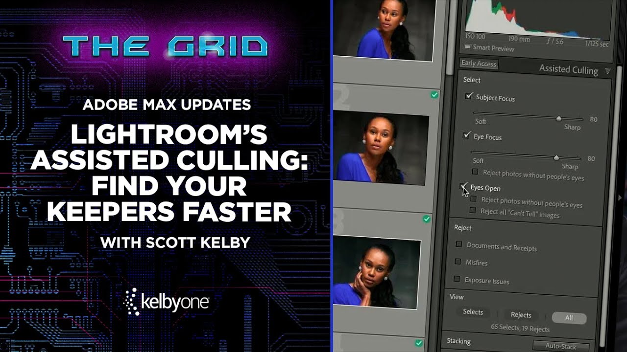
Stop Drowning in Rejected Shots: How Lightroom's AI Culling Actually Works

Stop Drowning in Rejected Shots: How Lightroom's AI Culling Actually Works

Culling is the part of my workflow I like least. I will spend an entire Sunday afternoon obsessing over a single preset’s tone curve, but asking me to sit down and reject 800 near-identical frames from a portrait session? That’s where motivation goes to die. After a while, you stop making real decisions and start clicking randomly, which defeats the whole point. So when Adobe dropped their Adobe Max announcements and Scott Kelby broke down the new Assisted Culling feature in a recent KelbyOne tutorial, I watched it twice before my coffee finished brewing.

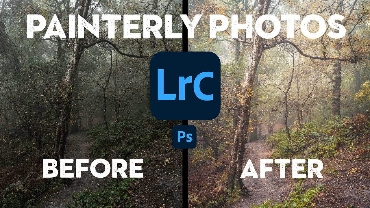
Steal Like a Painter: How to Give Your Woodland Photos That Soft, Atmospheric Look

Steal Like a Painter: How to Give Your Woodland Photos That Soft, Atmospheric Look

There’s a specific kind of woodland photo that stops me mid-scroll every time. It’s not sharp-everything, every-leaf-in-focus landscape photography. It’s something softer. More felt than seen. The kind of image that makes you think of oil paintings before you think of cameras. I’ve been chasing that look for a while, and I kept running into the same wall: I’d get into the woods, shoot something I thought had potential, bring it into Lightroom, and watch it turn into… a perfectly fine photo of some trees.