Video Tutorials
Stop Manually Dragging Sliders Back to Zero — There's a Much Faster Way
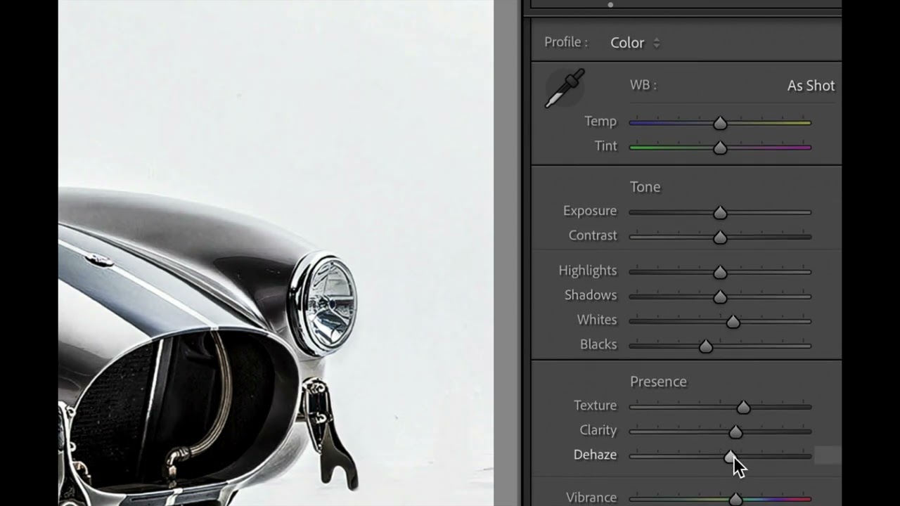
Last week I was doing a second pass on a batch of live music shots, the kind where you’ve already applied a sync across fifty frames and then realize the Texture slider is doing something weird on half of them. My usual move was to grab each slider and drag it back toward zero, squinting at the number until I landed close enough. Close enough. That’s not a workflow, that’s a nervous habit.