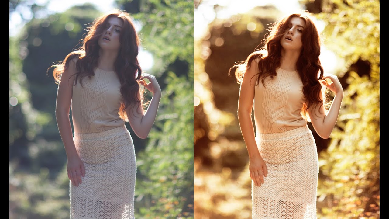
Backlit portraits are one of those shots that look gorgeous straight out of camera but almost always need a push in post to reach their potential. The light is already doing something interesting, and your job as an editor is to lean into that warmth rather than fight it. I’ve spent a lot of time chasing that golden-hour feel inside Lightroom, but sometimes a Photoshop-based approach gives you more control over where the warmth actually lands in the frame.
Watch the full tutorial on YouTube
In this Jessica Kobeissi tutorial, she walks through a layered Photoshop workflow that builds a warm, sun-kissed glow from scratch using gradient fills and adjustment layers. No plugins, no presets, no complicated masking. What I like about her approach is that each layer does one specific job, which makes the whole thing easy to reverse or tweak without unraveling everything else. I’ve adapted her method a few times for my own portrait work and the results translate well even when you’re starting from a photo that doesn’t have strong natural backlight.
Here’s how the whole thing works, step by step.
Step 1: Desaturate Slightly with Hue/Saturation
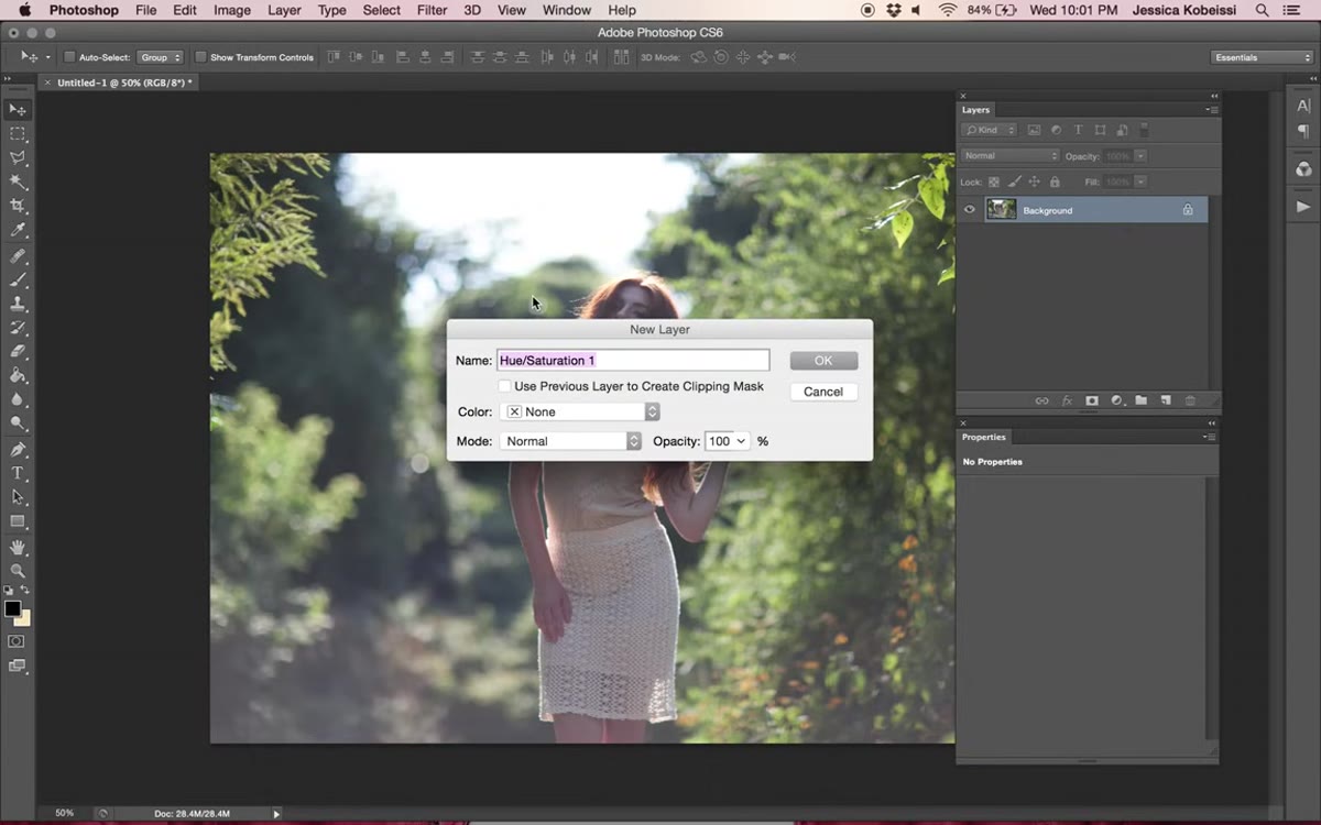 Hue/Saturation adjustment layer panel open in Photoshop
Before any color is added, Jessica pulls the overall saturation down slightly using a Hue/Saturation adjustment layer. Go to Layer, New Adjustment Layer, then Hue/Saturation. Drop the Saturation slider to around -21. This feels counterintuitive when you’re going for a warm, vibrant look, but it actually clears the way for the colors you add afterward to sit more naturally. Oversaturated base tones tend to fight with gradient overlays, producing muddy or artificial results. Think of this as priming the canvas.
Hue/Saturation adjustment layer panel open in Photoshop
Before any color is added, Jessica pulls the overall saturation down slightly using a Hue/Saturation adjustment layer. Go to Layer, New Adjustment Layer, then Hue/Saturation. Drop the Saturation slider to around -21. This feels counterintuitive when you’re going for a warm, vibrant look, but it actually clears the way for the colors you add afterward to sit more naturally. Oversaturated base tones tend to fight with gradient overlays, producing muddy or artificial results. Think of this as priming the canvas.
Step 2: Add an Orange-to-Red Gradient Fill Layer
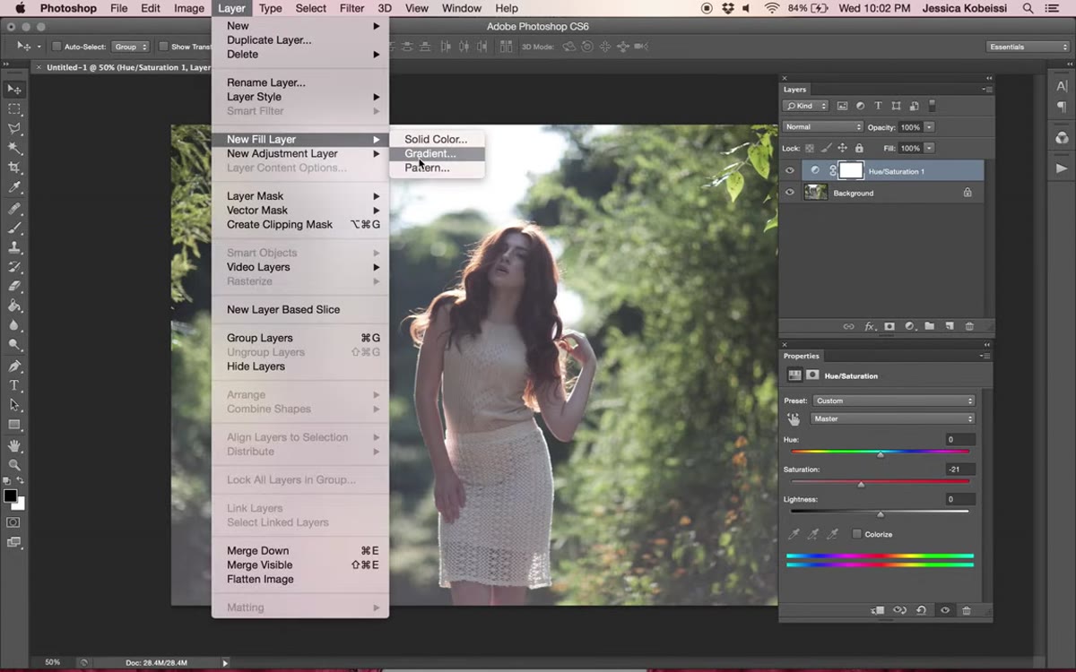 Gradient fill dialog with orange-to-red gradient selected
This is where the warmth starts. Go to Layer, New Fill Layer, Gradient. You’re building a gradient that moves from a bright orange to a slightly lighter orange and then into red, mimicking the color spread you’d see near a setting sun. Jessica names this layer “self-destruction,” which honestly tracks for a gradient that looks like the sky right before something dramatic happens.
Gradient fill dialog with orange-to-red gradient selected
This is where the warmth starts. Go to Layer, New Fill Layer, Gradient. You’re building a gradient that moves from a bright orange to a slightly lighter orange and then into red, mimicking the color spread you’d see near a setting sun. Jessica names this layer “self-destruction,” which honestly tracks for a gradient that looks like the sky right before something dramatic happens.
Once the gradient is created, drag it so the deeper red sits toward the lower right corner of the frame. Click and hold inside the gradient fill dialog to reposition it. After placing it, press OK, then change the blend mode from Normal to Soft Light. Drop the opacity down to around 28%. At full opacity this gradient is overwhelming. At 28% it adds a warm color cast that feels like it was baked into the light itself rather than painted on top.
Step 3: Add a Second Gradient Fill - Orange to Transparent
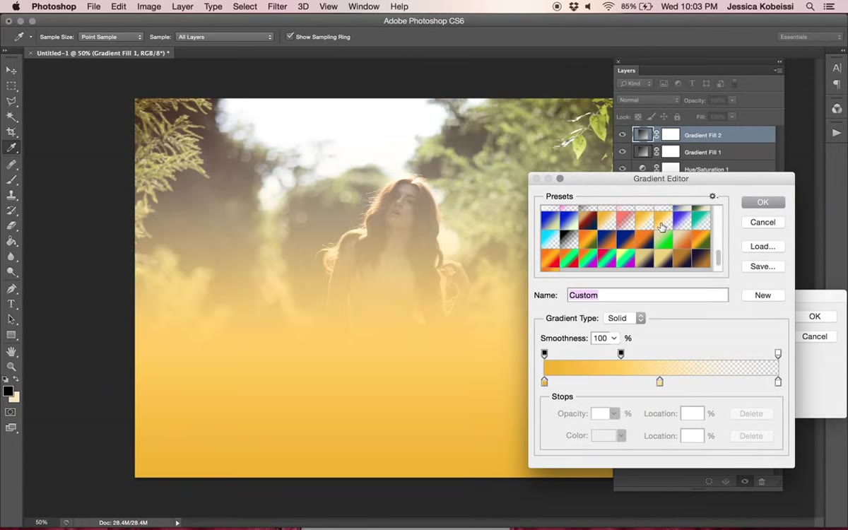 Radial gradient fill positioned in lower left corner of frame
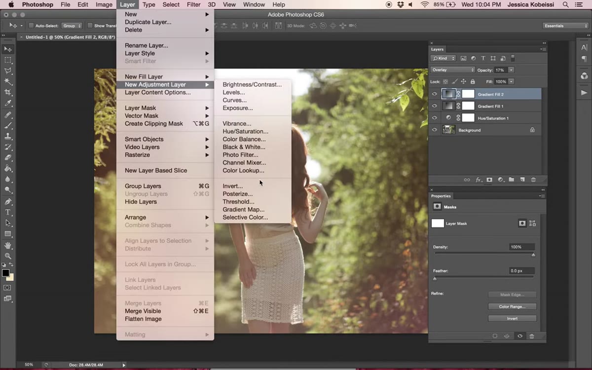
The first gradient handles the overall tone. This second one creates a focal point of light, like a sun source bleeding in from the corner. Go back to Layer, New Fill Layer, Gradient, and this time choose an orange-to-transparent gradient. Switch the style from Linear to Radial. Position this one toward the lower left corner of the frame so it looks like light is spilling in from that direction.
Radial gradient fill positioned in lower left corner of frame
The first gradient handles the overall tone. This second one creates a focal point of light, like a sun source bleeding in from the corner. Go back to Layer, New Fill Layer, Gradient, and this time choose an orange-to-transparent gradient. Switch the style from Linear to Radial. Position this one toward the lower left corner of the frame so it looks like light is spilling in from that direction.
Scale it up slightly if the glow feels too tight, then press OK. Change the blend mode to Overlay and bring the opacity down to around 17%. The Overlay mode makes this second gradient interact with the tones underneath it more aggressively than Soft Light does, so it picks up highlight areas and amplifies them. At 17% it’s a subtle pop rather than a blown-out mess.
Step 4: Boost and Refine Colors with a Second Hue/Saturation Layer
 Hue/Saturation panel showing Yellow channel selected
Now that the gradients are in place, some targeted color work brings everything together. Add another Hue/Saturation adjustment layer (Layer, New Adjustment Layer, Hue/Saturation). On the Master channel, nudge the saturation up to around +7 to restore some of the vibrancy you took away in Step 1. Think of it as dialing back up, but now the color you’re boosting is playing nicely with the gradients.
Hue/Saturation panel showing Yellow channel selected
Now that the gradients are in place, some targeted color work brings everything together. Add another Hue/Saturation adjustment layer (Layer, New Adjustment Layer, Hue/Saturation). On the Master channel, nudge the saturation up to around +7 to restore some of the vibrancy you took away in Step 1. Think of it as dialing back up, but now the color you’re boosting is playing nicely with the gradients.
Then switch from Master to the Yellow channel specifically. Bring the Hue slider down to around -14. This shifts the yellows already present in the image slightly, which on a backlit portrait usually means skin tones and any warm ambient light get a subtle nudge toward gold rather than staying flat. It’s a small move but it shows up clearly in the final result.
Step 5: Shape the Light with a Curves Adjustment
 RGB Curves panel with two adjustment points brightening midtones
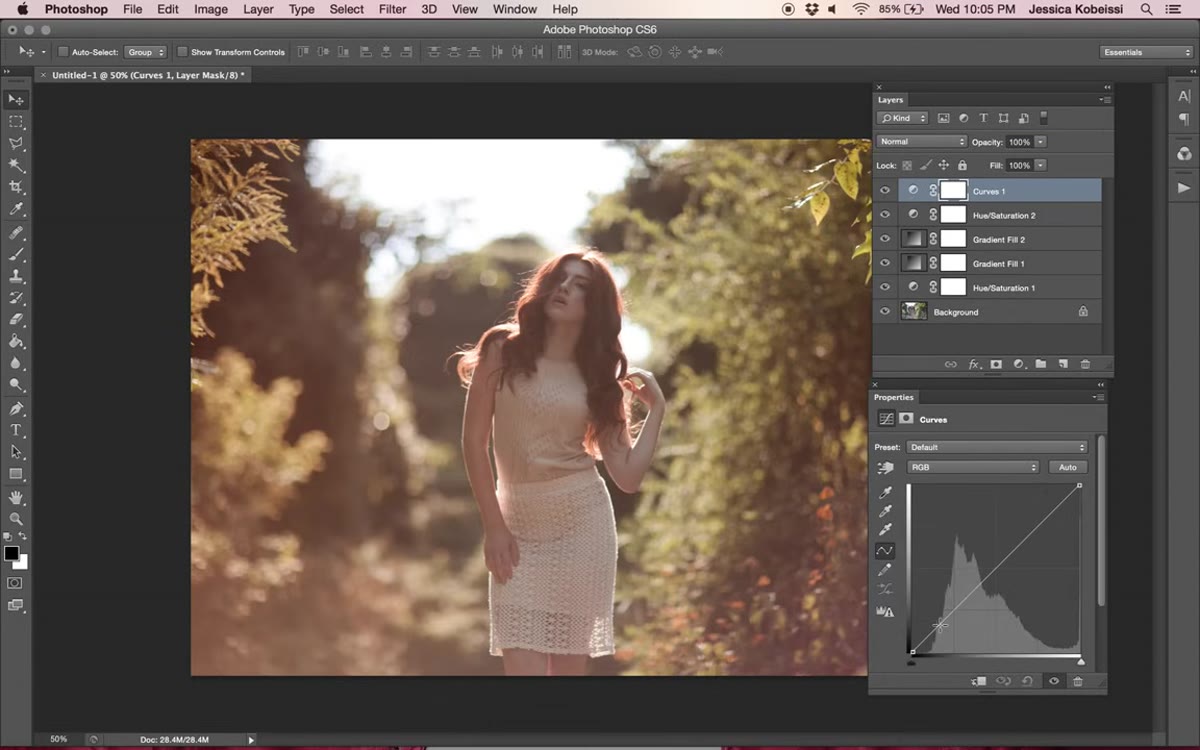
A Curves layer is the cleanest way to control overall brightness and contrast without flattening what the gradients are doing. Go to Layer, New Adjustment Layer, Curves. Jessica adds two points to the curve and lifts the midtones upward to brighten the image. The specific shape matters less than the direction: you want the mid-to-upper portion of the curve to arc gently upward. Even a small lift here adds dimension and keeps skin tones from looking muddy under all that warm color.
RGB Curves panel with two adjustment points brightening midtones
A Curves layer is the cleanest way to control overall brightness and contrast without flattening what the gradients are doing. Go to Layer, New Adjustment Layer, Curves. Jessica adds two points to the curve and lifts the midtones upward to brighten the image. The specific shape matters less than the direction: you want the mid-to-upper portion of the curve to arc gently upward. Even a small lift here adds dimension and keeps skin tones from looking muddy under all that warm color.
After brightening the RGB curve, switch the channel to Blue. Pull the Blue curve down very slightly at the midpoint. Reducing blue in the midtones pushes those tones toward amber and gold, reinforcing the warm-light story you’ve been building since Step 1. This is one of those moves that feels invisible until you toggle the layer on and off, and then you can’t unsee the difference.
A Note on Translating This Workflow to Lightroom
Lightroom doesn’t have gradient fill layers or blend modes, so you can’t replicate this workflow one-to-one. But the underlying logic transfers. I’ve gotten close to this look using a combination of the Color Grading panel (pushing Shadows toward orange and Highlights toward yellow-red), a targeted HSL adjustment on the Yellows, and a radial gradient mask to simulate that lower-corner sun source. The Curves panel in Lightroom handles the blue reduction in the same way Jessica does it in Photoshop.
One thing Lightroom does give you that Photoshop doesn’t is the ability to save this entire approach as a preset and apply it to a whole shoot in seconds. I’ve been working on a version of this warm backlit grade that I’m pretty close to releasing. It’s going in the preset pack I’m building right now, and yes, I’ve already named it after a song.
The biggest thing Jessica’s tutorial reinforced for me is that a warm edit is built in layers, not in one slider. Desaturate first, add color with gradient fills set to low-opacity blend modes, then refine with targeted hue shifts and curves. Each layer is doing a specific job, and that structure is what keeps the result looking intentional rather than slapped-on.
If you want to follow along directly, watch the full tutorial on YouTube and work through it with your own backlit portrait open. The settings Jessica uses are solid starting points, but don’t be afraid to push or pull them once you understand what each layer is actually contributing.
Comments (2)
The tip about how to add a warm backlit glow was the missing piece for me. Thank you.
I tried this on a client project yesterday and the results were way better than expected.
Leave a Comment