The Lightroom-to-Photoshop Bridge Most Editors Set Up Wrong (And How to Fix It)

The Lightroom-to-Photoshop Bridge Most Editors Set Up Wrong (And How to Fix It)

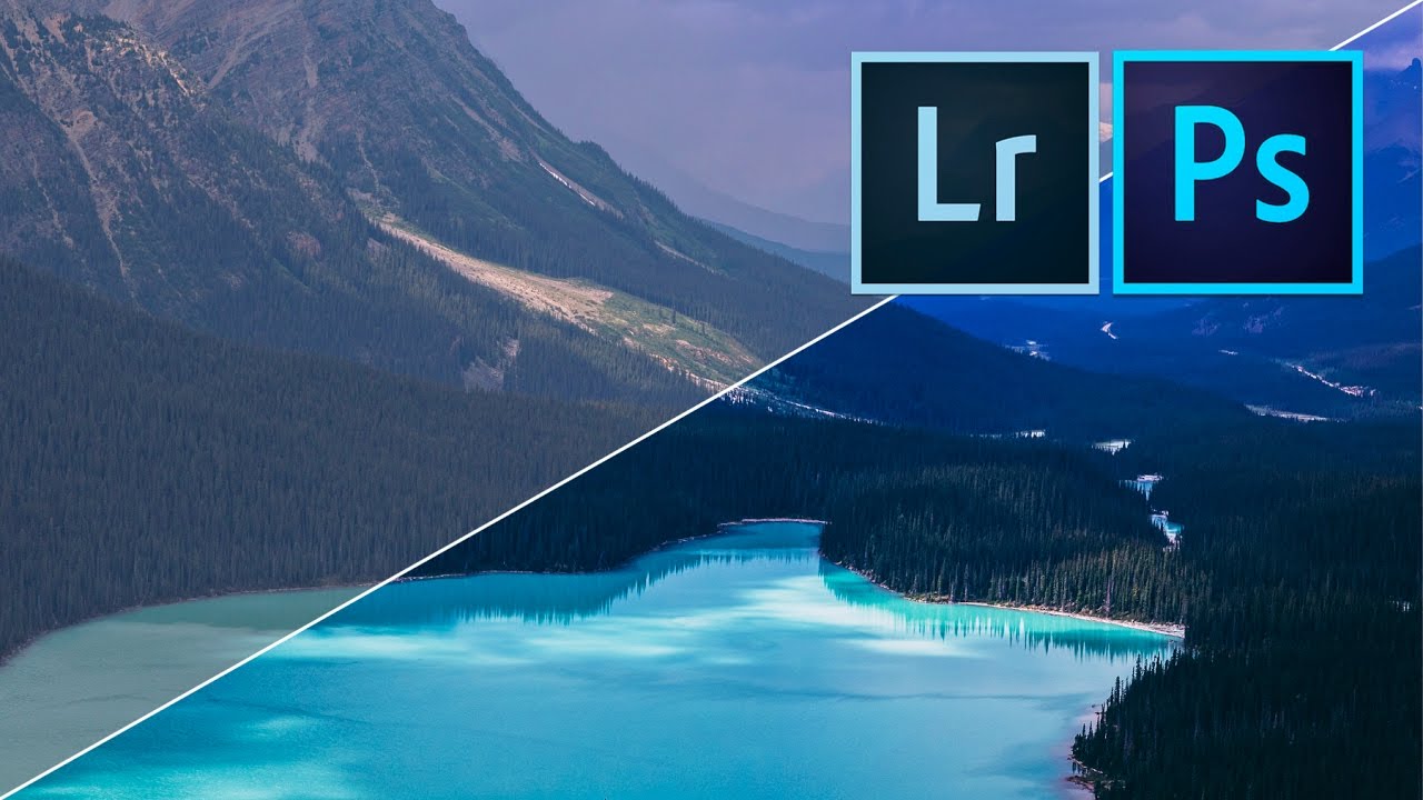
There’s a specific kind of frustration that comes from doing everything right inside Lightroom, sending a file to Photoshop, and watching the color shift the moment it opens. I’ve had that happen on client work more times than I’d like to admit, usually because I hadn’t thought carefully about the handoff settings that govern what Lightroom passes to Photoshop in the first place. Once I locked those settings down, the whole round-trip workflow clicked into place in a way it never had before.
From Lightroom to Photoshop Without Losing Your Mind (or Your Raw Data)

From Lightroom to Photoshop Without Losing Your Mind (or Your Raw Data)

Here is the honest truth about most Lightroom-to-Photoshop workflows: they leak quality somewhere in the handoff. You export a JPEG, open it in Photoshop, do your thing, save it back, and suddenly you are three generations deep into a file that started as a beautiful raw. I have done this more times than I want to admit, usually late on a Friday night with a record on the turntable and a deadline in the morning.

The Photoshop Feature Lightroom Users Are Sleeping On (And How to Finally Use It)

The Photoshop Feature Lightroom Users Are Sleeping On (And How to Finally Use It)

I’ll be honest with you: for a long time, I was a Photoshop avoider. I build presets for a living, I live inside Lightroom’s Develop module, and every time I opened Photoshop it felt like walking into someone else’s kitchen and not knowing where anything was. I’d close it within five minutes and tell myself Lightroom was “enough.” It was a cope. And if you’ve ever done the same thing, this breakdown is for you.

How to Brand Every Page of a Lightroom Photo Book (Without Making It Weird)

How to Brand Every Page of a Lightroom Photo Book (Without Making It Weird)

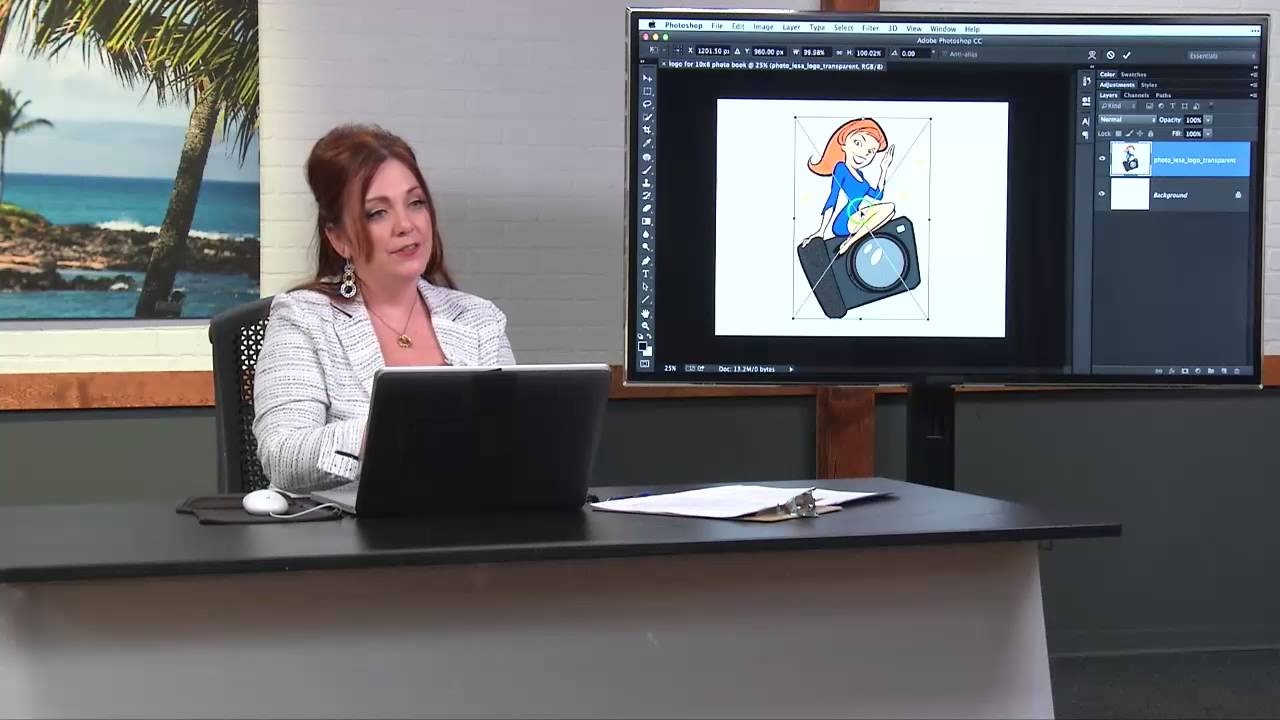
Client photo books are one of those deliverables that look effortless until you try to build one yourself. The layout tools in Lightroom’s Book module are genuinely solid, but the moment a client asks “can you put our logo on every page?” you hit a wall that isn’t obvious until you’re already staring at it. That wall is this: Lightroom gives you one set of cell padding guides per page, and those guides are already doing the job of positioning your photos.

How to Get a Warm, Film-Toned Look in Photoshop Using Four Adjustment Layers

How to Get a Warm, Film-Toned Look in Photoshop Using Four Adjustment Layers

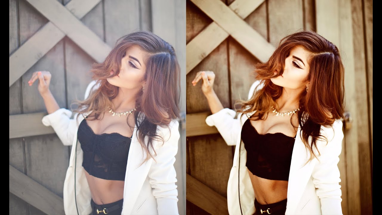
Most of my workflow lives inside Lightroom. That’s no secret. But every once in a while, a Photoshop technique comes along that makes me stop what I’m doing, close my preset panel, and actually pay attention. This is one of those techniques. Watch the full tutorial on YouTube In this Jessica Kobeissi tutorial, she walks through a warm-toned color grading effect using just four adjustment layers in Photoshop. No plugins, no complicated masking, no frequency separation rabbit holes.

The Photoshop Color Grading Stack That Actually Makes Flat Photos Look Cinematic

The Photoshop Color Grading Stack That Actually Makes Flat Photos Look Cinematic

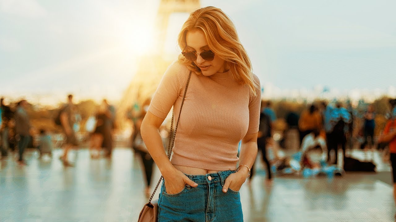
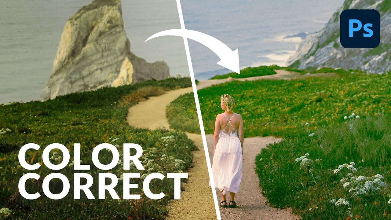
There’s a specific kind of photo that ends up in my reject pile not because it’s technically bad, but because it’s just… flat. Good light, decent composition, nothing wrong with it, and yet nothing is happening. For years I threw processing power at that problem. More contrast, more vibrance, heavier presets. The results were always a little blunt. What I actually needed was a stacked adjustment layer approach that builds color gradually, the way a good mix engineer layers frequencies instead of just cranking the volume.

Crop, Color, and Dodge: A Portrait Editing Walkthrough That Actually Holds Up

Crop, Color, and Dodge: A Portrait Editing Walkthrough That Actually Holds Up

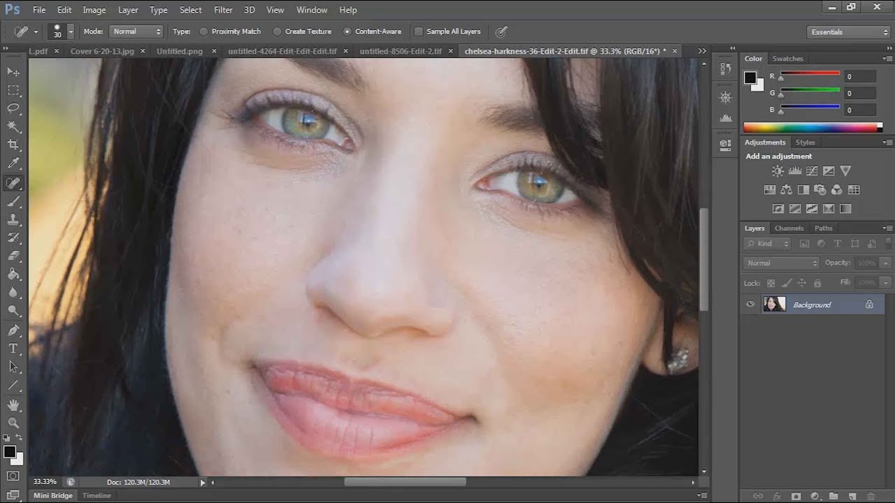
Portrait editing is one of those things where the gap between “technically correct” and “actually good” is enormous. I spent years closing that gap by watching tutorials, breaking them down, and rebuilding the techniques in my own workflow. One tutorial that keeps earning its place in my rotation is Chelsea Northrup’s portrait editing walkthrough from the Tony & Chelsea Northrup channel. It’s a practical, no-fluff demonstration that covers Lightroom color work and a couple of targeted Photoshop moves that make a real difference on skin and hair.

From Flat to Cinematic: What Peter McKinnon's Landscape Editing Workflow Actually Teaches You

From Flat to Cinematic: What Peter McKinnon's Landscape Editing Workflow Actually Teaches You

Every time I open a folder of RAW landscape shots, there’s that split second of either excitement or disappointment before I’ve touched a single slider. The difference between those two feelings almost never comes down to the location or the camera. It comes down to whether I’ve built a reliable editing process or whether I’m just winging it again. In this Peter McKinnon tutorial on editing landscape photos with Lightroom and Photoshop, McKinnon lays out a workflow that’s worth paying attention to because it starts way before you open the develop module.

Color Grading in Adobe Camera Raw: The Lightroom Trick Photoshop Users Are Sleeping On

Color Grading in Adobe Camera Raw: The Lightroom Trick Photoshop Users Are Sleeping On

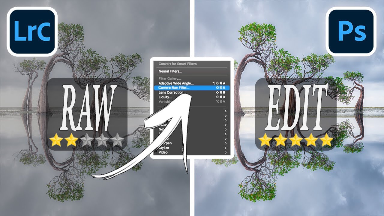
Most of my color grading happens in Lightroom. That’s just the reality of my workflow. But I’ve had clients send me layered Photoshop files and ask for “that warm, filmy look” - and jumping between apps to pull it off is the kind of friction that quietly kills your afternoon. What I didn’t realize until recently is that I’ve been making it harder than it needs to be. In this Aaron Nace (PHLEARN) tutorial, he walks through the Camera Raw filter inside Photoshop and shows how it gives you access to the exact same color grading tools you’d use in Lightroom Classic, Lightroom mobile, or Lightroom desktop.

How to Shift an Entire Photo's Tone in Photoshop Using Five Adjustment Layers

How to Shift an Entire Photo's Tone in Photoshop Using Five Adjustment Layers

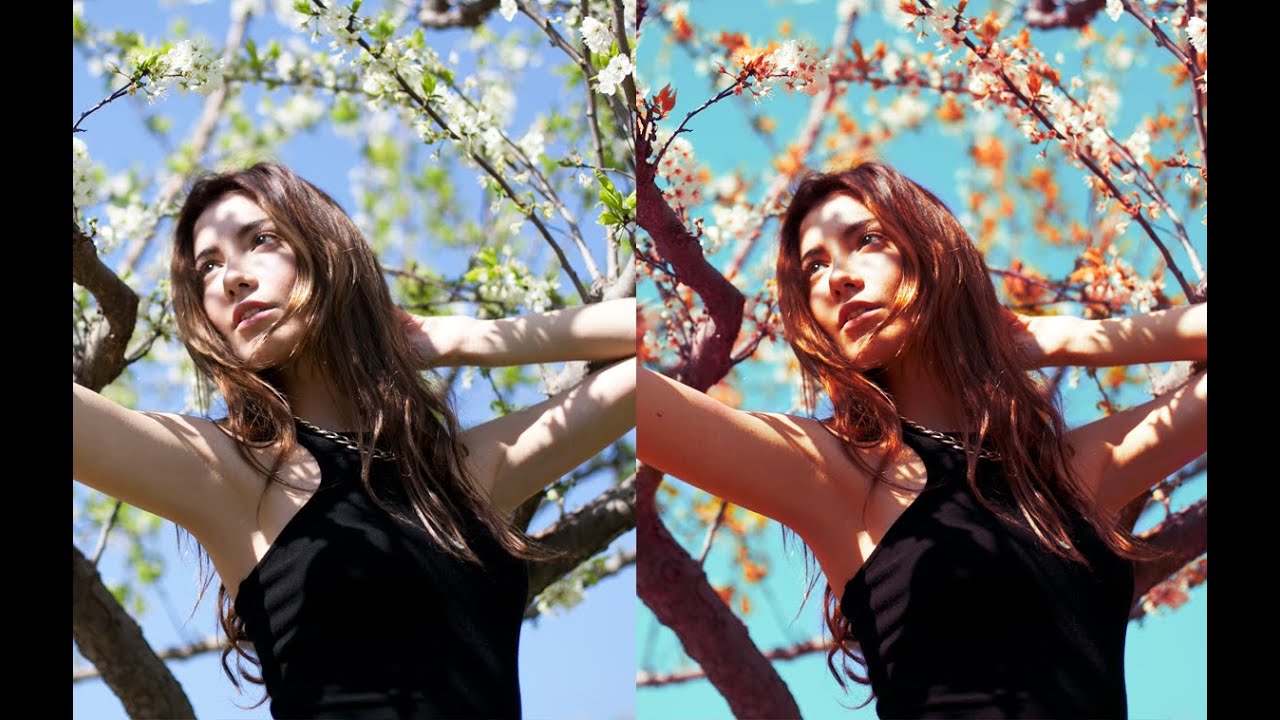
There’s a specific frustration every portrait photographer knows: you nail the shot, the subject looks great, but the background is working against you. The sky is flat, the leaves are the wrong shade, and the overall color story feels like it belongs to a different image. You can push sliders in Lightroom all afternoon and still not get the nuanced control you actually want. That’s the gap this technique fills.

How to Build a Solar Eclipse Composite in Lightroom and Photoshop (Before You Even Shoot It)

How to Build a Solar Eclipse Composite in Lightroom and Photoshop (Before You Even Shoot It)

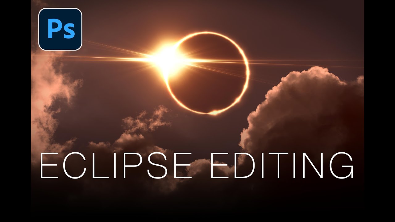
Most editing tutorials are reactive. You shoot something, it comes out weird, and then you go looking for a fix. What I genuinely appreciate about this Matt Kloskowski tutorial on editing solar eclipse photos is that it flips that order entirely. The argument he makes at the top of the video is one I wish someone had made to me earlier in my shooting life: your post-processing vision should inform your shooting decisions, not the other way around.

Blend If in Photoshop: The Color Toning Trick That Leaves Lightroom's Split Toning in the Dust

Blend If in Photoshop: The Color Toning Trick That Leaves Lightroom's Split Toning in the Dust

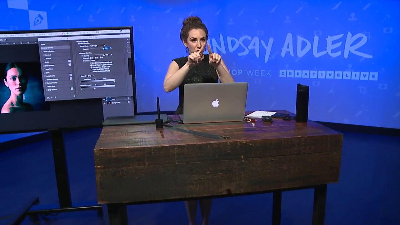
I have a complicated relationship with split toning in Lightroom. I use it constantly, I’ve named half my presets after it, and I also quietly resent how little control it gives me. You set a hue for the highlights, a hue for the shadows, and then Lightroom just… does it. Everywhere. On skin, on backgrounds, on the whites of someone’s eyes. There’s no telling it where to apply and where to back off.