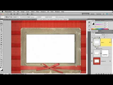
Turn Stock Holiday Graphics Into Pro Lightroom Print Templates (With a Little Photoshop Prep)

Turn Stock Holiday Graphics Into Pro Lightroom Print Templates (With a Little Photoshop Prep)

Every December I get the same question from readers: “How do I make my holiday cards look like something other than a Walgreens kiosk special?” The answer I keep coming back to involves Lightroom’s Print module, which is genuinely one of the most underused tools in the whole application. Most people think of it as the thing you click when you just want to send a file to a printer. It’s actually a surprisingly powerful layout engine, and when you feed it a well-prepared graphic, the results look custom without requiring a graphic design degree.
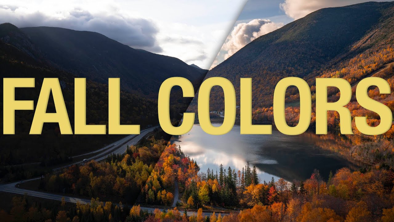
Fall Color Editing Is Harder Than It Looks — Here's How to Actually Get It Right

Fall Color Editing Is Harder Than It Looks — Here's How to Actually Get It Right

Every October I tell myself I’m going to nail the fall color edit this year. And every October I open Lightroom, drag the Vibrance slider up until the leaves look radioactive, and quietly close the file. The problem isn’t effort — it’s that fall color is deceptively tricky. The range of hues shifts dramatically depending on where you live and whether you’re shooting in direct sun or open shade, which means there’s no single slider that solves it for everyone.

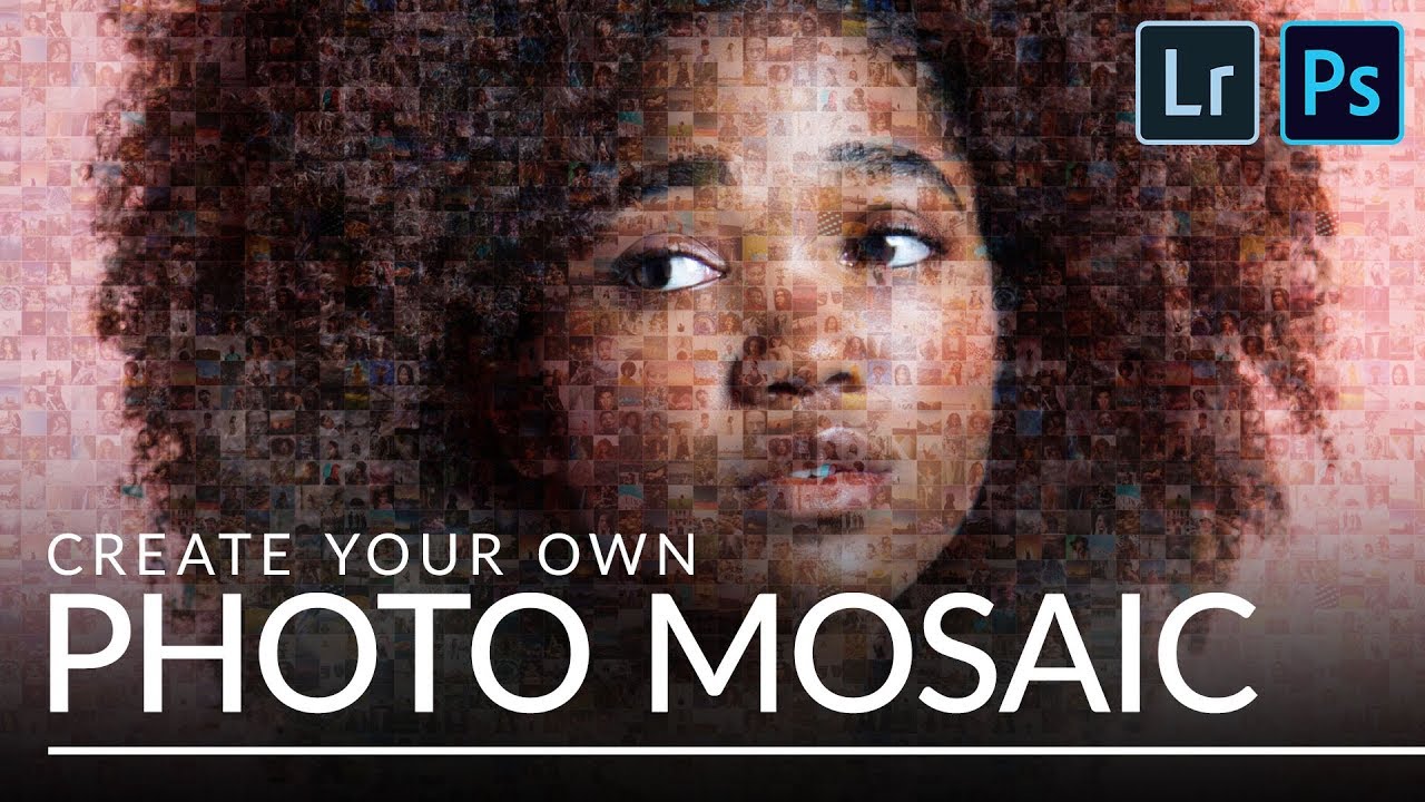
Build a Photo Mosaic From Scratch Using Lightroom and Photoshop

Build a Photo Mosaic From Scratch Using Lightroom and Photoshop

Every few months I get a message that starts with something like: “I have 200 employee headshots and I want to do something interesting with them.” I used to have no good answer for that. A slideshow felt lazy. A contact sheet felt clinical. But a photo mosaic - a single image built from dozens or hundreds of smaller photos - that actually makes people stop scrolling. This technique landed on my radar through Aaron Nace’s tutorial over at PHLEARN, and I want to walk you through what he covers because the workflow is genuinely clever.

The Brightness Trick That Makes Dark-Background Extractions Actually Work in Photoshop

The Brightness Trick That Makes Dark-Background Extractions Actually Work in Photoshop

There’s a specific kind of frustration that comes from trying to select a subject standing against a dark background. The Quick Selection tool fumbles around the edges, the contrast isn’t there for it to grab onto, and you end up with a selection that looks like it was cut out with safety scissors. I’ve been there more times than I’d like to admit, including on some early band press shots where the lighting was, let’s say, “creative” in all the wrong ways.

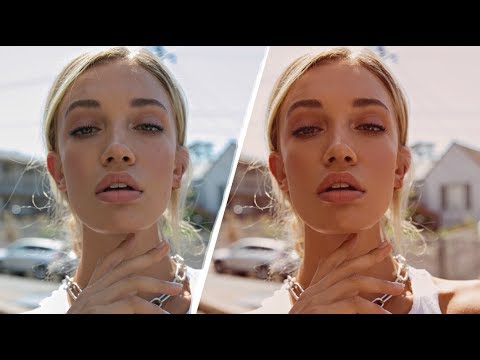
Warm It Up: A Photoshop Layer-by-Layer Guide to Soft, Golden Fashion Tones

Warm It Up: A Photoshop Layer-by-Layer Guide to Soft, Golden Fashion Tones

There’s a specific problem I run into more than I’d like to admit. I shoot a portrait session on an overcast Nashville afternoon, pull the RAW files into Photoshop, and the whole thing looks like a dental office waiting room. Technically correct. Emotionally inert. The image needs warmth, not just a temperature slider drag, but a layered, intentional warmth that reads as a creative choice rather than a fix. That’s exactly the territory Jessica Kobeissi covers in her tutorial on creating a warm-toned fashion photo.

Warm Highlights, Cool Shadows: How to Actually Use Photoshop's Color Grading Wheels

Warm Highlights, Cool Shadows: How to Actually Use Photoshop's Color Grading Wheels

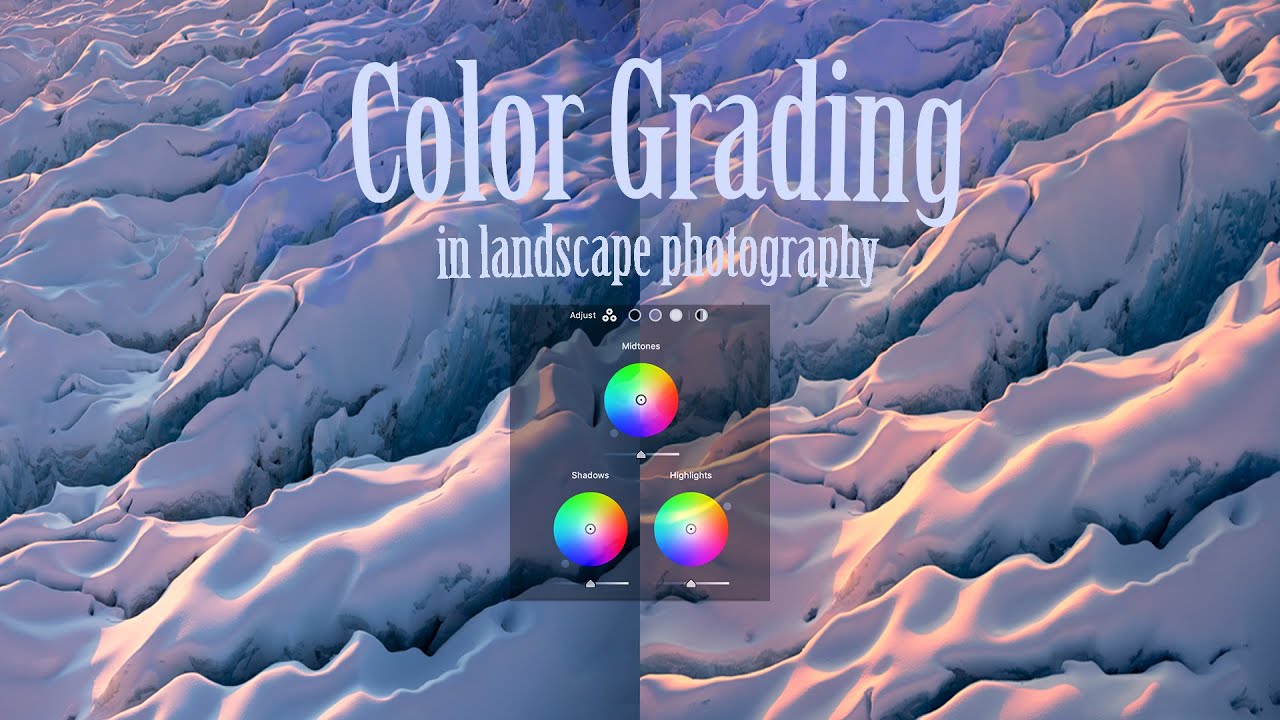
Every raw file I open has the same problem: the light looks flat. Technically correct, emotionally absent. The histogram is fine, the exposure is fine, and somehow the image still feels like it was shot through a grey sock. Color grading is the tool I reach for when the basic sliders have done their job and the photo still isn’t alive yet. Not the heavy-handed, “I watched a YouTube tutorial once” color grading.

Back to Black and Into Color: Using Duotone and Tritone to Transform Your Photos

Back to Black and Into Color: Using Duotone and Tritone to Transform Your Photos

There’s a category of color grade that feels almost impossible to recreate with standard Lightroom sliders. You know the look: a photo where the shadows lean hard into one hue, the highlights drift somewhere completely different, and the whole thing feels unified in a way that no HSL panel adjustment is going to get you. I’ve spent enough hours pushing the Color Grading wheels around to know when I’m fighting the tool.

Color Toning in Photoshop with Levels: The Non-Destructive Trick I Keep Coming Back To

Color Toning in Photoshop with Levels: The Non-Destructive Trick I Keep Coming Back To

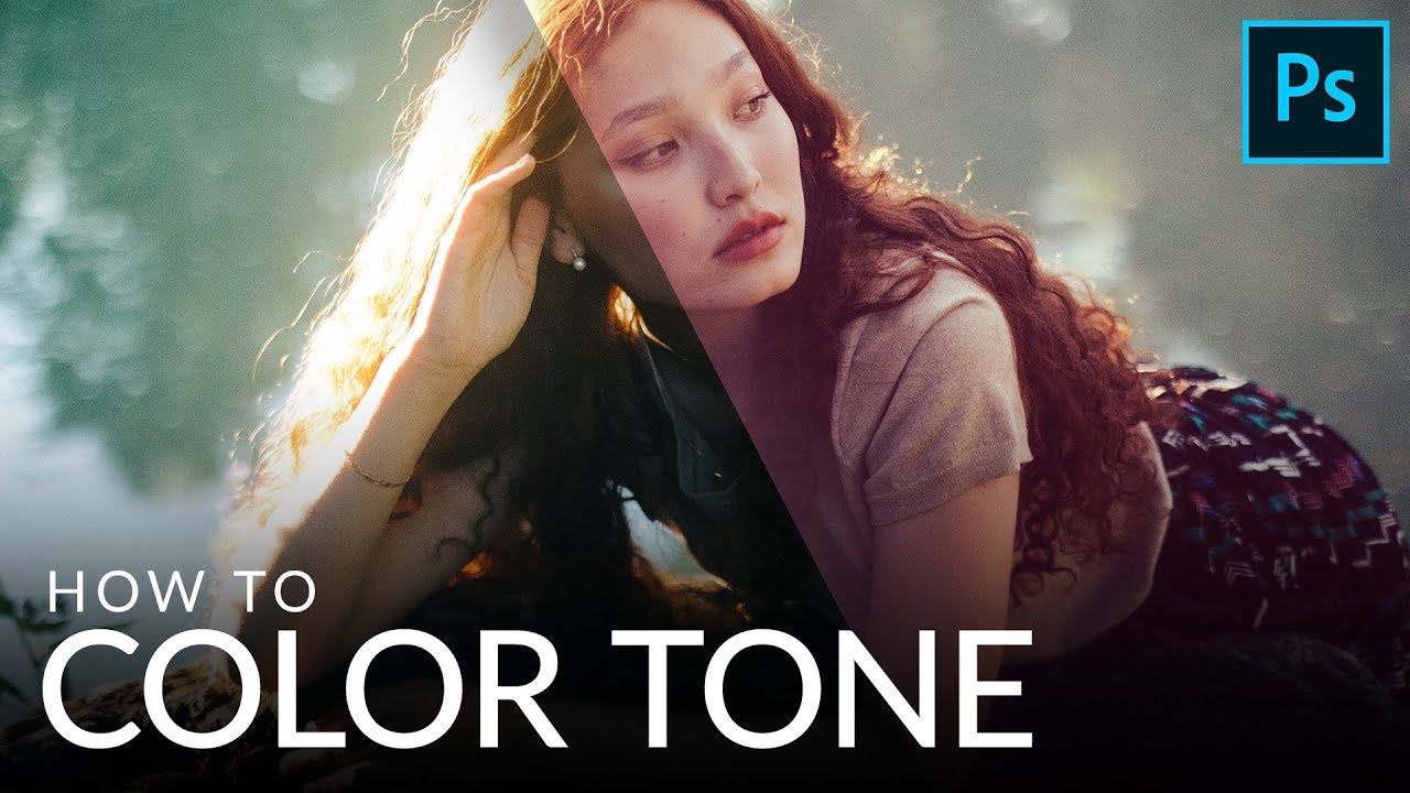
Most of my work happens in Lightroom, but every so often a technique from the Photoshop side of the world earns a permanent spot in my rotation. Color toning with a Levels adjustment layer is one of those techniques. It looks deceptively simple on the surface, and that simplicity is exactly why it works. No plugins, no complicated masking, no destructive pixel-pushing. Just a single adjustment layer and a little knowledge about how color channels behave.

When Lightroom Isn't Enough: 5 Reasons to Open Photoshop (And How to Do Each One)

When Lightroom Isn't Enough: 5 Reasons to Open Photoshop (And How to Do Each One)

I spend about 95% of my editing life inside Lightroom. It’s faster, it keeps me working directly on raw data, and honestly, it handles most of what landscape and portrait photographers actually need. But every once in a while, I hit a wall. There’s something in the frame that needs to disappear, or I’ve got two shots that need to become one, and suddenly Lightroom just shrugs at me. That’s when Photoshop earns its place in the subscription.

How to Build Golden Portrait Tones in Photoshop — A Layer-by-Layer Breakdown

How to Build Golden Portrait Tones in Photoshop — A Layer-by-Layer Breakdown

There’s a specific problem I run into with warm-light portraits that took me an embarrassingly long time to solve. The shot looks beautiful straight out of camera — that magic-hour glow, everything slightly amber — and then you try to push it further in post and it falls apart. Crank the temperature and the skin goes orange. Boost the highlights and the whole thing looks blown out. You end up with something that reads “filtered” instead of “cinematic,” and those are very different things.

How to Watermark Your Photos in Lightroom Without Making Them Look Cheap

How to Watermark Your Photos in Lightroom Without Making Them Look Cheap

There’s a specific kind of frustration that comes from sharing a photo online and watching it float away from you with no indication it was yours. I’ve been there more times than I can count. Before I ever wrote a single tutorial, I was editing press shots for my band in a tiny apartment in Nashville, learning Lightroom out of necessity because we couldn’t afford to hire anyone. Credit rarely traveled with those images.

Steal Any Color Grade in Minutes: The Reference Image Trick Professionals Actually Use

Steal Any Color Grade in Minutes: The Reference Image Trick Professionals Actually Use

There’s a specific kind of frustration that hits when you see a photo with a color grade you love and have absolutely no idea how to recreate it. You know the feeling. You’re staring at a fashion editorial with that perfect warm-teal tension, or a moody film still with shadows that feel almost purple, and you’re thinking: where do I even start? I’ve been there more times than I want to admit.