Every December I get the same question from readers: “How do I make my holiday cards look like something other than a Walgreens kiosk special?” The answer I keep coming back to involves Lightroom’s Print module, which is genuinely one of the most underused tools in the whole application. Most people think of it as the thing you click when you just want to send a file to a printer. It’s actually a surprisingly powerful layout engine, and when you feed it a well-prepared graphic, the results look custom without requiring a graphic design degree.
That’s exactly what this KelbyOne tutorial covers, and the approach is smarter than it first appears. Watch the full tutorial on YouTube before diving in if you prefer to see it in motion, but everything you need to actually execute it is laid out below. The presenter makes a point I want to underline before we get into the steps: this workflow is not just for December. The same technique applies to birthday cards, client gift prints, album covers, announcement mailers. Learn it once, use it all year.
Step 1: Find a Stock Graphic That Works (and Know Its One Problem)
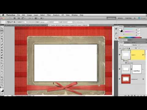
 Stock holiday card graphic open in Photoshop with rounded corners visible
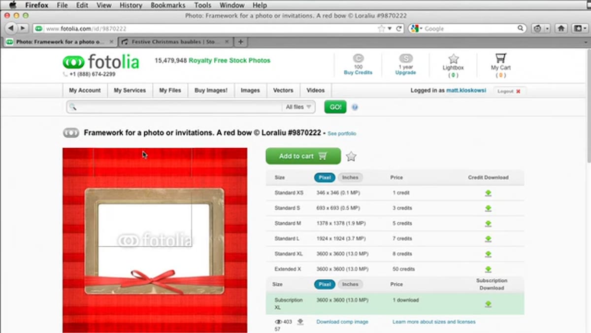
Head to a stock site like iStock and search for something like “holiday card frame” or “Christmas card border.” You’re looking for graphics that have a clear white or open center where your photo will eventually sit. Download a flat image file, not a layered PSD, so you have full control in Photoshop.
Stock holiday card graphic open in Photoshop with rounded corners visible
Head to a stock site like iStock and search for something like “holiday card frame” or “Christmas card border.” You’re looking for graphics that have a clear white or open center where your photo will eventually sit. Download a flat image file, not a layered PSD, so you have full control in Photoshop.
Here’s the catch that trips people up: a lot of these decorative card templates have rounded corners or organic edges that bleed off the frame. Lightroom’s Print module works strictly with rectangular geometry. Any soft edge, rounded corner, or design element that extends outside a clean rectangle will either get clipped awkwardly or ruin the illusion entirely. You need to square everything off before Lightroom ever sees the file, and that squaring-off process is most of what the Photoshop prep is about.
Step 2: Handle Any Decorative Elements That Overlap the Photo Area
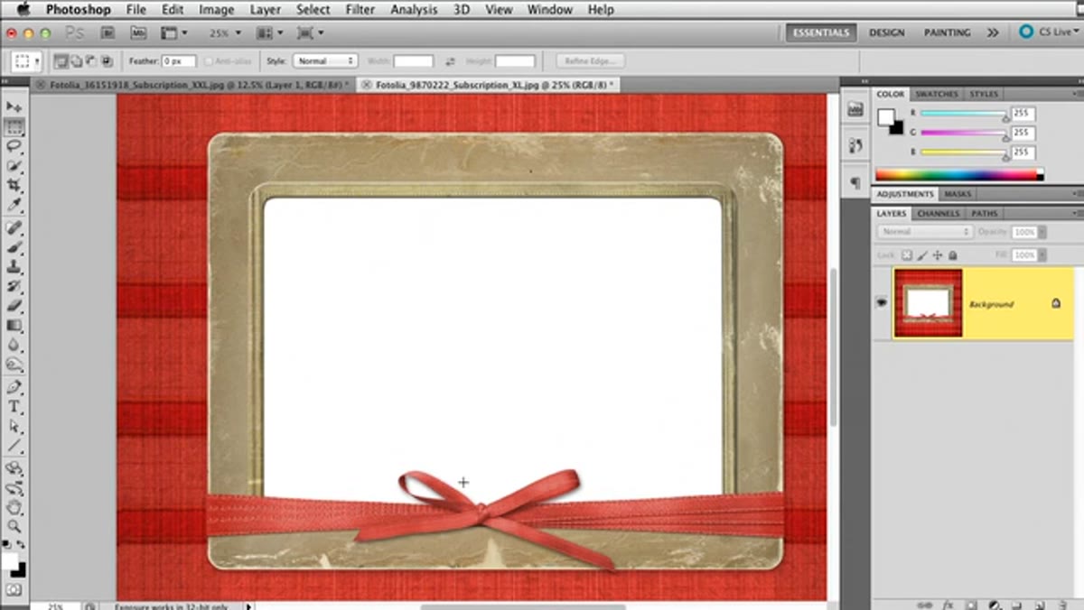 Bow element overlapping white photo space in Photoshop layers panel
The example graphic in the tutorial has a ribbon bow that hangs over the white center area where the photo will go. If you leave it alone, your photo will cut right through the bow and look broken. The fix is to isolate the top section of the graphic using the Rectangular Marquee tool, copy and paste it to its own layer, then use Free Transform (Cmd/Ctrl + T) to flip it vertically and slide it down so it covers the problematic bow.
Bow element overlapping white photo space in Photoshop layers panel
The example graphic in the tutorial has a ribbon bow that hangs over the white center area where the photo will go. If you leave it alone, your photo will cut right through the bow and look broken. The fix is to isolate the top section of the graphic using the Rectangular Marquee tool, copy and paste it to its own layer, then use Free Transform (Cmd/Ctrl + T) to flip it vertically and slide it down so it covers the problematic bow.
Reduce the opacity of that flipped layer temporarily so you can see where the bow sits underneath. You want the bottom edge of your new layer to land just above the bow, then stretch it slightly to fill any gap. Once you’re happy with the placement, press Enter and bring opacity back to 100%. You’re essentially building a clean “ceiling” over the element you want to keep visible.
Step 3: Clean Up the Edge With the Eraser Tool
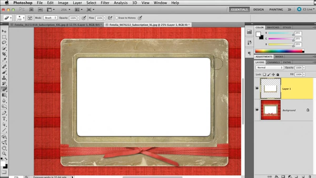 Eraser tool removing fringe pixels along layer edge in Photoshop
After positioning your flipped layer, zoom in and look for any fringe or seam where the two sections meet. A small, hard-edged Eraser brush handles this quickly. Work along the seam in short strokes rather than one long drag. You’re not trying to be surgical here, just removing the obvious artifacts that would show up in print.
Eraser tool removing fringe pixels along layer edge in Photoshop
After positioning your flipped layer, zoom in and look for any fringe or seam where the two sections meet. A small, hard-edged Eraser brush handles this quickly. Work along the seam in short strokes rather than one long drag. You’re not trying to be surgical here, just removing the obvious artifacts that would show up in print.
This step takes about 30 seconds if your graphic is relatively clean. Don’t overthink it. The goal is a seam that reads as invisible at normal viewing distance, not pixel-perfect at 400% zoom.
Step 4: Reveal the Bow With a Quick Selection and an Inverted Layer Mask
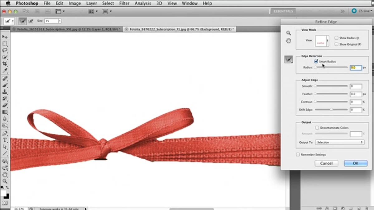 Quick Selection tool active with bow element selected on its layer
Here’s where it gets clever. Toggle off your flipped repair layer, click back on the original layer with the bow, and use the Quick Selection tool with a small brush to trace around the parts of the bow that extend into the white photo area. If the selection grabs some white space you don’t want, hold Option (Mac) or Alt (PC) and brush over those areas to subtract them.
Quick Selection tool active with bow element selected on its layer
Here’s where it gets clever. Toggle off your flipped repair layer, click back on the original layer with the bow, and use the Quick Selection tool with a small brush to trace around the parts of the bow that extend into the white photo area. If the selection grabs some white space you don’t want, hold Option (Mac) or Alt (PC) and brush over those areas to subtract them.
Once your selection looks reasonable, hit Refine Edge, enable Smart Radius, and push that slider to roughly the halfway mark. Photoshop will tighten up the organic edges of the bow automatically. Now turn your repair layer back on, and instead of adding a standard layer mask, hold Option/Alt while clicking the layer mask icon. This inverts the mask, which means it reveals the bow instead of hiding it. The result: your patched layer is visible everywhere except where the bow pokes through, so the bow appears naturally on top.
Step 5: Square Off the Rounded Corners With a Filled Rectangle
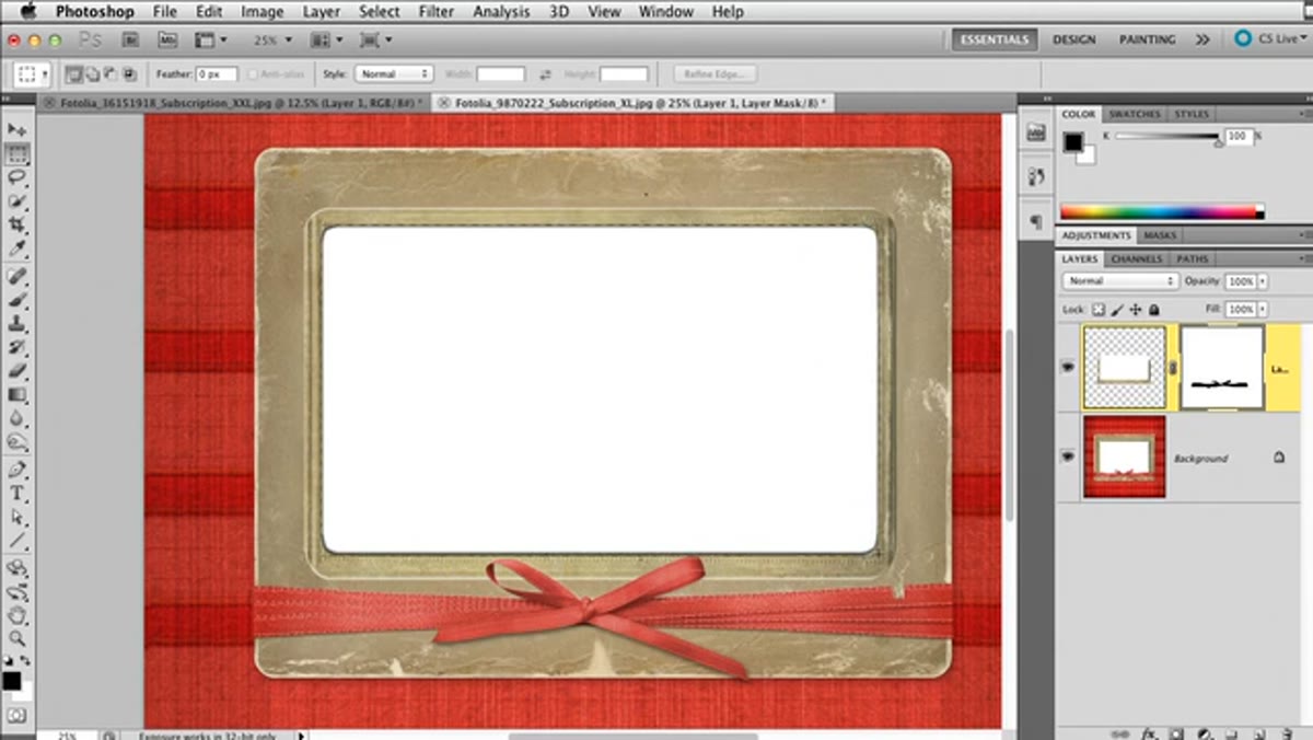 Rectangular Marquee tool drawing over rounded corner of card graphic
Create a new blank layer, then use the Rectangular Marquee tool to draw a rectangle that covers one of the rounded corner areas. Go to Edit, then Fill, and fill with white. Deselect and repeat for any other rounded corners. This forces the graphic into a clean rectangular shape that Lightroom can use without any geometry complaints.
Rectangular Marquee tool drawing over rounded corner of card graphic
Create a new blank layer, then use the Rectangular Marquee tool to draw a rectangle that covers one of the rounded corner areas. Go to Edit, then Fill, and fill with white. Deselect and repeat for any other rounded corners. This forces the graphic into a clean rectangular shape that Lightroom can use without any geometry complaints.
Once the corners are squared, double-click that white-fill layer to open Layer Style. Add an Outer Glow effect, change the blend mode to Multiply, swap the color to black, and nudge the size up slightly. What you get is a subtle drop shadow effect that makes the card feel like it’s sitting on the page rather than floating in a void. It’s a small detail that adds a lot of perceived polish.
Step 6: Export Flat and Bring Into Lightroom’s Print Module
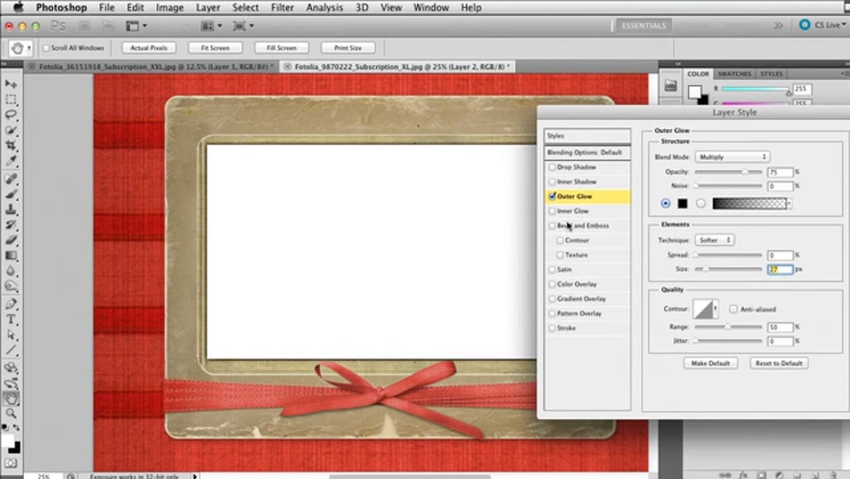 Layer Style dialog with Outer Glow settings showing Multiply blend mode
Flatten your document and export it as a high-resolution JPEG or TIFF. Bring that file into Lightroom and import it like any other image. From there, head to the Print module and use the layout tools to set up your photo cell inside the white space of your card graphic. Position your actual client photo or holiday image in the center opening, and the decorative frame becomes the border of your final print.
Layer Style dialog with Outer Glow settings showing Multiply blend mode
Flatten your document and export it as a high-resolution JPEG or TIFF. Bring that file into Lightroom and import it like any other image. From there, head to the Print module and use the layout tools to set up your photo cell inside the white space of your card graphic. Position your actual client photo or holiday image in the center opening, and the decorative frame becomes the border of your final print.
The Print module gives you precise control over cell size and placement, so take your time matching the photo cell to the white area you prepared. Get it close in the preview, then test print to a PDF first to verify alignment before sending anything to an actual printer.
My Take: This Works Even Better With Your Own Graphics
I’ve started doing a version of this with custom frames I build from scratch in Photoshop, using textures sourced from my own film scans. The vintage grain from a pushed roll of HP5 makes for a frame that feels more personal than any stock graphic. The Lightroom prep process is identical whether you’re using a stock holiday border or something completely original.
One thing I’d add to this workflow: save your final Print module layout as a template using the Template Browser on the left panel. Name it something useful, something that tells you the graphic dimensions and orientation. Next year you won’t have to rebuild anything, you’ll just swap the photo and print. That compounding efficiency is the whole point.
The single most important idea here is the one the tutorial opens with: don’t file this away as a “holiday card trick.” The Print module template workflow is a year-round production tool, and the Photoshop prep skills transfer to every frame-style graphic you’ll ever want to use. Once you’ve done it twice it becomes second nature.
Watch the full tutorial on YouTube to see every mouse movement in real time, especially the Quick Selection and Refine Edge section, which moves fast and benefits from actually seeing the tool in action.
Comments
Leave a Comment