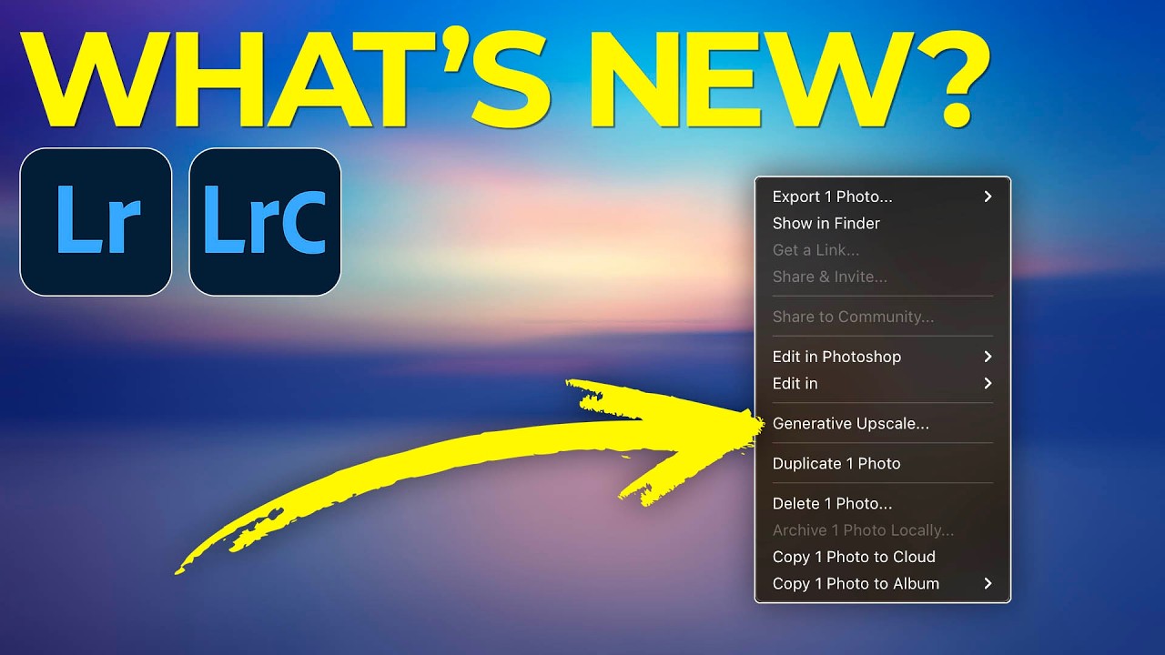
HSL in Lightroom: The Color Control Most Editors Treat Like a Mystery Box

HSL in Lightroom: The Color Control Most Editors Treat Like a Mystery Box

I was editing a set of golden hour portraits last spring, and the skin tones looked like the subject had been standing inside a traffic cone. The overall white balance was fine. The exposure was good. But somewhere between the warm light and my heavy-handed orange push in the tone curve, everything had gone sideways in a very specific, very unflattering direction. The fix took about forty-five seconds once I opened the HSL panel.

Split Toning Is the Reason Your Photos Look Flat (And How to Fix It in 4 Steps)

Split Toning Is the Reason Your Photos Look Flat (And How to Fix It in 4 Steps)

A few years back I was editing press shots for my band. No budget, no photographer, just me with a Nikon and a free trial of Lightroom trying to make us look like we belonged on a festival poster. I kept cranking up the contrast and punching the saturation and wondering why every photo looked like it came out of a vending machine. Something was off, and I couldn’t name it.

The Art of Color Grading: Transform Your Photos Like a Hollywood Film

The Art of Color Grading: Transform Your Photos Like a Hollywood Film

The Art of Color Grading: Transform Your Photos Like a Hollywood Film I remember the first time I really understood color grading. I was editing a portrait that felt flat and lifeless, and after spending three hours adjusting individual color channels, something clicked. The image suddenly had mood, atmosphere, and depth—it looked like it belonged in a film. That’s when I realized color grading isn’t just about making things look pretty.

The Golden Age of Photography: Why Orotone Is Having Its Moment

The Golden Age of Photography: Why Orotone Is Having Its Moment

The Golden Age of Photography: Why Orotone Is Having Its Moment I recently stumbled upon something that stopped me mid-scroll: a gallery exhibition featuring photographs that literally shimmer with gold leaf. Not the Instagram filter kind of gold—I’m talking about actual, luminous prints that seem to glow from within. It’s called orotone, and it’s making me completely rethink how we approach color grading in the digital era. What Exactly Is Orotone?

Color Grading Fundamentals: How to Transform Your Photos in Lightroom

Color Grading Fundamentals: How to Transform Your Photos in Lightroom

Color Grading Fundamentals: How to Transform Your Photos in Lightroom When I first started editing photos, I thought color grading was some mysterious art reserved for film colorists and Instagrammers with secret presets. Turns out, it’s actually a learnable skill—and once you understand the fundamentals, you’ll never look at your photos the same way again. Color grading isn’t just about making things look pretty. It’s about telling a story with color, creating mood, and guiding your viewer’s eye exactly where you want it to go.

Beyond the Basics: The Advanced Lightroom Techniques That Actually Transform Your Images

Beyond the Basics: The Advanced Lightroom Techniques That Actually Transform Your Images

The Lightroom Skills Nobody Talks About Here’s something that hit me recently: most photographers are using Lightroom like they’re driving a Ferrari in first gear. The software has evolved so dramatically over the past decade, yet we’re often stuck doing the same basic adjustments our mentors taught us five years ago. After watching how experienced editors approach their craft, I’ve realized there’s a massive gap between “competent” Lightroom editing and the kind of work that makes people stop scrolling.

The Great Color Grading Showdown: How New Creator Tools Are Changing Our Workflow

The Great Color Grading Showdown: How New Creator Tools Are Changing Our Workflow

The Plot Thickens in Post-Production Something significant is happening in the creator tools space, and honestly, it’s the kind of shift that makes you reevaluate your entire editing workflow. The emergence of DaVinci Resolve as a serious contender in the color grading arena isn’t just industry noise—it’s a wake-up call for anyone who’s been coasting with their current setup. For years, Lightroom has been the undisputed heavyweight champion of photo editing.

Masking Tools in Lightroom: The Secret Weapon for Surgical Color Grading

Masking Tools in Lightroom: The Secret Weapon for Surgical Color Grading

Masking Tools in Lightroom: The Secret Weapon for Surgical Color Grading I remember the moment masking clicked for me. I was editing a portrait where the skin looked perfect but the background was blown out and lifeless. I used to just accept that trade-off—nail one element, compromise another. Then I discovered Lightroom’s masking tools, and suddenly I could treat different parts of my image like they deserved their own color grade.

The Dehaze Tool: When to Use It and When to Stop

The Dehaze Tool: When to Use It and When to Stop

The Dehaze slider is one of Lightroom’s most powerful and most abused tools. In the right situation, it transforms a flat, hazy image into something vivid and clear. Applied carelessly, it creates crunchy, oversaturated, haloed messes. Understanding what it actually does helps you use it well. What Dehaze Does Technically, Dehaze estimates the atmospheric haze in an image and reduces it by increasing local contrast and restoring color saturation in areas affected by haze.

The Color Grading Blueprint: How to Match Any Mood in Lightroom

The Color Grading Blueprint: How to Match Any Mood in Lightroom

The Color Grading Blueprint: How to Match Any Mood in Lightroom I used to think color grading was magic—the kind of thing only professionals with mysterious knowledge could pull off. Then I realized it’s actually a language. Once you learn to speak it, you can make your photos whisper, shout, or sing whatever emotional note you want. Here’s what changed everything for me: understanding that color grading isn’t about making things look “better.

The Art of Color Grading in Lightroom: Moving Beyond Auto Tone

The Art of Color Grading in Lightroom: Moving Beyond Auto Tone

The Art of Color Grading in Lightroom: Moving Beyond Auto Tone I used to think color grading was something only Hollywood colorists did in million-dollar studios. Then I realized I’d been looking at it all wrong. Every time you scroll through Instagram and see a photo that just hits differently—that moody blue hour portrait, that sun-soaked travel shot with buttery golden tones—that’s color grading. And I’m here to tell you that you absolutely can master it in Lightroom.

Split Toning in Lightroom: The Secret Weapon for Cinematic Color

Split Toning in Lightroom: The Secret Weapon for Cinematic Color

Split Toning in Lightroom: The Secret Weapon for Cinematic Color I remember the first time I really understood split toning. I was editing a sunset portrait that felt flat despite nailing the exposure, and I thought: “This needs something.” I opened the Split Toning panel in Lightroom, threw a cool blue into the shadows while keeping the highlights warm, and suddenly the image had dimension. It looked like a film still instead of a snapshot.