Color Grading
Split Toning Is the Reason Your Photos Look Flat (And How to Fix It in 4 Steps)
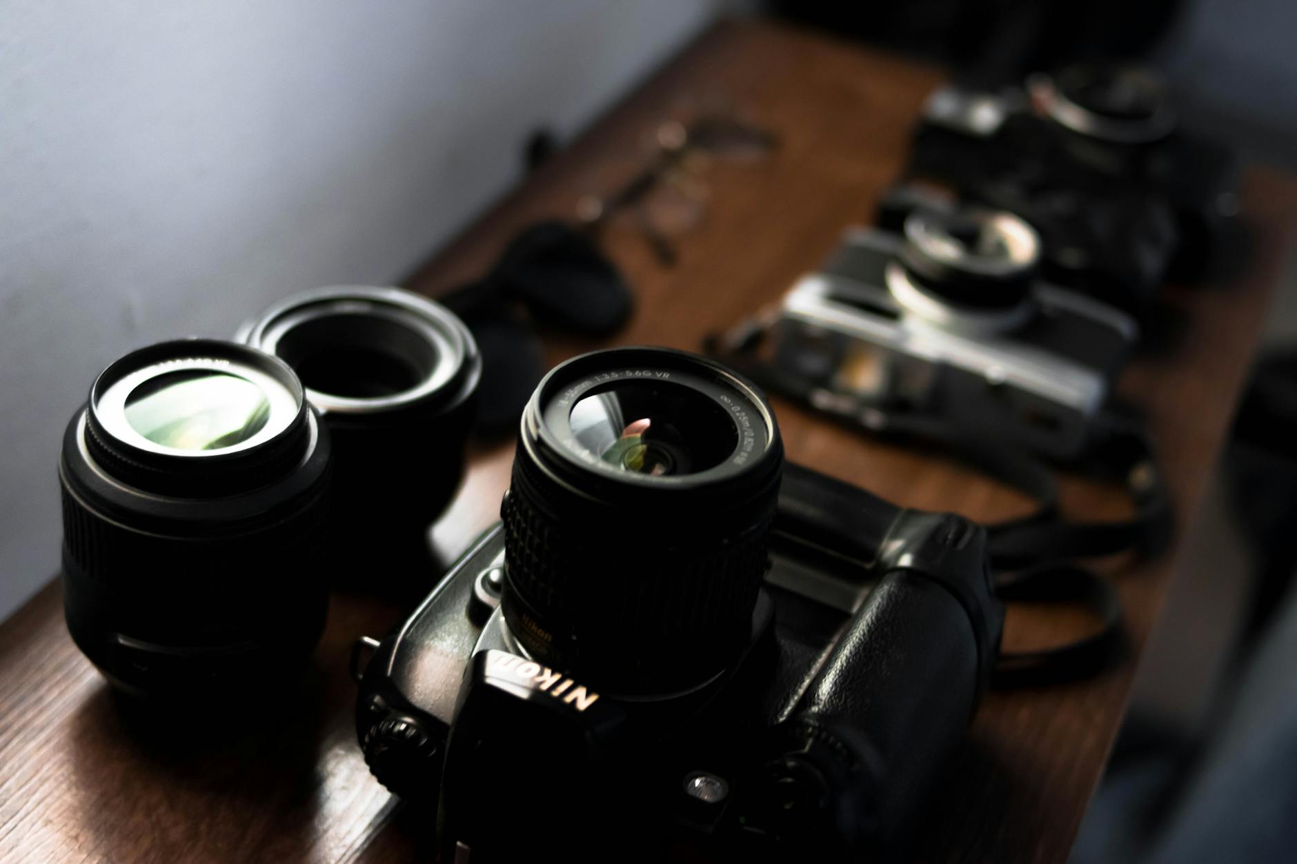
A few years back I was editing press shots for my band. No budget, no photographer, just me with a Nikon and a free trial of Lightroom trying to make us look like we belonged on a festival poster. I kept cranking up the contrast and punching the saturation and wondering why every photo looked like it came out of a vending machine. Something was off, and I couldn’t name it.