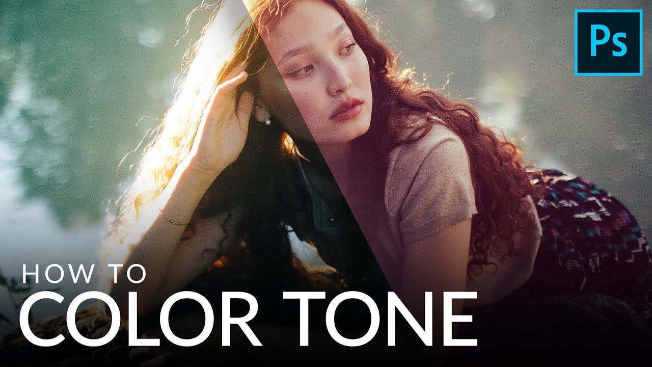
Most of my work happens in Lightroom, but every so often a technique from the Photoshop side of the world earns a permanent spot in my rotation. Color toning with a Levels adjustment layer is one of those techniques. It looks deceptively simple on the surface, and that simplicity is exactly why it works. No plugins, no complicated masking, no destructive pixel-pushing. Just a single adjustment layer and a little knowledge about how color channels behave.
I came across this approach watching Watch the full tutorial on YouTube from Aaron Nace over at PHLEARN. Aaron has a gift for stripping a technique down to its actual mechanics without making you feel like you’re sitting in a lecture. His breakdown of the Levels panel here is the clearest explanation of color channel behavior I’ve seen in a five-minute window, and it filled in some gaps I didn’t even know I had.
What sold me immediately was the non-destructive angle. I named a preset pack after a Joni Mitchell record once and spent two days dialing in the color relationships. The idea of doing that kind of tonal work directly on pixels and then having to undo it later is genuinely painful. An adjustment layer means you can revisit, tweak, or scrap the whole thing without touching the original image. That alone makes this worth learning.
Step 1: Add a Levels Adjustment Layer
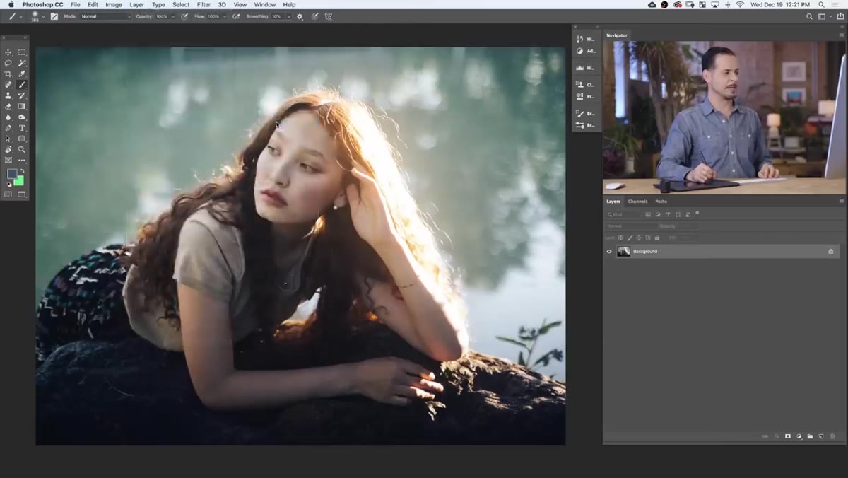 New Levels adjustment layer being created in the Layer menu
Start by going to Layer, then New Adjustment Layer, then Levels. This creates a non-destructive layer sitting above your image that you can edit, hide, or delete at any time. You’ll see the Levels panel open automatically with a histogram in the middle and two rows of sliders beneath it. The top row controls your input levels. The bottom row controls your output levels. These two sets of sliders do different things, and understanding that difference is the whole foundation of this technique.
New Levels adjustment layer being created in the Layer menu
Start by going to Layer, then New Adjustment Layer, then Levels. This creates a non-destructive layer sitting above your image that you can edit, hide, or delete at any time. You’ll see the Levels panel open automatically with a histogram in the middle and two rows of sliders beneath it. The top row controls your input levels. The bottom row controls your output levels. These two sets of sliders do different things, and understanding that difference is the whole foundation of this technique.
Step 2: Understand Input vs. Output Levels
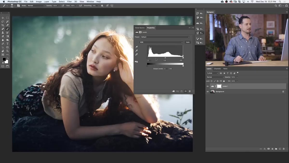 Levels panel showing input and output sliders with histogram
The input sliders let you define what counts as black, white, and midtone in your image. Drag the left input slider to the right and you’re pushing more tonal information into pure black. Drag the right input slider to the left and more of the image clips to white. The middle slider nudges your midtones brighter or darker depending on which direction you drag it.
Levels panel showing input and output sliders with histogram
The input sliders let you define what counts as black, white, and midtone in your image. Drag the left input slider to the right and you’re pushing more tonal information into pure black. Drag the right input slider to the left and more of the image clips to white. The middle slider nudges your midtones brighter or darker depending on which direction you drag it.
Output levels work in the opposite direction. Instead of clipping tones harder, they constrain the tonal range. Pull the left output slider to the right and your darkest shadows lift, becoming a dark gray rather than pure black. Pull the right output slider to the left and your brightest highlights dim slightly. This distinction matters a lot when you move into the color channels, because lifting your shadow output on a specific color channel is how you introduce that color into the dark areas of your image.
Step 3: Switch to the Red Channel
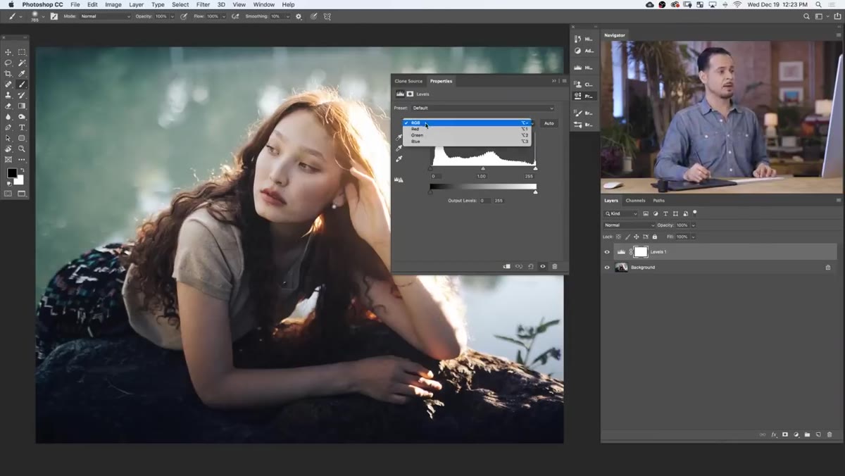 RGB dropdown open with Red channel selected in Levels panel
At the top of the Levels panel, there’s a dropdown that defaults to RGB, meaning any slider adjustments you make affect all three color channels equally. Click that dropdown and switch to Red. Now your sliders only affect the red information in the image. This is where the color toning actually begins.
RGB dropdown open with Red channel selected in Levels panel
At the top of the Levels panel, there’s a dropdown that defaults to RGB, meaning any slider adjustments you make affect all three color channels equally. Click that dropdown and switch to Red. Now your sliders only affect the red information in the image. This is where the color toning actually begins.
Here’s the core logic: on the output levels, dragging the left slider to the right adds red to your shadows. Dragging the right slider to the left removes red from your highlights. On the input levels, the right slider removes red from the light areas, and the left slider removes red from the dark areas. Red and cyan are opposites here. When you remove red, you’re effectively adding cyan, and vice versa.
Step 4: Use the Red Channel to Warm the Shadows
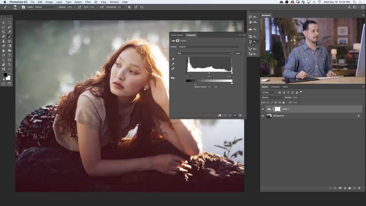 Red channel output level shadow slider being adjusted in Levels
In the tutorial, Aaron lifts the shadow output on the Red channel slightly. This adds a subtle warm red tone into the darkest parts of the image. His reasoning is specific to the photo he’s working with. There’s red in the subject’s hair and lips, and pushing a little of that same hue into the shadows helps unify the color story across the frame.
Red channel output level shadow slider being adjusted in Levels
In the tutorial, Aaron lifts the shadow output on the Red channel slightly. This adds a subtle warm red tone into the darkest parts of the image. His reasoning is specific to the photo he’s working with. There’s red in the subject’s hair and lips, and pushing a little of that same hue into the shadows helps unify the color story across the frame.
That kind of intentionality is worth stealing. Don’t move sliders until the image looks “interesting.” Think about what’s already present in the photo and use color toning to reinforce it. A small input value shift goes a long way, so keep your adjustments conservative on the first pass.
Step 5: Adjust the Green Channel for Midtones
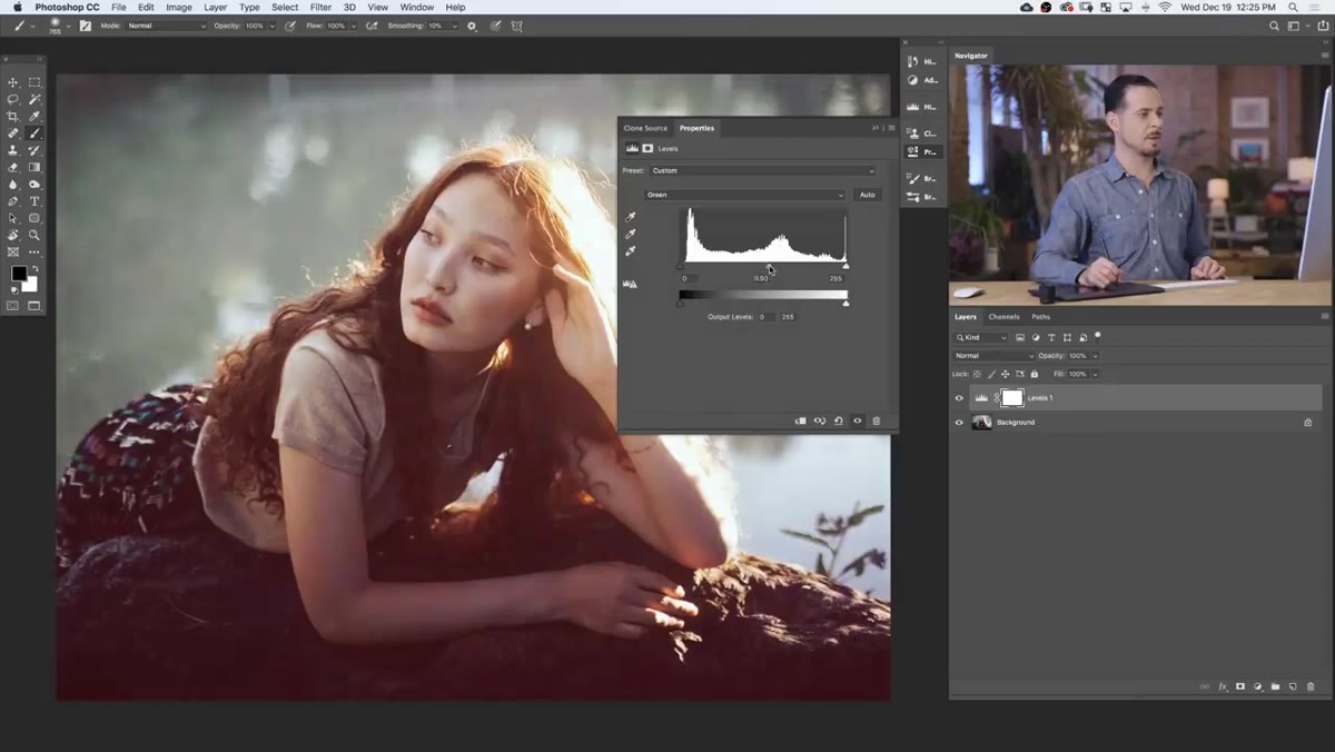 Green channel selected with midtone slider being moved in Levels
Switch the dropdown to Green. The midtone slider here becomes your control for pushing the overall color temperature of the middle tones toward green or magenta. Green and magenta are the opposites in this channel. A small push in either direction changes the feel of skin tones and neutral backgrounds more than you’d expect.
Green channel selected with midtone slider being moved in Levels
Switch the dropdown to Green. The midtone slider here becomes your control for pushing the overall color temperature of the middle tones toward green or magenta. Green and magenta are the opposites in this channel. A small push in either direction changes the feel of skin tones and neutral backgrounds more than you’d expect.
Aaron makes a subtle midtone adjustment here to counterbalance the red shift from the previous step. This is the part where a lot of people over-correct. Treat midtone adjustments like seasoning rather than a main ingredient.
Step 6: Use the Blue Channel to Balance Highlights and Shadows
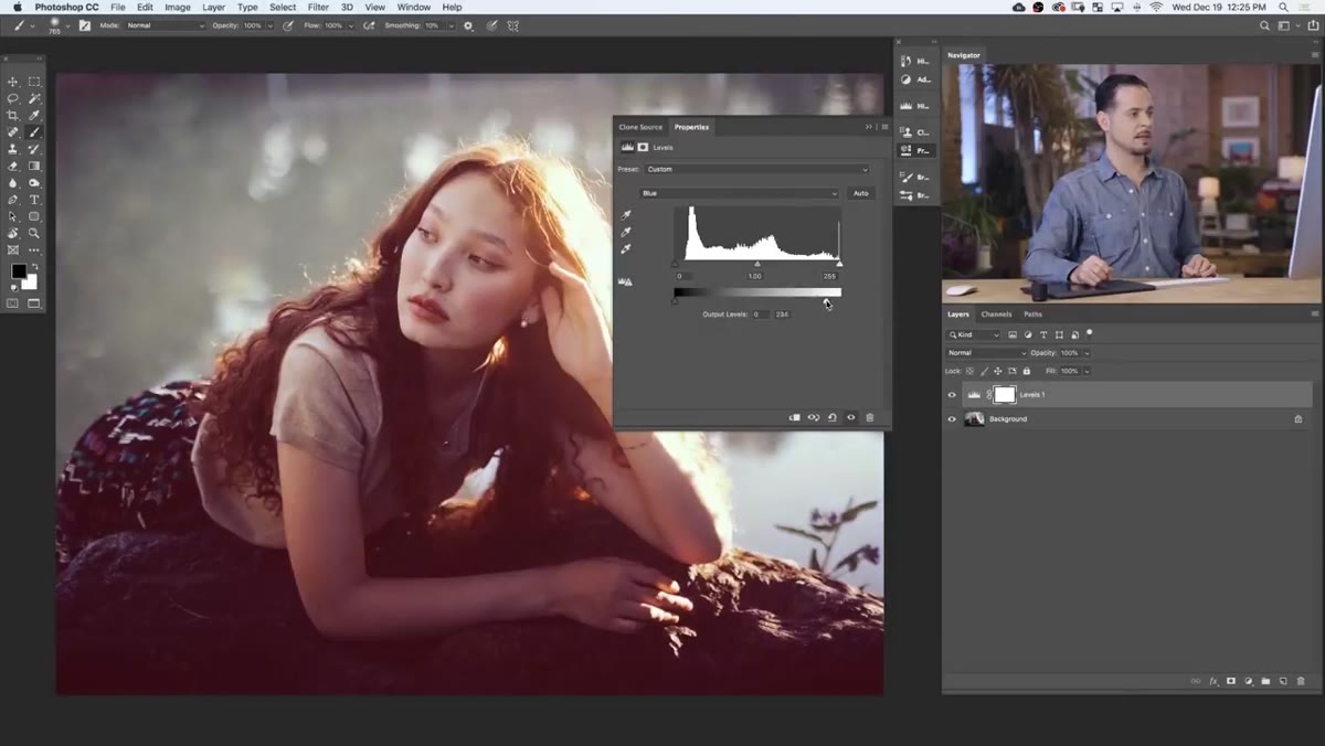 Blue channel selected with highlight and shadow sliders being adjusted
Switch to the Blue channel. Blue and yellow are the opposites here, so reducing blue adds yellow warmth, and adding blue cools things down. Aaron introduces a touch of yellow into the highlights by pulling the right output slider to the left, which warms up the brighter areas of the image. Then he adds a small amount of blue into the shadows, creating a slight cool contrast against the warmer highlights.
Blue channel selected with highlight and shadow sliders being adjusted
Switch to the Blue channel. Blue and yellow are the opposites here, so reducing blue adds yellow warmth, and adding blue cools things down. Aaron introduces a touch of yellow into the highlights by pulling the right output slider to the left, which warms up the brighter areas of the image. Then he adds a small amount of blue into the shadows, creating a slight cool contrast against the warmer highlights.
This warm-highlights, cool-shadows relationship shows up in film photography all the time and gives images a cinematic quality that feels grounded rather than processed. It’s a simple split tone effect, but built channel by channel, you have more surgical control than a two-color split tone slider would give you.
Step 7: Compare and Adjust Opacity
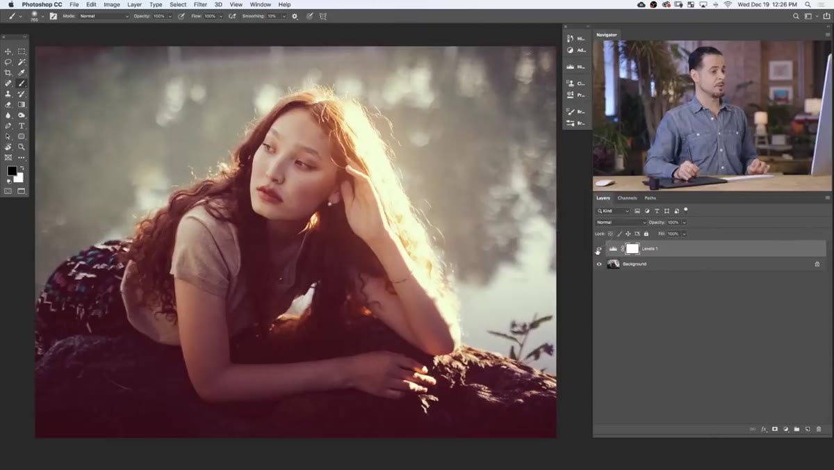 Layer visibility toggle showing before and after of color tone effect
Once you’ve made adjustments across all three channels, toggle the adjustment layer’s visibility on and off to compare the before and after. This is the reality check moment. Effects that look subtle while you’re building them can read as heavy once you see the full comparison.
Layer visibility toggle showing before and after of color tone effect
Once you’ve made adjustments across all three channels, toggle the adjustment layer’s visibility on and off to compare the before and after. This is the reality check moment. Effects that look subtle while you’re building them can read as heavy once you see the full comparison.
If the toning feels too strong, dial back the layer’s opacity. Dropping it to 60 or 70 percent often produces results that feel more like a film stock and less like a filter.
How This Translates to My Lightroom Workflow
Lightroom’s HSL panel and the Tone Curve’s individual channel controls work on the same underlying logic. Red channel output lifting in Photoshop is roughly the same idea as adding red to the shadows in Lightroom’s Point Curve. Understanding the Levels approach made me faster in Lightroom because the conceptual framework transferred directly. If you’ve ever wondered why the Point Curve’s individual color channels behave the way they do, this tutorial is the clearest explanation I’ve found, even though it’s technically a Photoshop lesson.
The biggest thing Aaron’s tutorial gave me is a more intentional approach to color decisions. Every slider move should have a reason tied to what’s already in the image. Color toning that reinforces existing hues reads as natural. Color toning that ignores the source material reads as a filter. That distinction is the difference between a grade that makes people ask what camera you used and one that makes people ask what preset you used.
Watch the full tutorial on YouTube and follow along with Aaron’s walkthrough. Five minutes is a small investment for a technique you’ll use for years.
Comments (2)
Love how you break down complex stuff into manageable steps.
Printing this out and pinning it next to my monitor. That good.
Leave a Comment