News
The Masking Methods That Elevate Your Lightroom Edits From Flat to Polished
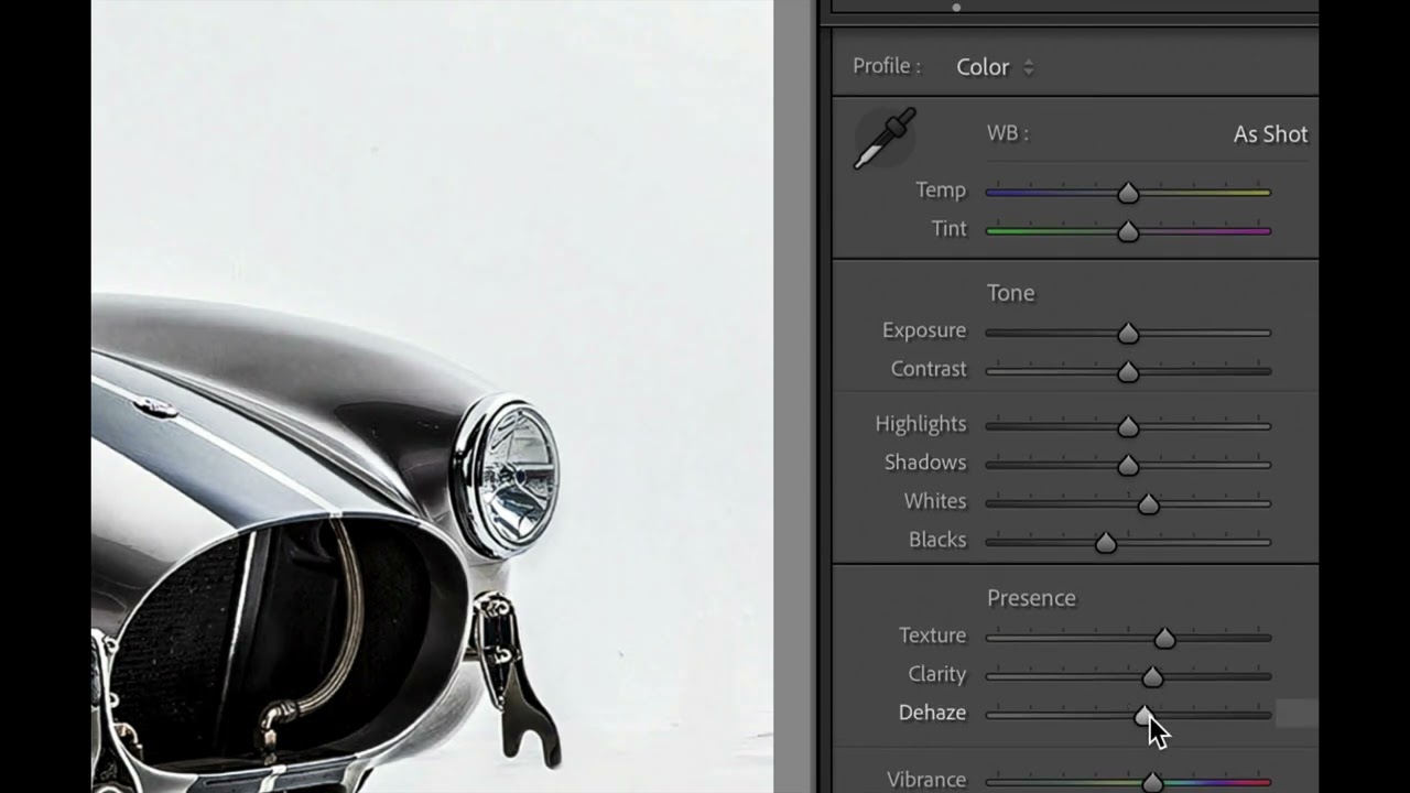
The Masking Methods That Elevate Your Lightroom Edits From Flat to Polished I’ve spent enough time scrolling through photography communities to recognize a pattern: the difference between a good edit and a great edit often comes down to one thing—restraint paired with precision. And that’s exactly what I’m seeing more photographers discover right now with Lightroom Classic’s masking capabilities. Why Your Photos Feel “Overdone” We’ve all been there. You push the vibrance slider, boost contrast, add some warmth, and suddenly your photo looks like it was processed by a robot with no chill.