Video Tutorials
When the Sky Blows Out: A Practical Guide to Recovering Highlights in Lightroom
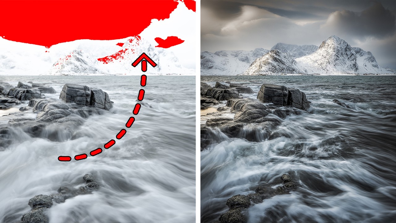
Last week I was culling through a batch of golden hour landscapes and kept landing on the same problem: skies that had gone completely white. Not just bright. Gone. The kind of blown-out exposure that makes you wonder if your histogram was even trying. My instinct, the same one I had for years, was to flag those frames and move on. But I’ve learned to sit with them longer now, because more often than not, the detail is still in there.