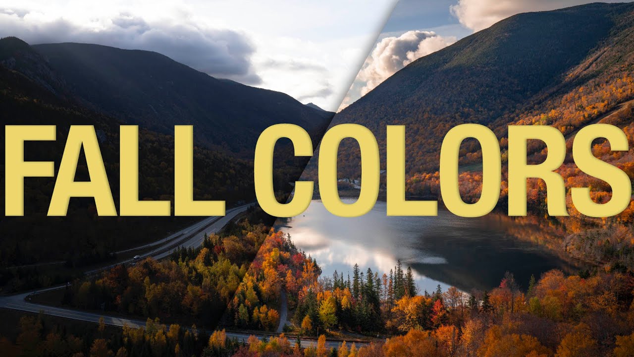
Every October I tell myself I’m going to nail the fall color edit this year. And every October I open Lightroom, drag the Vibrance slider up until the leaves look radioactive, and quietly close the file. The problem isn’t effort — it’s that fall color is deceptively tricky. The range of hues shifts dramatically depending on where you live and whether you’re shooting in direct sun or open shade, which means there’s no single slider that solves it for everyone.
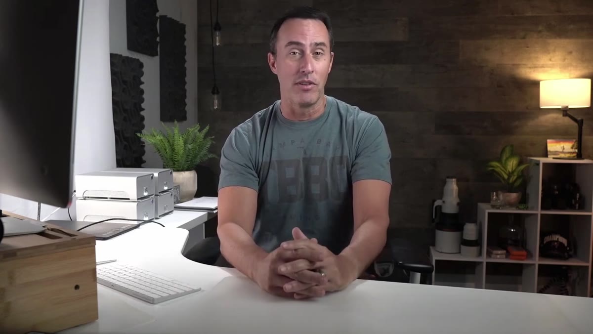
That’s exactly the premise of Watch the full tutorial on YouTube — a breakdown from Matt Kloskowski that focuses less on “use this preset” and more on building a flexible toolkit. I’ve been working through it with a few of my own fall shots, and the approach holds up. What follows is my walkthrough of the core techniques, with enough detail that you can follow along without the video open.
The biggest thing I took away before we even get to color: get your tones right first. It sounds obvious, but I’ve wasted hours trying to fix a muddy orange in HSL when the real problem was clipped highlights flattening the whole image.
Step 1: Establish Your Exposure Foundation Before Touching Color
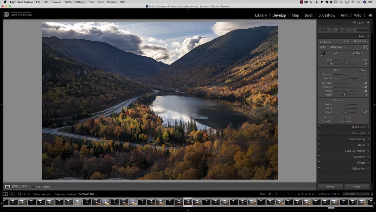
 Highlights pulled back, shadows opened in Basic panel
Before any color work happens, Matt runs through a quick but deliberate tonal pass. Pull the Highlights slider down to recover any blown-out areas in the canopy, then lift the Shadows to open up the darker zones underneath the tree line. Neither move needs to be dramatic — you’re not going for HDR, you’re just giving yourself a workable range to push color into later.
Highlights pulled back, shadows opened in Basic panel
Before any color work happens, Matt runs through a quick but deliberate tonal pass. Pull the Highlights slider down to recover any blown-out areas in the canopy, then lift the Shadows to open up the darker zones underneath the tree line. Neither move needs to be dramatic — you’re not going for HDR, you’re just giving yourself a workable range to push color into later.
From there, use the Option key (Alt on PC) while dragging Whites and Blacks. This triggers a threshold view that shows exactly where clipping starts, letting you set a true white point and black point without guessing. The goal is contrast that feels natural, not crunchy. Whether you use these sliders, the Contrast slider, or a Tone Curve doesn’t matter — pick what you’re comfortable with. The output is what counts.
Step 2: Use a Graduated Filter on the Sky Instead of a Global Highlights Pull
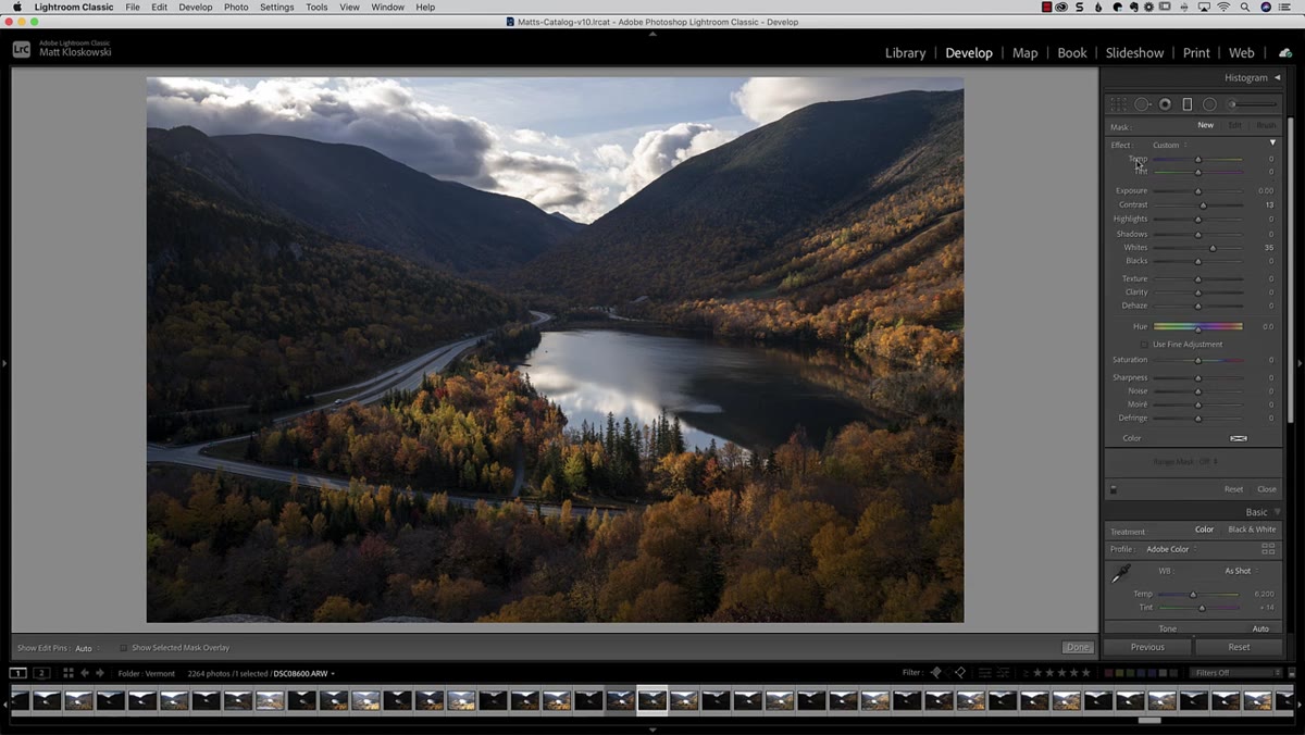 Graduated filter dragged down from top of frame
Here’s a move I started stealing immediately. Instead of pulling Highlights down across the entire image (which tanks the brightness on your nicely lit foreground leaves), apply a Graduated Filter from the top of the frame downward and reduce highlights only in that zone.
Graduated filter dragged down from top of frame
Here’s a move I started stealing immediately. Instead of pulling Highlights down across the entire image (which tanks the brightness on your nicely lit foreground leaves), apply a Graduated Filter from the top of the frame downward and reduce highlights only in that zone.
This keeps the luminous quality of well-lit foliage in the lower two-thirds of the frame intact, while still controlling an overly bright sky. Once the filter is in place, Matt also reaches for the Dehaze slider inside that local adjustment. Pushing Dehaze on a flat, hazy background adds contrast and color saturation back into the distant trees without affecting anything in the foreground. The background gets a little darker, which is actually a feature — depth in a landscape photo comes from that tonal separation between near and far.
Step 3: Fine-Tune the Global White Point After Local Adjustments
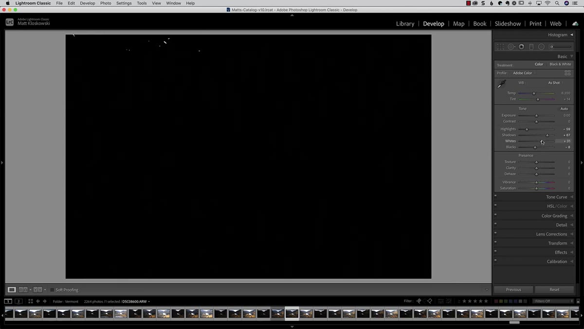 Whites slider adjusted after graduated filter applied
Any time you add a local adjustment that affects brightness, your global white point shifts. Matt catches this and goes back to the Whites slider, again using Option/Alt to check for clipping, and nudges it upward to compensate for the darkening effect the Graduated Filter introduced into the upper portion of the frame.
Whites slider adjusted after graduated filter applied
Any time you add a local adjustment that affects brightness, your global white point shifts. Matt catches this and goes back to the Whites slider, again using Option/Alt to check for clipping, and nudges it upward to compensate for the darkening effect the Graduated Filter introduced into the upper portion of the frame.
It’s a small recalibration step that’s easy to skip — and easy to regret later when you export and wonder why the image looks slightly duller than it did on screen. Think of it as closing the loop on your tonal work before the color phase begins. A touch of global Dehaze at this stage can also clean up any remaining atmospheric muddiness in the background.
Step 4: Explore Color Profiles as Your First Color Move
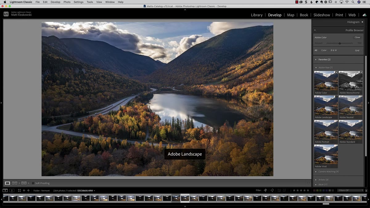
 Profile browser open with fall-specific profiles visible
Once tones are locked, the first color tool Matt introduces is Profiles, accessed through the Profile Browser at the top of the Basic panel in Lightroom (or via Camera Raw in Photoshop). Profiles operate differently from presets — they work at a deeper level before any of your sliders are applied, which means they change how color is interpreted rather than just layering adjustments on top.
Profile browser open with fall-specific profiles visible
Once tones are locked, the first color tool Matt introduces is Profiles, accessed through the Profile Browser at the top of the Basic panel in Lightroom (or via Camera Raw in Photoshop). Profiles operate differently from presets — they work at a deeper level before any of your sliders are applied, which means they change how color is interpreted rather than just layering adjustments on top.
For fall shooting, Adobe’s Creative profiles and any camera-specific profiles worth exploring are ones that lean warmer or that pull more separation out of reds and oranges. The key is to use the opacity slider that appears when you select a profile. Full strength often looks over-processed. Pulling it back to 60-70% gives you the color direction without the artificial quality. This is a technique I wish someone had shown me three years ago because I used to apply profiles at full blast and then wonder why everything looked like a stock photo from 2009.
Step 5: Target Specific Hues with HSL for Precise Color Shifts
 HSL panel open with orange and yellow sliders highlighted
The HSL panel (Hue, Saturation, Luminance) is where you can get surgical with fall color. The logic is simple: Hue shifts the actual color value, Saturation controls intensity, and Luminance controls how bright or dark that color appears. For fall foliage, the channels doing the heavy lifting are almost always Oranges, Yellows, and Reds.
HSL panel open with orange and yellow sliders highlighted
The HSL panel (Hue, Saturation, Luminance) is where you can get surgical with fall color. The logic is simple: Hue shifts the actual color value, Saturation controls intensity, and Luminance controls how bright or dark that color appears. For fall foliage, the channels doing the heavy lifting are almost always Oranges, Yellows, and Reds.
A small Hue adjustment on Oranges can push a muddy brown-orange toward a vibrant true orange, or nudge it warmer toward a red-gold. Saturation boosts on those same channels add pop without affecting blues or greens in the frame. Luminance is the underused one — brightening the Yellow channel, for example, can make yellow leaves feel like they’re lit from within without any masking required. Work each slider conservatively and check your before/after frequently.
A Note From My Own Workflow: Local Color Masks Change Everything
The techniques above are all global or semi-global adjustments. What Matt’s tutorial sparked for me was going further with Lightroom’s masking tools to apply HSL-style color work to specific regions. Using a luminance range mask tied to the orange and yellow values in the leaves, I can run a more aggressive Vibrance or Saturation boost only on the foliage without it bleeding into the sky or any neutral foreground elements.
In Nashville, a lot of our fall shoots involve mixed light — golden sun hitting one side of a tree while the other sits in open shade. The shaded leaves read as desaturated and slightly cool compared to the sunlit ones, and a global saturation lift makes the sunlit side look fake before the shaded side looks good. A masked local adjustment solves that. It takes an extra few minutes to set up, but the difference in a finished print is significant enough that I won’t skip it anymore.
The single most important idea from this tutorial is also the least flashy: fall color editing doesn’t have a universal fix because fall itself doesn’t look the same everywhere. Building a flexible process — tones first, profiles second, targeted HSL third — will serve you better than any preset, no matter how good the preview thumbnail looks.
Watch the full tutorial on YouTube to see Matt walk through each step on his actual image, including the Photoshop-specific color options he covers after the Lightroom section.
Comments (2)
Tried this technique this morning. Game changer for real.
Love how you break down complex stuff into manageable steps.
Leave a Comment