There’s a specific kind of frustration that hits when you see a photo with a color grade you love and have absolutely no idea how to recreate it. You know the feeling. You’re staring at a fashion editorial with that perfect warm-teal tension, or a moody film still with shadows that feel almost purple, and you’re thinking: where do I even start? I’ve been there more times than I want to admit. Most of the time I end up poking at Curves until something looks close enough, which is not a workflow anyone should be proud of.
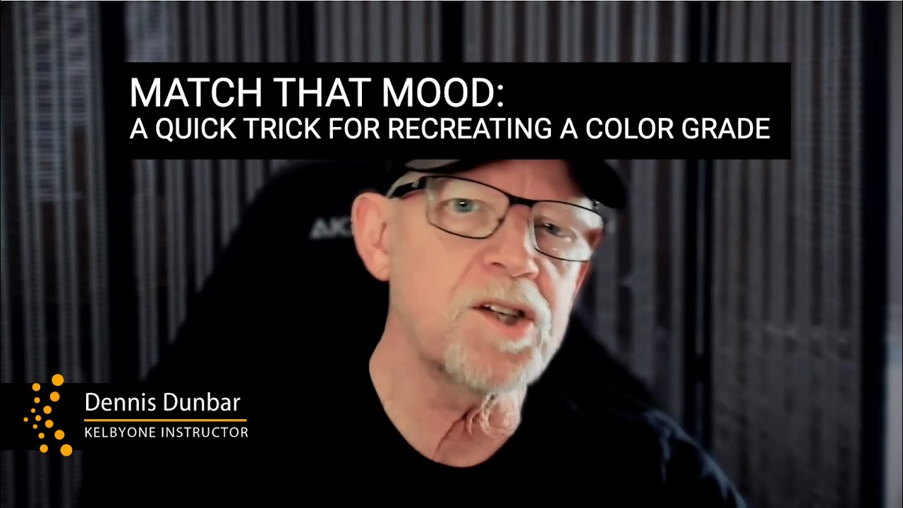
That’s exactly why I stopped what I was doing when I came across this KelbyOne tutorial featuring Dennis Dunbar. Watch the full tutorial on YouTube. Dennis has been working in Photoshop since version one, and his specialty is adding color magic to movie posters and ad campaign images. This isn’t a hobbyist talking about vibes. This is someone who has matched color grades professionally for decades. The technique he shares here, which he credits to fellow retoucher Lisa Carney, is one of those rare tricks that looks almost too simple to work and then absolutely works.
The core idea: use Photoshop’s Curves Auto Options to sample shadow, midtone, and highlight colors directly from a reference image sitting in your layer stack. Instead of guessing what values make up a specific look, you’re literally pulling them from the source. Here’s how to do it step by step.
Step 1: Place Your Reference Image at the Top of the Layer Stack
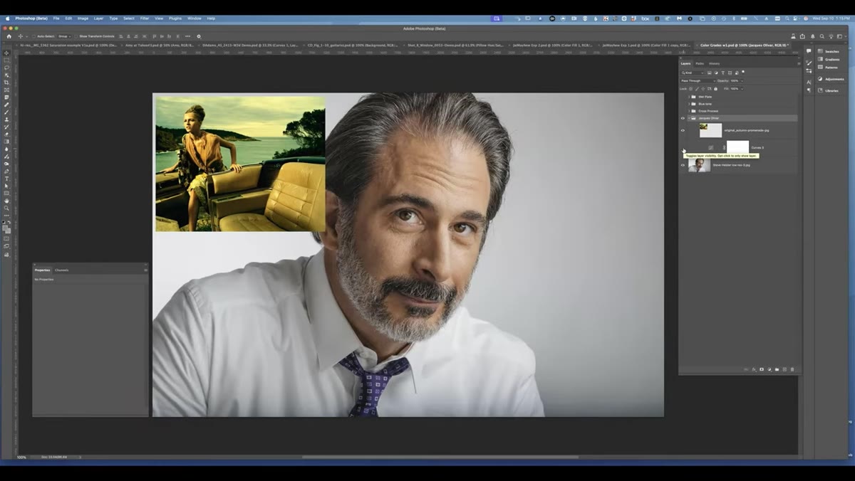 Reference image placed above target image in layers panel
Open both your target photo and your reference image in Photoshop. Place the reference image as a layer above everything else in your Layers panel. This positioning matters. The reference needs to sit on top of your entire layer stack because you’re going to sample colors from it while working on an adjustment layer below it. Think of it as a color guide floating above your actual image.
Reference image placed above target image in layers panel
Open both your target photo and your reference image in Photoshop. Place the reference image as a layer above everything else in your Layers panel. This positioning matters. The reference needs to sit on top of your entire layer stack because you’re going to sample colors from it while working on an adjustment layer below it. Think of it as a color guide floating above your actual image.
You can temporarily lower the opacity if you want to see both images at once while you work, but keep it above all other layers. Don’t flatten it into your image. It needs to stay separate.
Step 2: Create a New Curves Adjustment Layer
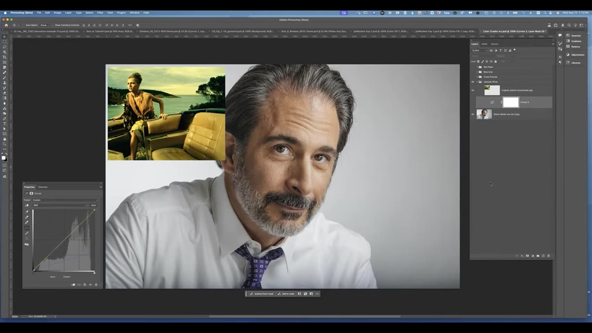 New Curves adjustment layer added below reference image
Add a Curves adjustment layer directly below your reference image. This is the adjustment layer that’s going to carry your entire color grade, so name it something useful. Dennis names his “demo” in the tutorial, but in my own work I’d probably call it something like the track that was playing when I made it. Old habit.
New Curves adjustment layer added below reference image
Add a Curves adjustment layer directly below your reference image. This is the adjustment layer that’s going to carry your entire color grade, so name it something useful. Dennis names his “demo” in the tutorial, but in my own work I’d probably call it something like the track that was playing when I made it. Old habit.
The Curves adjustment layer should sit between your reference image and your base photo. Your layer order from top to bottom should be: reference image, Curves adjustment layer, your base image.
Step 3: Set the Eyedropper Tool to Sample from All Layers
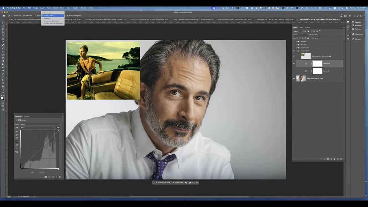 Eyedropper tool options bar showing “All Layers” selected
This is the step most people miss, and it’s the reason the whole technique can fail if you skip it. Select the Eyedropper tool and look at the options bar at the top of your screen. You’ll see a Sample dropdown. Change it from “Current Layer” or “Current and Below” to “All Layers.”
Eyedropper tool options bar showing “All Layers” selected
This is the step most people miss, and it’s the reason the whole technique can fail if you skip it. Select the Eyedropper tool and look at the options bar at the top of your screen. You’ll see a Sample dropdown. Change it from “Current Layer” or “Current and Below” to “All Layers.”
The reason this matters: when you use the eyedropper inside the Curves Auto Options dialog, Photoshop needs to be able to reach up through your layer stack and grab color data from the reference image sitting above your Curves layer. Without “All Layers” selected, it can only see what’s beneath the adjustment layer, which means it’s sampling from your original photo instead of your reference. You’d just be sampling yourself. Dennis mentions he has to remind himself to do this every single time, which honestly made me feel a lot better about the number of times I’ve forgotten settings like this mid-workflow.
Step 4: Open Auto Options Inside the Curves Panel
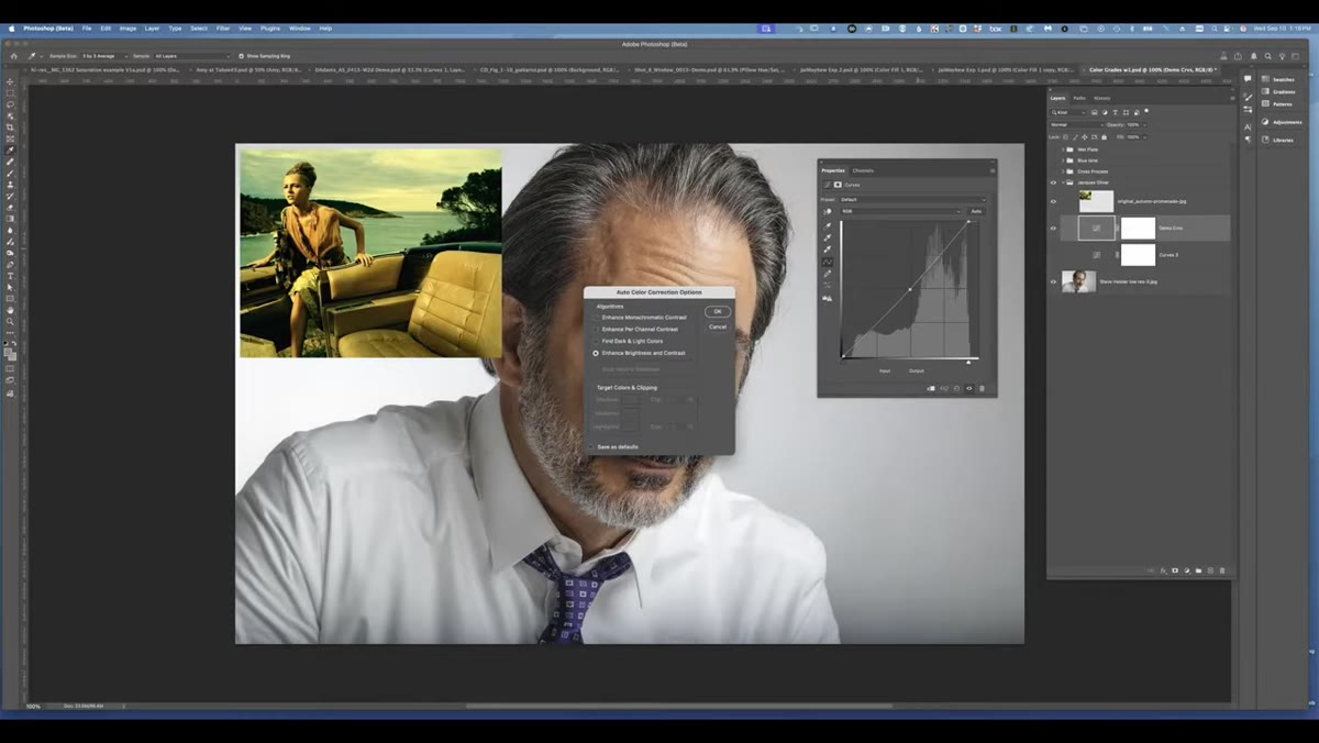 Curves Auto Options dialog box open in Photoshop
With your Curves adjustment layer selected, open the Curves properties panel. Click the Auto button, then immediately hold Alt (Windows) or Option (Mac) as you click it to jump straight into the Auto Options dialog. You can also find this through the panel menu.
Curves Auto Options dialog box open in Photoshop
With your Curves adjustment layer selected, open the Curves properties panel. Click the Auto button, then immediately hold Alt (Windows) or Option (Mac) as you click it to jump straight into the Auto Options dialog. You can also find this through the panel menu.
Inside Auto Options, you’ll see choices for algorithm type. Dennis uses “Enhance Per Channel Contrast” here, though he notes that “Enhance Monochromatic Contrast” also works. The algorithm choice is less critical than what comes next. What you’re really here for are the three color target eyedroppers at the bottom of the dialog: Shadows, Midtones, and Highlights.
Step 5: Sample Your Shadow Color from the Reference Image
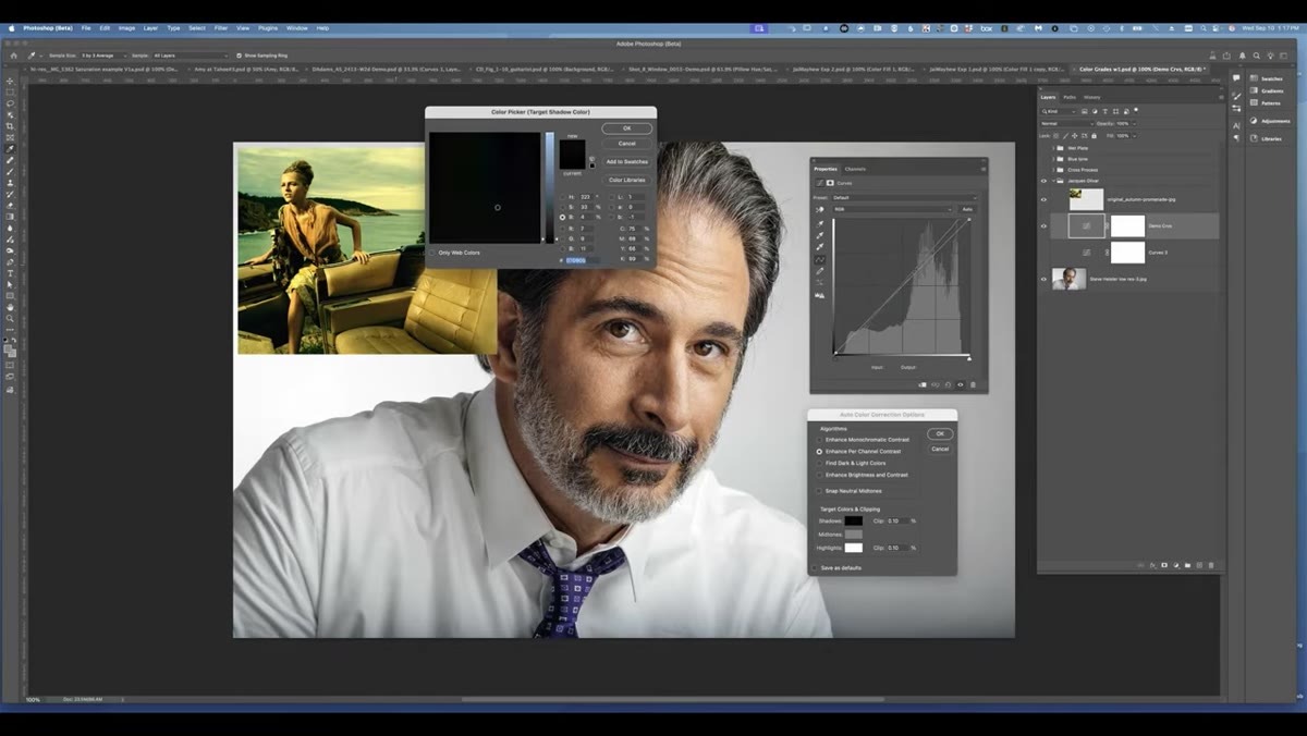 Eyedropper sampling shadow area on reference image
Double-click the Shadows eyedropper swatch in the Auto Options dialog. This opens the color picker, but here’s where the magic happens: instead of manually entering color values, move your cursor over your reference image in the canvas and click on an area that represents the darkest tones in the grade you’re trying to match.
Eyedropper sampling shadow area on reference image
Double-click the Shadows eyedropper swatch in the Auto Options dialog. This opens the color picker, but here’s where the magic happens: instead of manually entering color values, move your cursor over your reference image in the canvas and click on an area that represents the darkest tones in the grade you’re trying to match.
You don’t need to find absolute black. Dennis looks for something that reads as a deep shadow color with the character of the reference grade baked in. Once you click, that color becomes your target shadow point and Photoshop begins adjusting your Curves to match it. You’ll see the curve shape shift in real time.
Step 6: Sample Your Highlight and Midtone Colors
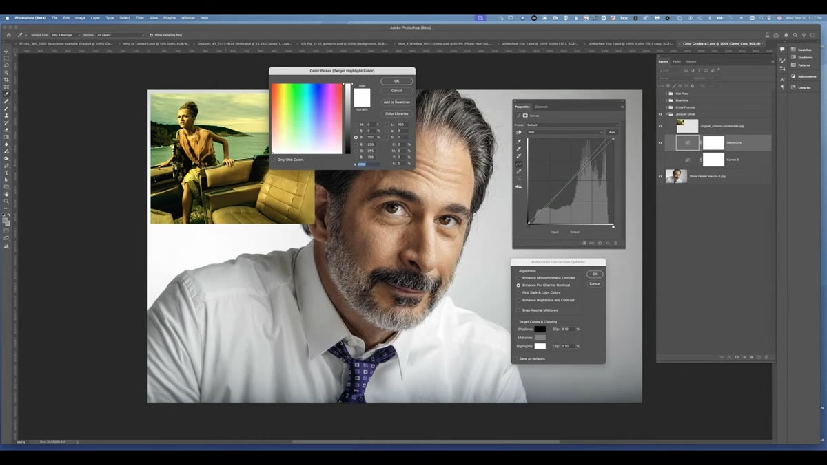 Sampling highlight color from warm area of reference image
Repeat the sampling process for Highlights, this time clicking on a bright area of your reference image that captures the highlight character you want. If your sampled color feels too dark for a true highlight, you can adjust the Brightness slider in the color picker before confirming. You’re not locked into exactly what you click. Use the picker to fine-tune it toward what feels right.
Sampling highlight color from warm area of reference image
Repeat the sampling process for Highlights, this time clicking on a bright area of your reference image that captures the highlight character you want. If your sampled color feels too dark for a true highlight, you can adjust the Brightness slider in the color picker before confirming. You’re not locked into exactly what you click. Use the picker to fine-tune it toward what feels right.
For Midtones, the key constraint Dennis flags is keeping your sampled color close to 50% brightness. Check the B value in the HSB sliders inside the color picker as you poke around the reference image. You want a midtone that influences color balance without crushing or lifting the contrast of your image. The midtone eyedropper is about hue and saturation, not dramatic tonal shifts.
My Take: This Works Best as a Starting Point, Not a Finish Line
I’ve started using this technique as a first move rather than a final answer. The result it produces is usually 60 to 70 percent of the way to matching a reference grade, which is genuinely impressive for something that takes under two minutes. Where it falls short is in the finer details: the specific curve shape, any vignetting baked into the reference, or luminosity-based color shifts that happen because of how a particular camera or film stock renders light.
After running this technique, I’ll usually dive into the individual RGB channels of the resulting Curves adjustment and make small tweaks by hand. But starting from a point that’s already in the neighborhood, as Dennis puts it, is so much better than staring at a flat image trying to invent a grade from scratch. It also helps me reverse-engineer what’s actually happening in a grade I admire, which makes me a better editor even when I’m not actively using the technique.
The single most transferable idea here is that color grading doesn’t have to be a guessing game. When you have a reference and you know how to sample it systematically through shadows, midtones, and highlights, you’re working with intention instead of instinct alone. That’s the difference between an edit that looks cool and one you can actually explain and recreate.
Watch the full tutorial on YouTube to see Dennis walk through the full technique with his actual reference image, including the live curve adjustments as each color gets sampled in.
Comments (3)
I've been looking for exactly this kind of tutorial. Perfect timing.
Simple but effective. Sometimes that's all you need.
Couldn't agree more. I've seen this make a huge difference in photoshop work specifically.
Leave a Comment