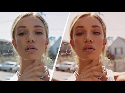
There’s a specific problem I run into with warm-light portraits that took me an embarrassingly long time to solve. The shot looks beautiful straight out of camera — that magic-hour glow, everything slightly amber — and then you try to push it further in post and it falls apart. Crank the temperature and the skin goes orange. Boost the highlights and the whole thing looks blown out. You end up with something that reads “filtered” instead of “cinematic,” and those are very different things.
What I keep coming back to is that warm, golden editorial look is almost never built with a single slider. It’s constructed in layers, each one doing a small, specific job. That’s the core lesson inside Watch the full tutorial on YouTube — Jessica Kobeissi’s breakdown of her favorite golden-tone portrait edit. Jessica is a working photographer with a sharp eye for color, and this particular tutorial is a masterclass in restraint. She isn’t reaching for presets. She’s building something from scratch, one quiet adjustment at a time, and the reasoning behind each decision is worth paying close attention to.
I’ve pulled apart the technique here so you can follow it without having to pause and rewind. These are Photoshop adjustment layers, so if you live primarily in Lightroom, think of this as a companion skill — the kind of finishing work that takes a solid raw edit into something that looks like it belongs in a magazine.
Step 1: Desaturate the Base with a Black and White Adjustment Layer
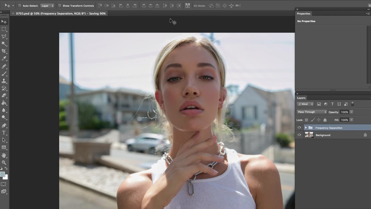 Black and White adjustment layer dialog at 10% opacity
Before any color goes on, Jessica pulls a little color out. She adds a Black and White adjustment layer (Layer - New Adjustment Layer - Black and White), keeps the blend mode at Normal, and drops the opacity down to around 10%. That’s it. This isn’t a dramatic move — you’re not going for moody or desaturated. You’re just creating a neutral canvas. Think of it as clearing the palette before you paint. Skin tones that are already slightly oversaturated will calm down, and your subsequent color layers will sit more cleanly on top.
Black and White adjustment layer dialog at 10% opacity
Before any color goes on, Jessica pulls a little color out. She adds a Black and White adjustment layer (Layer - New Adjustment Layer - Black and White), keeps the blend mode at Normal, and drops the opacity down to around 10%. That’s it. This isn’t a dramatic move — you’re not going for moody or desaturated. You’re just creating a neutral canvas. Think of it as clearing the palette before you paint. Skin tones that are already slightly oversaturated will calm down, and your subsequent color layers will sit more cleanly on top.
Step 2: Add a Solid Color Fill Layer in a Warm Beige
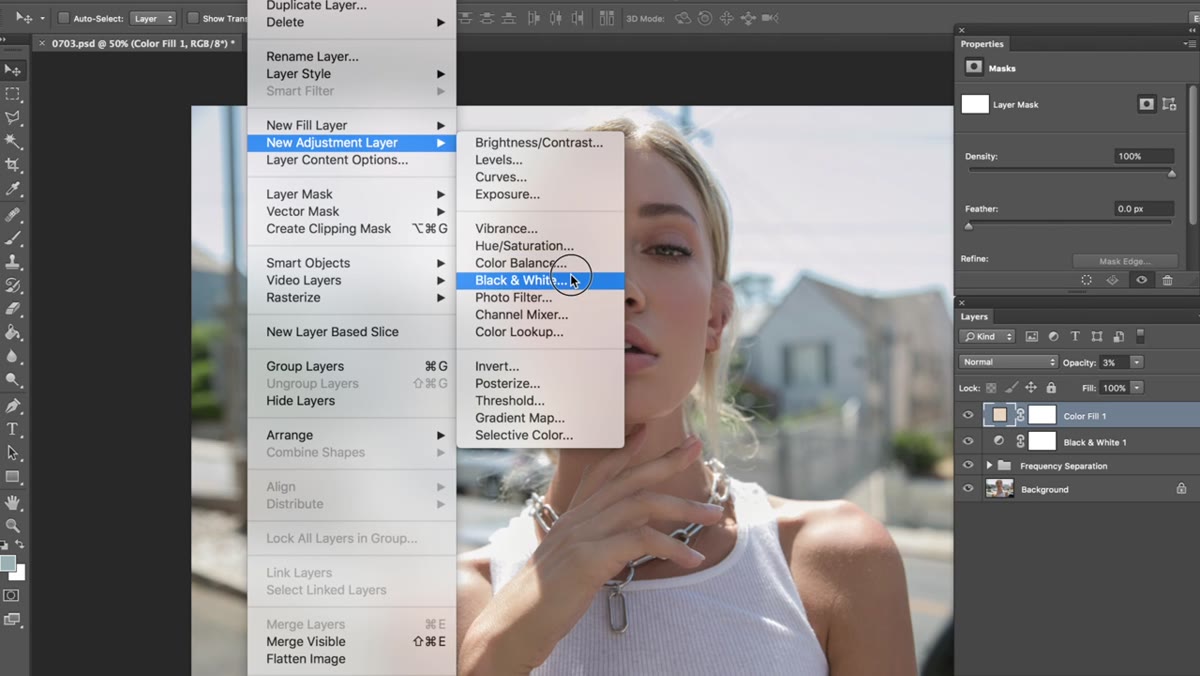
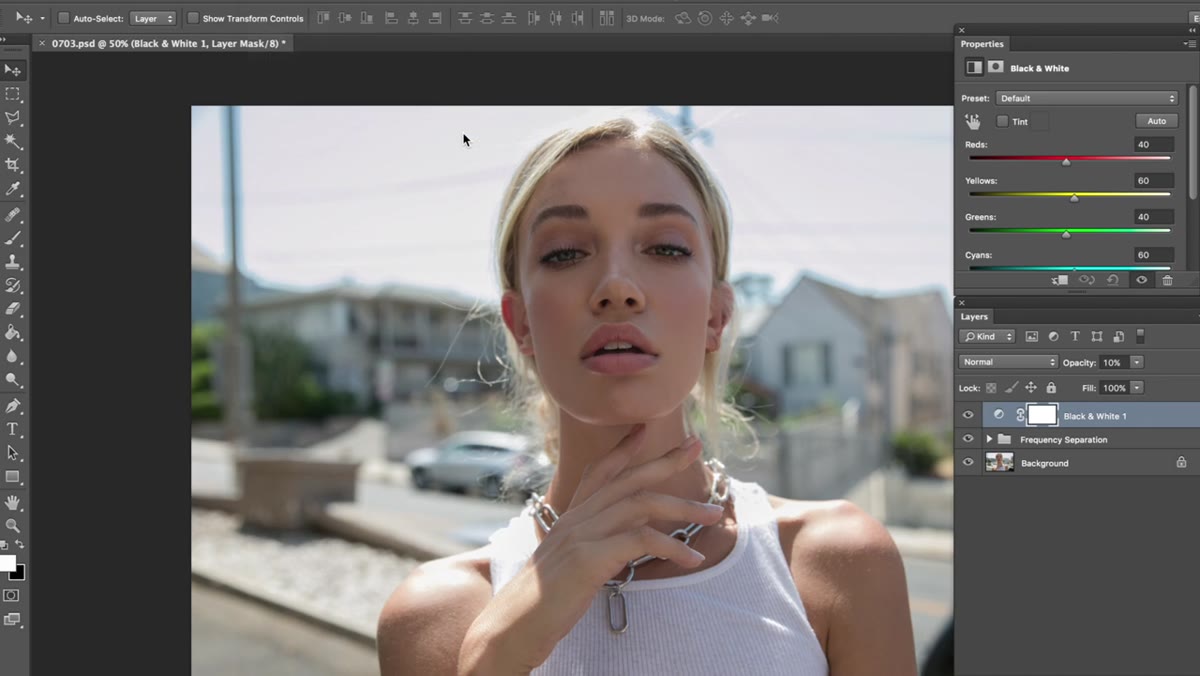 Solid Color fill layer picker showing light beige selection
Next comes a Solid Color fill layer (Layer - New Fill Layer - Solid Color). The target shade is a very light, warm beige — firmly in the orange family but extremely pale, almost like the color of parchment paper in good light. Jessica types in the exact hex value in the tutorial, and she notes that anything close in that neighborhood should produce a similar result. The blend mode stays Normal and the opacity drops to about 3%. At 3% you might wonder if anything is happening at all. It is. This layer is adding the faintest warm cast across the entire image, producing that slightly washed, sun-faded quality that separates editorial warm tones from the aggressive orange of a bad Instagram filter.
Solid Color fill layer picker showing light beige selection
Next comes a Solid Color fill layer (Layer - New Fill Layer - Solid Color). The target shade is a very light, warm beige — firmly in the orange family but extremely pale, almost like the color of parchment paper in good light. Jessica types in the exact hex value in the tutorial, and she notes that anything close in that neighborhood should produce a similar result. The blend mode stays Normal and the opacity drops to about 3%. At 3% you might wonder if anything is happening at all. It is. This layer is adding the faintest warm cast across the entire image, producing that slightly washed, sun-faded quality that separates editorial warm tones from the aggressive orange of a bad Instagram filter.
Step 3: Use a Tinted Black and White Layer to Build the Golden Foundation
 Black and White adjustment layer with Tint checkbox enabled
Here’s where the layering philosophy really kicks in. Jessica adds another Black and White adjustment layer, but this time she checks the Tint box. The tint that Photoshop defaults to is fine — she leaves it. She then brings the opacity down to roughly 40% and goes into the color sliders, specifically Reds and Yellows. The Reds get nudged down to around negative 7. The Yellows come down more significantly, to around negative 33. These adjustments control how light or dark those hues appear through the layer, and pulling them down adds depth and richness to the warm midtones. The final move is changing the blend mode from Normal to Soft Light. Soft Light is doing the heavy lifting here — it presses the warm tint into the image in a way that feels organic rather than painted on.
Black and White adjustment layer with Tint checkbox enabled
Here’s where the layering philosophy really kicks in. Jessica adds another Black and White adjustment layer, but this time she checks the Tint box. The tint that Photoshop defaults to is fine — she leaves it. She then brings the opacity down to roughly 40% and goes into the color sliders, specifically Reds and Yellows. The Reds get nudged down to around negative 7. The Yellows come down more significantly, to around negative 33. These adjustments control how light or dark those hues appear through the layer, and pulling them down adds depth and richness to the warm midtones. The final move is changing the blend mode from Normal to Soft Light. Soft Light is doing the heavy lifting here — it presses the warm tint into the image in a way that feels organic rather than painted on.
Step 4: Shape the Tones with a Curves Layer
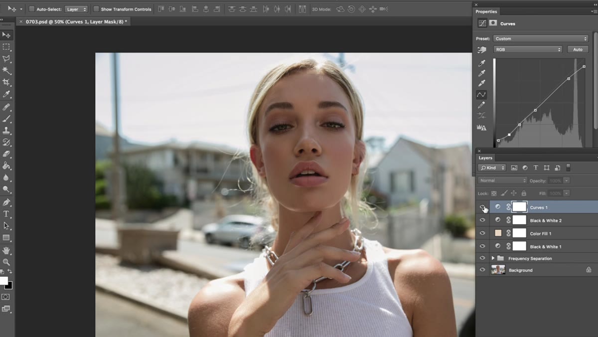
 Curves adjustment layer with custom S-curve applied
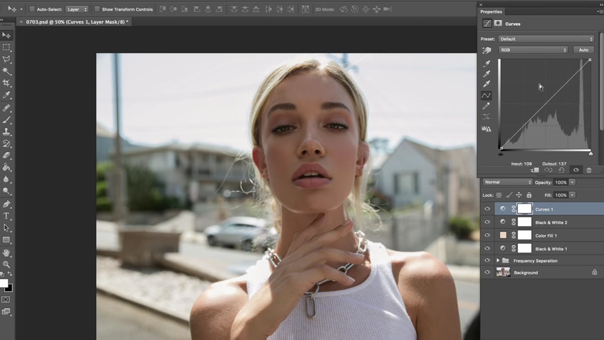
The Curves layer is where exposure, contrast, and color all get fine-tuned at once. Jessica’s approach here is intentional but relaxed — she’s pulling the curve into a shape that lifts the shadows slightly and brings the highlights down just enough to keep the image from looking clean in the clinical sense. The goal is something more vintage-adjacent: images where the blacks never go fully black and the highlights carry a little warmth. If you’re not familiar with working Curves by feel, start by placing a point in the lower third of the curve and pulling it up slightly, then place a second point in the upper third and pulling it down slightly. That S-shape is a good starting point, and you can push or pull from there based on your specific image.
Curves adjustment layer with custom S-curve applied
The Curves layer is where exposure, contrast, and color all get fine-tuned at once. Jessica’s approach here is intentional but relaxed — she’s pulling the curve into a shape that lifts the shadows slightly and brings the highlights down just enough to keep the image from looking clean in the clinical sense. The goal is something more vintage-adjacent: images where the blacks never go fully black and the highlights carry a little warmth. If you’re not familiar with working Curves by feel, start by placing a point in the lower third of the curve and pulling it up slightly, then place a second point in the upper third and pulling it down slightly. That S-shape is a good starting point, and you can push or pull from there based on your specific image.
Step 5: Work the Channel Curves for Color
 Curves panel showing individual RGB channel selected
Within the same Curves panel, the individual RGB channels give you specific color control that a simple temperature slider can’t match. For a golden look, the Red channel usually wants a slight lift, the Green channel can stay close to neutral or get the faintest pull upward, and the Blue channel typically comes down — pulling blue out of highlights is one of the fastest ways to make an image read as warm without touching the overall exposure. Jessica works these channels by feel, and honestly that’s the right way to approach it. Make a small adjustment, step back, and look at how the image reads as a whole rather than chasing specific numbers.
Curves panel showing individual RGB channel selected
Within the same Curves panel, the individual RGB channels give you specific color control that a simple temperature slider can’t match. For a golden look, the Red channel usually wants a slight lift, the Green channel can stay close to neutral or get the faintest pull upward, and the Blue channel typically comes down — pulling blue out of highlights is one of the fastest ways to make an image read as warm without touching the overall exposure. Jessica works these channels by feel, and honestly that’s the right way to approach it. Make a small adjustment, step back, and look at how the image reads as a whole rather than chasing specific numbers.
My Own Extension: Bring This into Lightroom as a Starting Point
I don’t always have time to build a Photoshop stack from scratch on every portrait job. What I’ve started doing is translating the logic of this approach into a Lightroom starting preset — warm temperature, slightly reduced saturation, lifted blacks via the Tone Curve, and a color grading adjustment in the Shadows that leans amber. It doesn’t replace the Photoshop work for a hero image, but it gets me into the right neighborhood fast during culling. If you shoot in a warm-light environment regularly, building a base preset around this layering philosophy will save you more time than any AI tool I’ve come across. The principle is the same regardless of the software: desaturate slightly first, add color carefully, and use blend modes to let the layers interact naturally rather than stacking flat color on top of your image.
The single most important thing Jessica demonstrates here isn’t a specific setting — it’s the mindset that color grading is addition through subtraction. You pull a little out, you put a little back in, and every layer is doing something quiet and specific rather than one layer trying to do everything at once.
Watch the full tutorial on YouTube to see Jessica work through the edit in real time, including her before-and-after on the retouching side before the color grade even begins.
Comments (2)
Shared this with my photography group. Everyone loved it.
Great article! I actually covered something related on my site — the gear angle is really complementary to this.
Leave a Comment