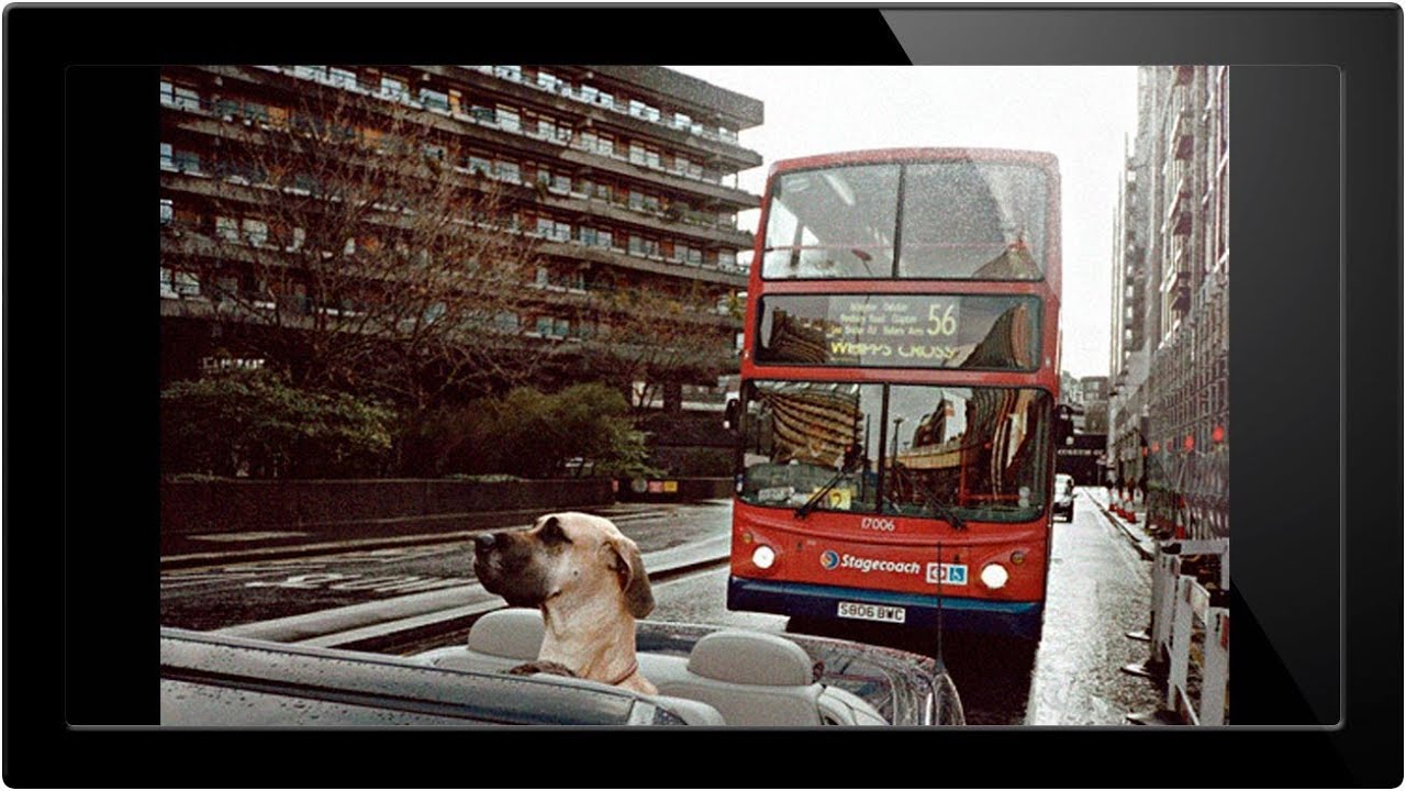
There’s a category of color grade that feels almost impossible to recreate with standard Lightroom sliders. You know the look: a photo where the shadows lean hard into one hue, the highlights drift somewhere completely different, and the whole thing feels unified in a way that no HSL panel adjustment is going to get you. I’ve spent enough hours pushing the Color Grading wheels around to know when I’m fighting the tool. Sometimes the answer isn’t more Lightroom. Sometimes you need to go somewhere else entirely.
That’s why this technique from Aaron Nace over at PHLEARN stopped me cold. Watch the full tutorial on YouTube before you dig in, or follow along here and use the video to fill in any gaps. Nace walks through a method built on Photoshop’s Duotone and Tritone modes, which are features most photographers have never touched because they’re locked behind a grayscale conversion step that feels counterintuitive. The trick is that going through grayscale isn’t destroying your image. It’s actually the doorway into a color system that gives you precise, surgical control over how different ink tones layer across your tonal range.
The workflow is a little unconventional, which is exactly why it works. Here’s how to follow along.
Step 1: Open Your Image and Duplicate It to a New Document
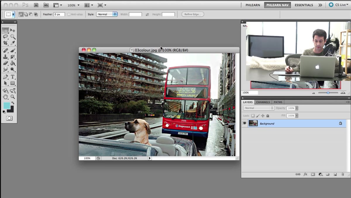 Right-clicking background layer to duplicate it
Start with your image open in Photoshop. Right-click on the background layer in the Layers panel and choose “Duplicate Layer.” Here’s the part that matters: in the dialog box that appears, change the “Document” dropdown from the current file to “New.” Hit OK. Photoshop will open a fresh document with your layer copied into it.
Right-clicking background layer to duplicate it
Start with your image open in Photoshop. Right-click on the background layer in the Layers panel and choose “Duplicate Layer.” Here’s the part that matters: in the dialog box that appears, change the “Document” dropdown from the current file to “New.” Hit OK. Photoshop will open a fresh document with your layer copied into it.
This isn’t just housekeeping. The duotone workflow involves a destructive mode conversion, meaning you’ll be throwing away color data. Working on a duplicate in a separate document means your original file stays completely untouched. Think of it as doing the experiment in a controlled environment before bringing results back to the main lab.
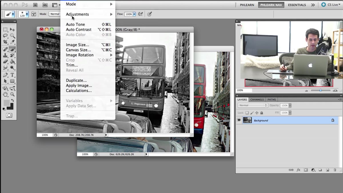
Step 2: Convert the Duplicate to Grayscale
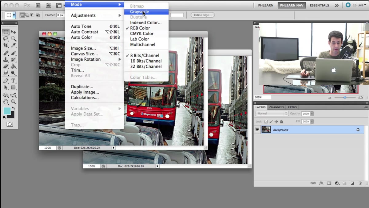 Image mode menu with Grayscale option highlighted
With your new duplicate document active, go to Image, then Mode, then Grayscale. Photoshop will ask if you want to discard color information. Confirm it. Your image is now a true grayscale file, and that’s intentional.
Image mode menu with Grayscale option highlighted
With your new duplicate document active, go to Image, then Mode, then Grayscale. Photoshop will ask if you want to discard color information. Confirm it. Your image is now a true grayscale file, and that’s intentional.
This step is what unlocks the duotone option in the Mode menu, which will have been grayed out before. It’s worth understanding why Photoshop requires this: Duotone mode was originally designed for commercial printing, where you use two or more ink colors to extend the tonal range of a grayscale image. The mode only operates on grayscale data, so you have to speak its language first. Yes, you just removed all the color from your photo. Stay with me.
Step 3: Switch the Mode to Duotone
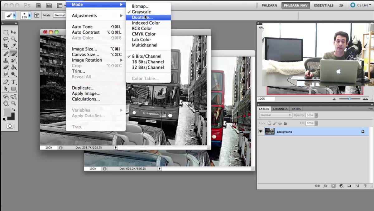 Mode menu now showing Duotone as an available option
Go back to Image, then Mode. This time, Duotone will be clickable. Select it. A dialog box will open with a “Type” dropdown at the top, which defaults to Monotone (a single ink color). This is where the real work begins.
Mode menu now showing Duotone as an available option
Go back to Image, then Mode. This time, Duotone will be clickable. Select it. A dialog box will open with a “Type” dropdown at the top, which defaults to Monotone (a single ink color). This is where the real work begins.
Change the Type dropdown to Duotone to work with two colors, or jump straight to Tritone for three, or Quadtone for four. Each additional ink layer gives you more control over how colors behave in different parts of the tonal range, from deep shadows up through midtones and into highlights. For most creative color grades, Tritone hits the sweet spot between complexity and control.
Step 4: Assign Colors to Each Ink Channel
 Duotone dialog box showing ink color swatches and curve slots
Inside the Duotone dialog, you’ll see a list of ink slots, each with a color swatch and a curve box. Click a color swatch to open the color picker and choose your hue. The curve next to each swatch controls how strongly that ink color appears across the tonal range. A flat diagonal curve means the color applies evenly from shadows to highlights. Pull the curve down in the highlights and you’ll concentrate that ink in the shadows. Push it up in the shadows and it fades toward the brighter end.
Duotone dialog box showing ink color swatches and curve slots
Inside the Duotone dialog, you’ll see a list of ink slots, each with a color swatch and a curve box. Click a color swatch to open the color picker and choose your hue. The curve next to each swatch controls how strongly that ink color appears across the tonal range. A flat diagonal curve means the color applies evenly from shadows to highlights. Pull the curve down in the highlights and you’ll concentrate that ink in the shadows. Push it up in the shadows and it fades toward the brighter end.
This curve-per-color relationship is what separates duotone grading from anything you can do with a single color wheel. You can have a cool blue that only lives in the deep shadows, a warm amber that takes over in the midtones, and a near-neutral white in the highlights, all operating independently. Spend time here. Small curve adjustments create dramatically different moods.
Step 5: Bring the Toned Image Back Into Your Original Document
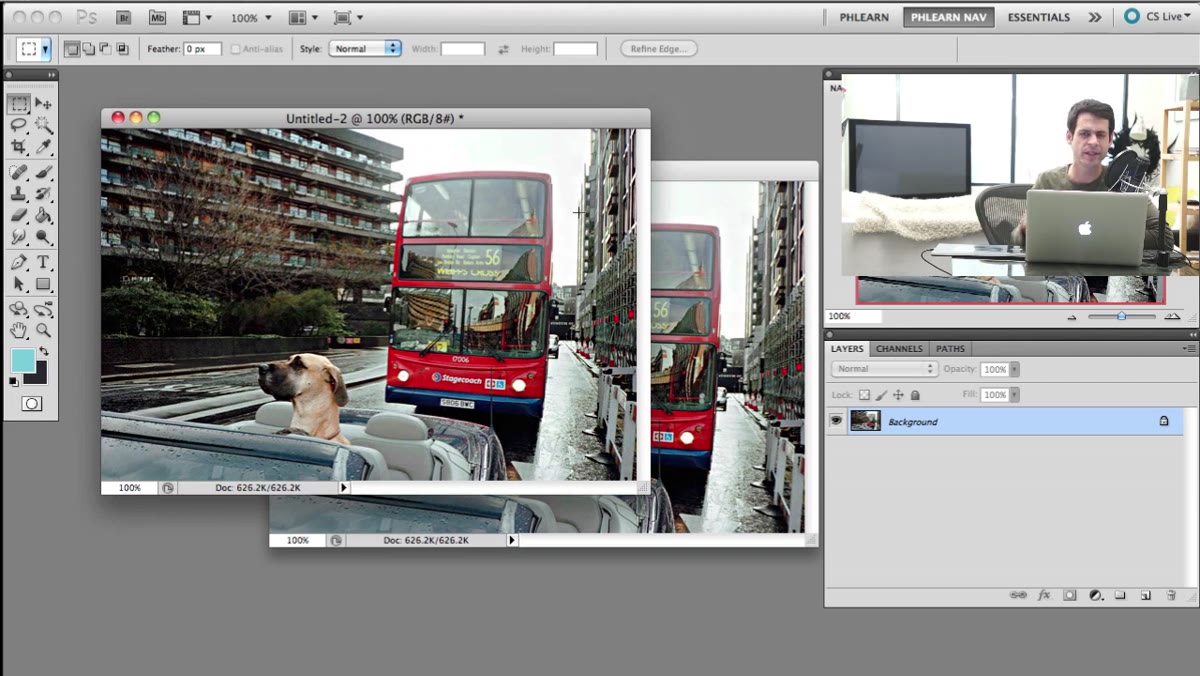 New document created from duplicated layer showing in Photoshop
Once you’re happy with the color tone, you need to convert the file back to RGB before you can bring it into your original document. Go to Image, Mode, RGB Color. This bakes the duotone effect into the pixel data as actual RGB values. Now you can use the Move tool or simply drag the layer from the toned document back into your original working file, where you can blend it, mask it, or adjust its opacity.
New document created from duplicated layer showing in Photoshop
Once you’re happy with the color tone, you need to convert the file back to RGB before you can bring it into your original document. Go to Image, Mode, RGB Color. This bakes the duotone effect into the pixel data as actual RGB values. Now you can use the Move tool or simply drag the layer from the toned document back into your original working file, where you can blend it, mask it, or adjust its opacity.
This is where the technique opens up creatively. Dropping the toned version on top of your original at reduced opacity lets you dial in how heavily the effect reads. Blending modes like Soft Light or Color can integrate the toned version in ways that feel organic rather than filtered.
What I’d Add From My Own Workflow
Nace’s tutorial is focused on Photoshop, and it’s a genuinely powerful standalone technique. But when I use this approach, I build the duotone effect on its own layer, then bring the whole thing into Lightroom as a smart object or flattened file for final adjustments. The reason is simple: Lightroom’s masking tools, especially the Luminance Range mask, let me control exactly where the toned layer shows up based on brightness values. So if the duotone is affecting my highlights in a way I don’t love, I can mask it out precisely without going back into the Photoshop dialog and starting over.
One thing I’d flag for anyone working with portrait photos specifically: skin tones are very sensitive to this kind of treatment. Warm tritone combinations that look cinematic on landscapes can make skin read as jaundiced or oversaturated. My rule is to keep one of the ink channels in the midtone range close to a neutral or very slightly warm value, and let the creative color push happen in the shadows and highlights where it has less contact with skin.
The single most important thing this tutorial taught me is that Photoshop’s legacy print tools are hiding some of the most precise color grading controls in the entire Adobe ecosystem. Most photographers never open the Duotone dialog because the grayscale conversion looks like a dead end. It’s actually the starting line.
Watch the full tutorial on YouTube and see Aaron Nace walk through every step with a real image. The moment the color comes back after the full conversion is worth seeing in motion.
Comments (2)
Clear and practical. No fluff. Appreciate that.
This should be required reading for anyone starting out.
Leave a Comment