Every raw file I open has the same problem: the light looks flat. Technically correct, emotionally absent. The histogram is fine, the exposure is fine, and somehow the image still feels like it was shot through a grey sock. Color grading is the tool I reach for when the basic sliders have done their job and the photo still isn’t alive yet. Not the heavy-handed, “I watched a YouTube tutorial once” color grading. The kind that makes someone look at your photo and feel the temperature of the light without knowing why.
In this William Patino tutorial on Photoshop’s Color Grading tool, he walks through exactly that approach using a real raw file in Adobe Camera Raw. The technique transfers directly to Lightroom, which is where most of you are probably working. The panel layout is nearly identical. Watch the full tutorial on YouTube before or after reading this, but I’ve written this breakdown so you can follow along with your own photo open without having to pause and rewind every 20 seconds.
What I appreciate about Patino’s approach is that he treats color grading as light manipulation, not just stylization. He’s not chasing a look. He’s trying to make the light in the frame feel the way it almost felt when the shutter fired. That framing changed how I think about this tool, and it’s worth carrying into every step below.
Step 1: Find the Color Grading Panel
 Color Grading tab highlighted in Adobe Camera Raw panel
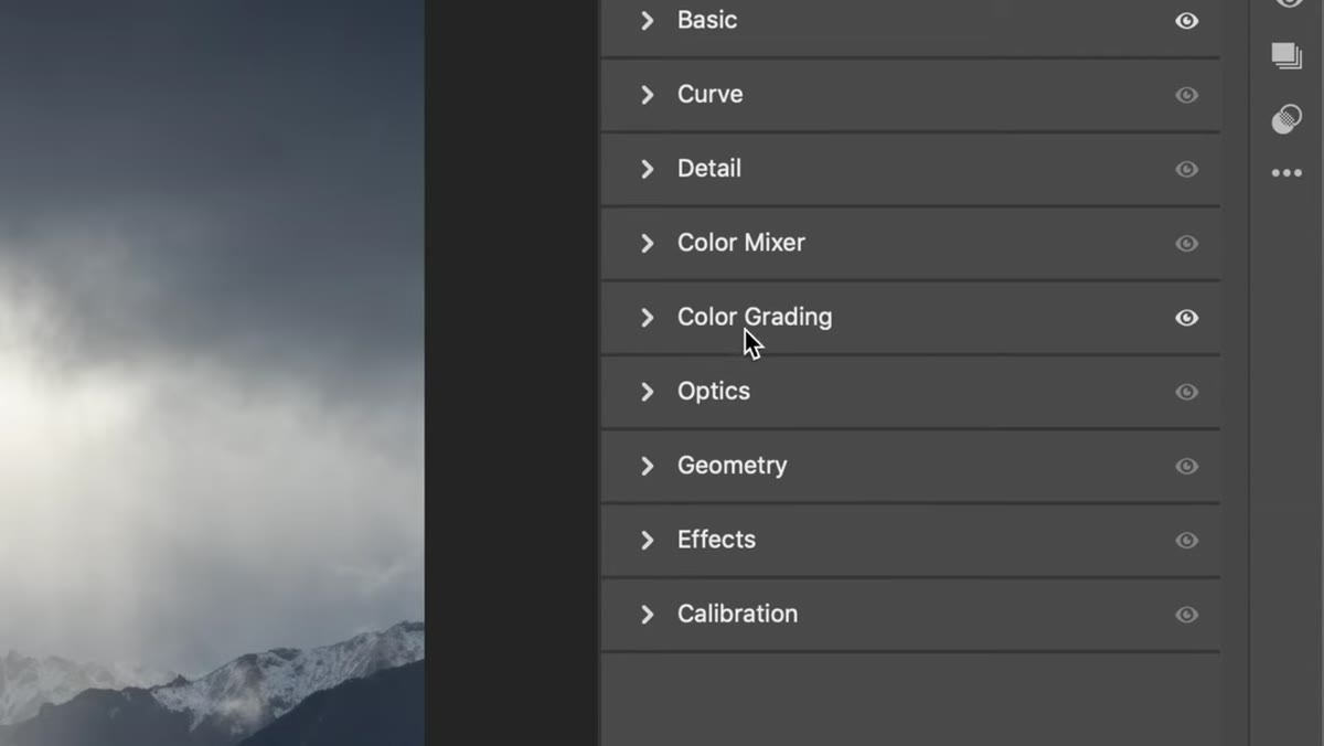
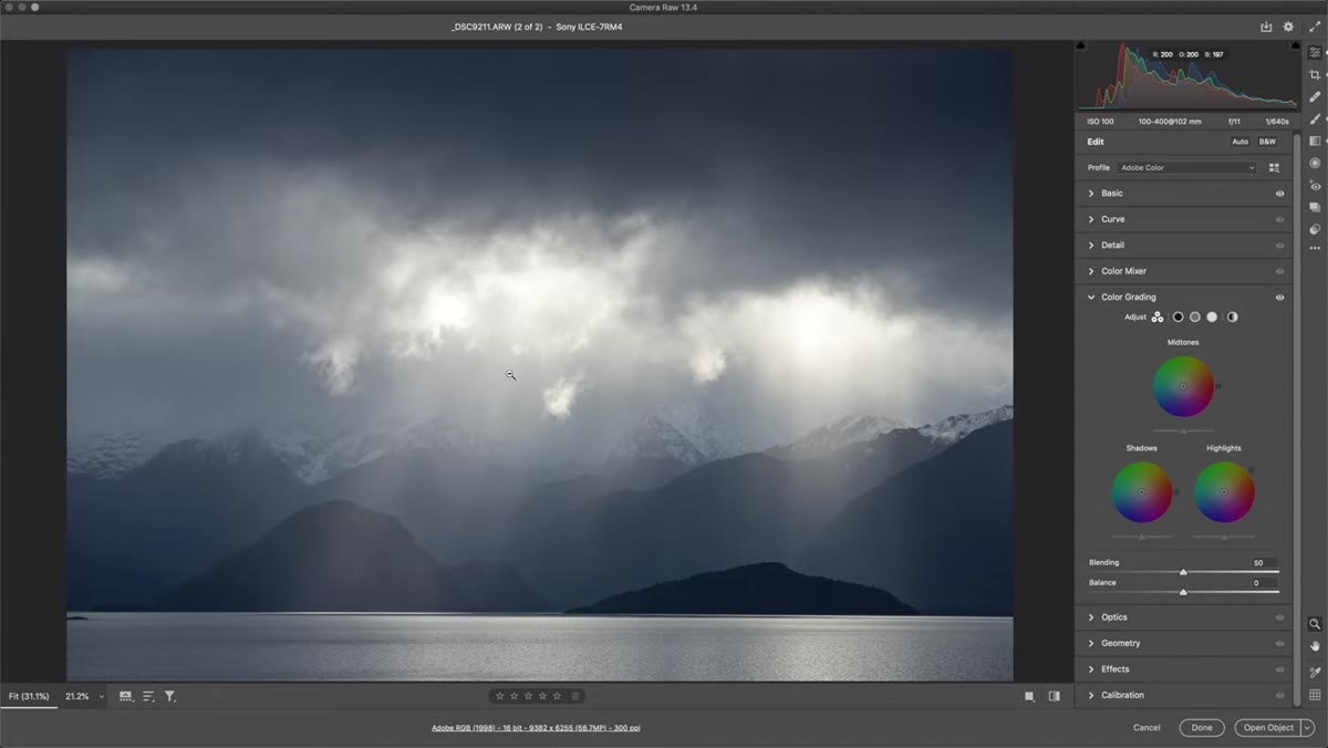
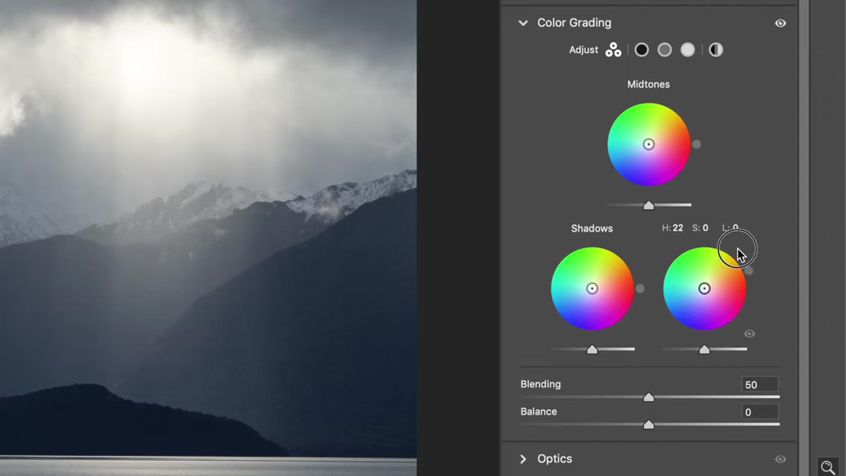
Open your raw file in Adobe Camera Raw or Lightroom. In ACR, look for the Color Grading tab along the right-side panel icons. In Lightroom Classic, it lives in the Develop module, further down the right panel. You’ll see three color wheels labeled Shadows, Midtones, and Highlights, plus a smaller one for global adjustments. Each wheel has two interactive elements: an outer ring for selecting a hue, and an inner circle you drag toward that hue to increase saturation of that color in the corresponding tonal range.
Color Grading tab highlighted in Adobe Camera Raw panel
Open your raw file in Adobe Camera Raw or Lightroom. In ACR, look for the Color Grading tab along the right-side panel icons. In Lightroom Classic, it lives in the Develop module, further down the right panel. You’ll see three color wheels labeled Shadows, Midtones, and Highlights, plus a smaller one for global adjustments. Each wheel has two interactive elements: an outer ring for selecting a hue, and an inner circle you drag toward that hue to increase saturation of that color in the corresponding tonal range.
The older version of this panel used sliders. If you used Lightroom several years ago and found HSL adjustments clunky for this purpose, the wheels are a significant improvement once you understand how they move, which is what the next steps cover.
Step 2: Identify What the Light in Your Photo Actually Needs
 Before and after comparison of the sample landscape image
Before you touch anything, look at your image and ask what the light is doing versus what you want it to do. Patino’s sample photo was shot just before golden hour. The light filtering through the scene was mostly white, close to neutral, with very little warmth. He knew he wanted to push that toward a yellow-orange to simulate the warmth the scene was approaching but hadn’t quite reached.
Before and after comparison of the sample landscape image
Before you touch anything, look at your image and ask what the light is doing versus what you want it to do. Patino’s sample photo was shot just before golden hour. The light filtering through the scene was mostly white, close to neutral, with very little warmth. He knew he wanted to push that toward a yellow-orange to simulate the warmth the scene was approaching but hadn’t quite reached.
This diagnostic step saves you from spinning wheels randomly. For portrait work, you might want to warm skin highlights and push shadows slightly green or teal to create separation. For landscapes, warm highlights and cool shadows is a classic combination because it mirrors how natural light actually behaves at dawn and dusk. Start with an intention, then use the tool to get there.
Step 3: Set Your Highlight Hue on the Outer Ring
 Outer point being moved around the Highlights wheel toward orange-yellow
Click and drag the outer point on the Highlights wheel to the hue you want to introduce. For a warming effect, aim for the yellow-orange zone, roughly the 30-to-50-degree range on the wheel if you think of it like a clock face pointing toward 1 or 2 o’clock. You’re not applying any color yet at this stage. You’re just telling the tool which direction to go.
Outer point being moved around the Highlights wheel toward orange-yellow
Click and drag the outer point on the Highlights wheel to the hue you want to introduce. For a warming effect, aim for the yellow-orange zone, roughly the 30-to-50-degree range on the wheel if you think of it like a clock face pointing toward 1 or 2 o’clock. You’re not applying any color yet at this stage. You’re just telling the tool which direction to go.
Take your time with this. The difference between a orange that reads as “golden hour” and one that reads as “Instagram filter from 2014” is often just 15 degrees on that outer ring.
Step 4: Hold Shift, Then Drag the Inner Circle
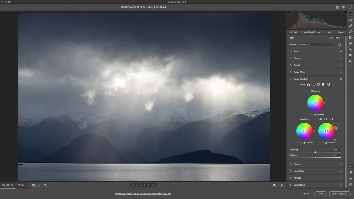 Inner circle being dragged toward outer point with Shift held down
This is the step that trips up almost everyone the first time. If you just click and drag the inner circle without holding Shift, it moves freely in any direction and your color ends up somewhere you didn’t intend. Patino demonstrates this clearly, letting the circle drift off-axis before showing the fix.
Inner circle being dragged toward outer point with Shift held down
This is the step that trips up almost everyone the first time. If you just click and drag the inner circle without holding Shift, it moves freely in any direction and your color ends up somewhere you didn’t intend. Patino demonstrates this clearly, letting the circle drift off-axis before showing the fix.
Hold Shift before you click the inner circle, and it snaps to a straight line toward your selected outer hue. Now drag toward the outer edge. The further you pull it, the more saturation you’re adding in that tonal range. Watch your image as you drag. You’ll see the highlights take on warmth in real time. Stop earlier than you think you need to. A value that looks subtle at 100% zoom is often exactly right when you step back.
Step 5: Apply the Complementary Tone to Shadows
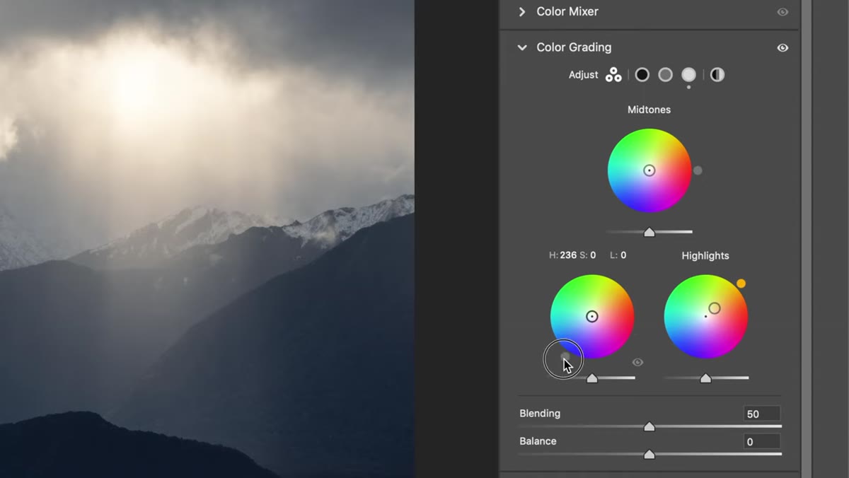 Shadow wheel being adjusted toward blue-teal tones
Once your highlights have a warm tone, move to the Shadow wheel and go to the opposite side of the color wheel. Warm highlights pair with cool shadows. Think blue or teal. Spin the outer ring of the Shadow wheel to that cooler zone, hold Shift, and drag the inner circle toward it.
Shadow wheel being adjusted toward blue-teal tones
Once your highlights have a warm tone, move to the Shadow wheel and go to the opposite side of the color wheel. Warm highlights pair with cool shadows. Think blue or teal. Spin the outer ring of the Shadow wheel to that cooler zone, hold Shift, and drag the inner circle toward it.
This creates color contrast, which your eye reads as depth and dimension. It’s the same principle as complementary colors in painting. Patino points out that his photo already had natural shadow cooling happening in the scene itself, so he kept this adjustment light. That’s good calibration. The tool should enhance what’s already there, not overwrite it.
Step 6: Fine-Tune Hue After Setting Saturation
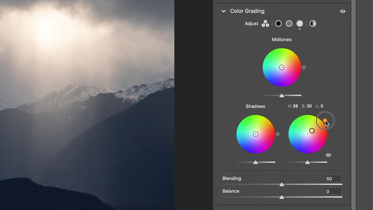 Outer ring being nudged to adjust final hue after saturation is dialed in
Once you’ve dragged the inner circle to your target saturation level, go back and slightly adjust the outer ring. Moving it a few degrees left or right changes the specific hue while keeping the saturation amount you already dialed in. This two-pass approach, saturation first, hue refinement second, gives you more control than trying to get both perfect simultaneously.
Outer ring being nudged to adjust final hue after saturation is dialed in
Once you’ve dragged the inner circle to your target saturation level, go back and slightly adjust the outer ring. Moving it a few degrees left or right changes the specific hue while keeping the saturation amount you already dialed in. This two-pass approach, saturation first, hue refinement second, gives you more control than trying to get both perfect simultaneously.
This is especially useful in highlights, where a shift from true orange toward a more golden yellow can mean the difference between a photo that looks sun-kissed and one that looks overcooked.
What I Do Differently: Check Midtones Last
Patino mentions midtones briefly, and I want to expand on that because it’s where I see people make mistakes. Midtones affect the largest portion of most images, which means small adjustments here have outsized consequences. I always treat midtones as a corrective tool rather than a stylistic one. After I’ve set highlights and shadows, if something in the overall tone still feels off, the midtone wheel is usually where the fix lives. A slight nudge toward warmth in the midtones can unify a photo that looks like it has two competing color stories. But I’d rather leave midtones at center than push them somewhere that fights what I’ve already built with the other two wheels.
The single most important thing I took from this tutorial is that Shift-lock behavior. It sounds like a small keyboard trick. It’s actually the difference between color grading looking intentional versus looking like an accident. Set your hue, hold Shift, drag toward it. Everything else builds from there.
Watch the full tutorial on YouTube to see Patino demonstrate this on his own image with the full visual context. His pacing is calm and his example photo is genuinely beautiful, which makes the before-and-after comparison easier to read than most tutorials that use low-stakes stock images.
Comments
Leave a Comment