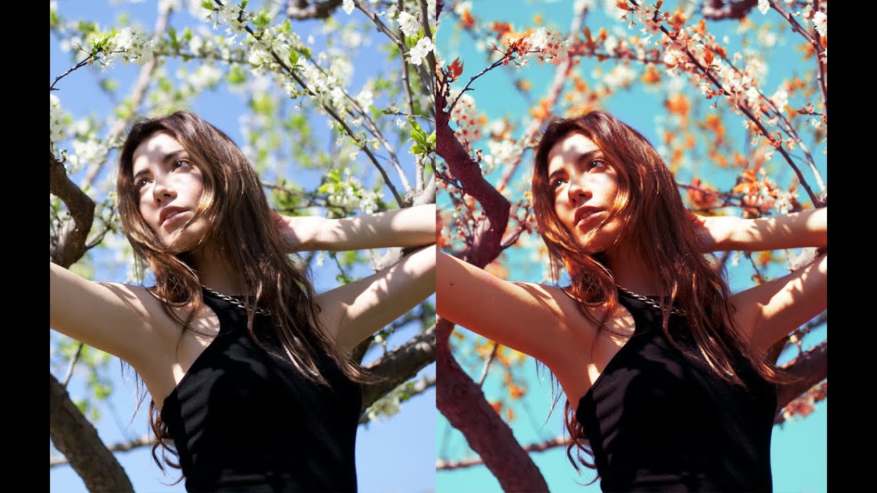
There’s a specific frustration every portrait photographer knows: you nail the shot, the subject looks great, but the background is working against you. The sky is flat, the leaves are the wrong shade, and the overall color story feels like it belongs to a different image. You can push sliders in Lightroom all afternoon and still not get the nuanced control you actually want. That’s the gap this technique fills.
In this Jessica Kobeissi tutorial, she walks through a multi-layer Photoshop workflow that gives you surgical control over tone and color - separating the background mood from the subject’s skin without destructive edits. I’ve spent a lot of time in Lightroom (most of my preset names are lifted straight from Tom Waits and Joni Mitchell records), but I keep coming back to this kind of layered Photoshop approach when a file needs real tonal transformation rather than a broad color push. The before and after she shows at the start is genuinely convincing: warmer leaves, a brighter sky, and a cohesive golden tone that reads as intentional rather than filtered.
What makes this method worth learning is the stacking logic. Each layer does a small job, and together they build something that would be impossible to achieve with a single tool. Here’s how to replicate it.
Step 1: Build Your Foundation With a Curves Adjustment Layer
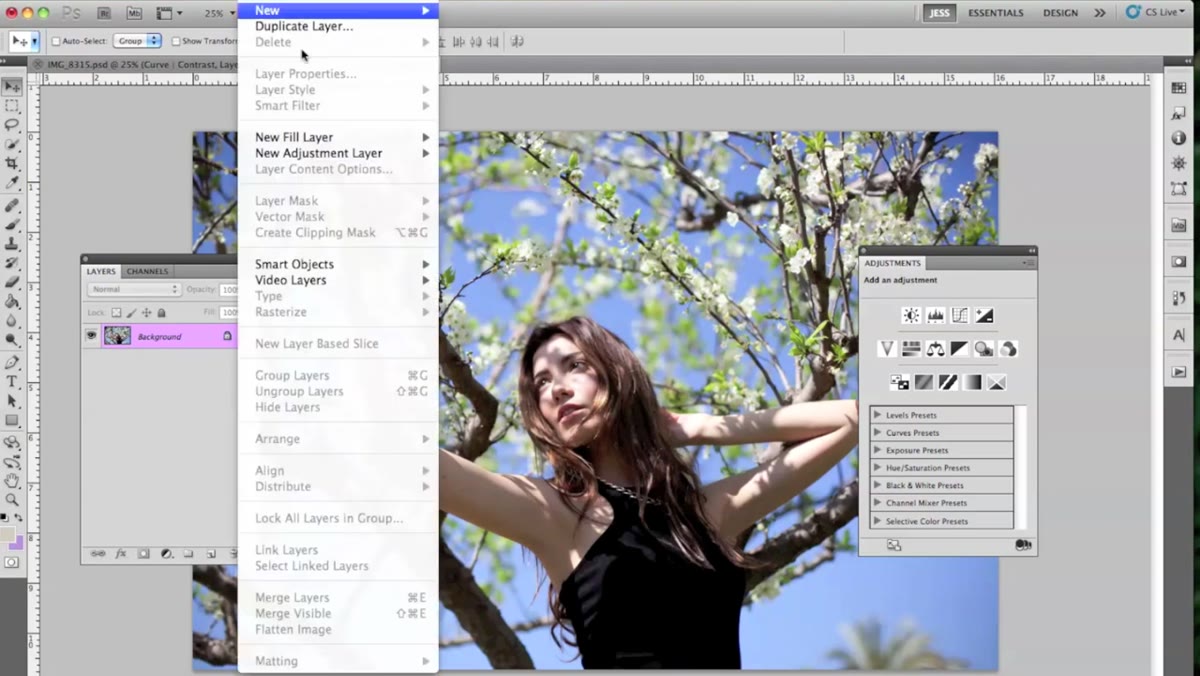 Curves adjustment layer panel open in Photoshop
Start by adding a Curves adjustment layer through the Layers panel. The goal here isn’t a dramatic S-curve - it’s calibration. Jessica pulls the curve into a gentle shape that adds a modest amount of contrast, nudging the midtones and shadows into a position she’s happy with before any color work begins. She’s candid about the fact that she could spend hours on a curves layer alone, which I completely relate to. Resist that impulse here. Get the tonal range roughly where you want it - a slight lift in the highlights, a small drop in the shadows - and move on. You can always revisit.
Curves adjustment layer panel open in Photoshop
Start by adding a Curves adjustment layer through the Layers panel. The goal here isn’t a dramatic S-curve - it’s calibration. Jessica pulls the curve into a gentle shape that adds a modest amount of contrast, nudging the midtones and shadows into a position she’s happy with before any color work begins. She’s candid about the fact that she could spend hours on a curves layer alone, which I completely relate to. Resist that impulse here. Get the tonal range roughly where you want it - a slight lift in the highlights, a small drop in the shadows - and move on. You can always revisit.
Step 2: Use the Channel Mixer to Shift Color Balance
 Channel Mixer panel open, Red channel selected
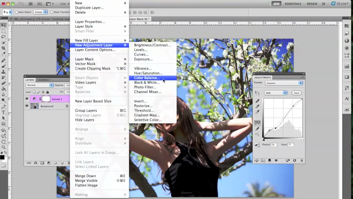
Add a Channel Mixer adjustment layer via Layer - New Adjustment Layer. Stay on the Red output channel and make a subtle addition to the Green source slider. This sounds counterintuitive, but what you’re doing is feeding a small amount of green channel information into the red output, which pushes the overall tone toward yellow without the bluntness of a Hue/Saturation slider. Once the layer is created, change its blend mode from Normal to Soft Light and bring the opacity down to around 20 percent. At full strength this layer would look garish. At 20 percent, it’s just quietly warming up the midtones - the kind of change you notice when you toggle the layer off rather than when it’s on.
Channel Mixer panel open, Red channel selected
Add a Channel Mixer adjustment layer via Layer - New Adjustment Layer. Stay on the Red output channel and make a subtle addition to the Green source slider. This sounds counterintuitive, but what you’re doing is feeding a small amount of green channel information into the red output, which pushes the overall tone toward yellow without the bluntness of a Hue/Saturation slider. Once the layer is created, change its blend mode from Normal to Soft Light and bring the opacity down to around 20 percent. At full strength this layer would look garish. At 20 percent, it’s just quietly warming up the midtones - the kind of change you notice when you toggle the layer off rather than when it’s on.
Step 3: Target Specific Color Ranges With Selective Color (Background Pass)
 Selective Color panel, Yellow channel selected
This is where the real separation starts. Add a Selective Color adjustment layer and begin with the Yellows range. Adjust the cyan, magenta, yellow, and black sliders to push the yellows toward a warmer, more saturated tone. Then move into the Whites and Neutrals ranges and make smaller adjustments to unify the lighter parts of the image. Jessica notes that the sky color shifts noticeably during this step - that’s the point. This layer is primarily doing background work, nudging foliage and sky tones without touching the subject much, since those areas carry different underlying color values.
Selective Color panel, Yellow channel selected
This is where the real separation starts. Add a Selective Color adjustment layer and begin with the Yellows range. Adjust the cyan, magenta, yellow, and black sliders to push the yellows toward a warmer, more saturated tone. Then move into the Whites and Neutrals ranges and make smaller adjustments to unify the lighter parts of the image. Jessica notes that the sky color shifts noticeably during this step - that’s the point. This layer is primarily doing background work, nudging foliage and sky tones without touching the subject much, since those areas carry different underlying color values.
Step 4: Add a Second Selective Color Layer for Skin Tones
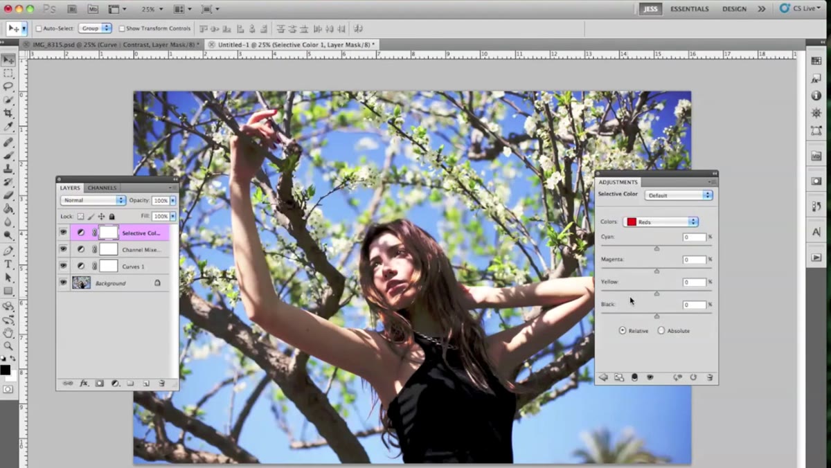
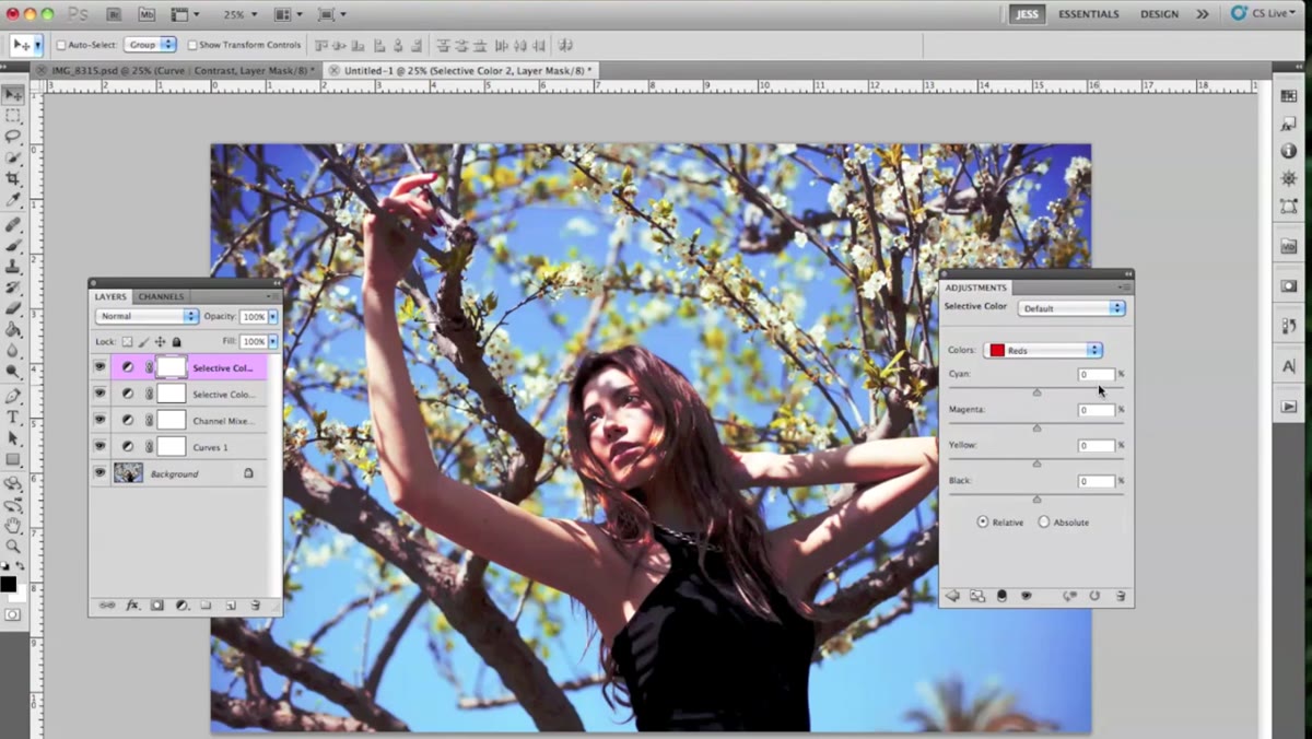 Second Selective Color layer, Reds channel selected
Create another Selective Color adjustment layer - yes, a second one. This time, stay in the Reds and Yellows ranges and focus your adjustments on the values that live inside skin tones. Where the first Selective Color layer was doing environmental work, this one is managing the subject. Jessica describes it as giving the face and shadows a little more color and warmth. Keeping these as two separate layers instead of one combined layer gives you the ability to dial each one back independently. If the skin goes too orange, you pull back layer four without affecting the sky treatment in layer three.
Second Selective Color layer, Reds channel selected
Create another Selective Color adjustment layer - yes, a second one. This time, stay in the Reds and Yellows ranges and focus your adjustments on the values that live inside skin tones. Where the first Selective Color layer was doing environmental work, this one is managing the subject. Jessica describes it as giving the face and shadows a little more color and warmth. Keeping these as two separate layers instead of one combined layer gives you the ability to dial each one back independently. If the skin goes too orange, you pull back layer four without affecting the sky treatment in layer three.
Step 5: Add a Gradient Map at Low Opacity for Tonal Cohesion
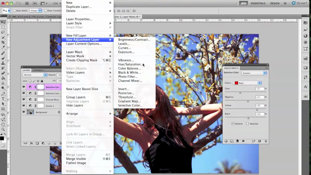 Gradient Map panel, orange-to-yellow gradient selected
Add a Gradient Map adjustment layer and select an orange-to-yellow gradient. This alone will make your image look like a Instagram filter from 2012, so the next step is non-negotiable: switch the blend mode to Soft Light and drag the opacity down to 13 percent. At that setting the gradient map isn’t colorizing the image - it’s just nudging the warmth of the highlights and midtones closer together. Think of it as the layer that makes everything feel like it was shot in the same light. The difference between 13 percent and 20 percent on this layer is significant, so move slowly.
Gradient Map panel, orange-to-yellow gradient selected
Add a Gradient Map adjustment layer and select an orange-to-yellow gradient. This alone will make your image look like a Instagram filter from 2012, so the next step is non-negotiable: switch the blend mode to Soft Light and drag the opacity down to 13 percent. At that setting the gradient map isn’t colorizing the image - it’s just nudging the warmth of the highlights and midtones closer together. Think of it as the layer that makes everything feel like it was shot in the same light. The difference between 13 percent and 20 percent on this layer is significant, so move slowly.
Step 6: Use Hue/Saturation - Then Mask Your Subject Out
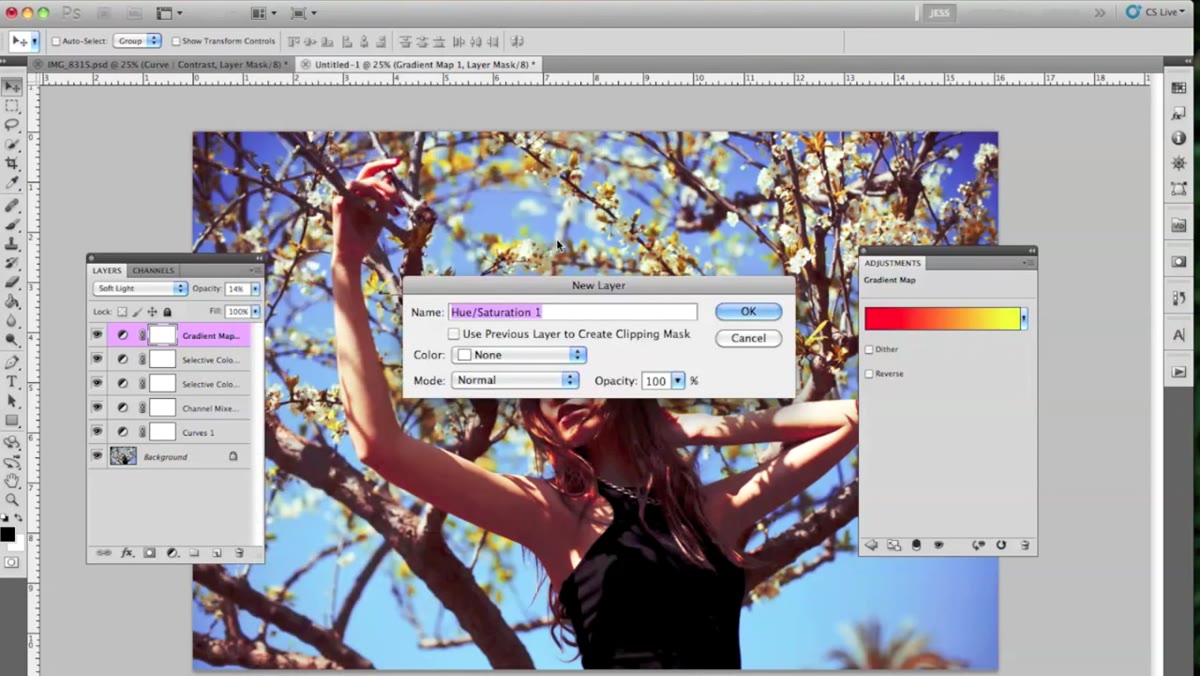 Hue/Saturation panel open, image showing color shift
Add a Hue/Saturation adjustment layer and shift the Hue slider to move the background toward whatever color story you’re after - in the tutorial, the target is a warmer, more orange-leaning sky. The moment you do this, your subject will shift too, and it’ll look wrong. That’s expected. The Hue/Saturation layer already comes with a mask, so select the mask thumbnail, grab any soft brush, set the foreground color to black, and paint directly over your subject. You’re hiding the effect from the areas you paint over. Take your time around the edges of the hair and shoulders. The mask doesn’t need to be perfect at a pixel level, but the transition should be smooth enough that the viewer’s eye doesn’t catch the seam.
Hue/Saturation panel open, image showing color shift
Add a Hue/Saturation adjustment layer and shift the Hue slider to move the background toward whatever color story you’re after - in the tutorial, the target is a warmer, more orange-leaning sky. The moment you do this, your subject will shift too, and it’ll look wrong. That’s expected. The Hue/Saturation layer already comes with a mask, so select the mask thumbnail, grab any soft brush, set the foreground color to black, and paint directly over your subject. You’re hiding the effect from the areas you paint over. Take your time around the edges of the hair and shoulders. The mask doesn’t need to be perfect at a pixel level, but the transition should be smooth enough that the viewer’s eye doesn’t catch the seam.
What I’d Add From My Own Workflow
One thing Jessica doesn’t get into here - probably because the tutorial is already covering a lot - is saving these layers as a reusable starting point. Once you’ve built this stack and you’re happy with it, save the layered PSD as a template. Strip out the image and keep the adjustment layers with their masks cleared. When the next shoot comes in with a similar outdoor setting, you drag your subject in, do a quick mask pass on the Hue/Saturation layer, and you’re 80 percent of the way there. I do this with every Photoshop workflow that takes more than 20 minutes to build. The time savings compound fast.
Also worth noting: this technique gets dramatically more interesting when your background has actual color variety. A flat grey sky won’t respond the way a partly cloudy golden-hour sky will. If you’re planning a shoot specifically to try this, give yourself some tonal range in the background to work with.
The single biggest lesson from this tutorial is that tonal transformation in Photoshop is a conversation between layers, not a single adjustment. Each layer in this stack does less than you think on its own, and more than you’d expect in combination. Stack small changes on top of each other, keep your opacities low, and use masks to protect your subject - that’s the whole philosophy, and it works.
Watch the full tutorial on YouTube to see Jessica walk through each adjustment in real time - seeing the before and after on an actual image makes the logic of each layer click much faster than reading about it can.
Comments (1)
I've been looking for exactly this kind of tutorial. Perfect timing.
Leave a Comment