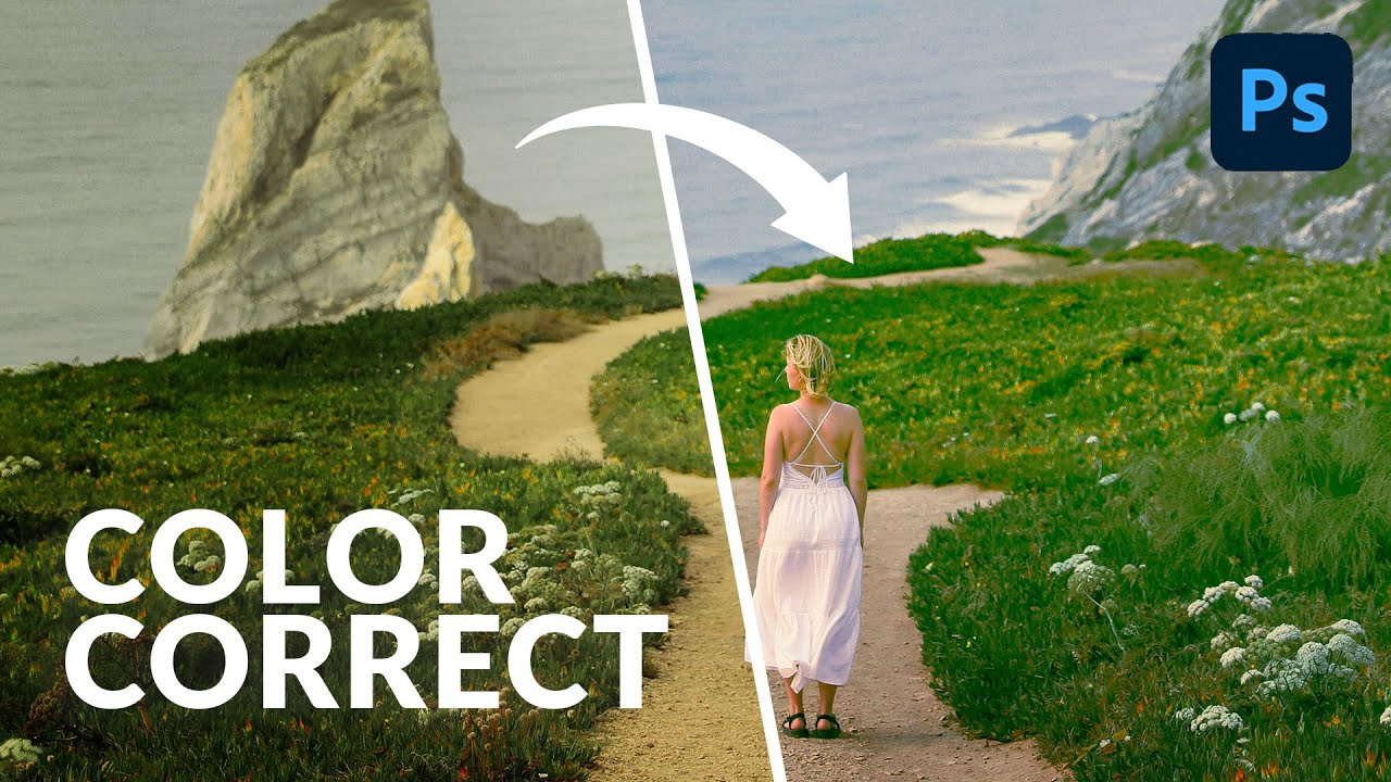
Most of my color grading happens in Lightroom. That’s just the reality of my workflow. But I’ve had clients send me layered Photoshop files and ask for “that warm, filmy look” - and jumping between apps to pull it off is the kind of friction that quietly kills your afternoon. What I didn’t realize until recently is that I’ve been making it harder than it needs to be.
In this Aaron Nace (PHLEARN) tutorial, he walks through the Camera Raw filter inside Photoshop and shows how it gives you access to the exact same color grading tools you’d use in Lightroom Classic, Lightroom mobile, or Lightroom desktop. Same wheel. Same shadows, midtones, and highlights controls. Same saturation and luminance sliders. If you already know your way around Lightroom’s color grading panel, this will feel like coming home. If you don’t, this is honestly one of the cleaner places to learn it. Watch the full tutorial on YouTube
The tutorial uses three sample images, all free to download from the PHLEARN site. I’d recommend grabbing them so you can follow along with the same starting material Aaron uses. It removes one variable from the learning process.
Step 1: Convert Your Layer to a Smart Object
 Converting background layer to Smart Object in Photoshop
Before you touch any filters, right-click your layer in the Layers panel, go to Layer, then Smart Objects, then Convert to Smart Object. You’ll see a small badge icon appear on the layer thumbnail confirming it worked.
Converting background layer to Smart Object in Photoshop
Before you touch any filters, right-click your layer in the Layers panel, go to Layer, then Smart Objects, then Convert to Smart Object. You’ll see a small badge icon appear on the layer thumbnail confirming it worked.
This step matters more than it might look like. When you apply the Camera Raw filter to a Smart Object, it stays editable. You can go back in, adjust your color grading, change your mind entirely - all without starting over. Apply it to a regular layer and you’re committing to every decision permanently. Do yourself the favor.
Step 2: Open the Camera Raw Filter
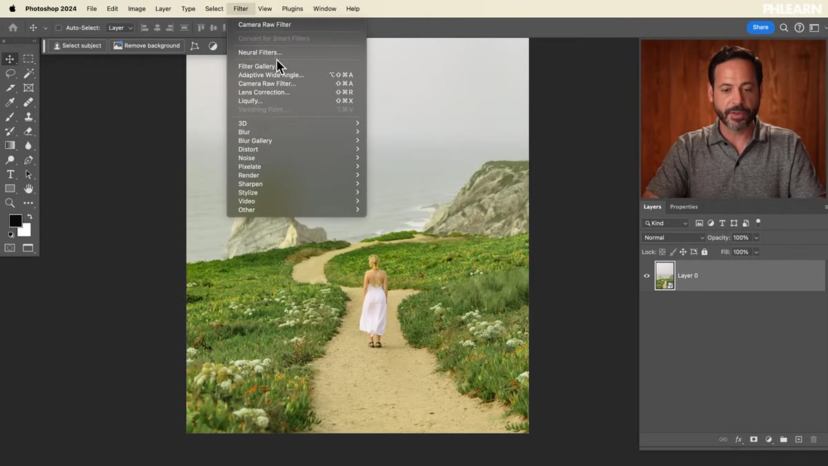 Navigating to Filter menu, selecting Camera Raw Filter
With your Smart Object selected, go to Filter in the top menu and choose Camera Raw Filter near the bottom of the list. The Camera Raw interface will open as a panel overlaying your image.
Navigating to Filter menu, selecting Camera Raw Filter
With your Smart Object selected, go to Filter in the top menu and choose Camera Raw Filter near the bottom of the list. The Camera Raw interface will open as a panel overlaying your image.
If you’ve spent time in Lightroom, the layout will be immediately familiar. You’ve got your Basic panel, your Light panel, your Color Mixer. Scroll down past those and you’ll land on Color Grading - the section Aaron focuses on for this tutorial. Same tools, different address.
Step 3: Understand the Color Grading Wheel Layout
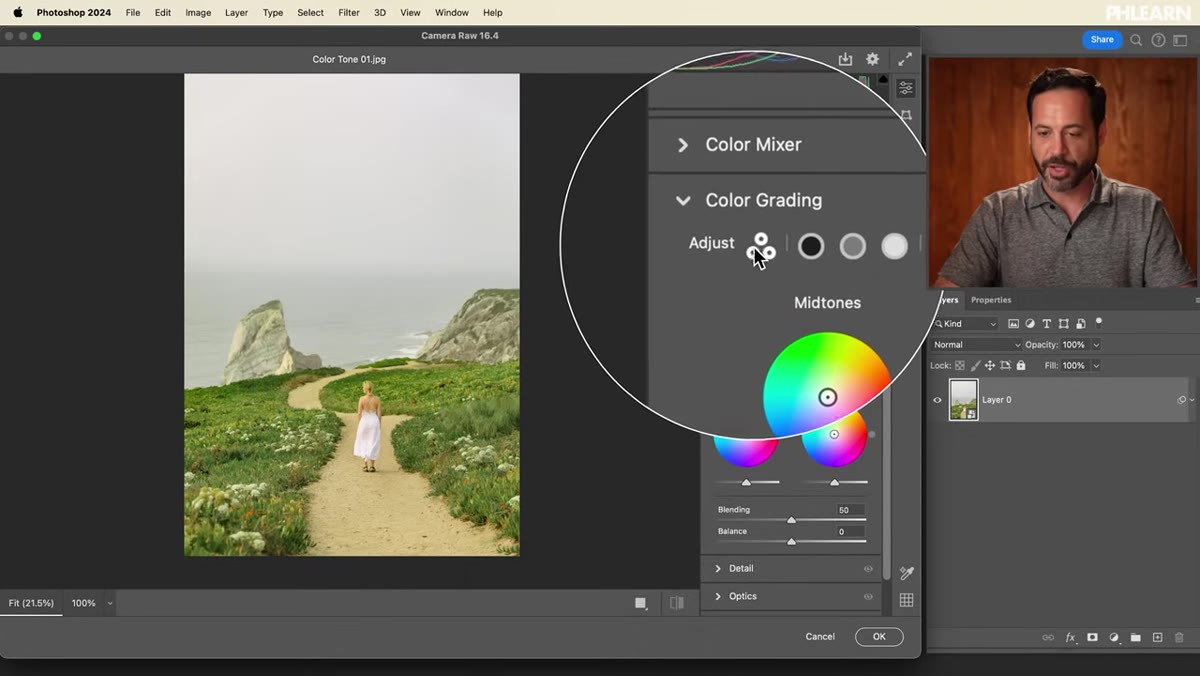 Color Grading panel showing three-way wheel layout
The Color Grading panel gives you four targets to work with: Shadows, Midtones, Highlights, and a Global option that applies a color cast across the entire image. Aaron recommends working in the three-way view, which shows all three tonal wheels - Shadows, Midtones, Highlights - on screen at once so you can see how they interact.
Color Grading panel showing three-way wheel layout
The Color Grading panel gives you four targets to work with: Shadows, Midtones, Highlights, and a Global option that applies a color cast across the entire image. Aaron recommends working in the three-way view, which shows all three tonal wheels - Shadows, Midtones, Highlights - on screen at once so you can see how they interact.
Each wheel has two interactive points. The outer point controls hue, so you’re choosing which color family you’re pulling toward. The inner point controls saturation, so you’re deciding how strongly that color gets pushed into the image. Below each wheel there’s a Luminance slider that lets you brighten or darken that tonal range independently. Learn which point does what before you start dragging, and you’ll have a much cleaner time.
Step 4: Set Your Shadows Color
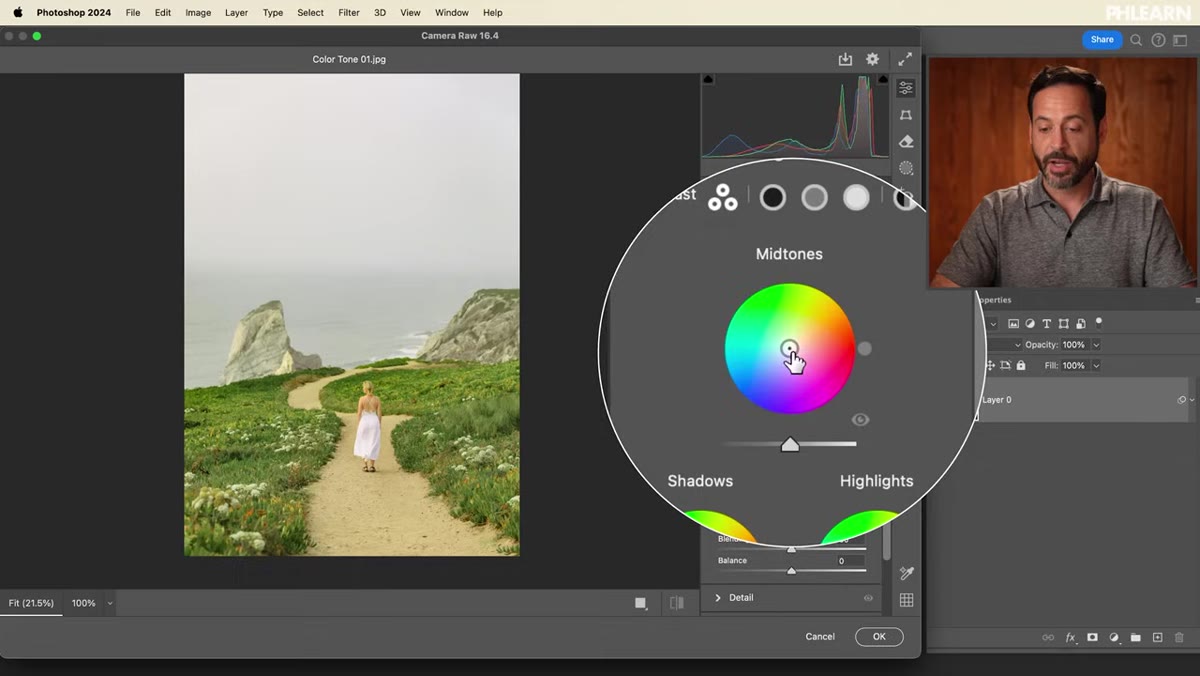 Dragging shadow color wheel outward to select hue
Click in the center of the Shadows wheel and drag outward toward the edge. Aaron’s method here is smart: drag all the way out first to get a fully saturated, exaggerated version of the color you’re considering. When saturation is cranked high, it’s much easier to compare hues and decide which direction you actually want to go.
Dragging shadow color wheel outward to select hue
Click in the center of the Shadows wheel and drag outward toward the edge. Aaron’s method here is smart: drag all the way out first to get a fully saturated, exaggerated version of the color you’re considering. When saturation is cranked high, it’s much easier to compare hues and decide which direction you actually want to go.
He lands on a cool blue for the shadows, which is a classic move for landscape and outdoor work - it separates the shadows from the warmer tones you’ll add to the highlights later, and it gives the image depth without looking heavy-handed. Once you’ve chosen your hue, use the inner point to pull saturation back to something that feels subtle and intentional rather than filtered. Adjust the Luminance slider to taste. Aaron goes slightly darker on the shadows here, and it reads well.
Step 5: Set Your Midtones Color
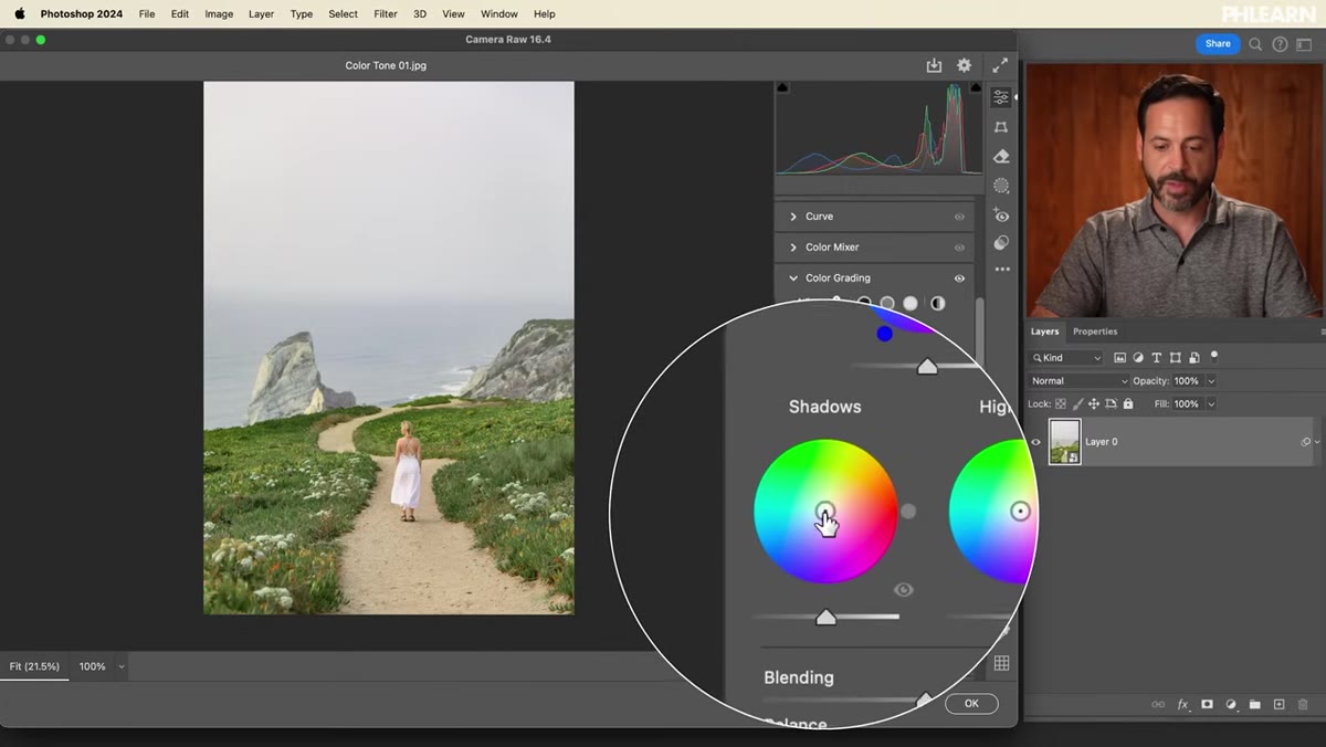 Adjusting midtones wheel with reduced saturation
Aaron actually recommends starting with the midtones before the shadows, even though his demo moves between them a bit. The midtones carry the most visual weight in most images, so dialing those in first gives you a reference point for how aggressive to be in the other ranges.
Adjusting midtones wheel with reduced saturation
Aaron actually recommends starting with the midtones before the shadows, even though his demo moves between them a bit. The midtones carry the most visual weight in most images, so dialing those in first gives you a reference point for how aggressive to be in the other ranges.
Apply the same technique: drag out, find a hue you like, then bring saturation down to a level that complements the image rather than fighting it. The midtones color choice will define the overall feeling of the photo more than anything else you do in this panel. Take your time here.
Step 6: Set Your Highlights Color and Compare
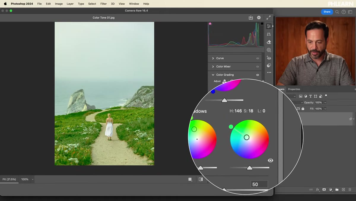 Highlights wheel adjusted with warm tone, before/after preview toggled
Drag out from the center of the Highlights wheel and pick a hue that creates contrast with your shadows. Aaron goes warm here - a golden-adjacent tone that plays off the cool shadows and gives the landscape image that sunrise quality. Again, bring saturation down after choosing your hue, and consider whether you want the highlights slightly brighter or slightly pulled back using the Luminance slider.
Highlights wheel adjusted with warm tone, before/after preview toggled
Drag out from the center of the Highlights wheel and pick a hue that creates contrast with your shadows. Aaron goes warm here - a golden-adjacent tone that plays off the cool shadows and gives the landscape image that sunrise quality. Again, bring saturation down after choosing your hue, and consider whether you want the highlights slightly brighter or slightly pulled back using the Luminance slider.
Once all three wheels are dialed in, use the small eye icon in the Color Grading panel header to toggle a before/after preview. This is where you’ll catch yourself being too heavy-handed, which happens to everyone including people who should know better.
What I’d Add From My Own Workflow
Aaron keeps this tutorial focused and clean, which is exactly what a tutorial should do. What he doesn’t get into - because it’s not the point of this video - is how much the Color Grading panel changes depending on the image’s exposure baseline. I’ve found that if the image is slightly underexposed coming in, the shadows wheel will have an outsized effect because there’s more shadow information across the frame. Running a quick Exposure or Levels adjustment before touching Color Grading tends to give you more predictable results.
I also keep a few preset color grading combinations saved in Camera Raw specifically for different lighting conditions - overcast portraits, golden hour landscapes, indoor tungsten work. I name them after songs, which is either charming or insufferable depending on who you ask. The point is that once you find combinations you like, Camera Raw lets you save them as presets so you’re not rebuilding from scratch on every file.
The biggest takeaway here is simple: if you edit in Lightroom, you already know how to do this in Photoshop. The Camera Raw filter is not a separate tool you need to learn - it’s the same panel wearing a different jacket. Aaron Nace does a great job showing that clearly without overcomplicating it.
Watch the full tutorial on YouTube and download the free sample images from the PHLEARN site to follow along. It’s a faster watch than you’d expect.
Comments (3)
Finally someone explains this in a way that actually makes sense.
My workflow just got 10x faster. Not even kidding.
Well explained. I think my audience would really benefit from this — mind if I link to it?
Leave a Comment