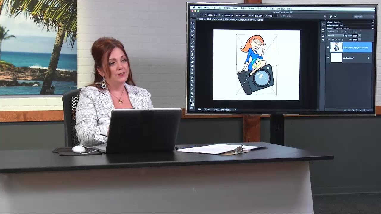
Client photo books are one of those deliverables that look effortless until you try to build one yourself. The layout tools in Lightroom’s Book module are genuinely solid, but the moment a client asks “can you put our logo on every page?” you hit a wall that isn’t obvious until you’re already staring at it. That wall is this: Lightroom gives you one set of cell padding guides per page, and those guides are already doing the job of positioning your photos. You can’t use them to precisely place a logo at the same time. It’s not a bug, it’s just a limitation most people don’t discover until they’ve already promised something they’re not sure they can deliver.
I ran into exactly this problem last year when I was putting together a portfolio book for a client who had very specific ideas about where their watermark should sit. I eventually figured out a workable solution, but it took me longer than it should have. So when I came across this CreativeLive tutorial from Lesa Snider on adding logos to Lightroom photo books, I was genuinely relieved to see someone lay out the correct approach clearly. Watch the full tutorial on YouTube if you want to follow along with Lesa directly. What follows is my breakdown of her method, plus a few things I’ve added to the workflow based on my own use.
Step 1: Understand Why the Background Panel Is Your Only Real Option
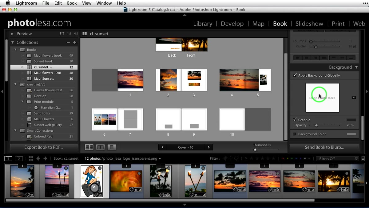 Background panel highlighted in Lightroom Book module
In Lightroom’s Book module, the Background panel is where logo placement actually lives. This is different from placing a text or graphic element directly on a single page. When you add something through the Background panel, it appears across all pages, which is exactly what you want for consistent branding. The trade-off is that you lose the fine-grained positioning control you’d get from placing an element manually. That’s the constraint the whole workaround is built around.
Background panel highlighted in Lightroom Book module
In Lightroom’s Book module, the Background panel is where logo placement actually lives. This is different from placing a text or graphic element directly on a single page. When you add something through the Background panel, it appears across all pages, which is exactly what you want for consistent branding. The trade-off is that you lose the fine-grained positioning control you’d get from placing an element manually. That’s the constraint the whole workaround is built around.
Step 2: Check Your Book Dimensions in the Book Settings Panel
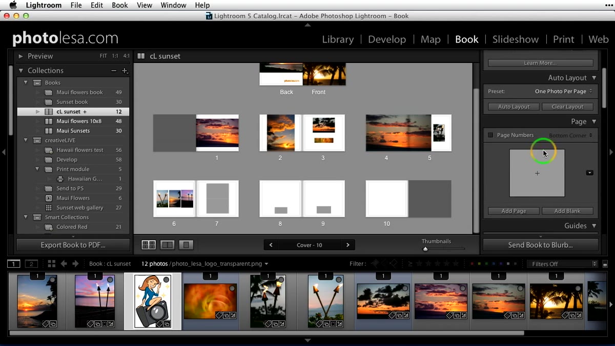 Book Settings panel showing 10x8 inch size option
Before you open Photoshop, you need to know exactly what size canvas to create. In the Book module, go to the Book Settings panel at the top right of the panel column and open the size popup menu. Lesa’s example uses a 10-by-8 inch book, which is one of the most common sizes. Write down those dimensions. You’ll also want to note the resolution. She recommends 300 PPI to keep things clean, even though Lightroom itself works at 240. Going to 300 gives you a little headroom and won’t hurt anything.
Book Settings panel showing 10x8 inch size option
Before you open Photoshop, you need to know exactly what size canvas to create. In the Book module, go to the Book Settings panel at the top right of the panel column and open the size popup menu. Lesa’s example uses a 10-by-8 inch book, which is one of the most common sizes. Write down those dimensions. You’ll also want to note the resolution. She recommends 300 PPI to keep things clean, even though Lightroom itself works at 240. Going to 300 gives you a little headroom and won’t hurt anything.
Step 3: Create a New Document in Photoshop to Match Your Book Page
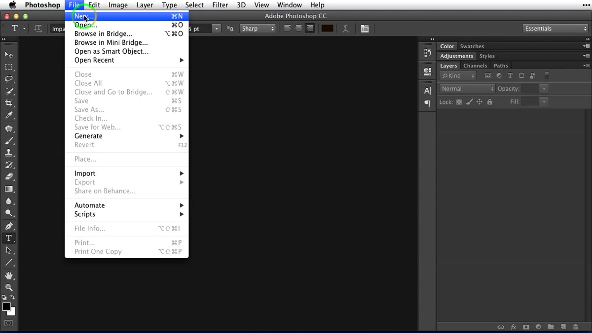 Photoshop new document dialog with 10x8 inch dimensions
Open Photoshop and create a new document using File - New (Command/Control + N). Name it something descriptive, like “Logo for 10x8 Photo Book,” so you know exactly what it belongs to six months from now when you’re digging through your hard drive. Set the dimensions to match your book page (10 by 8 inches in this case), set the resolution to 300 PPI, and click OK. This document is essentially a stand-in for one page of your book. Everything you position here will be reflected in Lightroom when you bring the file in as a background image.
Photoshop new document dialog with 10x8 inch dimensions
Open Photoshop and create a new document using File - New (Command/Control + N). Name it something descriptive, like “Logo for 10x8 Photo Book,” so you know exactly what it belongs to six months from now when you’re digging through your hard drive. Set the dimensions to match your book page (10 by 8 inches in this case), set the resolution to 300 PPI, and click OK. This document is essentially a stand-in for one page of your book. Everything you position here will be reflected in Lightroom when you bring the file in as a background image.
Step 4: Place Your Logo as a Smart Object
 Logo placed in Photoshop as a smart object with transform handles visible
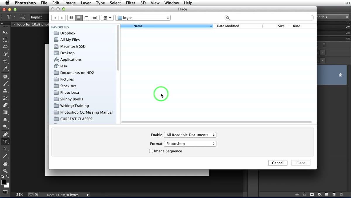
Use File - Place to bring your logo into the document. This matters more than it might seem. Placing a file rather than copy-pasting it creates a Smart Object, which means Photoshop wraps the file in a protective layer that preserves the original file format’s strengths. If your logo is a vector file (an AI or EPS, for example), placing it as a Smart Object means it stays infinitely scalable. You can resize it without any quality loss, even at this stage. Once the logo is placed, Photoshop gives you transform handles automatically. Hold Shift to constrain the aspect ratio while resizing, and hold Option (Mac) or Alt (PC) at the same time to resize from the center outward, which keeps things balanced.
Logo placed in Photoshop as a smart object with transform handles visible
Use File - Place to bring your logo into the document. This matters more than it might seem. Placing a file rather than copy-pasting it creates a Smart Object, which means Photoshop wraps the file in a protective layer that preserves the original file format’s strengths. If your logo is a vector file (an AI or EPS, for example), placing it as a Smart Object means it stays infinitely scalable. You can resize it without any quality loss, even at this stage. Once the logo is placed, Photoshop gives you transform handles automatically. Hold Shift to constrain the aspect ratio while resizing, and hold Option (Mac) or Alt (PC) at the same time to resize from the center outward, which keeps things balanced.
Step 5: Position the Logo Deliberately, Off-Center or Off-Edge
 Logo dragged to hang partially off the edge of the canvas
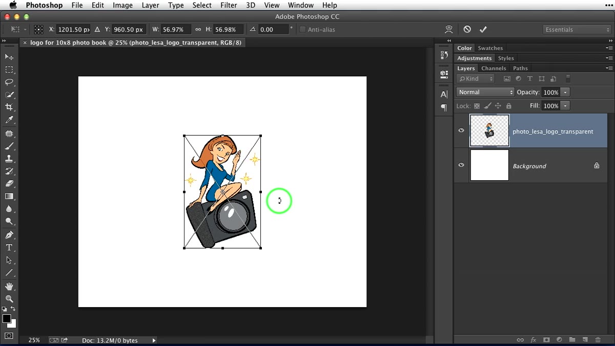
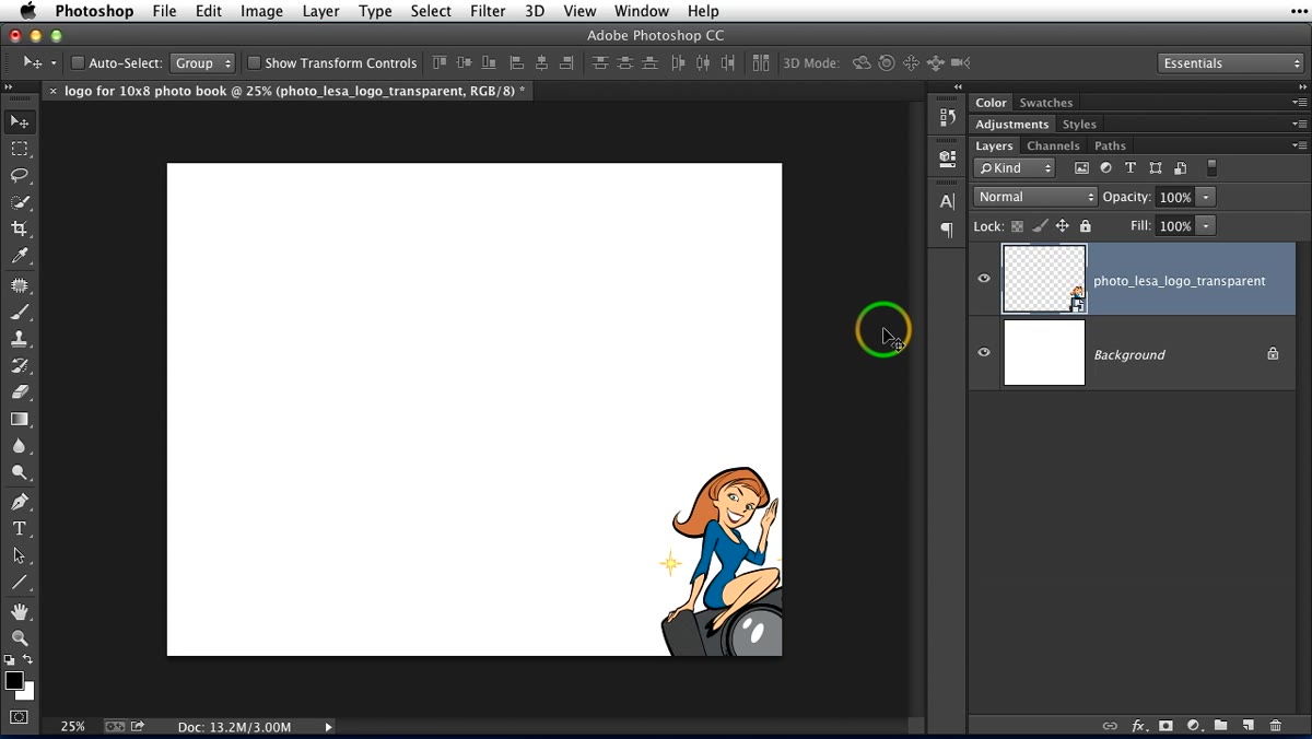
Here’s the creative decision that makes the difference between a logo placement that feels branded and one that feels like a legal disclaimer stamped on every page. Lesa’s suggestion, which I’ve used myself and can vouch for, is to position the logo so it bleeds off one edge of the canvas. Think bottom corner, far right, partially cropped. Switch to the Move tool and drag the logo to wherever you want it to sit. The portion that extends beyond the canvas will simply be cut off when the file is used as a background, giving you a clean, partially visible logo that reads as intentional design rather than an afterthought.
Logo dragged to hang partially off the edge of the canvas
Here’s the creative decision that makes the difference between a logo placement that feels branded and one that feels like a legal disclaimer stamped on every page. Lesa’s suggestion, which I’ve used myself and can vouch for, is to position the logo so it bleeds off one edge of the canvas. Think bottom corner, far right, partially cropped. Switch to the Move tool and drag the logo to wherever you want it to sit. The portion that extends beyond the canvas will simply be cut off when the file is used as a background, giving you a clean, partially visible logo that reads as intentional design rather than an afterthought.
Step 6: Bring the File into Lightroom as a Background Image and Lower the Opacity
 Lightroom Background panel with opacity slider visible
Save your Photoshop file as a PNG (to preserve transparency if your logo has it) or a JPEG if it’s on a solid background. Then, back in Lightroom’s Book module, open the Background panel and drag your file into the background image well. Once it’s in, you’ll see an opacity slider in the same panel. This is where the whole thing comes together. Dropping the opacity down, somewhere in the 15 to 30 percent range depending on your logo and your taste, makes the branding feel present without dominating every spread. It’s visible if you’re looking for it. It’s not in the reader’s face if they’re not.
Lightroom Background panel with opacity slider visible
Save your Photoshop file as a PNG (to preserve transparency if your logo has it) or a JPEG if it’s on a solid background. Then, back in Lightroom’s Book module, open the Background panel and drag your file into the background image well. Once it’s in, you’ll see an opacity slider in the same panel. This is where the whole thing comes together. Dropping the opacity down, somewhere in the 15 to 30 percent range depending on your logo and your taste, makes the branding feel present without dominating every spread. It’s visible if you’re looking for it. It’s not in the reader’s face if they’re not.
One Thing I’d Add: Use This Same Technique for Custom Textures
Lesa mentions this briefly near the end of the tutorial and I want to put a spotlight on it because it’s easy to miss. The Photoshop-to-Lightroom background workflow isn’t just for logos. It’s a general solution for any custom background element you want to repeat across your book. I’ve used it to add a subtle linen texture behind photos in a family portrait book. I’ve also used it to place a soft vignette gradient that gave an older portfolio book a more editorial feel. If you shoot in a specific style or genre, creating a small library of these background files in Photoshop gives you reusable assets that make future books faster to build. Keep them organized by book size and you’ll thank yourself later.
The single most important thing to take away from this workflow is that the limitation in Lightroom’s Book module isn’t a dead end. It’s a redirect toward Photoshop, where you have full control over placement before the file ever touches Lightroom. Once you make that mental shift, the whole process clicks into place.
Watch the full tutorial on YouTube to see Lesa walk through the whole thing in real time. Her explanation of Smart Objects alone is worth the watch if that concept is still fuzzy for you.
Comments (1)
I've been looking for exactly this kind of tutorial. Perfect timing.
Leave a Comment