Lightroom Mobile Is More Powerful Than You Think — Here's the Proof

Lightroom Mobile Is More Powerful Than You Think — Here's the Proof

I resisted Lightroom’s cloud-based desktop and mobile app for an embarrassingly long time. I had my Classic catalog, my folder structure, my backup drives humming under my desk like old friends. The idea of handing my raw files over to the cloud felt like trading a filing cabinet for a promise. Then I actually started using it, and I owe a small apology to the app I ignored for two years.

The Black and White Formula I Keep Coming Back To (and How to Actually Make It Work)

The Black and White Formula I Keep Coming Back To (and How to Actually Make It Work)

Most of my black and white conversions used to land in the same frustrating place: technically fine, emotionally flat. The tones were balanced, the histogram looked reasonable, and the image felt like a photocopy of something that should have been great. What was missing wasn’t drama exactly - it was depth. That particular quality you see in a well-printed darkroom photo where the shadows feel like you could fall into them.

How to Fake a Jaw-Dropping Sunset in Lightroom (Without Lying to Anyone)

How to Fake a Jaw-Dropping Sunset in Lightroom (Without Lying to Anyone)

There’s a specific kind of photographer envy I used to feel scrolling through Instagram at 11pm. Someone’s got this molten, cinematic sunset over a mountain range, and I’m sitting there wondering what national park gods they sacrificed to. Turns out, a lot of those images aren’t about luck at all. They’re about knowing what Lightroom’s color grading panel can actually do when you stop treating it like a novelty and start using it like a precision tool.

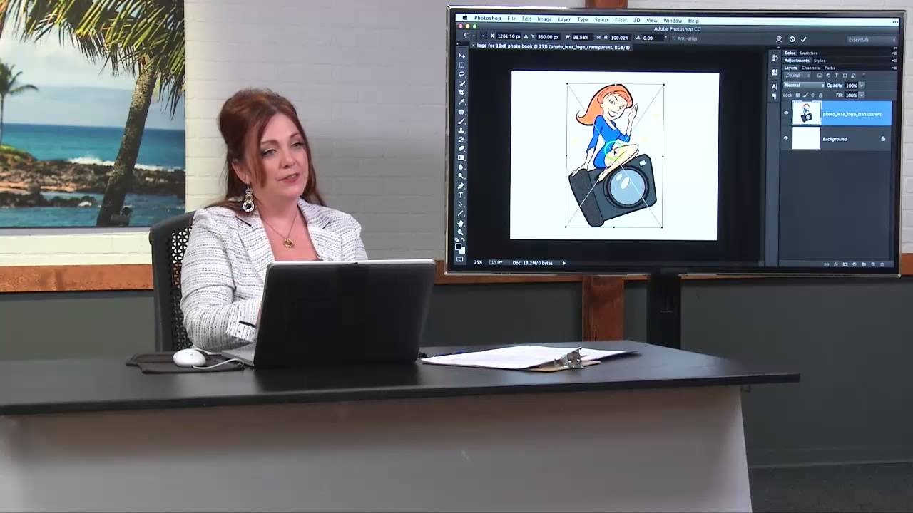
How to Brand Every Page of a Lightroom Photo Book (Without Making It Weird)

How to Brand Every Page of a Lightroom Photo Book (Without Making It Weird)

Client photo books are one of those deliverables that look effortless until you try to build one yourself. The layout tools in Lightroom’s Book module are genuinely solid, but the moment a client asks “can you put our logo on every page?” you hit a wall that isn’t obvious until you’re already staring at it. That wall is this: Lightroom gives you one set of cell padding guides per page, and those guides are already doing the job of positioning your photos.

Split Toning Is the Reason Your Photos Look Flat (And How to Fix It in Under 5 Minutes)

Split Toning Is the Reason Your Photos Look Flat (And How to Fix It in Under 5 Minutes)

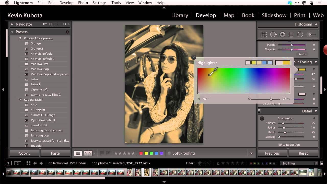
I used to wonder why my edits looked competent but not compelling. Exposure was right. Contrast was dialed in. White balance was technically correct. And yet something about them felt like a Wikipedia photo, clinical and finished but not alive. It took me embarrassingly long to figure out the culprit: I was treating highlights and shadows like they both needed to be neutral, and that’s exactly why nothing was singing.

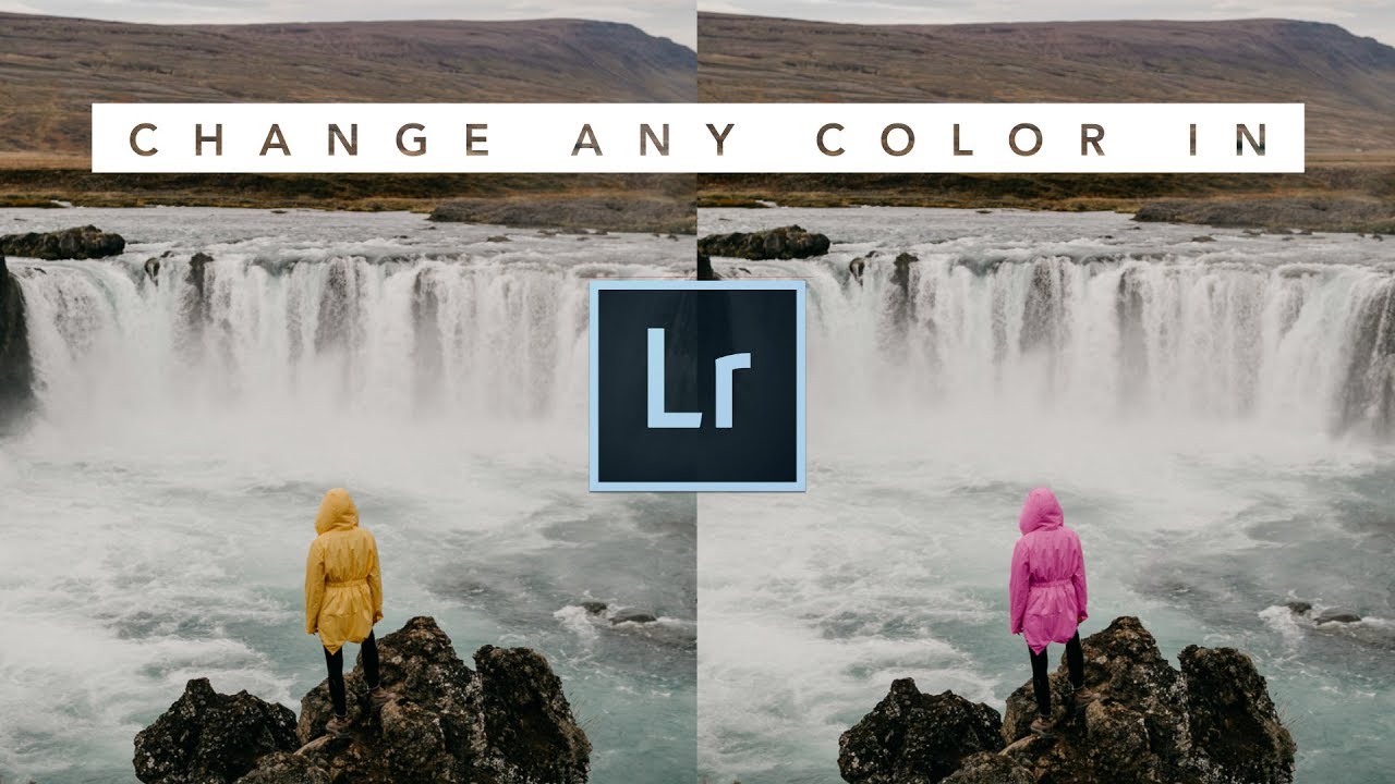
How to Change Any Color in Lightroom Using Masks (No Photoshop Required)

How to Change Any Color in Lightroom Using Masks (No Photoshop Required)

Most of my clients have no idea how much color work happens after the shutter clicks. A jacket that photographs as a muddy burgundy. A sky that came out flat and grey when it was golden in real life. A product shot where the background color just isn’t sitting right against the subject. These are the kinds of problems I used to punt to Photoshop, fire up a Select and Mask workflow, and spend twenty minutes fixing what should have taken five.

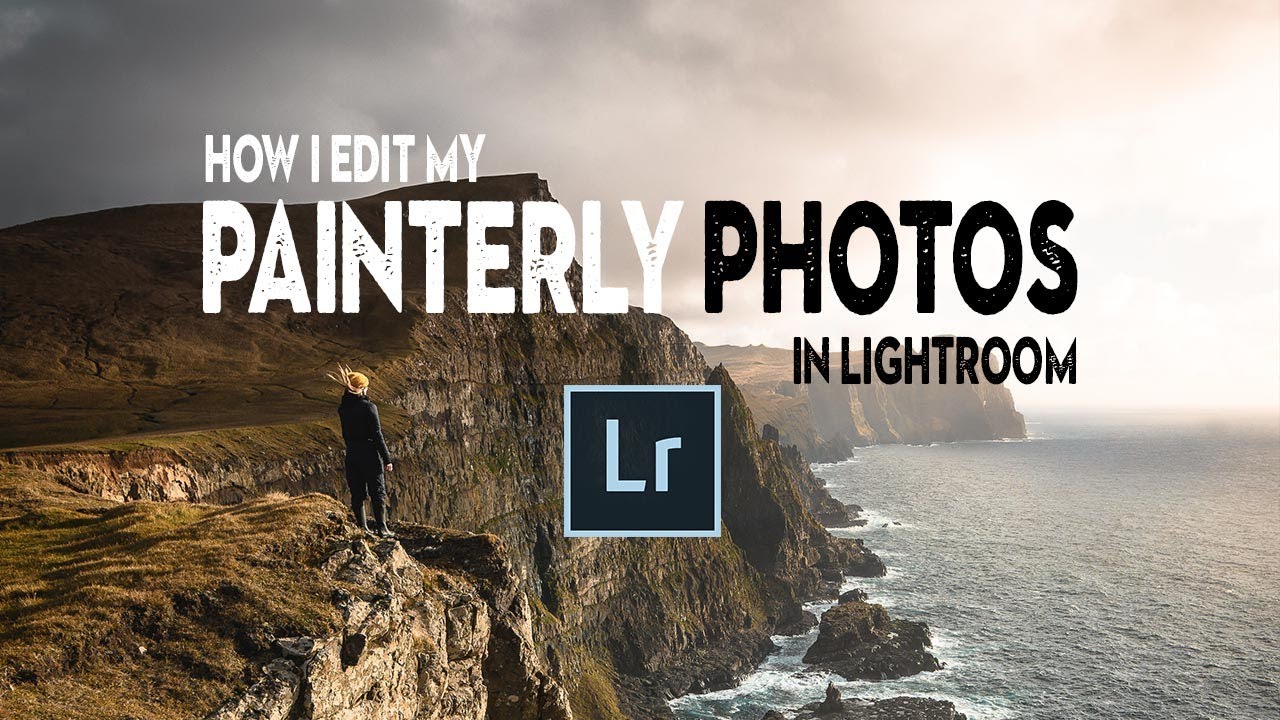
The Painterly Edit: How Nigel Danson Uses Lightroom to Make Photos Look Like Oil Paintings

The Painterly Edit: How Nigel Danson Uses Lightroom to Make Photos Look Like Oil Paintings

There’s a specific kind of photo that stops you mid-scroll. It doesn’t look like a photograph exactly. The light feels considered, the colors feel warm and unified, and there’s a softness to it that makes you think of a painting hanging in a gallery rather than a JPEG sitting in a Dropbox folder. I’ve been chasing that look for years, and I’ll be honest – most of my early attempts just looked like I’d cranked the fade slider and called it done.

How to Add a Professional Watermark in Lightroom (Text and Logo)

How to Add a Professional Watermark in Lightroom (Text and Logo)

Every photographer I know has a watermark horror story. A client takes a proof image and sends it to the printer. A photo gets reposted on Instagram without credit. Someone uses a “for review only” shot as final delivery. I learned this lesson early, back when I was shooting press photos for local Nashville bands and handing over low-res JPEGs without a second thought. A watermark would have saved me more than one awkward conversation.

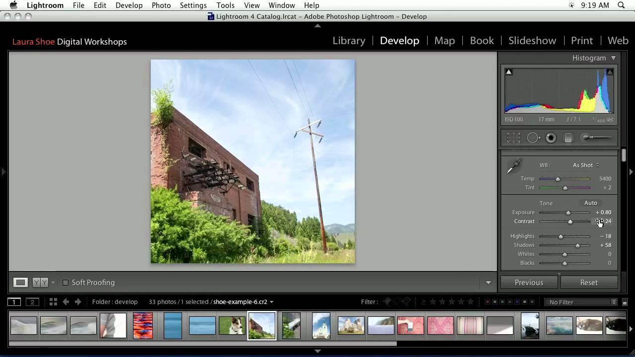
From Crop to Color Grade: A Working Walkthrough of Lightroom's Develop Module

From Crop to Color Grade: A Working Walkthrough of Lightroom's Develop Module

Every so often I come across a tutorial that cuts through the noise and just shows the work. No fluff, no five-minute intro, no sponsor reads before you’ve learned anything useful. Watch the full tutorial on YouTube from CreativeLive, and you’ll see what I mean. It’s a rapid-fire recap of the Develop Module — one photo, start to finish — and it covers more ground in a few minutes than most hour-long courses do.

Reference View in Lightroom CC 2015.8: How to Reverse Engineer Any Photo's Look

Reference View in Lightroom CC 2015.8: How to Reverse Engineer Any Photo's Look

There’s a specific kind of frustration I know too well. You’re staring at a JPEG you edited on your phone six months ago, the tones are exactly right, the contrast sits perfectly, and you have absolutely no idea what you did to get there. No develop history. No settings to copy. Just a finished photo mocking you from across the catalog. For a long time, my only move was to squint at it and try to rebuild it from memory, which is about as reliable as it sounds.

From Flat to Finished: Terry White's Lightroom Workflow for Photowalk Images (And Why It Actually Works)

From Flat to Finished: Terry White's Lightroom Workflow for Photowalk Images (And Why It Actually Works)

Most of the photos sitting in my Lightroom catalog right now are not bad shots. They’re just unfinished ones. Images I took on a good day, with decent light, that came out of camera looking flat and got buried in a folder I keep telling myself I’ll get to. If you shoot on photo walks or street sessions, you know the feeling. You come home with 300 frames, cull them down to 40 worth keeping, and then stall out because the editing feels like starting from scratch on each one.

Question Marks in Lightroom's Folder Panel? Here's How to Stop Losing Your Mind Over Missing Files

Question Marks in Lightroom's Folder Panel? Here's How to Stop Losing Your Mind Over Missing Files

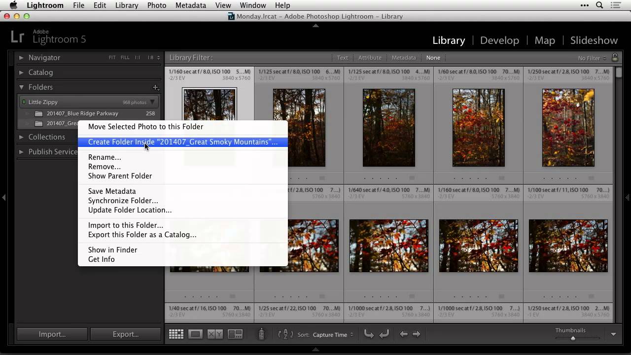
There’s a specific kind of dread that hits when you open Lightroom and your folder panel is suddenly full of question marks. It looks like your photos have vanished. Your carefully organized shoot folders seem to have evaporated overnight. If you’ve felt that cold drop in your stomach, you’re not alone, and more importantly, nothing is actually gone. I ran into this exact situation after reorganizing a hard drive mid-project. I’d renamed and moved some folders outside of Lightroom, which is the classic mistake, and suddenly the catalog had no idea where anything lived.