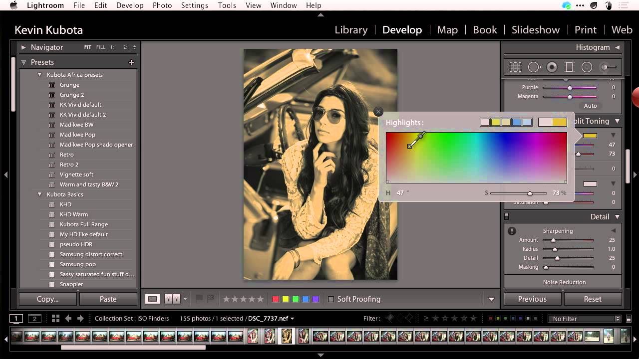
Most of my black and white conversions used to land in the same frustrating place: technically fine, emotionally flat. The tones were balanced, the histogram looked reasonable, and the image felt like a photocopy of something that should have been great. What was missing wasn’t drama exactly - it was depth. That particular quality you see in a well-printed darkroom photo where the shadows feel like you could fall into them.
I found what I was looking for in a CreativeLive tutorial on adjusting and improving tones in black and white photos. Watch the full tutorial on YouTube. The approach is built around two moves: shaping your tones with the curve and then adding a subtle split tone that gives the shadows a warmth that reads as richness rather than color. It’s a formula, and I mean that as a compliment. Good formulas are starting points that hold up across dozens of different images.
What sold me was the connection to film photography technique. The tutorial references something any darkroom shooter will remember - using colored filters over the lens during black and white film photography to shift how specific tones rendered. Orange filters to lighten skin, red filters to darken skies. That same logic lives inside Lightroom’s HSL panel, and when you pair it with a thoughtful split tone, the result looks genuinely considered rather than processed.
Step 1: Set the Tone Curve to Strong Contrast
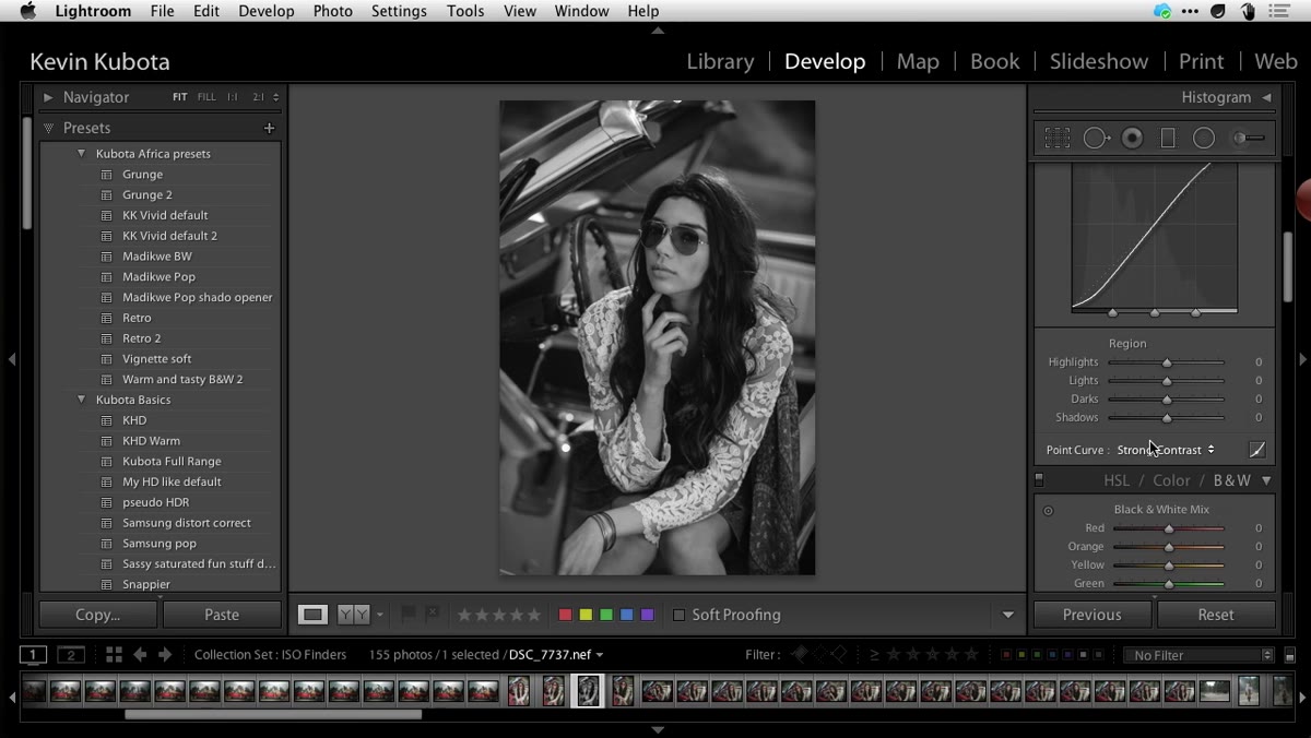 Tone Curve panel set to Strong Contrast preset
Before touching anything else, head to the Tone Curve panel and switch the preset to Strong Contrast. This single move does a lot of heavy lifting. It separates your darks and lights with more conviction than the default linear curve, giving your image a backbone to build from. Think of it as establishing the skeleton before you start adding muscle.
Tone Curve panel set to Strong Contrast preset
Before touching anything else, head to the Tone Curve panel and switch the preset to Strong Contrast. This single move does a lot of heavy lifting. It separates your darks and lights with more conviction than the default linear curve, giving your image a backbone to build from. Think of it as establishing the skeleton before you start adding muscle.
Don’t overthink this step or start manually dragging curve points yet. The Strong Contrast preset is the right foundation for this particular look, and you’ll be refining tone relationships through other tools in the next steps. Keep the curve clean and move on.
Step 2: Simulate Color Filtration in the HSL Panel
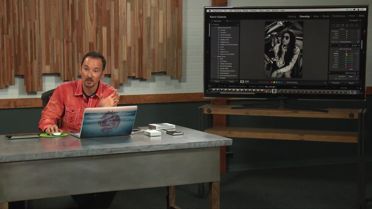 HSL panel with orange and red luminance sliders raised
This is where the film photography logic comes in. Open the HSL panel and navigate to the Luminance tab. What you’re doing here mimics the effect of shooting black and white film with a colored filter over the lens. Bring the orange and red sliders up to lighten skin tones and give them a creamy, flattering quality. This is the equivalent of that orange filter from the film days - it opens up faces and prevents them from looking muddy.
HSL panel with orange and red luminance sliders raised
This is where the film photography logic comes in. Open the HSL panel and navigate to the Luminance tab. What you’re doing here mimics the effect of shooting black and white film with a colored filter over the lens. Bring the orange and red sliders up to lighten skin tones and give them a creamy, flattering quality. This is the equivalent of that orange filter from the film days - it opens up faces and prevents them from looking muddy.
Then go in the opposite direction with the blues and aquas. Pull those down to deepen sky tones. For the greens, bring them up slightly to create that pseudo-infrared quality where foliage goes bright and airy. Even if your specific photo doesn’t have a visible sky or a lot of green, applying this pattern creates internal contrast between tone zones that makes the image feel more alive. The reds lightening, the blues darkening, the greens lifting - it all adds up to a more dimensional conversion.
Step 3: Open the Split Toning Panel
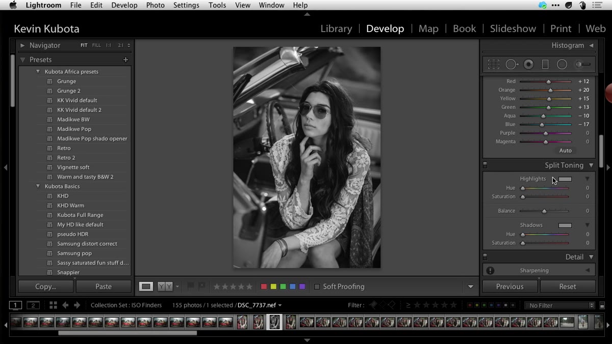 Split Toning panel open in Lightroom develop module
With your tones shaped, it’s time to add the quality that separates a printed photograph from a screen export - a subtle toning in the shadows. Open the Split Toning panel. The goal here is not sepia. Sepia pushes color into every tonal region and reads as a stylistic choice. What we’re after is something more like selenium toning from darkroom printing: a warmth that lives primarily in the shadows and makes the image feel rich when printed on paper.
Split Toning panel open in Lightroom develop module
With your tones shaped, it’s time to add the quality that separates a printed photograph from a screen export - a subtle toning in the shadows. Open the Split Toning panel. The goal here is not sepia. Sepia pushes color into every tonal region and reads as a stylistic choice. What we’re after is something more like selenium toning from darkroom printing: a warmth that lives primarily in the shadows and makes the image feel rich when printed on paper.
Keep that distinction in mind as you work through the next steps. Restraint is the whole point.
Step 4: Choose a Chocolatey Shadow Color
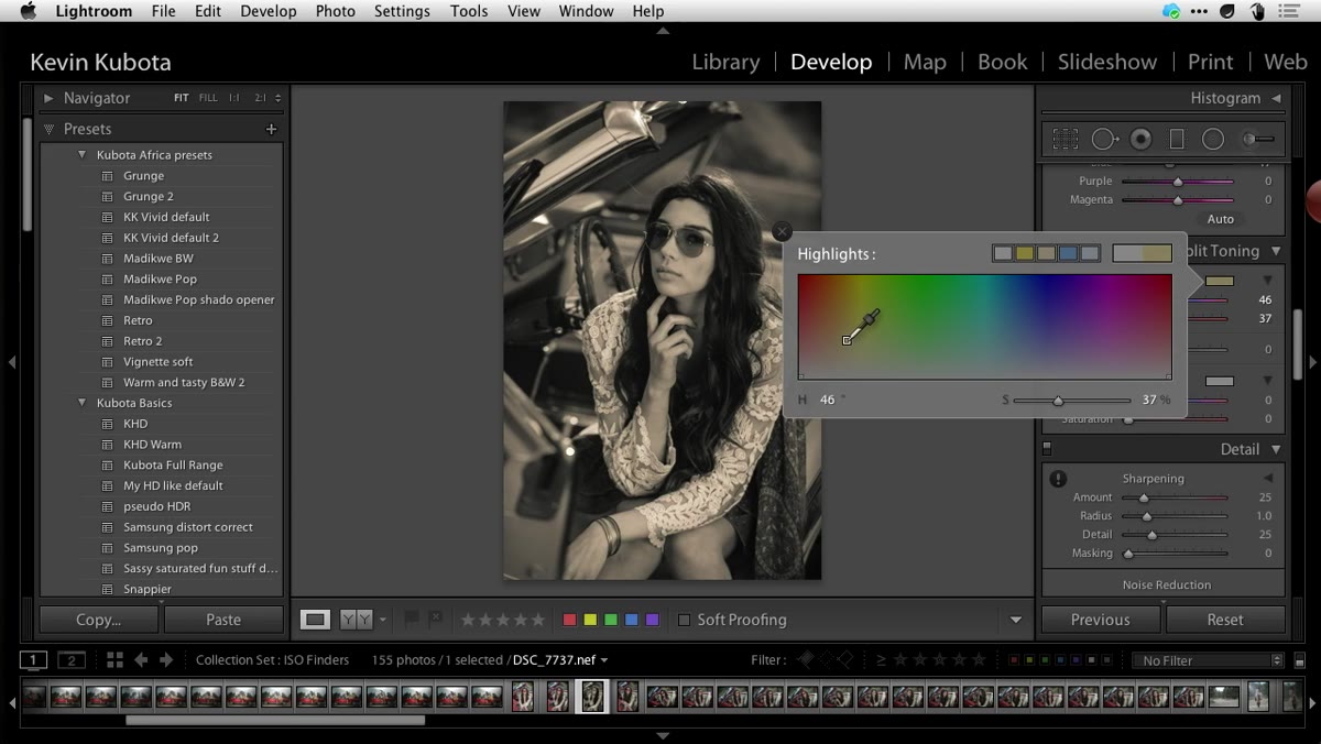 Color swatch picker open showing warm brown hue selection
Click the color swatch in the Shadows section of the Split Toning panel. When the picker opens, crank the saturation slider up high - not because you want it that intense in the final image, but because it’s easier to pick the right hue when you can actually see it. You’re looking for a warm, dark brown. Think good chocolate, not caramel and not orange. The specific hue will vary by image, but stay in the warm brown range and you’ll be in the right territory.
Color swatch picker open showing warm brown hue selection
Click the color swatch in the Shadows section of the Split Toning panel. When the picker opens, crank the saturation slider up high - not because you want it that intense in the final image, but because it’s easier to pick the right hue when you can actually see it. You’re looking for a warm, dark brown. Think good chocolate, not caramel and not orange. The specific hue will vary by image, but stay in the warm brown range and you’ll be in the right territory.
Don’t worry about how the image looks at this stage. The high saturation is a diagnostic tool, not a result.
Step 5: Adjust the Balance Slider Toward the Shadows
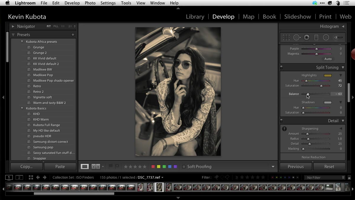 Balance slider moved to the right toward Shadows
Once you have your color chosen, use the Balance slider to control where that toning actually appears. Sliding left pushes the toning into the highlights. Sliding right restricts it toward the shadows. You want the majority of that chocolatey color living in your darkest tones while the highlights stay relatively clean and neutral.
Balance slider moved to the right toward Shadows
Once you have your color chosen, use the Balance slider to control where that toning actually appears. Sliding left pushes the toning into the highlights. Sliding right restricts it toward the shadows. You want the majority of that chocolatey color living in your darkest tones while the highlights stay relatively clean and neutral.
A value around +58 is a solid starting point according to the tutorial. From there, evaluate by eye. You should be able to see warmth and richness in the dark areas while the brighter parts of the image still feel like a clean black and white. If your highlights are picking up color, push the balance further right.
Step 6: Dial Back the Saturation to Taste
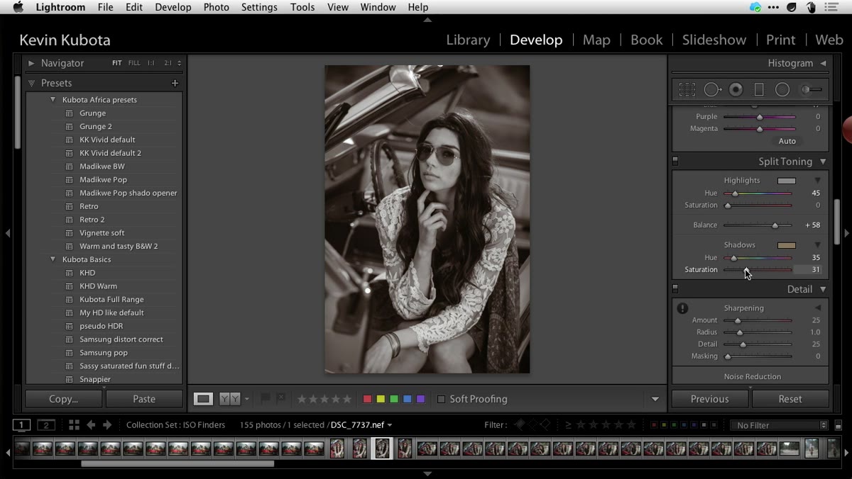 Shadow saturation slider reduced to around 23-25
Now bring the Shadow saturation back down. The tutorial lands around 23 to 25 as a starting point, and that’s a good range to work within. As you lower the saturation, the color stops reading as an obvious toning effect and starts reading as depth and warmth. That’s the target.
Shadow saturation slider reduced to around 23-25
Now bring the Shadow saturation back down. The tutorial lands around 23 to 25 as a starting point, and that’s a good range to work within. As you lower the saturation, the color stops reading as an obvious toning effect and starts reading as depth and warmth. That’s the target.
Watch what happens on the high end: if you push saturation up toward 40 or 50, the image starts looking like a sepia print. That’s a legitimate choice if it’s what you’re after, but the technique described here is more precise - chocolate in the shadows only, with highlights that stay close to neutral white. If you want true sepia, you’d bring the balance slider back toward center so the toning affects the full range of tones more evenly.
One Thing I’d Add From My Own Work
The tutorial doesn’t mention this, but the HSL luminance values become much more powerful when you’ve already done a solid job with the basic exposure and contrast settings before jumping in. I’ve found that running through exposure, highlights, shadows, and whites first gives the tone curve and split tone a cleaner surface to work on. When your blacks are actually black and your highlights aren’t clipped, the split tone reads exactly the way you want it to. When the exposure is off going in, the chocolatey shadows can turn muddy instead of rich. Think of the basic panel as prep work and the curve plus split tone as the finish coat.
The formula in this tutorial has become a genuine part of how I approach any serious black and white edit. It’s not a one-click preset shortcut - it’s a workflow with intentional moves at each stage, and the result is a black and white image that holds up in print in a way that flat digital conversions simply don’t. Get the contrast in the curve, shape the tone relationships in HSL, and then place that warmth exactly where it belongs in the shadows.
Watch the full tutorial on YouTube to see all of these adjustments demonstrated in real time with an actual image.
Comments (3)
Never thought of approaching it this way. Really creative.
Just used this on a wedding shoot edit. Client was thrilled.
This is fantastic. I've been recommending this approach to my readers too.
Leave a Comment