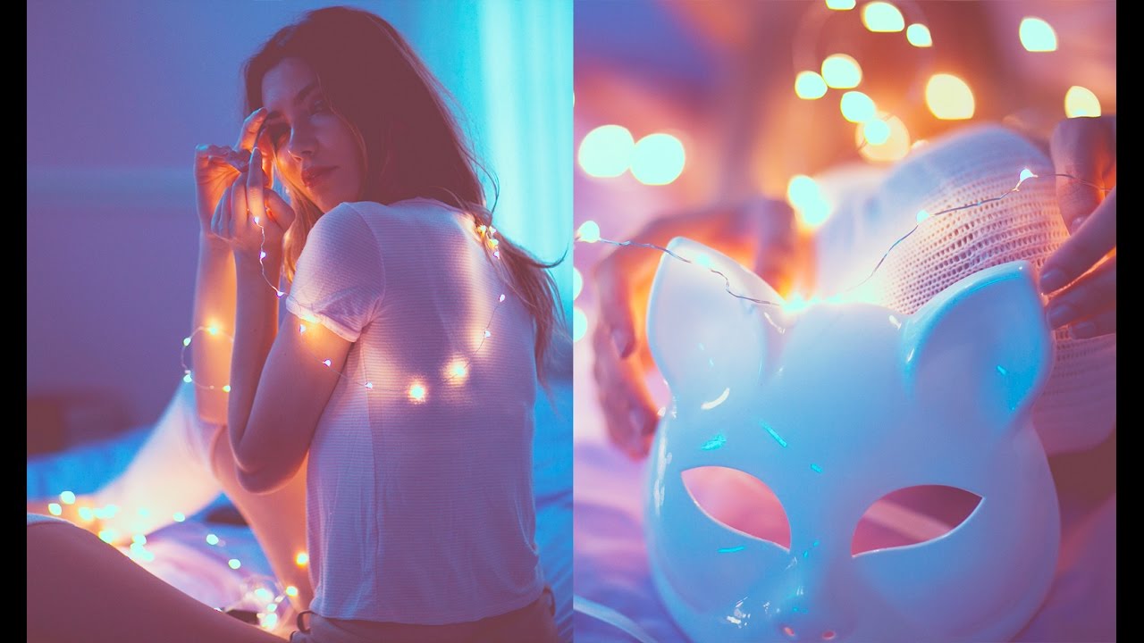
Split Toning Is the Reason Your Photos Look Flat (And the Fix Takes 90 Seconds)

Split Toning Is the Reason Your Photos Look Flat (And the Fix Takes 90 Seconds)

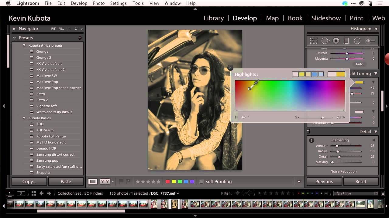
I once handed a raw wedding photo to a friend who edits casually, watched her spend twenty minutes pushing the Vibrance and Clarity sliders around, and then declare it “still kind of lifeless.” The exposure was fine. The whites were clean. But the image had no emotional temperature. It didn’t feel like anything. That’s usually a split toning problem. Split toning is one of those techniques that professional colorists use constantly and beginners overlook almost entirely because it doesn’t produce the dramatic before/after of a heavy preset.

The Tone Curve Isn't a Mystery — You're Just Using It Wrong

The Tone Curve Isn't a Mystery — You're Just Using It Wrong

I used to avoid the tone curve like it was a parking ticket I’d deal with later. Early on, I’d drag a few points around, watch the image turn into something that looked like a fever dream, and quietly hit undo. The sliders in the Basic panel were right there. They made sense. The curve felt like a different language. Then I started actually understanding what it was doing, and now it’s the first thing I reach for on almost every edit.

The Tone Curve Isn't Scary — You're Just Using It Wrong

The Tone Curve Isn't Scary — You're Just Using It Wrong

I used to drag the Highlights slider down, drag the Shadows slider up, call it a day, and move on. For a long time, that was my entire dynamic range strategy. It worked, loosely. Photos looked okay. But okay is a slow way to die as an editor, and eventually I sat down with the tone curve and actually learned what it was doing, instead of just fearing it. If you’ve been treating the tone curve like that weird neighbor you wave at but never talk to, this is the conversation we should have had two years ago.

From Flat RAW to Cinematic: How Pierre T. Lambert's Lightroom Workflow Actually Works

From Flat RAW to Cinematic: How Pierre T. Lambert's Lightroom Workflow Actually Works

There’s a particular kind of frustration that hits when you open a RAW file and it looks absolutely nothing like what you saw through the viewfinder. Flat, muddy, lifeless. I’ve been editing photos long enough to know that the gap between the RAW capture and the finished image is where most photographers either give up or develop a real workflow. For a long time, my own workflow was a patchwork of habits I’d picked up from a dozen different sources, none of them quite fitting together.

How Lightroom's Tone Curve Actually Works (And Why It's Not as Scary as It Looks)

How Lightroom's Tone Curve Actually Works (And Why It's Not as Scary as It Looks)

Every time I open a new editing session, the tone curve is one of the first panels I reach for. Not because it’s flashy, but because it gives me a level of control over light and contrast that the basic sliders just can’t replicate. That said, I’ve watched plenty of photographers drag a point around the curve, squint at the result, and then hit undo because they had no idea what they’d actually done.

Beyond the Contrast Slider: How to Build an S-Curve That Actually Bites

Beyond the Contrast Slider: How to Build an S-Curve That Actually Bites

There’s a specific kind of frustration I’ve felt more times than I can count: you’re editing a photo, the image looks flat, you drag the Contrast slider all the way to +100, and it still feels like the picture is behind a layer of gauze. The slider tops out and you’re left thinking, “That’s it? That’s all you’ve got?” For a long time I just lived with it, stacking other adjustments on top and hoping something would stick.

Split Toning in Lightroom: How Two Colors Can Make or Break the Whole Mood of a Photo

Split Toning in Lightroom: How Two Colors Can Make or Break the Whole Mood of a Photo

I have a preset I built about three years ago called “Rumours.” Warm golden shadows, slightly cool highlights, the kind of look that makes a portrait feel like it was shot in a California living room in 1977. I named it after the Fleetwood Mac album because that’s the mood I was chasing when I built it. I’ve used it on maybe two dozen client galleries since then, and people consistently ask me how I got “that color.

Understanding the Tone Curve in Lightroom

Understanding the Tone Curve in Lightroom

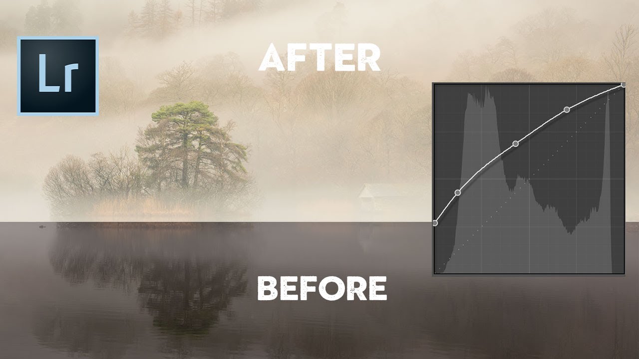
The tone curve is the most powerful tonal adjustment in Lightroom, and also the most intimidating. That wavy line on a graph scares people. But once you understand what it does, you’ll use it on every edit. What the Tone Curve Does The tone curve maps input brightness to output brightness. The horizontal axis represents the original tones in your image from dark (left) to light (right). The vertical axis represents the adjusted brightness from dark (bottom) to light (top).

Mastering Tone Curve in Lightroom: The Secret Weapon for Professional Color Grading

Mastering Tone Curve in Lightroom: The Secret Weapon for Professional Color Grading

Mastering Tone Curve in Lightroom: The Secret Weapon for Professional Color Grading When I first discovered the tone curve in Lightroom, it felt like unlocking a cheat code. The basic sliders—exposure, contrast, highlights—they’re great for quick fixes. But the tone curve? That’s where the magic happens. It’s the difference between a decent photo and one that makes people stop scrolling. Think of the tone curve as your personal lighting director. While exposure adjustments are like turning a dimmer switch on and off, the tone curve lets you reshape the entire tonal landscape of your image with surgical precision.

Mastering the Tone Curve in Lightroom: Your Secret Weapon for Professional Color Grading

Mastering the Tone Curve in Lightroom: Your Secret Weapon for Professional Color Grading

Mastering the Tone Curve in Lightroom: Your Secret Weapon for Professional Color Grading When I first started editing photos seriously, I lived and died by the Exposure slider. More light? Turn it up. Too dark? Crank it higher. It worked, sure—but it felt like using a sledgehammer when I needed a scalpel. Then I discovered the tone curve, and everything changed. The tone curve is where amateurs become professionals. It’s the difference between a photo that looks “edited” and one that looks intentional.

Mastering the Tone Curve in Lightroom: Transform Your Photos Like a Pro

Mastering the Tone Curve in Lightroom: Transform Your Photos Like a Pro

Mastering the Tone Curve in Lightroom: Transform Your Photos Like a Pro When I first opened Lightroom’s tone curve panel, I felt like I’d unlocked the cheat code to professional-looking edits. While the Basic panel handles the heavy lifting, the tone curve is where the magic happens. Think of it as the difference between a solid Marvel movie and one that actually wins awards—same foundation, infinitely more refinement. What Is a Tone Curve, Actually?

Mastering the Tone Curve in Lightroom: Transform Your Images with Precision

Mastering the Tone Curve in Lightroom: Transform Your Images with Precision

Mastering the Tone Curve in Lightroom: Transform Your Images with Precision I’ll be honest—when I first opened Lightroom’s tone curve panel, I felt like I was staring at a financial spreadsheet. Lines. Graphs. Numbers. Not exactly inspiring. But then I realized something: the tone curve isn’t complicated at all. It’s actually the most intuitive way to control your image’s mood, contrast, and personality. Think of the tone curve as a control panel for every brightness level in your photo.