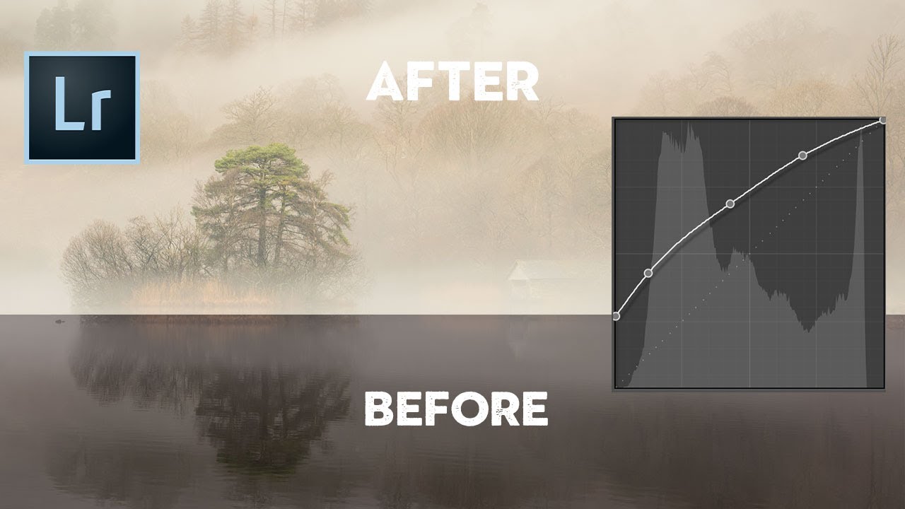
Every time I open a new editing session, the tone curve is one of the first panels I reach for. Not because it’s flashy, but because it gives me a level of control over light and contrast that the basic sliders just can’t replicate. That said, I’ve watched plenty of photographers drag a point around the curve, squint at the result, and then hit undo because they had no idea what they’d actually done. I was one of those photographers for longer than I’d like to admit.
In this Nigel Danson tutorial, he strips the tone curve down to its real logic, no jargon, no assumptions. Watch the full tutorial on YouTube if you want to see his screen as you read, because this is one of those concepts where watching the line move in real time clicks something into place. What I want to do here is expand on what he covers, so you can walk away with a mental model you can actually apply.
The thing that made curves feel manageable to me was understanding that the curve is a translation map. It’s not adding anything to your image or inventing light that wasn’t there. It’s telling your editing software how to interpret what already exists in the file. Once that framing lands, the rest follows pretty naturally.
Step 1: Understand What the Axes Mean
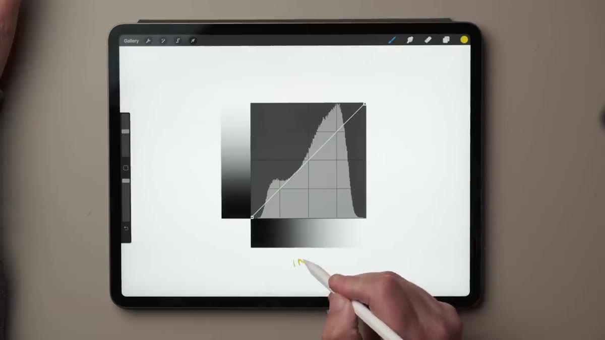 Diagram showing input axis at bottom, output axis on left
Before you touch anything, look at the graph itself. The horizontal axis (bottom) represents your input, which is the raw tonal information in your image file. The vertical axis (left side) represents the output, which is how those tones actually appear on screen after Lightroom processes them. Blacks live on the left, whites on the right. The same scale applies vertically from bottom to top.
Diagram showing input axis at bottom, output axis on left
Before you touch anything, look at the graph itself. The horizontal axis (bottom) represents your input, which is the raw tonal information in your image file. The vertical axis (left side) represents the output, which is how those tones actually appear on screen after Lightroom processes them. Blacks live on the left, whites on the right. The same scale applies vertically from bottom to top.
A straight diagonal line from the bottom-left corner to the top-right corner means input equals output at every point. Lightroom is passing your tones through unchanged. This is your neutral starting position, and it’s worth burning that visual into your memory because every curve adjustment you make is a deviation from this line.
Step 2: Learn to Read the Default (Straight) Curve
 Straight diagonal tone curve overlaid on histogram
Nigel uses a snowy landscape as his example image here, and it’s a smart choice. The histogram shows most of the tonal weight sitting toward the brighter end, which is exactly what you’d expect from a scene with a lot of snow and sky. The default straight-line curve sits on top of this histogram without altering it at all.
Straight diagonal tone curve overlaid on histogram
Nigel uses a snowy landscape as his example image here, and it’s a smart choice. The histogram shows most of the tonal weight sitting toward the brighter end, which is exactly what you’d expect from a scene with a lot of snow and sky. The default straight-line curve sits on top of this histogram without altering it at all.
Pick any point on that diagonal line and trace it. A midtone gray on the input axis maps to the exact same midtone gray on the output axis. White maps to white. Near-black maps to near-black. The line is doing nothing, and that’s the point. Understanding the baseline makes every other adjustment legible.
Step 3: Build Your First S-Curve
 S-curve shape on tone curve panel showing contrast boost
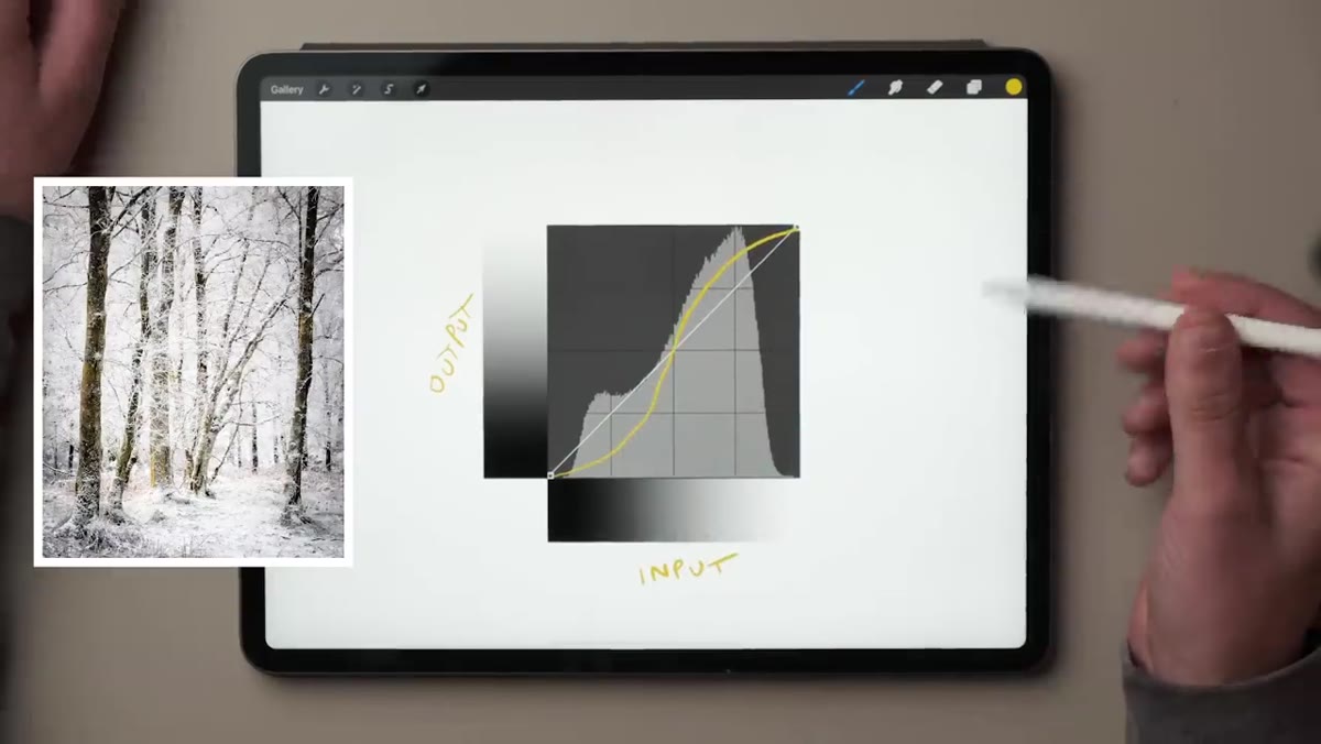
Here’s where it gets useful. An S-curve is the most common curve adjustment you’ll make, and it works by pulling the upper-midtone region upward (brighter) while pushing the lower-midtone region downward (darker). The result is a gentle S shape on what was previously a straight line.
S-curve shape on tone curve panel showing contrast boost
Here’s where it gets useful. An S-curve is the most common curve adjustment you’ll make, and it works by pulling the upper-midtone region upward (brighter) while pushing the lower-midtone region downward (darker). The result is a gentle S shape on what was previously a straight line.
To create one manually, click to place a point roughly in the upper-middle section of the curve and drag it slightly up. Then place a second point in the lower-middle section and drag it slightly down. You don’t need to go dramatic. Even a subtle S makes a noticeable difference to how punchy your image feels.
Step 4: Understand Why the S-Curve Increases Contrast
 Close-up of steepened midtone section of S-curve
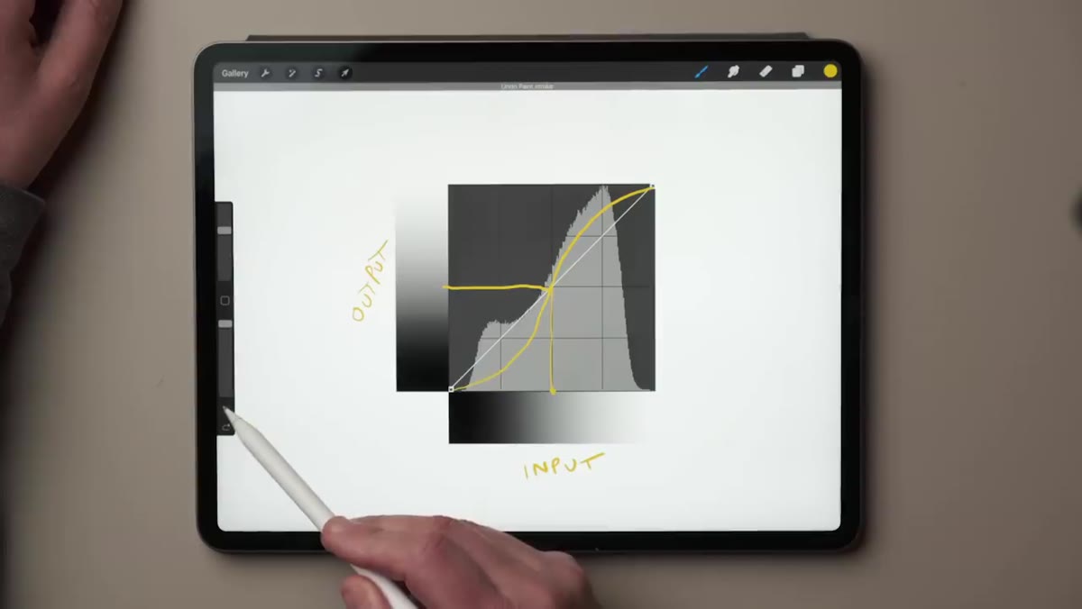
This is the conceptual piece that Nigel explains really well, and it’s the part most tutorials skip over. The S-curve doesn’t just make things brighter or darker in a general sense. What it’s actually doing is steepening the line through the midtone range, and a steeper line means more contrast in that zone.
Close-up of steepened midtone section of S-curve
This is the conceptual piece that Nigel explains really well, and it’s the part most tutorials skip over. The S-curve doesn’t just make things brighter or darker in a general sense. What it’s actually doing is steepening the line through the midtone range, and a steeper line means more contrast in that zone.
Think about it this way: if a narrow range of input tones now maps to a wider range of output tones, those tones become more visually separated from each other. That’s contrast. The inverse is also true. Flatten the line through any tonal region and you reduce contrast there. A flatter line compresses those tones together. Steep equals contrast. Flat equals compression. Keep that rule in your back pocket and curves stop being mysterious.
Step 5: Apply It to a Real Photo in Lightroom
 Lightroom interface showing tone curve applied to workshop sunset photo
Nigel jumps into Lightroom here with a landscape shot from one of his workshops, a rich sunset scene with photographers silhouetted in the foreground. It’s a great test image because it has a wide tonal range with significant detail in both the shadows and highlights.
Lightroom interface showing tone curve applied to workshop sunset photo
Nigel jumps into Lightroom here with a landscape shot from one of his workshops, a rich sunset scene with photographers silhouetted in the foreground. It’s a great test image because it has a wide tonal range with significant detail in both the shadows and highlights.
Open the Tone Curve panel in the Develop module. If you’re in the point curve view (click the small icon at the bottom right of the curve panel to toggle it), you can click directly on the curve to add points. Start conservative. A slight S-curve on a well-exposed image will almost always improve it. Push the curve too hard and you’ll clip your highlights or crush your shadows, so watch the histogram as you work rather than just staring at the image.
Step 6: Use the Curve to Target Specific Tonal Regions
 Curve panel with points placed at specific tonal regions on landscape
Once you’re comfortable with the basic S-curve, you can start placing points more intentionally. Want to lift just the shadows without blowing out the sky? Add a point in the lower quarter of the curve and pull it up slightly, then anchor the midtones and highlights with additional points so they don’t shift. Want to add drama to the sky without touching your foreground? Add a point in the upper-highlight range and drag down slightly.
Curve panel with points placed at specific tonal regions on landscape
Once you’re comfortable with the basic S-curve, you can start placing points more intentionally. Want to lift just the shadows without blowing out the sky? Add a point in the lower quarter of the curve and pull it up slightly, then anchor the midtones and highlights with additional points so they don’t shift. Want to add drama to the sky without touching your foreground? Add a point in the upper-highlight range and drag down slightly.
The key skill here is using anchor points strategically. Every point you place that you don’t move is holding that region of the curve in place while you adjust something nearby. Think of them as locks. The more precisely you want to target a tonal range, the more anchor points you’ll need.
My Own Addition: Where the Curve Beats the Contrast Slider
I’ve written before about why I reach for the tone curve instead of the Contrast slider in Lightroom’s Basic panel, and the reason is control. The Contrast slider applies a generic S-curve across the whole tonal range. It’s a preset adjustment with no flexibility. The tone curve lets you decide where the contrast lives.
For darker, moodier edits, I tend to flatten the highlight region of the curve slightly while steepening the midtones. It compresses the bright tones together and gives the image a heavier, more cinematic feel without killing the detail in the shadows. I’ve built a handful of curve shapes that I return to regularly, and most of them are saved inside presets I’ve named after songs. The curve is usually the thing I’m protecting most carefully when I adapt a preset for a new image.
The single biggest takeaway from Nigel’s tutorial is this: a steeper curve line means more contrast, a flatter curve line means less. Everything else about the tone curve is a variation on that one rule. Learn it, trust it, and the curve stops being a guessing game.
Watch the full tutorial on YouTube to see Nigel walk through the curve adjustments on his actual images. Watching the histogram respond in real time as he moves the points is worth the ten minutes on its own.
Comments (5)
Wow, I had no idea you could do this. Mind blown.
Quality content like this is rare. Keep it up.
Really solid breakdown. This pairs perfectly with the business work I've been writing about.
Great breakdown. The step-by-step approach really helps.
Never thought of approaching it this way. Really creative.
Leave a Comment