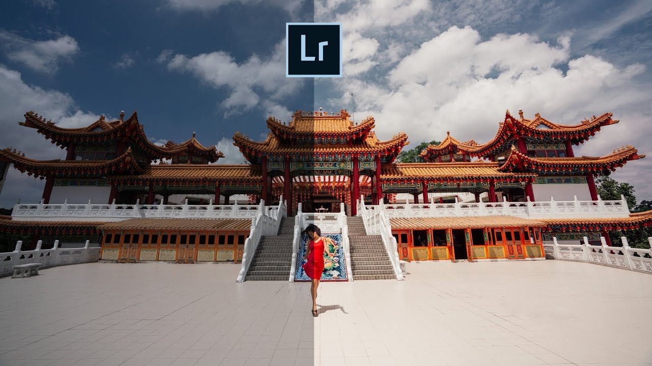
There’s a particular kind of frustration that hits when you open a RAW file and it looks absolutely nothing like what you saw through the viewfinder. Flat, muddy, lifeless. I’ve been editing photos long enough to know that the gap between the RAW capture and the finished image is where most photographers either give up or develop a real workflow. For a long time, my own workflow was a patchwork of habits I’d picked up from a dozen different sources, none of them quite fitting together. Then I started paying closer attention to how photographers like Pierre T. Lambert actually move through an edit, not just what sliders they touch, but in what order and why.
Watch the full tutorial on YouTube
In this Pierre T. Lambert tutorial, he walks through editing one of his most-liked Instagram images: a dynamic street shot of someone running in front of a temple in Kuala Lumpur. The goal is a deep blue sky, a subject that pops, and that cinematic punch that makes people stop scrolling. What makes his approach worth studying isn’t the destination, it’s the sequence. He builds the image in a specific order that most Lightroom users don’t follow, and that order turns out to matter a lot.
Step 1: Set White Balance Before Anything Else
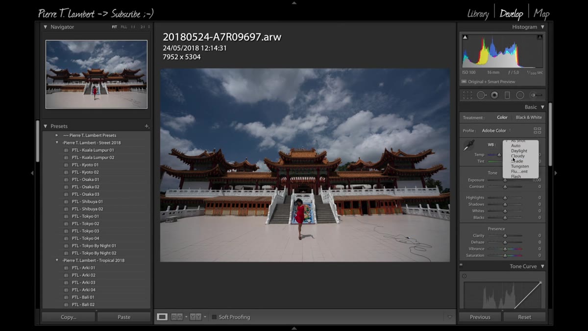 White Balance panel open, setting adjusted to Daylight
Before touching exposure or contrast, Lambert locks in the white balance. This sounds basic, but the reason is practical: every tonal decision you make downstream will shift if the color temperature is wrong. For this shot, the subject is partially in shadow, so he selects Daylight as the starting point rather than Auto, which would have tried to compensate for the mixed lighting and created a muddier look. If you’re shooting in shade or mixed outdoor light, Daylight or Cloudy presets usually give you a warmer, more intentional starting point than Auto. Set it first, then move on.
White Balance panel open, setting adjusted to Daylight
Before touching exposure or contrast, Lambert locks in the white balance. This sounds basic, but the reason is practical: every tonal decision you make downstream will shift if the color temperature is wrong. For this shot, the subject is partially in shadow, so he selects Daylight as the starting point rather than Auto, which would have tried to compensate for the mixed lighting and created a muddier look. If you’re shooting in shade or mixed outdoor light, Daylight or Cloudy presets usually give you a warmer, more intentional starting point than Auto. Set it first, then move on.
Step 2: Nudge Exposure Just Enough to See What You’re Working With
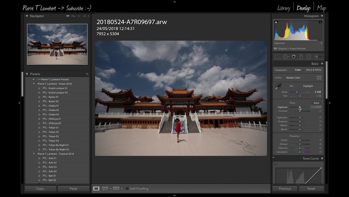 Exposure slider being raised slightly in the Basic panel
Lambert raises the exposure slightly here, and the reasoning is straightforward: a too-dark image makes it hard to evaluate your tones accurately. He’s not doing a full exposure correction at this stage. He’s lifting the image just enough so he can actually see the midtones and shadows clearly before he digs into the tone curve. Think of it as turning on the lights before you rearrange the furniture. A small positive exposure bump, maybe 0.3 to 0.7 stops depending on your image, is usually enough to get you there.
Exposure slider being raised slightly in the Basic panel
Lambert raises the exposure slightly here, and the reasoning is straightforward: a too-dark image makes it hard to evaluate your tones accurately. He’s not doing a full exposure correction at this stage. He’s lifting the image just enough so he can actually see the midtones and shadows clearly before he digs into the tone curve. Think of it as turning on the lights before you rearrange the furniture. A small positive exposure bump, maybe 0.3 to 0.7 stops depending on your image, is usually enough to get you there.
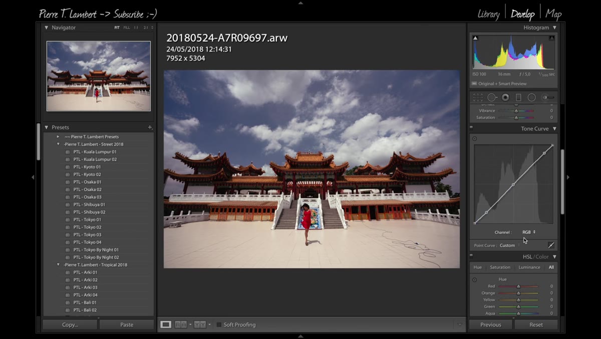
Step 3: Do the Heavy Lifting in the Tone Curve
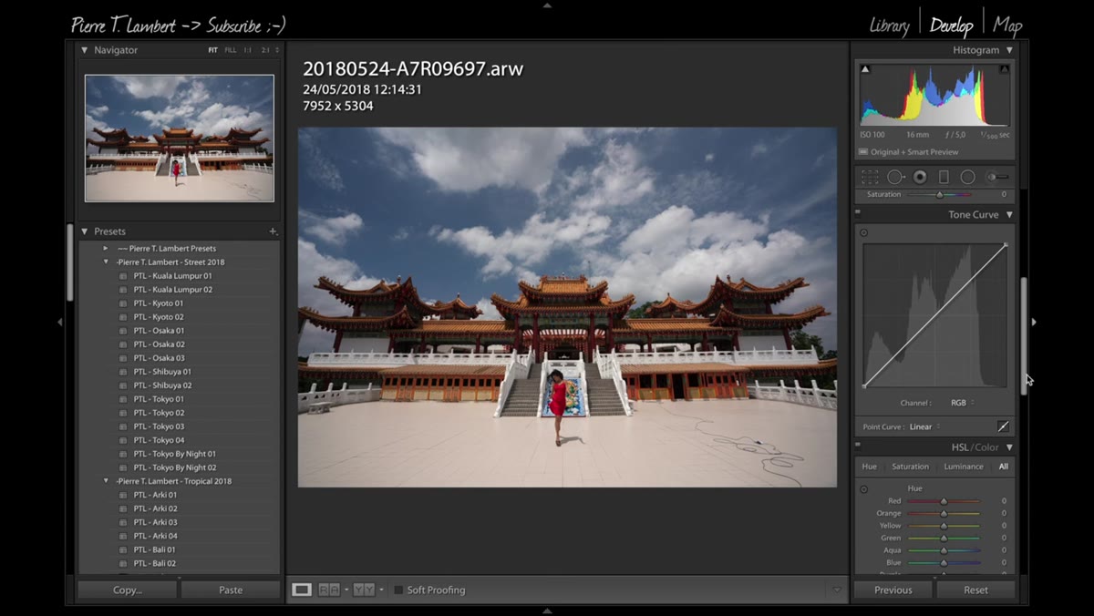 Tone Curve panel open with multiple control points placed
This is where Lambert spends most of his energy, and it’s the step that separates his results from a standard Lightroom slider edit. The tone curve gives you precise control over specific tonal ranges without the blunt-force effect of the Highlights and Shadows sliders. He places multiple points on the curve: pulling the darks down slightly to add depth, recovering some of the shadow detail so the architectural details in the background aren’t lost, and trimming the highlights just enough to keep the clouds from blowing out. The result is a contrast that feels earned rather than applied.
Tone Curve panel open with multiple control points placed
This is where Lambert spends most of his energy, and it’s the step that separates his results from a standard Lightroom slider edit. The tone curve gives you precise control over specific tonal ranges without the blunt-force effect of the Highlights and Shadows sliders. He places multiple points on the curve: pulling the darks down slightly to add depth, recovering some of the shadow detail so the architectural details in the background aren’t lost, and trimming the highlights just enough to keep the clouds from blowing out. The result is a contrast that feels earned rather than applied.
The key mental model he uses: the left side of the curve controls your darkest tones, the right side controls your brightest. A gentle S-curve, lifting the upper midtones slightly and holding the shadows, gives you that punchy cinematic look without crushing detail at either end.
Step 4: Use Individual RGB Channels in the Curve to Start Color Grading
 RGB channel selector open in Tone Curve, Red channel selected
Here’s the part that most beginner tutorials completely skip. Inside the tone curve, Lightroom lets you switch from the composite RGB curve to individual Red, Green, and Blue channels. Lambert uses this to start shaping the color grade directly in the curve rather than relying entirely on HSL or Color Grading later. Pushing the red channel up in the shadows adds warmth to the dark areas. Pulling it down adds cyan. Working the blue channel in the highlights can give you that cooler, slightly desaturated sky look that reads as cinematic in outdoor photography. He keeps the adjustments subtle here, using the channel curves to establish a color direction rather than making a dramatic statement.
RGB channel selector open in Tone Curve, Red channel selected
Here’s the part that most beginner tutorials completely skip. Inside the tone curve, Lightroom lets you switch from the composite RGB curve to individual Red, Green, and Blue channels. Lambert uses this to start shaping the color grade directly in the curve rather than relying entirely on HSL or Color Grading later. Pushing the red channel up in the shadows adds warmth to the dark areas. Pulling it down adds cyan. Working the blue channel in the highlights can give you that cooler, slightly desaturated sky look that reads as cinematic in outdoor photography. He keeps the adjustments subtle here, using the channel curves to establish a color direction rather than making a dramatic statement.
Step 5: Return to the Basic Panel to Refine the Tonal Range
 Basic panel showing Highlights, Shadows, Whites, and Blacks sliders adjusted
After the tone curve work is done, Lambert goes back up to the Basic panel to fine-tune. He pulls the Highlights slider down to protect the cloud detail he worked to preserve in the curve. He pushes Shadows up to bring out the temple in the background, which is doing a lot of visual work in the composition. Whites get trimmed slightly to keep the image from feeling overcooked, and he brings Blacks up just a touch to lift the deepest tones off pure black, giving the image a very slight fade that keeps it from feeling harsh. This is the order that matters: curve first for shape, Basic panel second for fine control.
Basic panel showing Highlights, Shadows, Whites, and Blacks sliders adjusted
After the tone curve work is done, Lambert goes back up to the Basic panel to fine-tune. He pulls the Highlights slider down to protect the cloud detail he worked to preserve in the curve. He pushes Shadows up to bring out the temple in the background, which is doing a lot of visual work in the composition. Whites get trimmed slightly to keep the image from feeling overcooked, and he brings Blacks up just a touch to lift the deepest tones off pure black, giving the image a very slight fade that keeps it from feeling harsh. This is the order that matters: curve first for shape, Basic panel second for fine control.
Step 6: Adjust the Black Point to Control the Fade
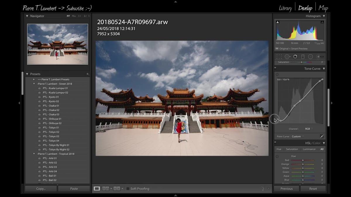 Black point slider being raised slightly to introduce a slight fade
Lambert raises the black point just a small amount, enough to introduce a subtle lift to the darkest shadows without making the image look fully matte or faded. This is a stylistic choice that reads differently depending on the image. For moody, high-contrast subjects like architecture or street photography, a slight black lift keeps the image from feeling too heavy while still retaining a sense of depth. The caution: don’t overdo it. A black point that’s too high starts to look like a film emulation preset that wasn’t quite finished.
Black point slider being raised slightly to introduce a slight fade
Lambert raises the black point just a small amount, enough to introduce a subtle lift to the darkest shadows without making the image look fully matte or faded. This is a stylistic choice that reads differently depending on the image. For moody, high-contrast subjects like architecture or street photography, a slight black lift keeps the image from feeling too heavy while still retaining a sense of depth. The caution: don’t overdo it. A black point that’s too high starts to look like a film emulation preset that wasn’t quite finished.
What I’d Add From My Own Experience
Lambert’s approach is essentially a structured conversation with the image, and the structure is the thing worth stealing. One habit I’ve built on top of his workflow: before touching the tone curve, I do a quick check on the histogram and make sure I understand where my exposure is actually sitting. RAW files from different cameras behave differently in Lightroom’s tone mapping, and what looks correct on screen can still be hiding clipped highlights or crushed shadows in the data.
I’d also suggest naming your curve adjustments as a starting preset for different lighting scenarios. Outdoor daylight, golden hour, indoor tungsten, each of those responds differently to the kind of S-curve Lambert builds here. Having a rough starting curve for each scenario means you’re not starting from scratch every session. I name mine after songs, which is either charming or deeply impractical depending on who you ask.
The single most important idea in Lambert’s entire workflow is this: the tone curve is not an advanced tool to use occasionally. It is the primary shaping tool, and the Basic panel sliders are the refinement layer that comes after. Most people have that exactly backwards. Flip the order, and you’ll start getting results that feel intentional rather than adjusted.
Watch the full tutorial on YouTube to see Lambert walk through the full edit, including his spot removal work and final composition polish.
Comments
Leave a Comment