
There’s a specific kind of frustration I’ve felt more times than I can count: you’re editing a photo, the image looks flat, you drag the Contrast slider all the way to +100, and it still feels like the picture is behind a layer of gauze. The slider tops out and you’re left thinking, “That’s it? That’s all you’ve got?” For a long time I just lived with it, stacking other adjustments on top and hoping something would stick.
It wasn’t until I worked through Watch the full tutorial on YouTube from Scott Kelby’s Lightroom Tip Tuesday series that I understood I was using the wrong tool for the job. The Contrast slider is a blunt instrument. The Tone Curve is a scalpel, and when you know how to sharpen it, you can create contrast that genuinely transforms a photograph rather than just nudging it.
The technique is fast, it’s precise, and once you feel what a steepened S-curve does to the midtone separation in an image, you will never go back to fighting with that slider alone. Here’s the full walkthrough.
Step 1: Max Out the Contrast Slider First
 Contrast slider being dragged right in Develop module
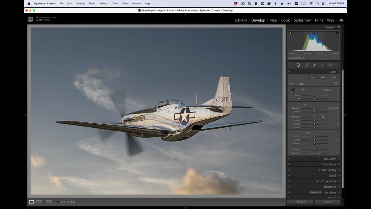
Start in the Develop module with your image open. Find the Contrast slider in the Basic panel and drag it as far right as it will go, to +100. Go ahead and commit to it. This isn’t your final look, but it establishes a baseline and forces you to confront where the slider’s ceiling actually is. On most images, +100 gives you something, but it rarely gives you enough. That gap between “something” and “enough” is exactly what the next steps are designed to close.
Contrast slider being dragged right in Develop module
Start in the Develop module with your image open. Find the Contrast slider in the Basic panel and drag it as far right as it will go, to +100. Go ahead and commit to it. This isn’t your final look, but it establishes a baseline and forces you to confront where the slider’s ceiling actually is. On most images, +100 gives you something, but it rarely gives you enough. That gap between “something” and “enough” is exactly what the next steps are designed to close.
Step 2: Navigate to the Tone Curve Panel
 Tone Curve panel open below the Basic panel
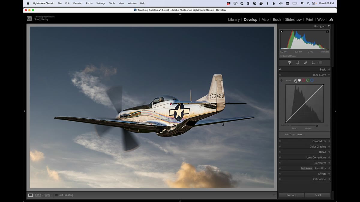
Scroll down past the Basic panel until you hit the Tone Curve panel. You’ll see it has two buttons at the top right of the panel that control which editing mode you’re working in. The one on the left looks like a small S-curve icon. Leave that one alone. Click the second button, the white square icon to its right. This switches you from the region-based sliders view to the Point Curve view, which gives you direct control over individual anchor points on the curve line. That direct control is what makes this whole technique work.
Tone Curve panel open below the Basic panel
Scroll down past the Basic panel until you hit the Tone Curve panel. You’ll see it has two buttons at the top right of the panel that control which editing mode you’re working in. The one on the left looks like a small S-curve icon. Leave that one alone. Click the second button, the white square icon to its right. This switches you from the region-based sliders view to the Point Curve view, which gives you direct control over individual anchor points on the curve line. That direct control is what makes this whole technique work.
Step 3: Start With a Built-In Preset to Understand the Range
 Point Curve dropdown showing contrast preset options
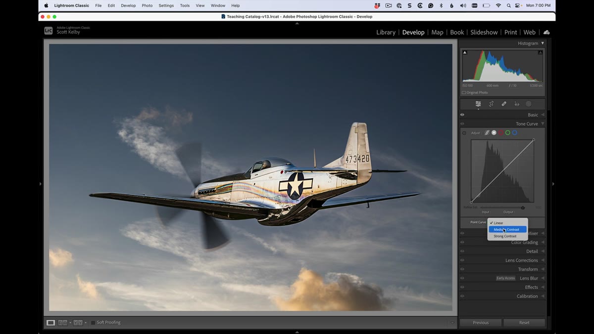
With the Point Curve view active, look for the dropdown menu at the bottom of the panel that likely reads “Linear” or “Custom.” Click it and you’ll see a short list of presets including Medium Contrast and Strong Contrast. Apply Medium Contrast first and look at your image. Then try Strong Contrast. These presets are useful reference points because they show you what a gentle S-curve and a moderate S-curve do to the image. Strong Contrast is already noticeably punchier than anything the Basic panel’s slider produces. But we’re not stopping here.
Point Curve dropdown showing contrast preset options
With the Point Curve view active, look for the dropdown menu at the bottom of the panel that likely reads “Linear” or “Custom.” Click it and you’ll see a short list of presets including Medium Contrast and Strong Contrast. Apply Medium Contrast first and look at your image. Then try Strong Contrast. These presets are useful reference points because they show you what a gentle S-curve and a moderate S-curve do to the image. Strong Contrast is already noticeably punchier than anything the Basic panel’s slider produces. But we’re not stopping here.
Step 4: Identify the Two Key Anchor Points on the Curve
 S-curve with two anchor points visible on the line
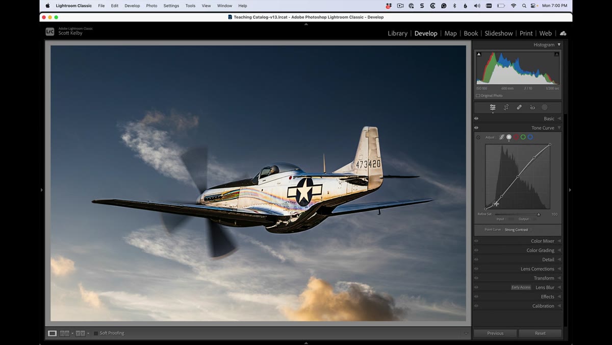
When you have Strong Contrast applied, look at the curve line on the graph. You’ll see two anchor points sitting on the diagonal, one in the upper portion of the curve and one in the lower portion. These two points define the shape of the S. The upper point controls how the highlights and upper midtones behave. The lower point controls the shadows and lower midtones. Everything about creating extraordinary contrast comes down to what you do with these two points next.
S-curve with two anchor points visible on the line
When you have Strong Contrast applied, look at the curve line on the graph. You’ll see two anchor points sitting on the diagonal, one in the upper portion of the curve and one in the lower portion. These two points define the shape of the S. The upper point controls how the highlights and upper midtones behave. The lower point controls the shadows and lower midtones. Everything about creating extraordinary contrast comes down to what you do with these two points next.
Step 5: Steepen the S by Dragging the Upper Point Up
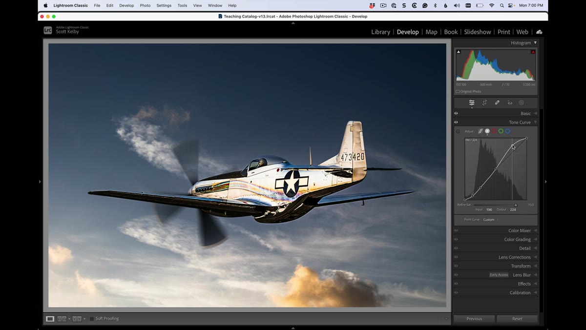 Upper anchor point being dragged upward on the curve
Click directly on the upper anchor point and drag it upward. Watch the image as you do this, not just the graph. You’ll see the highlights and brighter midtones push toward pure white, and the overall image starts to pop off the screen. The steeper this upper arm of the S becomes, the more aggressive the contrast gets in the lighter tonal range. Don’t worry about going too far right now. You can always pull back. The goal in this step is to feel the ceiling so you know your full range of motion.
Upper anchor point being dragged upward on the curve
Click directly on the upper anchor point and drag it upward. Watch the image as you do this, not just the graph. You’ll see the highlights and brighter midtones push toward pure white, and the overall image starts to pop off the screen. The steeper this upper arm of the S becomes, the more aggressive the contrast gets in the lighter tonal range. Don’t worry about going too far right now. You can always pull back. The goal in this step is to feel the ceiling so you know your full range of motion.
Step 6: Drag the Lower Point Down to Complete the S
 Lower anchor point being dragged downward on the curve
Now click the lower anchor point and drag it downward. This is the move that completes the S and does the heavy lifting in the shadows. As that lower arm steepens, the darker midtones and shadows compress toward pure black, which creates separation between tones that no amount of slider dragging can replicate. The visual result is an image that looks three-dimensional, where light sources feel genuinely bright and shadow areas feel genuinely deep. The steeper the S, the more dramatic the effect. Kelby demonstrates pushing this pretty far in the tutorial, enough that he calls it out himself as excessive, but seeing the extreme version is valuable. It shows you exactly what the tool can do.
Lower anchor point being dragged downward on the curve
Now click the lower anchor point and drag it downward. This is the move that completes the S and does the heavy lifting in the shadows. As that lower arm steepens, the darker midtones and shadows compress toward pure black, which creates separation between tones that no amount of slider dragging can replicate. The visual result is an image that looks three-dimensional, where light sources feel genuinely bright and shadow areas feel genuinely deep. The steeper the S, the more dramatic the effect. Kelby demonstrates pushing this pretty far in the tutorial, enough that he calls it out himself as excessive, but seeing the extreme version is valuable. It shows you exactly what the tool can do.
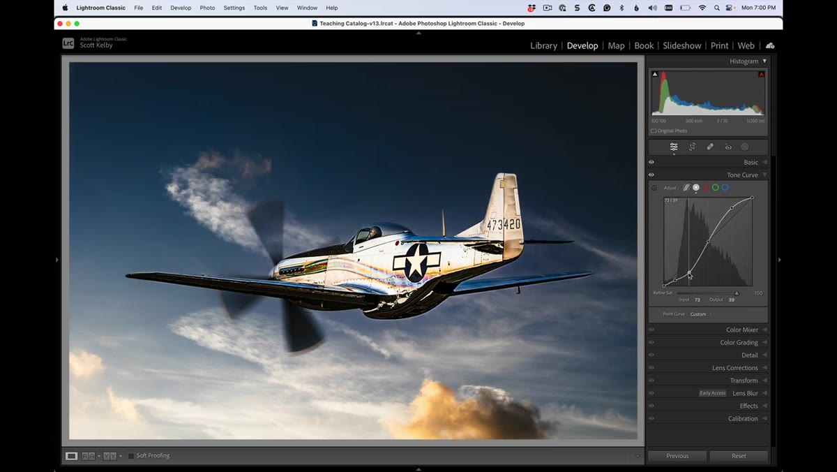
Step 7: Dial It Back to Taste
 Final curve applied with high-contrast image visible
Once you’ve seen the extreme, pull both points back toward their default positions until the image looks intentional rather than cooked. There’s no universal setting here. A moody portrait wants a different curve than a landscape shot at golden hour. The practical target is usually somewhere between the Strong Contrast preset and the most aggressive S you just built. Nudge the points gradually and check the histogram as you go. When the blacks are deep without clipping and the highlights still retain detail, you’re in the right neighborhood.
Final curve applied with high-contrast image visible
Once you’ve seen the extreme, pull both points back toward their default positions until the image looks intentional rather than cooked. There’s no universal setting here. A moody portrait wants a different curve than a landscape shot at golden hour. The practical target is usually somewhere between the Strong Contrast preset and the most aggressive S you just built. Nudge the points gradually and check the histogram as you go. When the blacks are deep without clipping and the highlights still retain detail, you’re in the right neighborhood.
A Note From My Own Editing Workflow
One thing Kelby doesn’t dig into in this short tip, but that I’ve found genuinely useful, is saving your custom S-curve as a named preset once you land on a shape you like. If you’ve dialed in an aggressive curve that works well for your concert shots or your street work, save it. I keep a handful of curve presets in my panel named after songs, which sounds ridiculous until you’re deep in a 200-photo edit and you just need the right starting point fast. The Point Curve panel has a “Save” option right in the same dropdown where you found the built-in presets. Use it.
One more thing worth knowing: this technique stacks with everything else in your develop workflow. Apply it after your basic exposure corrections, not before. The curve reads whatever tonal values already exist in the image, so if your exposure and white balance are already close, the S-curve has better raw material to work with.
The single most important thing I took from this tutorial is that the Contrast slider and the Tone Curve are not the same tool doing the same job at different strengths. They operate on different logic. The slider is a broad, automatic adjustment. The curve is a direct conversation with the tonal range of your specific image. When you need contrast that actually changes the character of a photograph, the curve is where that happens.
Watch the full tutorial on YouTube and see Scott Kelby walk through the before and after on a real image. It’s a short watch and the visual difference he demonstrates makes the technique click faster than any written description can.
Comments
Leave a Comment