Video Tutorials
The Black and White Formula I Keep Coming Back To (and How to Actually Make It Work)
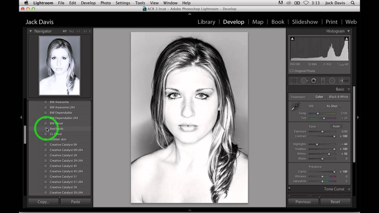
Most of my black and white conversions used to land in the same frustrating place: technically fine, emotionally flat. The tones were balanced, the histogram looked reasonable, and the image felt like a photocopy of something that should have been great. What was missing wasn’t drama exactly - it was depth. That particular quality you see in a well-printed darkroom photo where the shadows feel like you could fall into them.