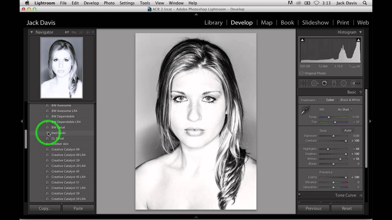
There’s a short list of things I tell every beginner who comes through my workshops: don’t max out your contrast slider, don’t crank clarity on a woman’s portrait, and don’t push highlights and shadows in opposite directions at the same time. Then I watched Jack Davis do all three of those things in a single edit, and the result looked incredible. That’s the kind of tutorial that makes you quietly question your own advice.
In this CreativeLive tutorial, Davis walks through a high-key black and white portrait edit that treats Lightroom’s tone panel like a hammer rather than a scalpel. It works, and once you understand why, you’ll see it’s not reckless at all. It’s deliberate. Watch the full tutorial on YouTube alongside this breakdown, or follow the steps below and come back to the video when you want to see Davis narrate it in his own words.
The core idea is this: black and white files have a structural advantage that color files don’t. When you push contrast hard in a color photo, you’re also pushing saturation, which muddies your image fast. In monochrome, that problem disappears. You get the tonal drama without the color blowout. That one insight is worth the price of the whole tutorial.
Step 1: Push Contrast to 100
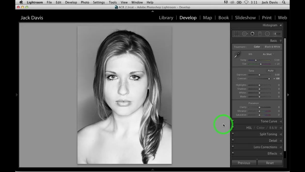 Contrast slider dragged to maximum in Lightroom’s Basic panel
Start by dragging the Contrast slider all the way to 100. In a color edit, I’d never do this. It would destroy the image. But Davis’s point here is precise: in black and white, maxing contrast only affects luminosity, not saturation. The file can handle it. Go ahead and commit. This is your foundation, and everything built on top of it depends on having this aggressive tonal base already in place.
Contrast slider dragged to maximum in Lightroom’s Basic panel
Start by dragging the Contrast slider all the way to 100. In a color edit, I’d never do this. It would destroy the image. But Davis’s point here is precise: in black and white, maxing contrast only affects luminosity, not saturation. The file can handle it. Go ahead and commit. This is your foundation, and everything built on top of it depends on having this aggressive tonal base already in place.
Step 2: Pull Highlights to -100
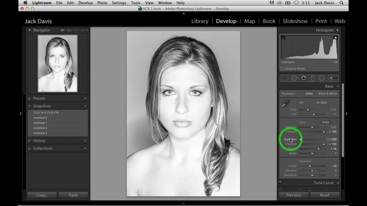
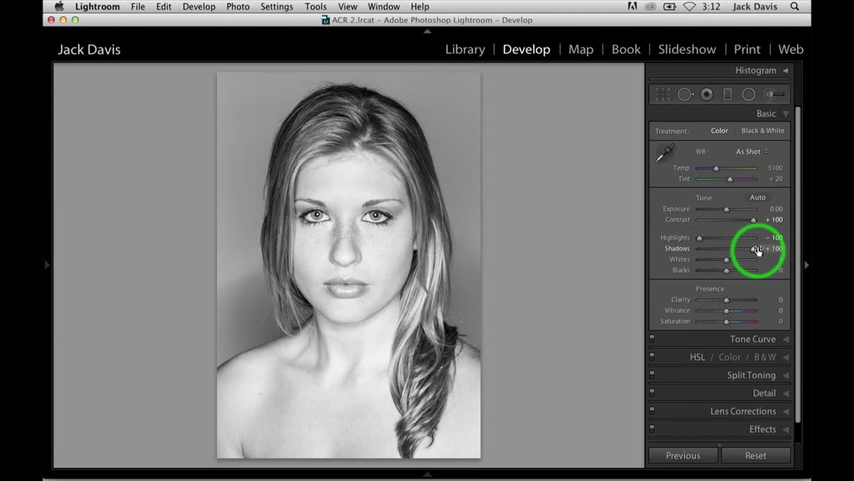 Highlights slider at negative 100 in the Basic panel
Drop your Highlights slider all the way to -100. The goal is to pull every recoverable detail back from the bright areas of the image. Davis frames this as telling Lightroom you want everything the file has to offer. Think of it as opening a negotiation with your raw data. You’re not clipping anything. You’re just demanding the full range. At this point the image might look muddy or flat. That’s fine. You’re building the edit in layers, not trying to make it look finished yet.
Highlights slider at negative 100 in the Basic panel
Drop your Highlights slider all the way to -100. The goal is to pull every recoverable detail back from the bright areas of the image. Davis frames this as telling Lightroom you want everything the file has to offer. Think of it as opening a negotiation with your raw data. You’re not clipping anything. You’re just demanding the full range. At this point the image might look muddy or flat. That’s fine. You’re building the edit in layers, not trying to make it look finished yet.
Step 3: Lift Shadows to +100
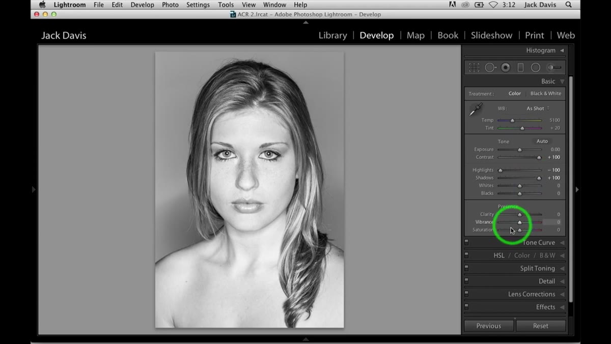 Shadows slider pushed to positive 100 alongside other extreme settings
Now push Shadows all the way to +100. Paired with the crushed highlights, this creates a massive tonal spread where detail is visible across nearly the entire luminosity range. Davis calls it greedy, and he’s right. You’re pulling the image in two directions at once. In most edits this would be a disaster. Here, with contrast already at maximum holding the structure together, it creates something that reads as hyper-detailed rather than flat. Check your clipping indicators. With a well-exposed raw file, you should still have headroom.
Shadows slider pushed to positive 100 alongside other extreme settings
Now push Shadows all the way to +100. Paired with the crushed highlights, this creates a massive tonal spread where detail is visible across nearly the entire luminosity range. Davis calls it greedy, and he’s right. You’re pulling the image in two directions at once. In most edits this would be a disaster. Here, with contrast already at maximum holding the structure together, it creates something that reads as hyper-detailed rather than flat. Check your clipping indicators. With a well-exposed raw file, you should still have headroom.
Step 4: Add Clarity at 100 (Yes, Really)
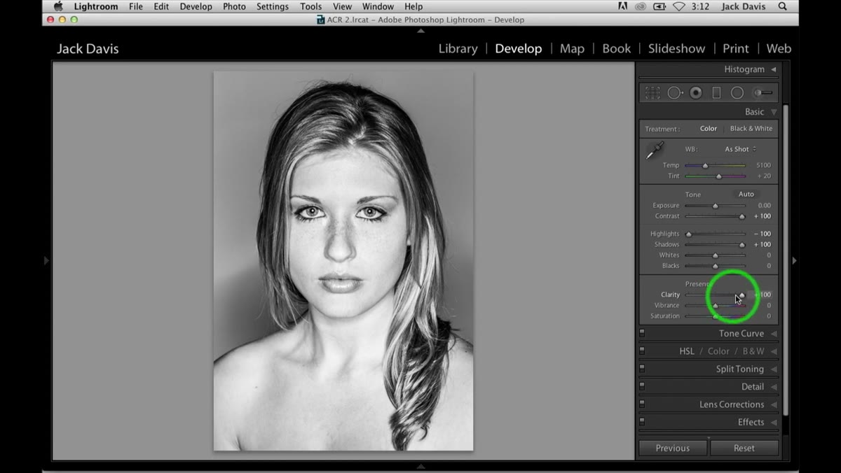 Clarity slider at 100 while portrait image shows strong midtone contrast
This is the step where Davis most directly challenges conventional wisdom. Clarity at 100 on a female portrait is the kind of thing that gets you roasted in photography forums. But Davis points out that because the dynamic range is already being managed so aggressively by the previous sliders, the image can absorb the clarity boost without turning the subject’s skin into a texture study. The clarity here adds punch to the midtones without the usual harshness because the highlights are already so dialed back. Try it. Use the clipping display to confirm nothing is blowing out. You’ll likely be surprised.
Clarity slider at 100 while portrait image shows strong midtone contrast
This is the step where Davis most directly challenges conventional wisdom. Clarity at 100 on a female portrait is the kind of thing that gets you roasted in photography forums. But Davis points out that because the dynamic range is already being managed so aggressively by the previous sliders, the image can absorb the clarity boost without turning the subject’s skin into a texture study. The clarity here adds punch to the midtones without the usual harshness because the highlights are already so dialed back. Try it. Use the clipping display to confirm nothing is blowing out. You’ll likely be surprised.
Step 5: Shape the Whites and Blacks to Taste
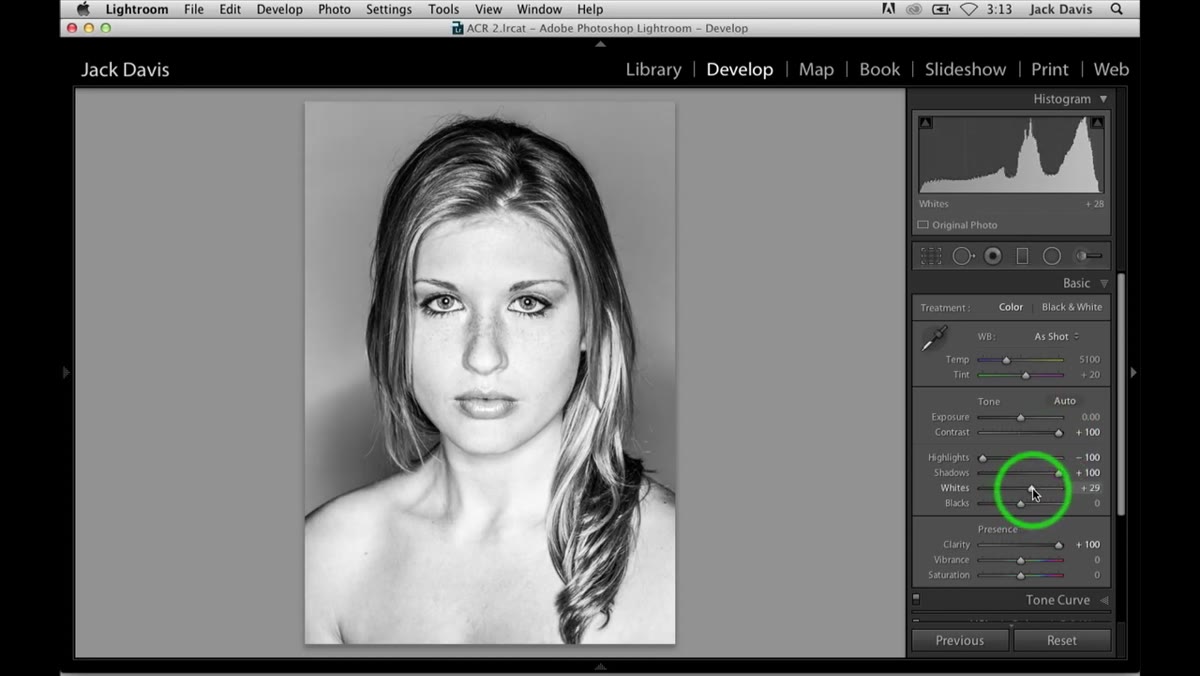 Whites and Blacks sliders being adjusted to refine tonal endpoints
With your big sliders locked in, now you do the fine work. Use the Whites slider to decide how much brightness you want at the bright end of your image. Davis acknowledges this is a taste call. Want that bleached, almost high-fashion look? Push whites up. Want to keep things moody and contained? Pull back. The Blacks slider works the same way from the other end. Nudging blacks down adds punch and separates the shadows. This is where the image stops feeling like an experiment and starts feeling like a finished photograph.
Whites and Blacks sliders being adjusted to refine tonal endpoints
With your big sliders locked in, now you do the fine work. Use the Whites slider to decide how much brightness you want at the bright end of your image. Davis acknowledges this is a taste call. Want that bleached, almost high-fashion look? Push whites up. Want to keep things moody and contained? Pull back. The Blacks slider works the same way from the other end. Nudging blacks down adds punch and separates the shadows. This is where the image stops feeling like an experiment and starts feeling like a finished photograph.
Step 6: Reduce Sharpness for a Radiant, Soft Look
 Sharpening slider being pulled down for a soft watercolor-style effect
Here’s the counterintuitive move that ties the whole edit together. Because you’ve built so much tonal contrast and clarity into the file, you can actually reduce sharpening below your default and get a soft, almost luminous quality that Davis calls a watercolor effect. Normally, pulling sharpness back makes a portrait look like a mistake. Here, the underlying contrast holds the structure of the image while the softness gives it an almost cinematic glow. Try dropping your Amount in the Detail panel down significantly and compare. The image doesn’t fall apart. It breathes.
Sharpening slider being pulled down for a soft watercolor-style effect
Here’s the counterintuitive move that ties the whole edit together. Because you’ve built so much tonal contrast and clarity into the file, you can actually reduce sharpening below your default and get a soft, almost luminous quality that Davis calls a watercolor effect. Normally, pulling sharpness back makes a portrait look like a mistake. Here, the underlying contrast holds the structure of the image while the softness gives it an almost cinematic glow. Try dropping your Amount in the Detail panel down significantly and compare. The image doesn’t fall apart. It breathes.
Step 7: Add a Vignette to Direct the Eye
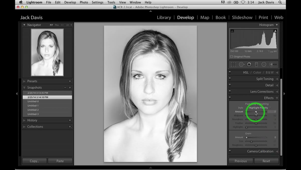 Post-crop vignetting panel open with amount slider being adjusted
Davis uses post-crop vignetting to finish the look, and he gives you two directions to try. A dark vignette, pulling the Amount slider into negative values, draws the viewer’s eye to the subject’s face and creates a dramatic, intimate feel. A light vignette, pushing Amount into positive values, lifts the edges and gives the image a bright, airy quality that reads completely differently. Davis saves both as snapshots to compare. Do the same. The dark version gives you a serious, high-contrast editorial look. The light version is softer and more flattering. Neither is wrong.
Post-crop vignetting panel open with amount slider being adjusted
Davis uses post-crop vignetting to finish the look, and he gives you two directions to try. A dark vignette, pulling the Amount slider into negative values, draws the viewer’s eye to the subject’s face and creates a dramatic, intimate feel. A light vignette, pushing Amount into positive values, lifts the edges and gives the image a bright, airy quality that reads completely differently. Davis saves both as snapshots to compare. Do the same. The dark version gives you a serious, high-contrast editorial look. The light version is softer and more flattering. Neither is wrong.
What I’d Add From My Own Experience
The thing Davis doesn’t say explicitly, but which becomes obvious when you run this workflow a few times, is that it’s highly dependent on your starting exposure. If your raw file is underexposed, pushing shadows to +100 and highlights to -100 will reveal noise and posterization you can’t easily fix afterward. I’ve found this technique works best with portraits shot in soft, even light where the histogram is already reasonably centered. I’ve also started using it as a test edit: if the image handles these extreme settings without falling apart, the underlying file is solid. If it breaks, that tells me something important about how it was captured. It’s become one of my standard quality checks before I commit to a full edit on a portrait session.
The single most important thing Davis demonstrates here is that black and white editing earns you freedoms that color editing doesn’t. Sliders that would wreck a color photo can sculpt a monochrome image in ways that feel bold rather than broken. Once you internalize that, your whole approach to B&W portraits changes.
Watch the full tutorial on YouTube to see Davis work through the edit in real time and hear his reasoning as he makes each move.
Comments (2)
This is going in my reference folder. Incredibly useful.
This should be required reading for anyone starting out.
Leave a Comment