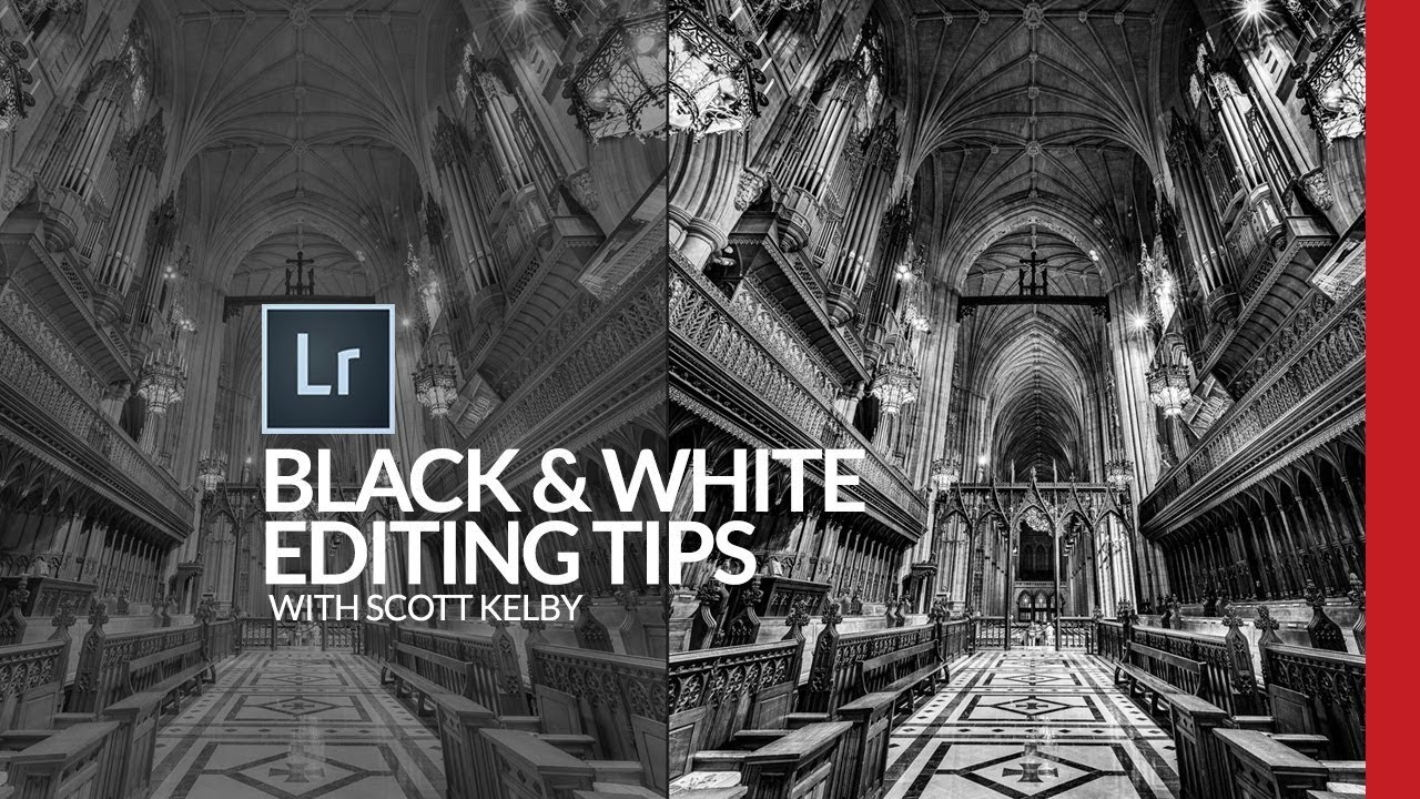
Most of my black and white conversions used to live in a frustrating middle ground. Not bad enough to delete, not good enough to post. I’d desaturate, bump contrast, call it done. The results looked like a color photo that had given up rather than a deliberate black and white image. It wasn’t until I started paying closer attention to the Profile Browser in Lightroom Classic that things clicked, and this Scott Kelby tutorial on black and white conversion is the clearest breakdown I’ve seen of exactly how to use it. Watch the full tutorial on YouTube
What makes Kelby’s approach useful is that it’s genuinely sequential. Each step builds on the last, and there’s no mystical “develop your eye” advice. He works through a cathedral interior shot, which is exactly the kind of high-contrast architectural scene where a thoughtful black and white conversion pays off. I’ve borrowed this workflow for everything from band portraits to live music shots, and it holds up across subjects.
The other thing worth saying upfront: this is a finishing workflow, not a one-click solution. You’re layering small adjustments, and the cumulative effect is what separates a polished black and white from a flat one.
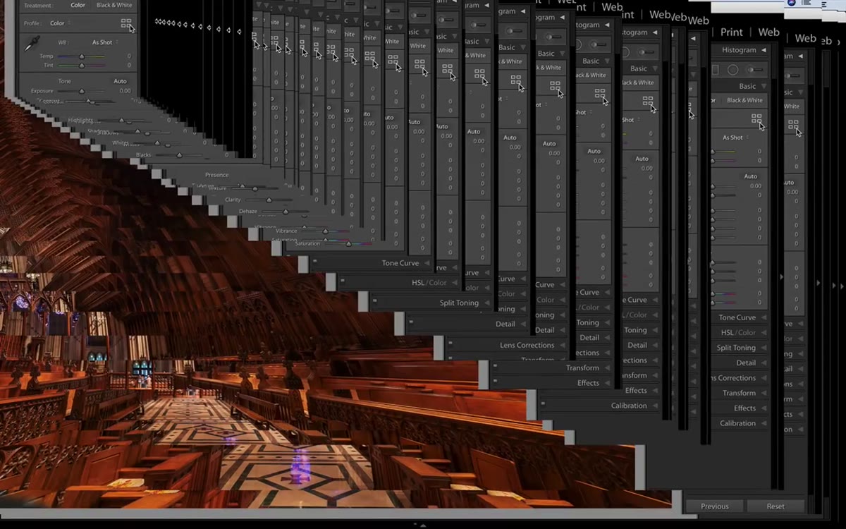
Step 1: Open the Profile Browser and Browse the B&W Presets
 Profile Browser open showing B&W thumbnail grid in Lightroom
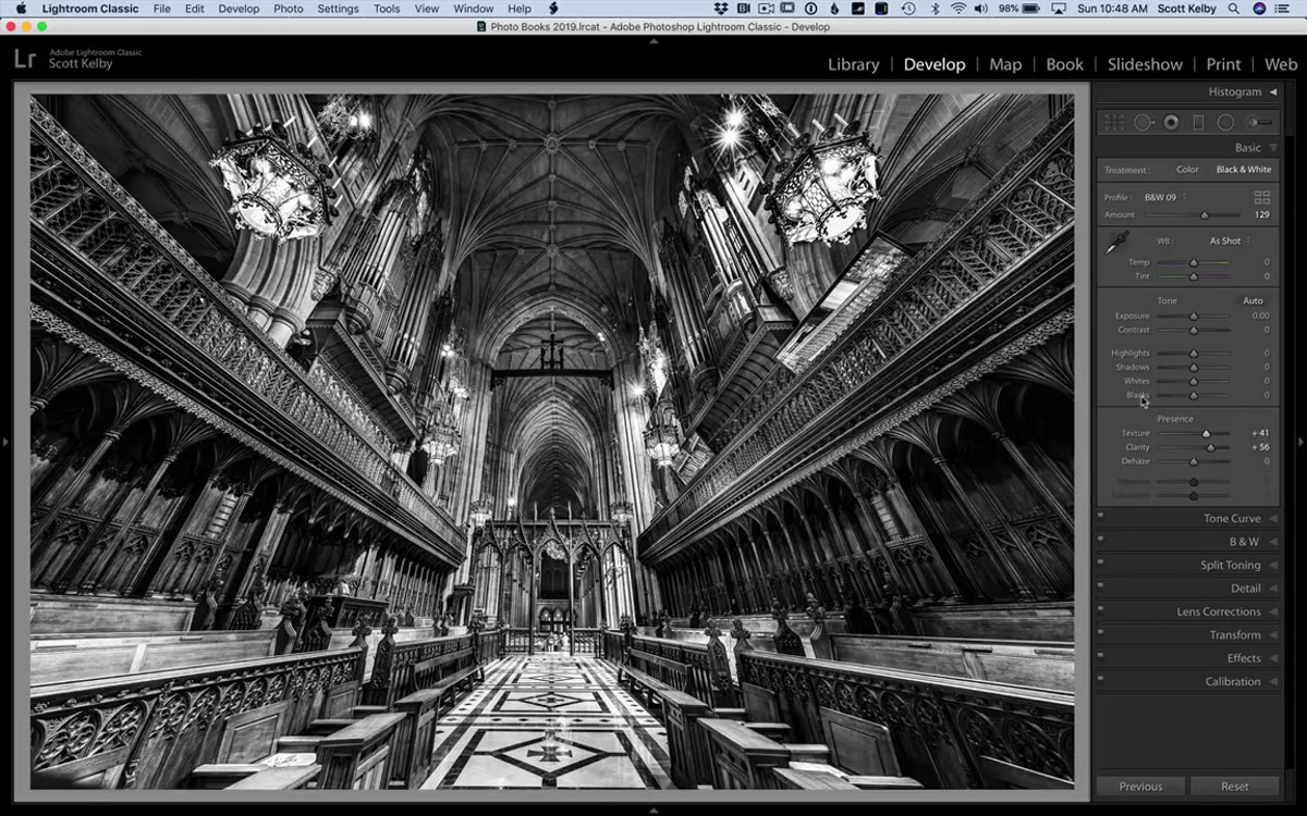
In Lightroom Classic, look to the right of the word “Profile” in the Basic panel. You’ll see four small rectangles. Click those to open the Profile Browser. Scroll down until you find the B&W section, which gives you 17 different starting profiles to choose from. These aren’t filters in the Instagram sense. They’re more like film stock simulations, each one shifting tonal relationships in a different way before you touch a single slider.
Profile Browser open showing B&W thumbnail grid in Lightroom
In Lightroom Classic, look to the right of the word “Profile” in the Basic panel. You’ll see four small rectangles. Click those to open the Profile Browser. Scroll down until you find the B&W section, which gives you 17 different starting profiles to choose from. These aren’t filters in the Instagram sense. They’re more like film stock simulations, each one shifting tonal relationships in a different way before you touch a single slider.
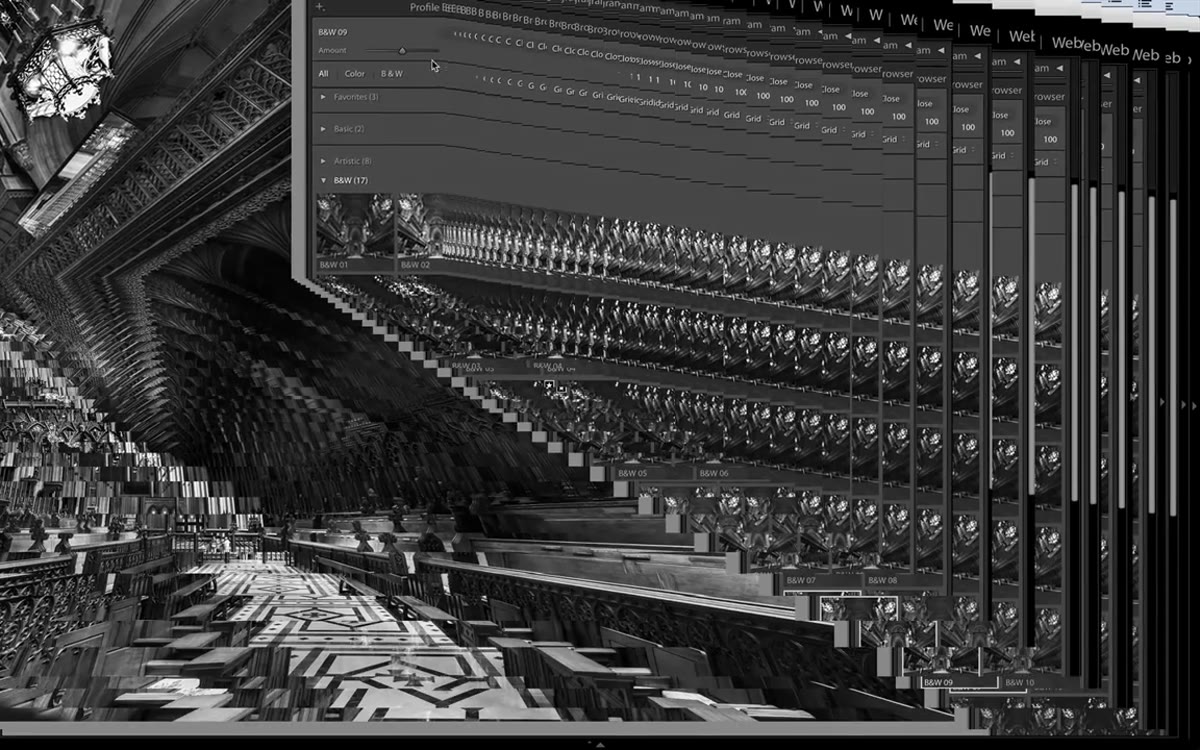
Hover your cursor over each thumbnail and watch your image update in real time. Kelby settles on B&W 09 for his cathedral image because it suits the intentionally dark mood he’s going for. Don’t treat this as a shortcut you’ll refine later. Spend a minute here. The profile you choose determines the tonal foundation for everything that follows.
Step 2: Use the Amount Slider to Dial In the Intensity
 Amount slider beneath profile thumbnail being adjusted
Once you’ve selected a profile, don’t close the Profile Browser yet. There’s an Amount slider directly beneath the selected thumbnail that most people miss entirely. Dragging it left softens the effect of the profile. Dragging it right intensifies it. In a high-contrast black and white, this slider often behaves like a contrast control, compressing or expanding the midtone range depending on which direction you push it.
Amount slider beneath profile thumbnail being adjusted
Once you’ve selected a profile, don’t close the Profile Browser yet. There’s an Amount slider directly beneath the selected thumbnail that most people miss entirely. Dragging it left softens the effect of the profile. Dragging it right intensifies it. In a high-contrast black and white, this slider often behaves like a contrast control, compressing or expanding the midtone range depending on which direction you push it.
Kelby keeps this subtle rather than cranking it to the extreme, which is the right instinct. I’d recommend toggling between the original and your adjusted version a few times before locking it in. Once you’re satisfied, close the Profile Browser and move into the Basic panel.
Step 3: Add Clarity and Texture
 Clarity and Texture sliders being adjusted in the Basic panel
This is where black and white images gain presence. Clarity works on midtone contrast, making edges feel more defined without blowing out highlights or crushing shadows. Texture is a newer slider that operates at a finer level of detail, great for pulling out fabric, stone, skin, or any surface that benefits from visible structure.
Clarity and Texture sliders being adjusted in the Basic panel
This is where black and white images gain presence. Clarity works on midtone contrast, making edges feel more defined without blowing out highlights or crushing shadows. Texture is a newer slider that operates at a finer level of detail, great for pulling out fabric, stone, skin, or any surface that benefits from visible structure.
For an architectural subject like a cathedral, Kelby pushes both of these upward. I do the same thing with live concert shots because stage lighting flattens texture fast. A word of caution: Clarity in particular gets harsh quickly on portraits. Go slower there. For architecture, landscapes, or anything with strong geometric lines, you have more room to push.
Step 4: Set the White Point and Black Point
 Whites and Blacks labels being shift-double-clicked in Basic panel
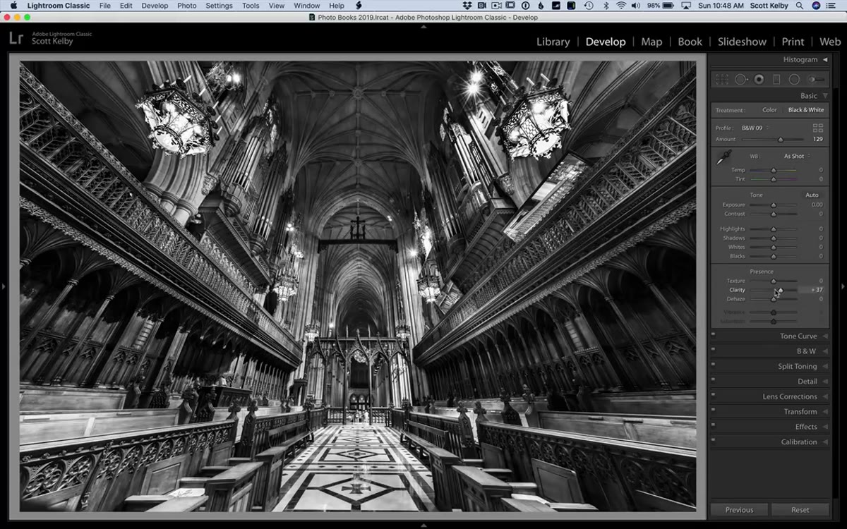
Hold Shift and double-click the word “Whites” in the Basic panel. Lightroom will automatically set the white point to the optimal value for your image. Do the same with the word “Blacks.” This auto-clipping method is fast and accurate, and Kelby points out honestly that for his image the black point adjustment didn’t do much because the image was already sitting where it needed to be. That’s fine. Let the tool make the call and move on.
Whites and Blacks labels being shift-double-clicked in Basic panel
Hold Shift and double-click the word “Whites” in the Basic panel. Lightroom will automatically set the white point to the optimal value for your image. Do the same with the word “Blacks.” This auto-clipping method is fast and accurate, and Kelby points out honestly that for his image the black point adjustment didn’t do much because the image was already sitting where it needed to be. That’s fine. Let the tool make the call and move on.
After that, nudge the Contrast slider up a small amount. This is a different kind of contrast adjustment than what the profile is doing. It’s affecting the overall tonal curve rather than the profile’s internal tonal mapping. Even a small move here adds punch.
Step 5: Apply a Subtle Vignette in the Effects Panel
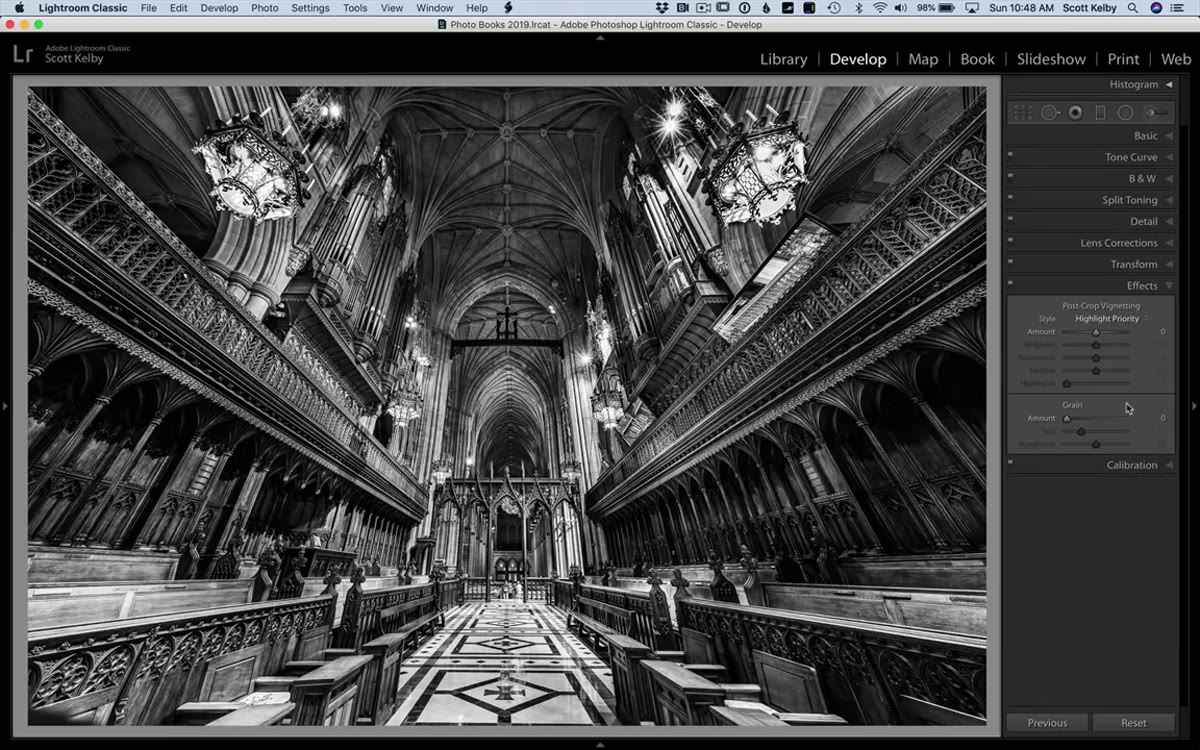 Post Crop Vignetting slider being moved to minus 11 in Effects panel
Scroll down to the Effects panel and find Post Crop Vignetting. Kelby’s go-to value is -11, and he’s not exaggerating when he calls it subtle. At that setting, you won’t look at the image and think “someone added a vignette.” But toggle it on and off and you’ll immediately feel the difference. The edges soften, the center draws your eye, and the image feels more contained.
Post Crop Vignetting slider being moved to minus 11 in Effects panel
Scroll down to the Effects panel and find Post Crop Vignetting. Kelby’s go-to value is -11, and he’s not exaggerating when he calls it subtle. At that setting, you won’t look at the image and think “someone added a vignette.” But toggle it on and off and you’ll immediately feel the difference. The edges soften, the center draws your eye, and the image feels more contained.
I’ve landed on -13 as my own default for most images, named it after a Wilco track in my preset pack for reasons I won’t fully justify here. The point is: this is a finishing move, not a statement. Keep it restrained.
Step 6: Compare Against the Post-Conversion State Using History
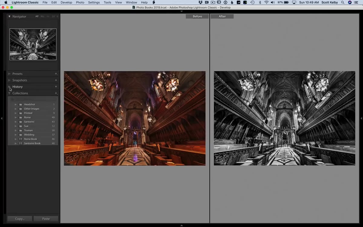 History panel open with right-click menu showing Copy as Before State option
This is the step most tutorials skip and it’s one of the smartest things in Kelby’s workflow. Instead of pressing Y to get a before/after view of the color original versus your black and white, open the History panel and find the moment in your history where you first applied the black and white profile. Right-click that step and choose “Copy as Before State.” Now when you toggle the before/after view with Y, you’re comparing the just-converted version to your fully finished version, which is the comparison that actually matters.
History panel open with right-click menu showing Copy as Before State option
This is the step most tutorials skip and it’s one of the smartest things in Kelby’s workflow. Instead of pressing Y to get a before/after view of the color original versus your black and white, open the History panel and find the moment in your history where you first applied the black and white profile. Right-click that step and choose “Copy as Before State.” Now when you toggle the before/after view with Y, you’re comparing the just-converted version to your fully finished version, which is the comparison that actually matters.
Step 7: Sharpen in the Detail Panel
 Detail panel open with Sharpening Amount slider being increased
As a final step, go to the Detail panel and bring up the Sharpening Amount. Kelby notes that his source image was a JPEG, which affects how aggressively you can sharpen. For RAW files, you have more latitude. Start around 60-80 and hold Alt (Option on Mac) while dragging the slider to see a grayscale preview of exactly where the sharpening is being applied. Pull back if you see noise amplifying in flat areas.
Detail panel open with Sharpening Amount slider being increased
As a final step, go to the Detail panel and bring up the Sharpening Amount. Kelby notes that his source image was a JPEG, which affects how aggressively you can sharpen. For RAW files, you have more latitude. Start around 60-80 and hold Alt (Option on Mac) while dragging the slider to see a grayscale preview of exactly where the sharpening is being applied. Pull back if you see noise amplifying in flat areas.
One Thing I’d Add: The HSL Panel Isn’t Gone
When you convert to black and white in Lightroom, the HSL panel becomes the B&W panel, and it’s worth visiting before you close out. Those color channel sliders now control how luminous each original color appears in the grayscale conversion. If your subject wore a red shirt and it’s blending into a red-brick background, pulling the Red slider in opposite directions for each region using the targeted adjustment tool separates them instantly. Kelby doesn’t cover this in the tutorial, but it pairs naturally with his workflow and gives you tonal control that no amount of Clarity or Contrast adjustment can replicate.
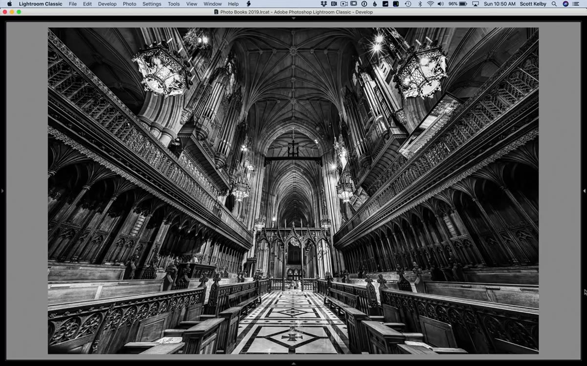
The single most important thing I took from Kelby’s approach is the Amount slider in the Profile Browser. I walked past it for years. It’s not dramatic, but it’s the difference between a profile that fits your image and one that overwhelms it. Start there, layer the rest methodically, and your black and white conversions will stop looking like desaturated color photos.
Watch the full tutorial on YouTube to see Kelby work through the cathedral image in real time.
Comments
Leave a Comment