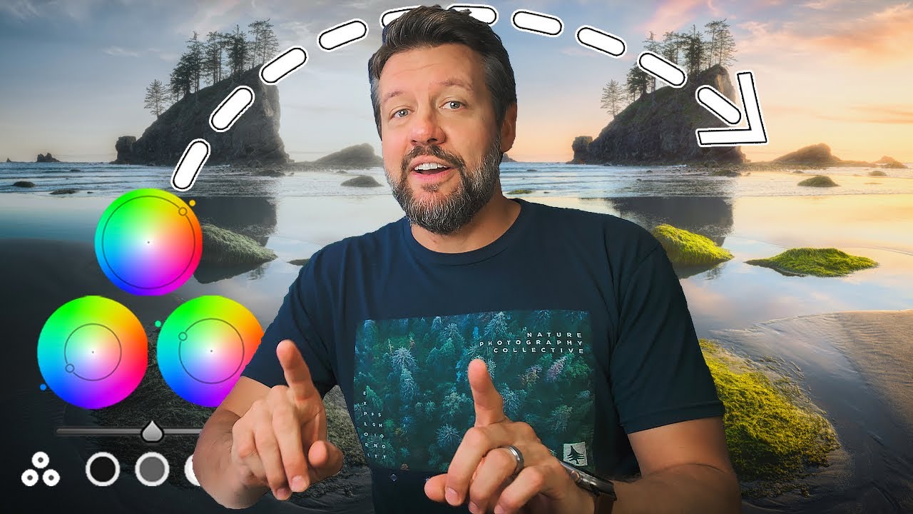
There’s a specific kind of photographer envy I used to feel scrolling through Instagram at 11pm. Someone’s got this molten, cinematic sunset over a mountain range, and I’m sitting there wondering what national park gods they sacrificed to. Turns out, a lot of those images aren’t about luck at all. They’re about knowing what Lightroom’s color grading panel can actually do when you stop treating it like a novelty and start using it like a precision tool.
In this Mark Denney tutorial on landscape color grading, he walks through a technique that transforms a perfectly decent sunset photo from Olympic National Park into something that genuinely looks like the sky caught fire. Watch the full tutorial on YouTube if you want to follow along with his exact image. But if you want a breakdown you can actually reference while you’re editing your own shots, keep reading, because I’ve pulled the core technique apart step by step.
The color grading panel is one of those features I see people skip constantly. They’ll spend 20 minutes in the HSL panel nudging individual hues and completely ignore the three color wheels sitting right above it. Once this clicked for me, I rebuilt half my preset library around it. Here’s how to use it the way Mark does.
Step 1: Enable Solo Mode in the Develop Panel
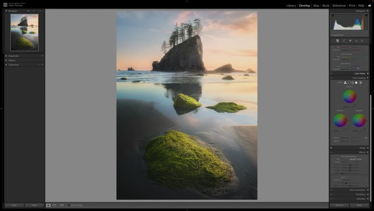 Right-click menu open showing Solo Mode option
Before touching a single slider, do yourself a favor and right-click anywhere in the right-side panel column in Lightroom’s Develop module. A small menu will appear. Select “Solo Mode.” This setting means only one panel can stay open at a time. Open Color Grading and the Tone Curve collapses automatically. Open Basic and everything else folds away.
Right-click menu open showing Solo Mode option
Before touching a single slider, do yourself a favor and right-click anywhere in the right-side panel column in Lightroom’s Develop module. A small menu will appear. Select “Solo Mode.” This setting means only one panel can stay open at a time. Open Color Grading and the Tone Curve collapses automatically. Open Basic and everything else folds away.
It sounds minor, but if you’re the kind of editor who has eight panels open and scrolls endlessly looking for the one slider you need, this is genuinely a quality-of-life upgrade. I wish someone had shown me this years ago. It takes about three seconds to enable and saves real mental overhead during longer editing sessions.
Step 2: Open the Color Grading Panel
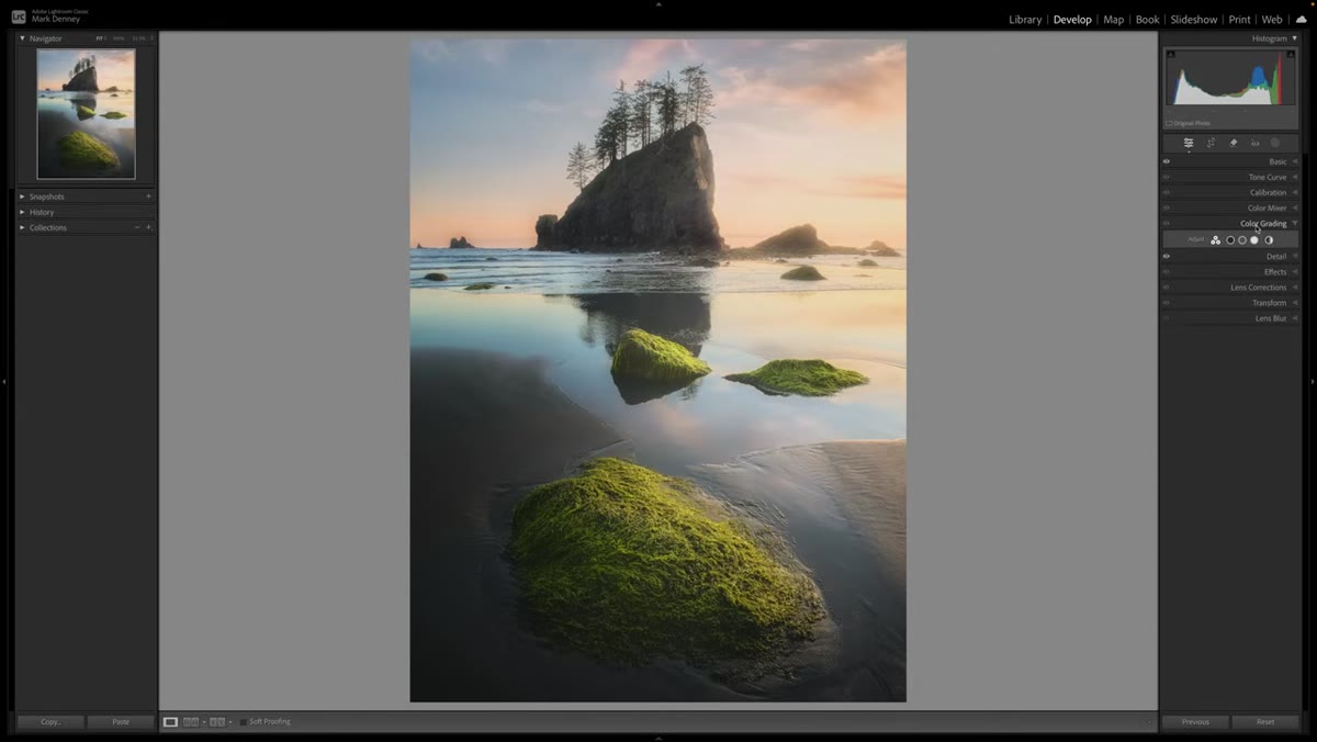 Color Grading section showing three color wheels
With Solo Mode active, click to open Color Grading. You’ll see three circular color wheels labeled Shadows, Midtones, and Highlights, plus a fourth Global wheel. If you don’t see this panel at all, right-click in the panel area and choose “Customize Develop Panel,” then make sure Color Grading is checked.
Color Grading section showing three color wheels
With Solo Mode active, click to open Color Grading. You’ll see three circular color wheels labeled Shadows, Midtones, and Highlights, plus a fourth Global wheel. If you don’t see this panel at all, right-click in the panel area and choose “Customize Develop Panel,” then make sure Color Grading is checked.
The core concept here is simple: each wheel lets you push a color tint into a specific tonal range of your image. Shadows get one color, midtones another, highlights a third. Think of it as painting light with a very controlled brush. The magic in landscape work comes from how these tonal zones interact with real-world light sources like a setting sun.
Step 3: Select the Highlights Wheel
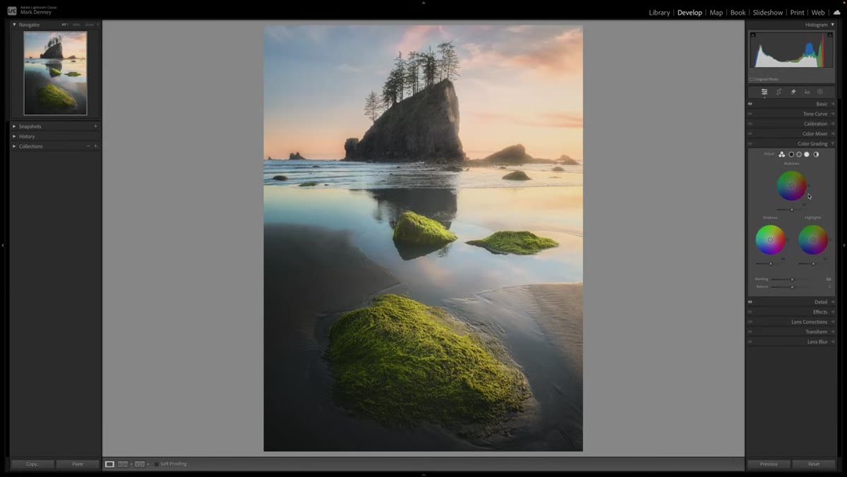 Highlights color wheel selected and active
Click the Highlights icon, which is the second of the three small icons above the wheels that lets you isolate just that wheel at full size. This is where most of the sunset technique lives. The highlights in a golden hour image are your sky, your sun flare, the bright edges of clouds. Pushing color into this zone has an outsized visual impact because it’s where your viewer’s eye goes first.
Highlights color wheel selected and active
Click the Highlights icon, which is the second of the three small icons above the wheels that lets you isolate just that wheel at full size. This is where most of the sunset technique lives. The highlights in a golden hour image are your sky, your sun flare, the bright edges of clouds. Pushing color into this zone has an outsized visual impact because it’s where your viewer’s eye goes first.
Mark works here intentionally rather than dragging the wheel dot randomly. The direction you move the center point on the wheel determines the color cast. Toward orange-yellow for warmth, toward blue for cool tones, toward magenta for a more dramatic editorial look.
Step 4: Use the Eyedropper to Sample Color from the Scene
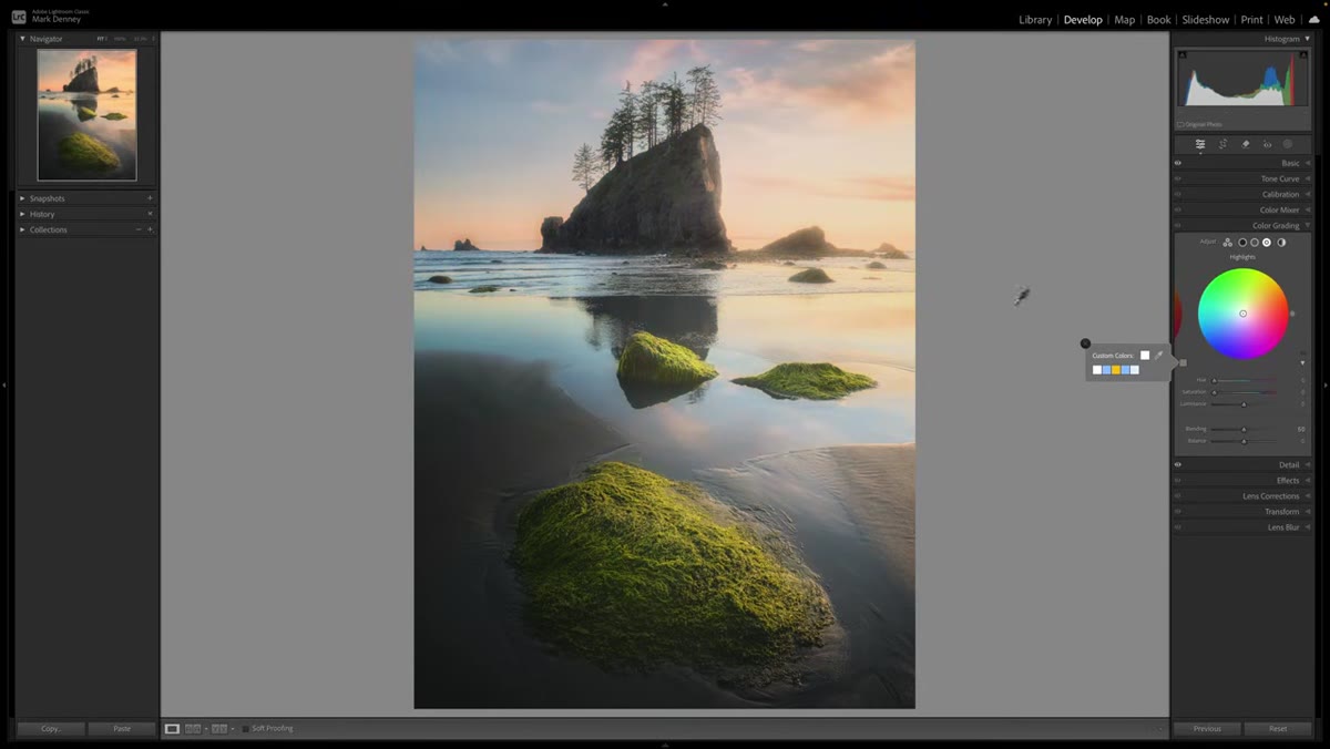 Eyedropper being dragged across the image scene
Here’s where the technique gets elegant. Instead of guessing at a color, click and hold the eyedropper tool inside the color wheel, then drag it directly over your photo. As you move across the image, the wheel’s center point follows the hue of whatever you’re hovering over.
Eyedropper being dragged across the image scene
Here’s where the technique gets elegant. Instead of guessing at a color, click and hold the eyedropper tool inside the color wheel, then drag it directly over your photo. As you move across the image, the wheel’s center point follows the hue of whatever you’re hovering over.
This means you can sample the warmest part of your actual sunset sky and apply that exact color to your highlights. You’re not inventing a color. You’re amplifying one that’s already there. The result reads as natural to a viewer because it literally is pulled from the photograph. For a scene with a blue-tinted horizon, you can drag to that cooler zone and push that tone into the highlights instead. The eyedropper makes the wheel reactive to your specific image rather than generic.
Step 5: Adjust the Luminance Slider Below the Wheel
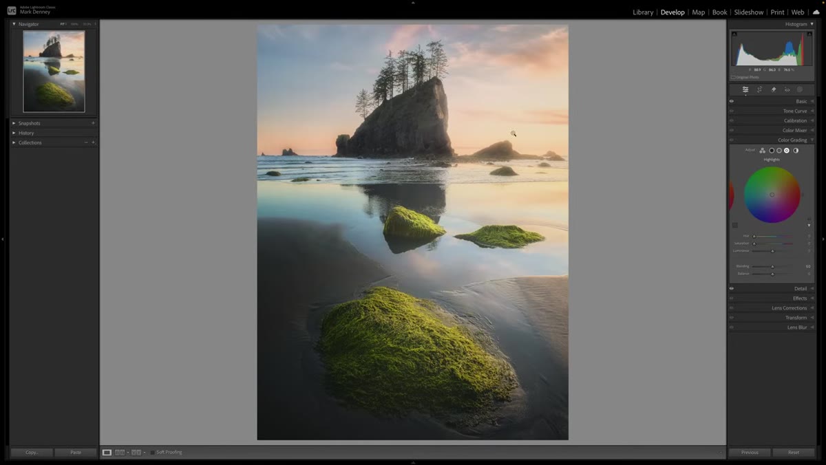 Luminance slider beneath the color wheel
Each color wheel has a Luminance slider running below it, and this one gets overlooked constantly. Luminance controls how bright or dark that tonal range becomes after you apply the color shift. Pushing the Highlights luminance up will make your sky feel more blown out and dreamy. Pulling it down adds drama and density.
Luminance slider beneath the color wheel
Each color wheel has a Luminance slider running below it, and this one gets overlooked constantly. Luminance controls how bright or dark that tonal range becomes after you apply the color shift. Pushing the Highlights luminance up will make your sky feel more blown out and dreamy. Pulling it down adds drama and density.
For a sunset image, a subtle lift here, maybe 5 to 15 points, keeps the warmth feeling airy rather than muddy. Go too far and the highlights look overcooked. This slider is the difference between a color grade that enhances the light and one that replaces it with something that looks filtered.
Step 6: Add a Complementary Tone to the Shadows
 Shadows color wheel being adjusted
Once the highlights are warm and punchy, switch to the Shadows wheel. A classic technique in cinematography and landscape editing is to push shadows in the opposite direction of your highlights. Warm highlights pair naturally with cool blue-teal shadows. This split-toning effect adds depth and makes the image feel three-dimensional.
Shadows color wheel being adjusted
Once the highlights are warm and punchy, switch to the Shadows wheel. A classic technique in cinematography and landscape editing is to push shadows in the opposite direction of your highlights. Warm highlights pair naturally with cool blue-teal shadows. This split-toning effect adds depth and makes the image feel three-dimensional.
Keep the shadow tint subtle. The center dot on the wheel doesn’t need to move far. Even a 10-15% shift toward blue or teal in the shadows will add visual separation without making your foreground look like a completely different photograph. The goal is contrast between tonal zones, not color chaos.
What I’d Add From My Own Editing Practice
Mark’s technique is clean and teachable, and I use a version of it on almost every golden hour landscape I edit. One thing I’ve layered on top of it: after dialing in the color wheels, I bring the Tone Curve’s blue channel down slightly in the shadows. This deepens the shadow color without muddying the midtones, and it interacts really nicely with the Color Grading work underneath.
I’ve also found that this approach works differently depending on your white balance starting point. If your white balance is sitting too cool coming out of camera, the warm highlight push from color grading can look artificial. Get your white balance in the right neighborhood in the Basic panel first, then use color grading to sculpt and enhance rather than correct. Color grading is seasoning, not the main dish.
The biggest shift in my landscape editing happened when I stopped treating color grading as an afterthought at the end of a session. It’s not a finishing touch. It’s where mood gets built. Mark’s tutorial makes that case better than almost anything else I’ve seen on the subject, and it’s worth watching in full to see how the technique lands on an actual image.
Watch the full tutorial on YouTube and pay attention to how he sequences the wheels. The order matters more than most people realize, and seeing it in motion will make everything above land more concretely.
Comments (3)
This saved me so much time on my last edit. Wish I'd found this sooner.
Would love to see a follow-up going deeper into this topic.
This is fantastic. I've been recommending this approach to my readers too.
Leave a Comment