Plan the Shot, Then Let It Go: What a Canyon Waterfall Taught Me About Color Grading

Plan the Shot, Then Let It Go: What a Canyon Waterfall Taught Me About Color Grading

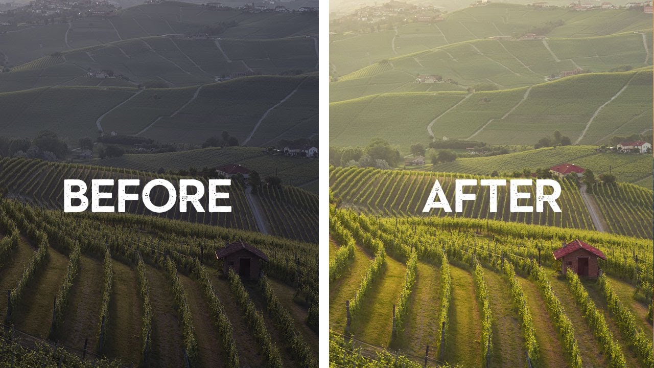
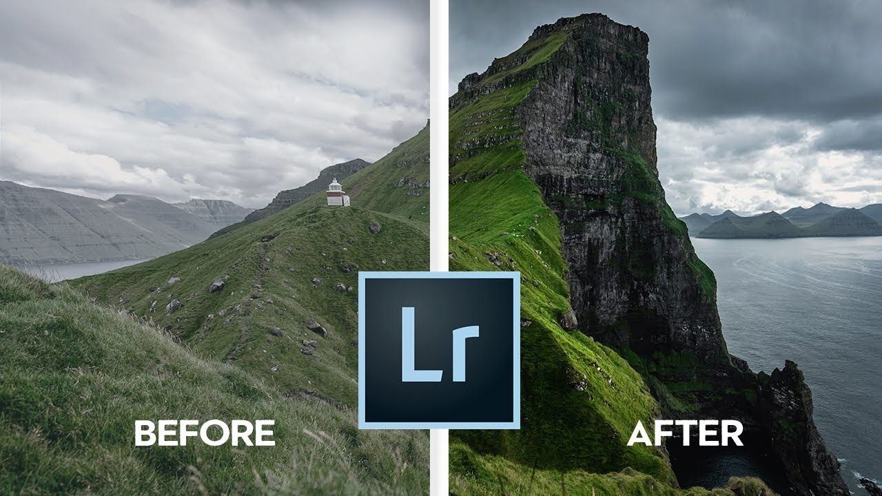
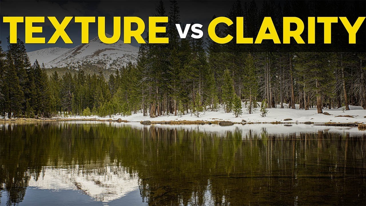
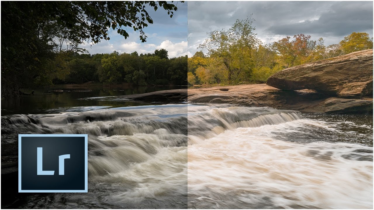
There’s a specific kind of frustration I know well: standing in front of a stunning location, firing off a solid technical shot, and then opening Lightroom later only to feel like something is just… missing. The image is fine. But fine isn’t why you drove two hours into a canyon. That gap between “technically correct” and “actually feels like the place” is where color grading lives, and it’s also the exact problem William Patino sets out to solve in this tutorial on shooting and editing a canyon waterfall.

Lightroom's Book Module Just Got a Lot Less Annoying — Here's What's New

Lightroom's Book Module Just Got a Lot Less Annoying — Here's What's New

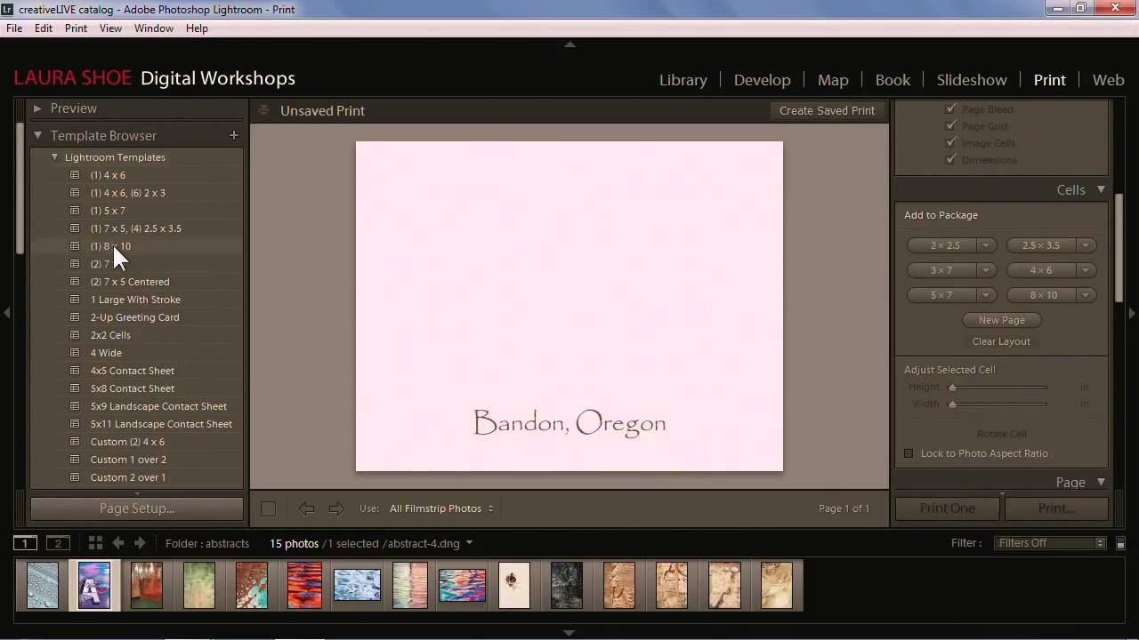
Photo books have always been one of those Lightroom features I wanted to love but kept abandoning halfway through. The cell-based layout system felt like it was designed by someone who had never actually tried to build a visually interesting spread under deadline pressure. I’d drag a cell, watch it snap somewhere useless, try to nudge it, and eventually just export everything to InDesign and move on with my life.

The Mobile-to-Desktop Lightroom Workflow That Actually Works for Travel Photographers

The Mobile-to-Desktop Lightroom Workflow That Actually Works for Travel Photographers

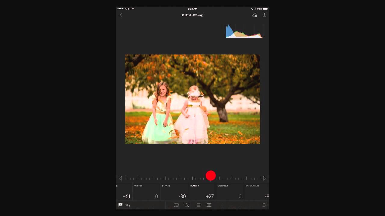
There is one workflow problem that used to wreck me every time I came home from a trip. My phone camera roll is a disaster of food photos, screenshots, and actual keepers all jumbled together. My Sony files are sitting on a card. And somewhere between those two worlds is a batch of photos I genuinely care about, waiting to get lost or forgotten. For a while my solution was “deal with it later,” which, as any photographer knows, is code for “never deal with it.

How to Fake a 35mm Film Look in Lightroom Using a Masked Gradient (Peter McKinnon's Best Trick)

How to Fake a 35mm Film Look in Lightroom Using a Masked Gradient (Peter McKinnon's Best Trick)

There’s a specific problem I kept running into with digital photos that were supposed to feel vintage. I’d pile on the grain, drop the contrast, pull back the clarity, and the result still looked like a digital photo wearing a Halloween costume. Something was off. The scene felt sharp in a way that film never is, too evenly exposed, too present. It took me longer than I’d like to admit to figure out what was missing, and honestly, the answer was sitting in a Lightroom panel I was already using for other things.

Fix a Flat, Boring Photo in Lightroom: Scott Kelby's Intermediate Workflow, Step by Step

Fix a Flat, Boring Photo in Lightroom: Scott Kelby's Intermediate Workflow, Step by Step

There’s a specific kind of photo I used to dread editing. Not a disaster shot, not a total throwaway, but the mediocre middle-ground image. Flat light, a blown highlight somewhere it shouldn’t be, colors that look like they were processed through a wet sock. The kind of file where you open it in Lightroom, stare at it for thirty seconds, and then go make coffee instead. I’ve got a whole folder of those from the early years, back when I was editing press photos for my band because nobody else was going to do it.

Lightroom (Not Classic) Finally Does What Bridge Never Could — Here's What Changed

Lightroom (Not Classic) Finally Does What Bridge Never Could — Here's What Changed

I’ll be honest with you. For years I told anyone who asked that Lightroom Classic was the only serious option. The newer Lightroom, the one Adobe just calls “Lightroom,” felt like a stripped-down cloud toy built for people who edit on iPads. I had strong feelings about this. I still have strong feelings about a lot of things in this industry. But a recent tutorial by Matt Kloskowski shifted my thinking on at least a few of those points, and when something changes my mind, I figure it’s worth writing about.

The Cinema Look in Lightroom: A Step-by-Step Breakdown That Actually Makes Sense

The Cinema Look in Lightroom: A Step-by-Step Breakdown That Actually Makes Sense

Every photographer hits a wall at some point where their images look technically correct but emotionally flat. Sharp, well-exposed, properly white-balanced – and somehow completely lifeless. That gap between a clean photo and a cinematic photo is something I spent a long time trying to close before I started really pulling apart tutorials from people who had already solved the problem. In this Kelvin Designs tutorial, Kelvin walks through how to build the cinema look from scratch in Lightroom, working through both a portrait and a landscape.

Build Multi-Photo Print Layouts in Lightroom Classic (Faster Than You Think)

Build Multi-Photo Print Layouts in Lightroom Classic (Faster Than You Think)

Every few months I get a message from someone asking how I put together those grid-style photo layouts — the kind you see on photographer portfolio pages, band promo sheets, or Instagram collages that actually look intentional. For the longest time I was doing it in Photoshop, dragging individual images onto a canvas and nudging them pixel by pixel. It worked, but it was the kind of workflow that makes you question your life choices around the third manual adjustment.

From Muddy to Intentional: What Sean Tucker's Colour Philosophy Taught Me About My Own Edits

From Muddy to Intentional: What Sean Tucker's Colour Philosophy Taught Me About My Own Edits

I used to name my presets after the feeling I was chasing. “Golden Hour Desperate.” “Blue That Isn’t Too Blue.” “Please Just Look Natural.” If you’ve ever stared at a raw file wondering whether your color instincts are broken, you already know the spiral I’m describing. Raw files are neutral by design, which is a gift and a curse. Film photographers had Kodachrome or Kodak Gold making the color decisions for them.