
I have a complicated relationship with the tone curve. For years I treated it like that one piece of gym equipment I kept walking past - aware of it, slightly intimidated by it, quietly hoping nobody noticed I was avoiding it. I knew it was powerful. I just never fully trusted myself to use it without wrecking a perfectly good edit. What I didn’t know - and what stopped me cold when I saw it demonstrated - is that there’s a small targeting tool sitting right inside the tone curve panel that most editors have never intentionally clicked. It’s not hidden in a menu. It’s not buried under a preference setting. It’s just… there, quietly waiting.
In this Mark Denney tutorial (Watch the full tutorial on YouTube), Mark does something I genuinely appreciate: he leads with the psychology before the technique. He talks about the paradox of choice, the way having too many tools can actually freeze you into doing nothing. It’s a real thing in editing. I’ve opened Lightroom on a Saturday morning, stared at the develop module, and closed my laptop forty minutes later having changed nothing. More tools don’t always mean better work. Sometimes one small, focused tool changes everything.
What Mark surfaces in this video is exactly that kind of tool - compact, specific, and quietly transformative once you understand what it’s actually doing. Here’s how it works, step by step.
Step 1: Open the Tone Curve Panel
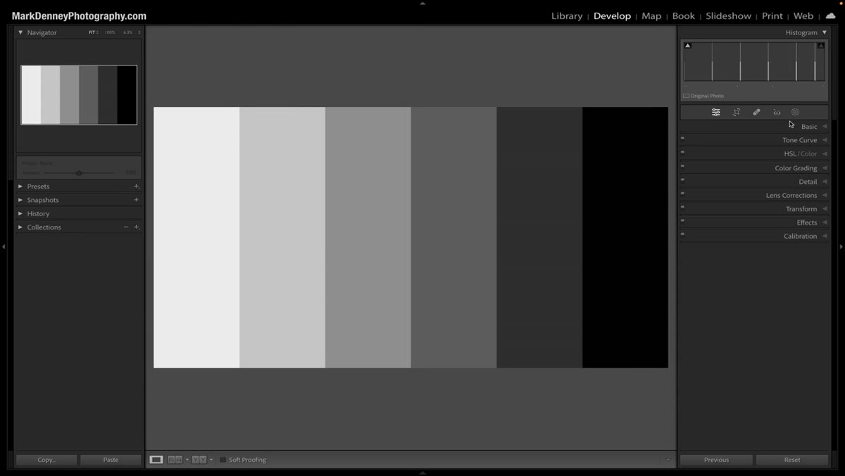 Tone curve panel open in Lightroom develop module
Head to the Develop module and scroll down to the Tone Curve panel. If you’ve been skipping past it, today’s the day to stop. The tone curve plots the tonal range of your image from deep shadows on the left to blown highlights on the right, with every midtone value living somewhere in between. Even if you’ve never touched a point on the curve itself, just understanding that left-to-right layout makes the next steps click into place.
Tone curve panel open in Lightroom develop module
Head to the Develop module and scroll down to the Tone Curve panel. If you’ve been skipping past it, today’s the day to stop. The tone curve plots the tonal range of your image from deep shadows on the left to blown highlights on the right, with every midtone value living somewhere in between. Even if you’ve never touched a point on the curve itself, just understanding that left-to-right layout makes the next steps click into place.
Step 2: Find the Targeting Tool Icon
 Small targeting tool icon inside the tone curve panel
Look closely at the top-left corner of the tone curve panel. There’s a small icon - easy to miss, easy to dismiss - that you’ve probably scrolled past a hundred times. It doesn’t announce itself. It doesn’t glow or pulse or have a label hovering over it. You only really notice it when you hover your mouse over it and it expands slightly. That’s the tool. That quiet little thing is the entire subject of this tutorial.
Small targeting tool icon inside the tone curve panel
Look closely at the top-left corner of the tone curve panel. There’s a small icon - easy to miss, easy to dismiss - that you’ve probably scrolled past a hundred times. It doesn’t announce itself. It doesn’t glow or pulse or have a label hovering over it. You only really notice it when you hover your mouse over it and it expands slightly. That’s the tool. That quiet little thing is the entire subject of this tutorial.
Mark’s point here is sharp: this isn’t a bug or a secret menu item. It’s sitting in plain sight. We just didn’t look because we weren’t looking for it.
Step 3: Activate the Tool and Watch Your Cursor Change
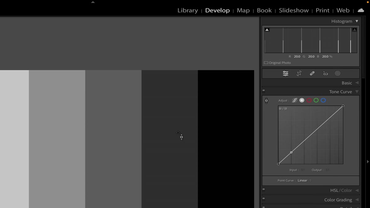 Mouse cursor changed to targeting tool shape on screen
Click the icon. Your cursor will immediately change shape to match the icon you just clicked - a visual confirmation that you’ve activated the tool. This is Lightroom telling you it’s ready to sample pixels directly from your image. Nothing else changes yet. Your image looks the same. The tone curve looks the same. But now the relationship between your cursor and the curve is live.
Mouse cursor changed to targeting tool shape on screen
Click the icon. Your cursor will immediately change shape to match the icon you just clicked - a visual confirmation that you’ve activated the tool. This is Lightroom telling you it’s ready to sample pixels directly from your image. Nothing else changes yet. Your image looks the same. The tone curve looks the same. But now the relationship between your cursor and the curve is live.
Step 4: Hover Over Your Image and Watch the Tone Curve React
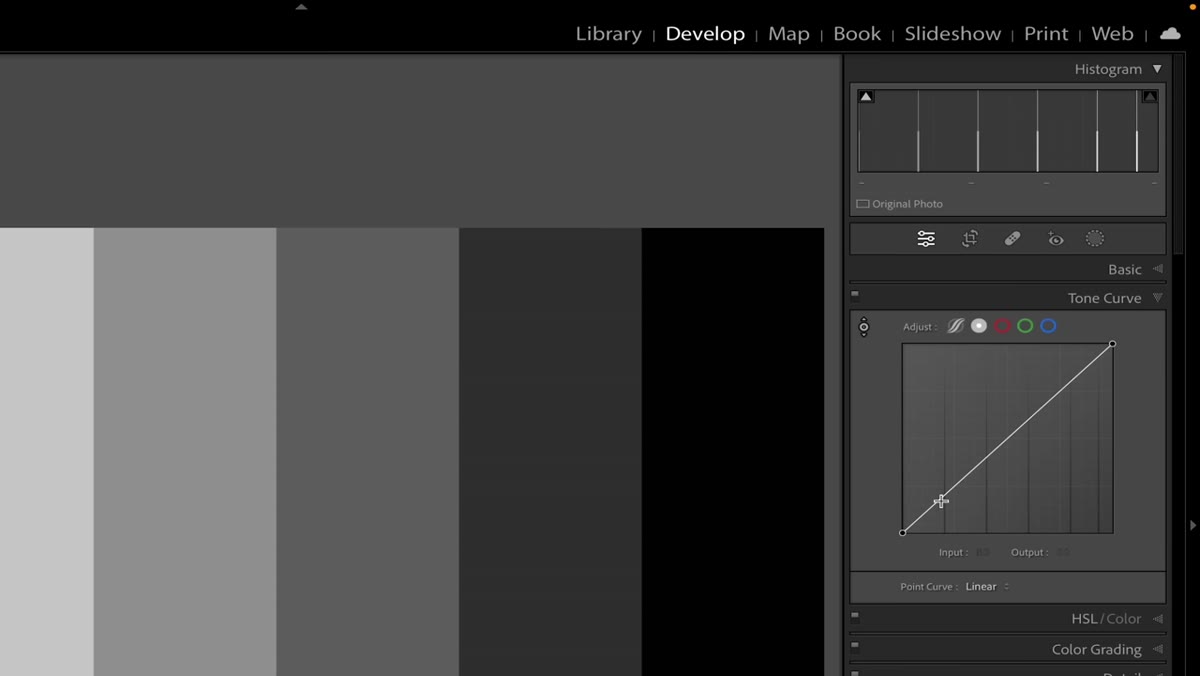 Cursor moving across image with tone curve line responding in real time
Move your cursor across the image without clicking anything. As you do, watch the tone curve panel. A marker moves along the curve line, tracking in real time to show you exactly where the pixels under your cursor fall on the tonal scale. Hover over a dark rock face and the marker slides toward the shadow end. Move to a bright sky and it shifts right toward the highlights. Sit over a shaded tree canopy and it lands somewhere in the darker midtones.
Cursor moving across image with tone curve line responding in real time
Move your cursor across the image without clicking anything. As you do, watch the tone curve panel. A marker moves along the curve line, tracking in real time to show you exactly where the pixels under your cursor fall on the tonal scale. Hover over a dark rock face and the marker slides toward the shadow end. Move to a bright sky and it shifts right toward the highlights. Sit over a shaded tree canopy and it lands somewhere in the darker midtones.
This is the breakthrough moment. Instead of guessing which part of the curve controls which part of your image, you’re reading it directly from the pixels themselves. The curve becomes a map, and your cursor becomes the pin.
Step 5: Identify Specific Tonal Zones in Your Scene
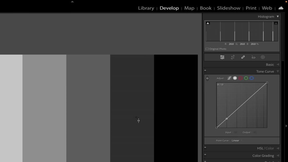 Cursor positioned on midtones area with corresponding curve point highlighted
Use this hover behavior to scout your image before you make any adjustments. Place your cursor on the areas you actually want to change - a face, a shadow, a patch of sky, a foreground element - and note where they land on the curve. You’ll start to see that “shadows” and “highlights” aren’t binary. There are darker midtones, brighter midtones, near-highlights, and everything in between. Knowing exactly where your subject pixels live on that spectrum tells you precisely where to place your adjustment point when you do start editing.
Cursor positioned on midtones area with corresponding curve point highlighted
Use this hover behavior to scout your image before you make any adjustments. Place your cursor on the areas you actually want to change - a face, a shadow, a patch of sky, a foreground element - and note where they land on the curve. You’ll start to see that “shadows” and “highlights” aren’t binary. There are darker midtones, brighter midtones, near-highlights, and everything in between. Knowing exactly where your subject pixels live on that spectrum tells you precisely where to place your adjustment point when you do start editing.
This reframes the whole tool. You’re not guessing anymore. You’re diagnosing.
Step 6: Click to Place a Point Directly on the Relevant Tonal Range
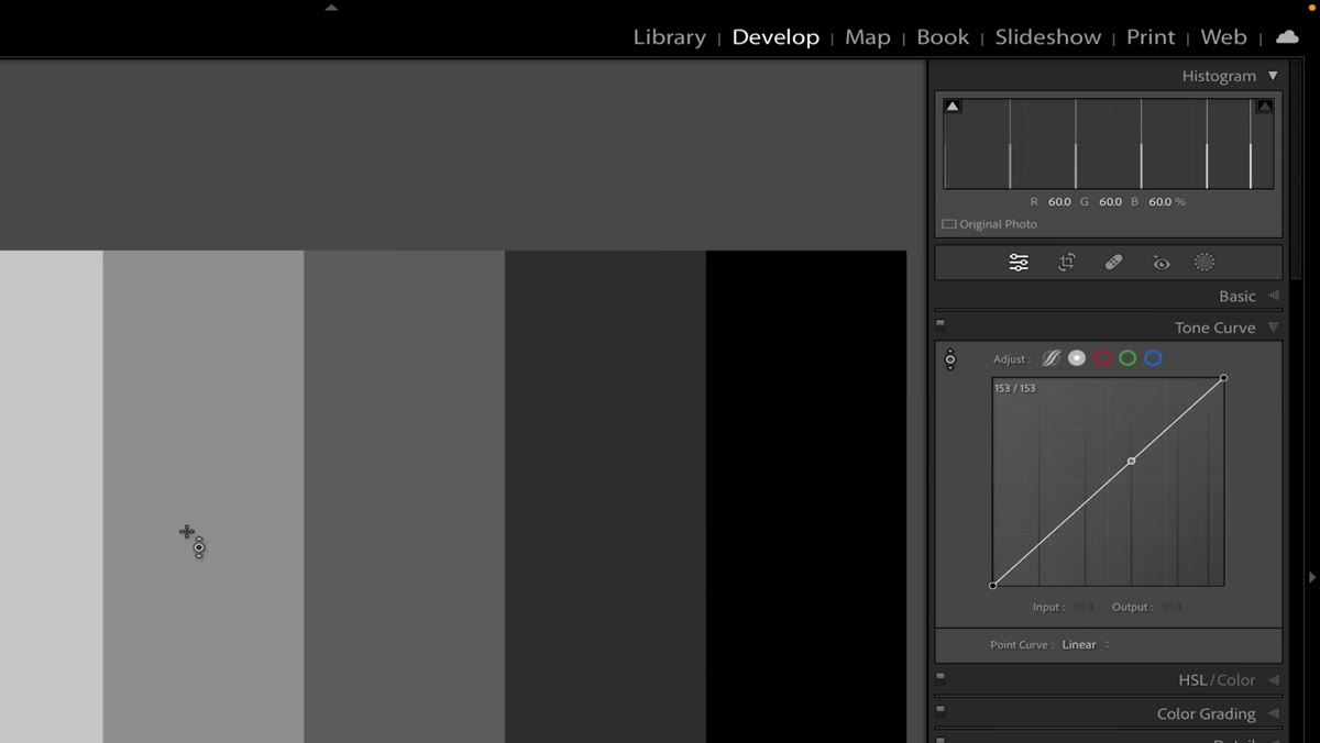 Click placing a curve point at exact luminance position of sampled pixels
Once you’ve identified where a specific element falls on the curve, click while your cursor is on that part of the image. Lightroom drops a control point on the curve at exactly the luminance value of the pixels you clicked. From there, drag up to brighten those tones, drag down to darken them. Because the point is placed with surgical accuracy, your adjustment targets only the tonal range you actually care about - not a rough approximation of it.
Click placing a curve point at exact luminance position of sampled pixels
Once you’ve identified where a specific element falls on the curve, click while your cursor is on that part of the image. Lightroom drops a control point on the curve at exactly the luminance value of the pixels you clicked. From there, drag up to brighten those tones, drag down to darken them. Because the point is placed with surgical accuracy, your adjustment targets only the tonal range you actually care about - not a rough approximation of it.
This is where the tool earns its keep. The difference between a point placed by feel and a point placed by sampling can be subtle in the curve panel but significant in the final image.
My Own Take: Use This Before Every Curve Edit
I’ve started using this targeting tool as a mandatory first step before I touch the tone curve on any image. Before I adjust anything, I spend sixty seconds hovering over the key elements in the frame - the subject’s skin tones, the deepest shadows, the brightest highlight I still want to hold detail in - and I note where they all live on the curve. It’s basically a pre-flight check. It takes almost no time and it’s eliminated a lot of the back-and-forth I used to do, dragging points around and wondering why the adjustment wasn’t landing where I expected.
One caveat worth naming: this tool responds to luminance, not color. If you’re working in the individual RGB channel curves (red, green, blue separately), the same tool works the same way, but you’re now reading that channel’s brightness rather than overall luminance. It’s worth spending a few minutes in each channel just to understand how the sampling behavior shifts. The more you hover, the more fluent you get with what the curve is actually telling you.
The biggest takeaway from Mark’s tutorial isn’t a setting or a slider value. It’s a posture shift - from guessing to reading. The tone curve becomes dramatically less intimidating when you stop treating it as an abstract graph and start treating it as a direct readout of your image’s tonal structure. That small targeting icon is what makes the translation possible.
Watch the full tutorial on YouTube to see Mark walk through the second location where this tool appears, which affects a completely different part of the image and is just as worth your time.
Comments
Leave a Comment