For a long time, my go-to move for adding detail to a photo was clarity. Crank it up, things look punchier. Pull it down, skin looks smoother. It worked well enough that I never questioned it. Then Lightroom dropped the Texture slider and I realized I had been using a sledgehammer when sometimes a scalpel was exactly what the job needed. The difference between these two tools is subtle in name and dramatic in practice, and once you understand what each one is actually doing to your pixels, you will not mix them up again.
In this Matt Kloskowski tutorial, Watch the full tutorial on YouTube, Matt breaks down the Texture slider with the kind of technical honesty that most YouTube educators skip over. He goes into frequency separation concepts, compares Texture directly against Clarity and Sharpening, and shows real examples of where each one earns its keep. I watched it twice, took notes, and then spent an afternoon running the same landscape shot through all three sliders independently. Here is what the tutorial covers and what I took away from it.
Step 1: Understand What “Frequency” Actually Means in a Photo
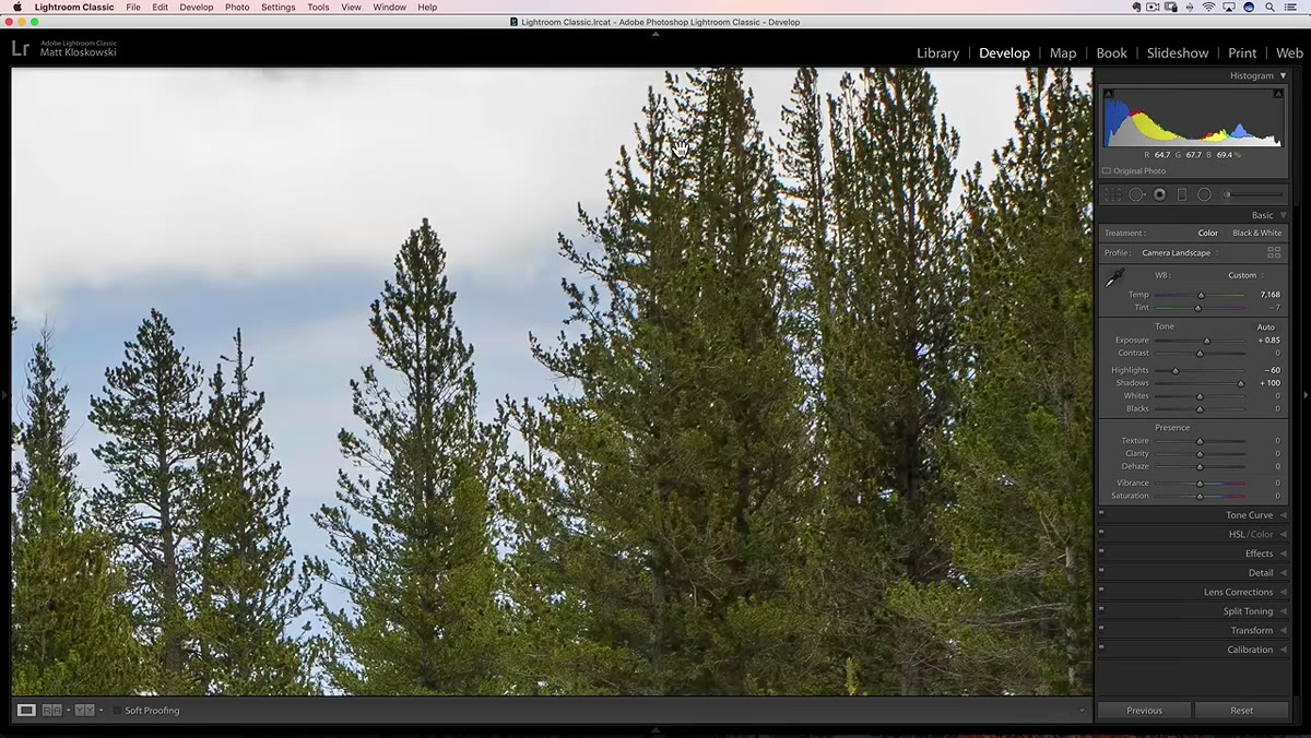 Zoomed-in tree branches showing high-frequency detail area
Before you touch any slider, you need a mental model for how Lightroom sees detail. Matt introduces the concept of frequency in images, and it is one of those ideas that sounds intimidating until someone just explains it plainly. High-frequency areas in a photo are zones with a lot of rapid contrast changes packed close together. Think tree branches against a bright sky, gravel textures, fabric weave, or stubble on a face. Low-frequency areas are smooth gradients with little tonal variation, like a clear sky or a softly lit cheek.
Zoomed-in tree branches showing high-frequency detail area
Before you touch any slider, you need a mental model for how Lightroom sees detail. Matt introduces the concept of frequency in images, and it is one of those ideas that sounds intimidating until someone just explains it plainly. High-frequency areas in a photo are zones with a lot of rapid contrast changes packed close together. Think tree branches against a bright sky, gravel textures, fabric weave, or stubble on a face. Low-frequency areas are smooth gradients with little tonal variation, like a clear sky or a softly lit cheek.
Why does this matter? Because Clarity, Texture, and Sharpening each target different frequency ranges. Knowing which part of the image you are trying to affect tells you which tool to pick up first.
Step 2: Get Clear on What the Contrast Slider Is Actually Doing
 Contrast slider in the Basic panel, values being adjusted
Matt spends a moment reframing the Contrast slider before moving on, and it is worth pausing here because it anchors everything else. When you push Contrast, you are essentially boosting the whites and pulling down the blacks across the entire image. It is a broad, blunt adjustment that hits the full tonal range. You can replicate the same effect in the Tone Curve by pushing the highlights up and pulling the shadows down in that classic S-curve shape.
Contrast slider in the Basic panel, values being adjusted
Matt spends a moment reframing the Contrast slider before moving on, and it is worth pausing here because it anchors everything else. When you push Contrast, you are essentially boosting the whites and pulling down the blacks across the entire image. It is a broad, blunt adjustment that hits the full tonal range. You can replicate the same effect in the Tone Curve by pushing the highlights up and pulling the shadows down in that classic S-curve shape.
This matters because Clarity builds on this idea but targets only the midtones. Understanding that Contrast is a full-range adjustment helps you see why Clarity feels different even though both tools are fundamentally adding contrast.
Step 3: Learn What Clarity Is Really Targeting
 Clarity slider moved to a high positive value on a landscape photo
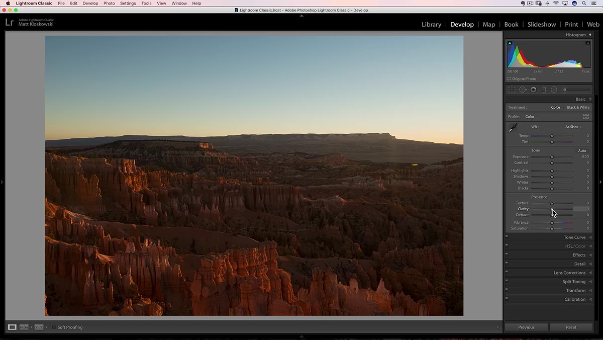
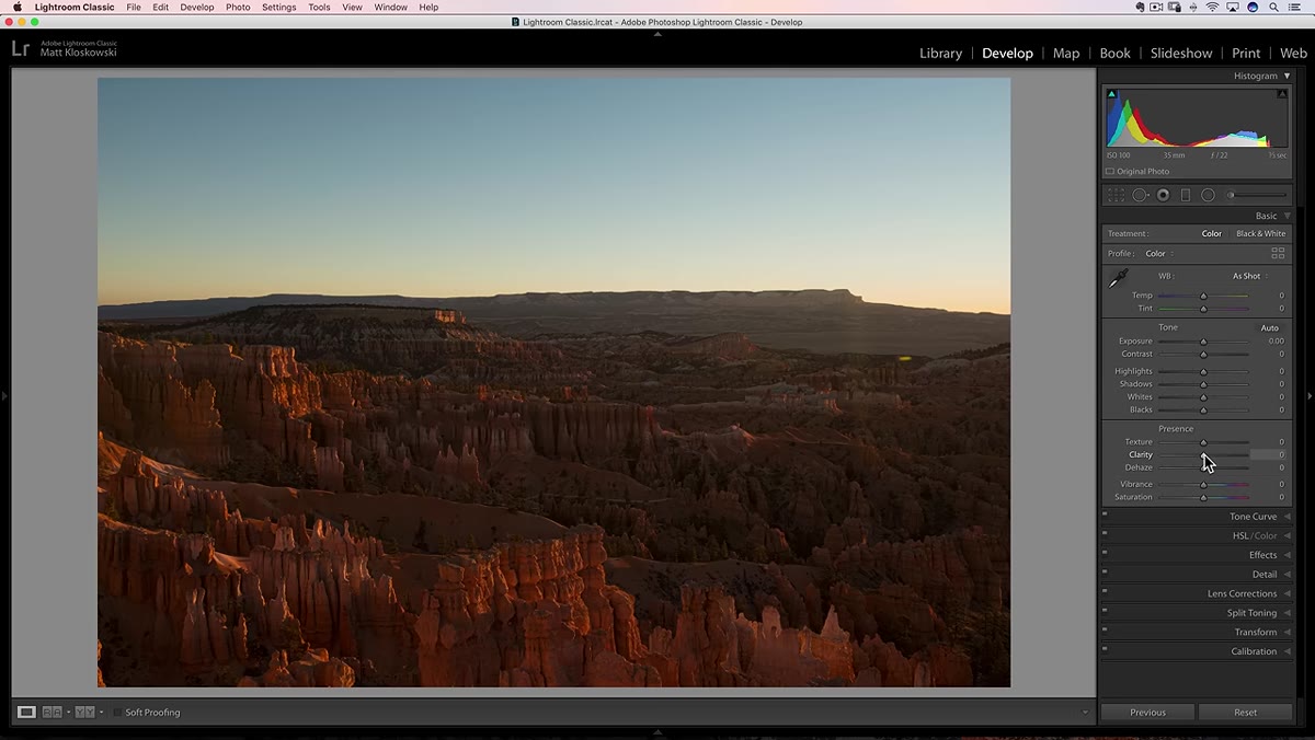
Clarity is a midtone contrast tool. It does not care much about your brightest highlights or your deepest shadows. It zeroes in on the middle values of your image and adds local contrast there. This is why it makes flat, hazy landscape shots look more dramatic and why it makes portraits look a little crunchy when you push it too far. The skin tones in a portrait often live in those midtone ranges, and Clarity hits them hard.
Clarity slider moved to a high positive value on a landscape photo
Clarity is a midtone contrast tool. It does not care much about your brightest highlights or your deepest shadows. It zeroes in on the middle values of your image and adds local contrast there. This is why it makes flat, hazy landscape shots look more dramatic and why it makes portraits look a little crunchy when you push it too far. The skin tones in a portrait often live in those midtone ranges, and Clarity hits them hard.
On a practical level, I use Clarity when I want the overall mood of an image to feel more defined and weighted. It is a broader stroke. When I drag it up on a landscape, the whole scene feels denser and more grounded. When I drag it into negative territory on a portrait, I am smoothing out the mid-range tonal transitions across skin, which gives a slightly softened, almost cinematic look.
Step 4: See Where the Texture Slider Fits in the Frequency Stack
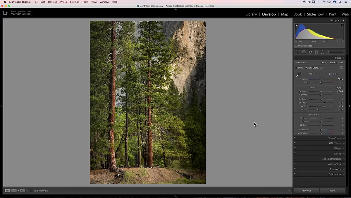 Texture slider introduced alongside Clarity in the Basic panel
Here is where Texture earns its own spot in your workflow. While Clarity works on midtone contrast in a broad sense, Texture specifically targets mid-frequency detail. It is not as broad as Clarity and not as hyper-local as Sharpening. Think of it as working in the middle ground between those two extremes.
Texture slider introduced alongside Clarity in the Basic panel
Here is where Texture earns its own spot in your workflow. While Clarity works on midtone contrast in a broad sense, Texture specifically targets mid-frequency detail. It is not as broad as Clarity and not as hyper-local as Sharpening. Think of it as working in the middle ground between those two extremes.
When you raise the Texture slider on a portrait, you are bringing out mid-scale skin detail like pores and subtle texture without making the overall image feel harsh or over-contrasted. When you raise it on a landscape, you pick up rock texture, bark grain, and foliage detail without blowing out the fine edge contrast the way Sharpening sometimes can. It is a more surgical version of what Clarity does, operating at a different scale of detail.
Step 5: Compare All Three Sliders on the Same Image
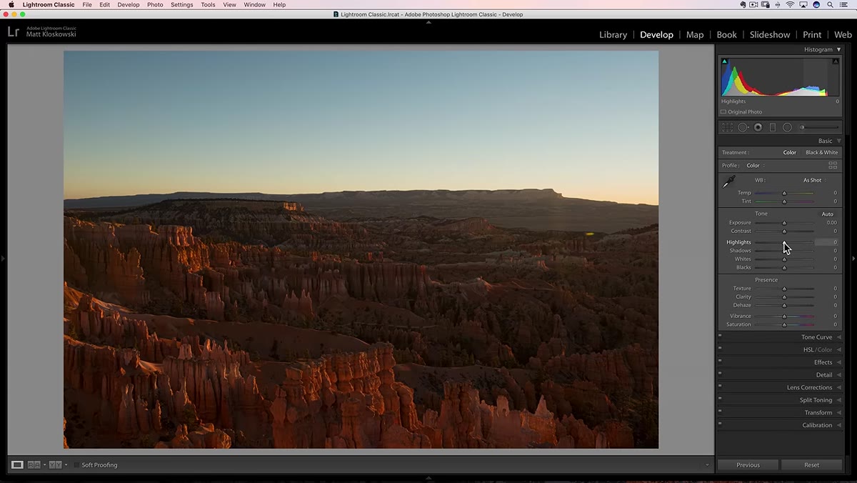 Side-by-side effect comparison of Texture versus Clarity on landscape
The most useful thing Matt does in the tutorial is isolate each slider on the same image so you can actually see what part of the photo each one is affecting. If you want to run this yourself, pull up any image that has a mix of soft areas and detailed areas, a portrait with background foliage works great, and try this sequence. Set everything to zero. Push Clarity to +60 and look at the whole image. Reset it. Push Texture to +60 and look at the same image. Reset it. Add Sharpening in the Detail panel and check the same areas.
Side-by-side effect comparison of Texture versus Clarity on landscape
The most useful thing Matt does in the tutorial is isolate each slider on the same image so you can actually see what part of the photo each one is affecting. If you want to run this yourself, pull up any image that has a mix of soft areas and detailed areas, a portrait with background foliage works great, and try this sequence. Set everything to zero. Push Clarity to +60 and look at the whole image. Reset it. Push Texture to +60 and look at the same image. Reset it. Add Sharpening in the Detail panel and check the same areas.
What you will notice: Clarity changes the feel of the whole photo. Texture brings up specific mid-scale detail without shifting the overall tonal weight as much. Sharpening creates crisp micro-edges, especially visible at pixel level. Once you see the difference, you cannot unsee it.
Step 6: Know When to Reach for Texture Over Clarity
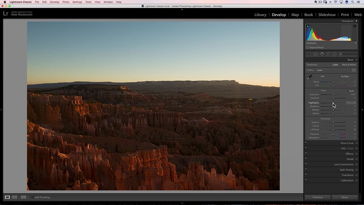 Negative Texture applied to portrait, smoothing skin without muddying tones
Matt’s practical advice here is simple and I agree with it completely. Use Texture when you want to affect surface detail without changing the tonal structure of the image. Portraits are the clearest use case. Pulling Texture slightly negative on skin gives a smoother result than pulling Clarity negative, because you are not flattening the midtone contrast of the entire scene. The overall image still feels defined. Only the skin surface detail softens.
Negative Texture applied to portrait, smoothing skin without muddying tones
Matt’s practical advice here is simple and I agree with it completely. Use Texture when you want to affect surface detail without changing the tonal structure of the image. Portraits are the clearest use case. Pulling Texture slightly negative on skin gives a smoother result than pulling Clarity negative, because you are not flattening the midtone contrast of the entire scene. The overall image still feels defined. Only the skin surface detail softens.
On the positive side, Texture is excellent for subjects where fine surface detail carries the image. Weathered wood, stone walls, animal fur, food photography, anything where the tactile quality of the surface is the point. Clarity might add too much overall punch in those cases. Texture lets the surface breathe.
My Take: Stack These Tools, Don’t Choose Between Them
After spending serious time with the Texture slider since it launched, the biggest shift in my own editing is that I stopped thinking of these as competing options. I routinely use Clarity and Texture at the same time now, often with different values and sometimes even in opposite directions. I might add a small amount of Clarity to give a landscape some overall weight, then layer Texture on top specifically to pull out the rock detail in the foreground. Or I will use negative Texture on a portrait subject while keeping Clarity at zero so the background retains its sense of depth.
The local adjustment tools in Lightroom, the Adjustment Brush, Radial Filter, and Graduated Filter, all have their own Texture slider too. That is where this tool really shines. Painting Texture selectively onto only the rough surfaces in an image while leaving the soft areas untouched is a level of control that did not exist before this slider arrived.
The single most important thing this tutorial taught me: Texture is not a replacement for Clarity or Sharpening. It is a third option that operates at a different scale of detail, and using all three intentionally gives you far more control than defaulting to just one. Watch the full tutorial on YouTube and bring an image with you. Follow along with your own photo open in Lightroom and you will feel the difference in about ten minutes.
Comments (2)
Applied this to my portfolio shots and the improvement is noticeable.
Never thought of approaching it this way. Really creative.
Leave a Comment