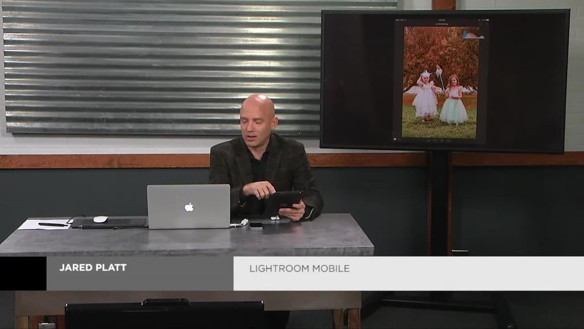
I edit a lot of photos on my phone. Not because I prefer it, but because deadlines don’t care where you are. And for years, my mobile edits had a subtle problem I couldn’t name: they looked great on my screen, then landed in delivery looking either blown out or flat. The culprit wasn’t my eye. It was that I was trusting a glowing rectangle held under a Nashville sun to tell me the truth about my exposure. It lies. Constantly.
In this CreativeLive tutorial on Lightroom Mobile color adjustment, the instructor cuts straight to the core of that problem and hands you two tools that fix it: the histogram and a two-finger gesture that most people scroll right past. Watch the full tutorial on YouTube if you want to follow along. What’s below is my working breakdown of every move shown, written so you can actually execute it without pausing the video every thirty seconds.
The workflow here is deceptively simple. But simple isn’t the same as obvious, and after watching this I immediately changed how I approach every mobile edit I do. Here’s the full walkthrough.
Step 1: Open the Histogram and Keep It Open
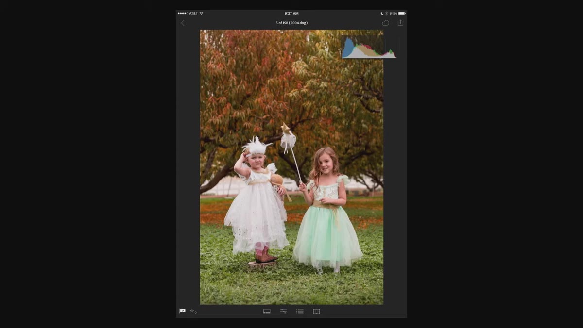
 Histogram visible in top right corner of single image view
When you’re in the single-image view in Lightroom Mobile, look at the top right corner. That’s your histogram, a graph that shows you the distribution of tones in your photo from pure black on the left to pure white on the right. It tells you whether your shadows are crushed, your highlights are blown, or your exposure is balanced, without relying on how the screen happens to look at that moment.
Histogram visible in top right corner of single image view
When you’re in the single-image view in Lightroom Mobile, look at the top right corner. That’s your histogram, a graph that shows you the distribution of tones in your photo from pure black on the left to pure white on the right. It tells you whether your shadows are crushed, your highlights are blown, or your exposure is balanced, without relying on how the screen happens to look at that moment.
Use a two-finger tap anywhere on the image to cycle through display modes: full view with histogram, information-only view, and clean photo view. The tutorial recommends leaving the histogram visible while you work. I second that completely. On a phone screen, especially outdoors, your perception of brightness shifts with ambient light. The histogram doesn’t. It’s the one honest thing in your editing environment.
Step 2: Browse Your Images Using the Thumbnail Strip
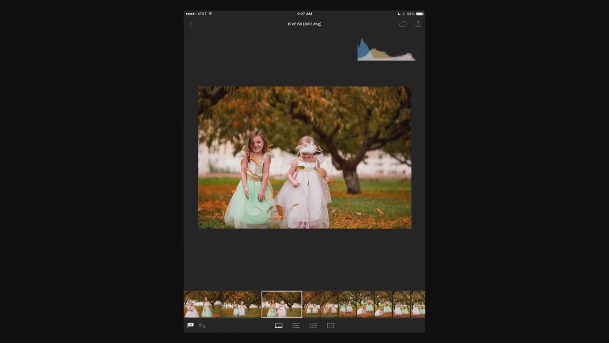
 Bottom thumbnail strip showing multiple images to scroll through
Along the bottom of the screen you’ll find a horizontal thumbnail strip showing the other images in your current album or import. Scroll through it to find the photo you want to edit, then tap to bring it into the main view.
Bottom thumbnail strip showing multiple images to scroll through
Along the bottom of the screen you’ll find a horizontal thumbnail strip showing the other images in your current album or import. Scroll through it to find the photo you want to edit, then tap to bring it into the main view.
This sounds basic but it matters for workflow. Rather than jumping in and out of the grid view constantly, you can stay in the single-image editing environment and just swipe through your selects. Less context-switching means you stay focused on the edit, not the navigation.
Step 3: Find the Adjustment Panels
 Three editing icons visible below the main image
Below the image, you’ll see a row of icons. The first opens your basic adjustment panel. This is where the majority of your color and tone work happens, and it maps almost exactly to the Basic panel in the desktop version of Lightroom. Same tools, same logic, just reordered for a vertical touch interface.
Three editing icons visible below the main image
Below the image, you’ll see a row of icons. The first opens your basic adjustment panel. This is where the majority of your color and tone work happens, and it maps almost exactly to the Basic panel in the desktop version of Lightroom. Same tools, same logic, just reordered for a vertical touch interface.
Tap the basic adjustments icon to open the panel. You’ll see sliders for everything from exposure to clarity to saturation. Each one is tappable individually, which expands it into a larger, easier-to-drag format.
Step 4: Set Your White Balance with Temperature and Tint
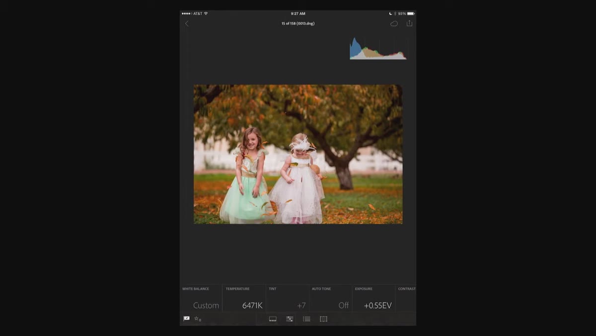 Color temperature wheel expanded and being dragged
Tap “Temperature” and the control expands into a horizontal slider. Drag right to push the image warmer, toward orange and gold. Drag left to cool it down toward blue. Then tap “Tint” and do the same thing. Tint controls the green-to-magenta axis, which is where you fix fluorescent light casts and skin tones that read slightly off.
Color temperature wheel expanded and being dragged
Tap “Temperature” and the control expands into a horizontal slider. Drag right to push the image warmer, toward orange and gold. Drag left to cool it down toward blue. Then tap “Tint” and do the same thing. Tint controls the green-to-magenta axis, which is where you fix fluorescent light casts and skin tones that read slightly off.
The goal here isn’t a specific number. It’s finding the point where neutrals look neutral and skin, if it’s in the frame, looks like skin. I usually set temperature first, then nudge tint until the whites in the image stop looking vaguely green or pink.
Step 5: Work Through the Rest of the Basic Adjustments
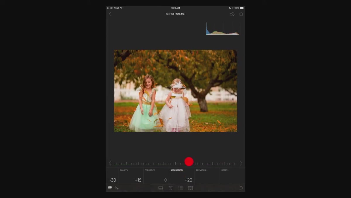 Saturation slider being adjusted in the basic panel
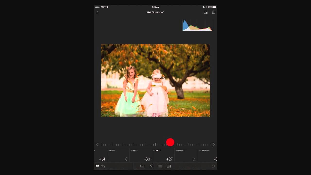
Scroll through the rest of the basic panel. You’ve got exposure, contrast, highlights, shadows, whites, blacks, clarity, and saturation. The tutorial touches on saturation specifically: you can push it up for more punch or pull it back for a moodier, more muted look. Clarity adds edge contrast and makes textures pop, which works great for landscapes and portraits with strong detail, though I’d be cautious with it on smooth skin.
Saturation slider being adjusted in the basic panel
Scroll through the rest of the basic panel. You’ve got exposure, contrast, highlights, shadows, whites, blacks, clarity, and saturation. The tutorial touches on saturation specifically: you can push it up for more punch or pull it back for a moodier, more muted look. Clarity adds edge contrast and makes textures pop, which works great for landscapes and portraits with strong detail, though I’d be cautious with it on smooth skin.
The key point from the tutorial is that everything you’d do in the desktop version’s Basic panel is available here. You’re not working with a stripped-down version of the tool. You have the full set, just in a different shape.
Step 6: Use Two-Finger Tap on Exposure to See Clipping
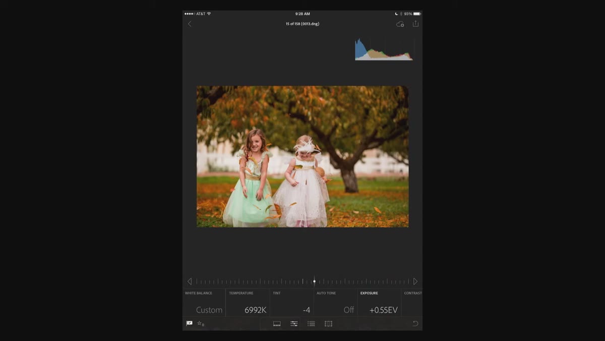 Two-finger tap revealing hot spot clipping overlay on image
This is the move that actually changed how I work on mobile. When you’re on the Exposure slider, a single finger drags the slider. But if you tap the image with two fingers while adjusting exposure, Lightroom switches into a clipping overlay view. Overexposed areas, the parts where you’ve lost all highlight detail, show up as bright color warnings on the image itself.
Two-finger tap revealing hot spot clipping overlay on image
This is the move that actually changed how I work on mobile. When you’re on the Exposure slider, a single finger drags the slider. But if you tap the image with two fingers while adjusting exposure, Lightroom switches into a clipping overlay view. Overexposed areas, the parts where you’ve lost all highlight detail, show up as bright color warnings on the image itself.
The tutorial shows a background going completely blown out while the image still looked passable on screen. The clipping view made the problem impossible to ignore. This is exactly the situation where trusting your eyes on a mobile display gets you in trouble. Use two fingers, check for clipping, then pull your exposure back until those warning areas disappear or shrink to an acceptable level.
One Thing the Tutorial Made Me Rethink
I used to skip the histogram entirely on mobile edits, treating it as a desktop-only concern. My logic was that mobile editing was quick and rough, meant to be finished later on a real monitor. What this tutorial clarified is that the histogram isn’t just for precision work. It’s actually more important on mobile, because the screen itself is unreliable data. The histogram is the correction for that unreliability.
Now I treat the histogram on mobile the same way I treat it in my full desktop workflow: open before the first slider moves, checked after every major adjustment. It adds maybe ten seconds to an edit and has saved me from delivering blown highlights more than once.
The single most important thing to take from this tutorial: your phone screen is not a calibrated monitor, and the histogram plus the clipping overlay exist specifically to compensate for that. Learn to read them, and your mobile edits will survive the jump to a real display without surprises.
Watch the full tutorial on YouTube to see every gesture and adjustment demonstrated in real time.
Comments (2)
Bookmarked. Coming back to this one for sure.
Quality content like this is rare. Keep it up.
Leave a Comment