Every photographer eventually hits the same wall: you share a photo online, and somewhere between your hard drive and the internet, the credit disappears. It happened to me constantly when I was just starting out, posting band press shots on every platform imaginable and watching the images float off into the void without my name attached. A watermark is not a perfect solution, but it is a working one, and Lightroom Classic makes it easier than most people realize.
In this KelbyOne tutorial, Scott Kelby walks through the full watermarking workflow inside Lightroom’s export panel. Watch the full tutorial on YouTube if you want to follow along in real time. What I like about Scott’s approach here is that he does not just show you where the controls live. He shows you where they fall short by default and how to fix that before you commit to anything.
The whole process lives inside the Export dialog, which means it is non-destructive and completely separate from your actual image files. Nothing gets baked in until you export. That alone makes it worth understanding properly.
Step 1: Open the Export Dialog and Find the Watermarking Panel
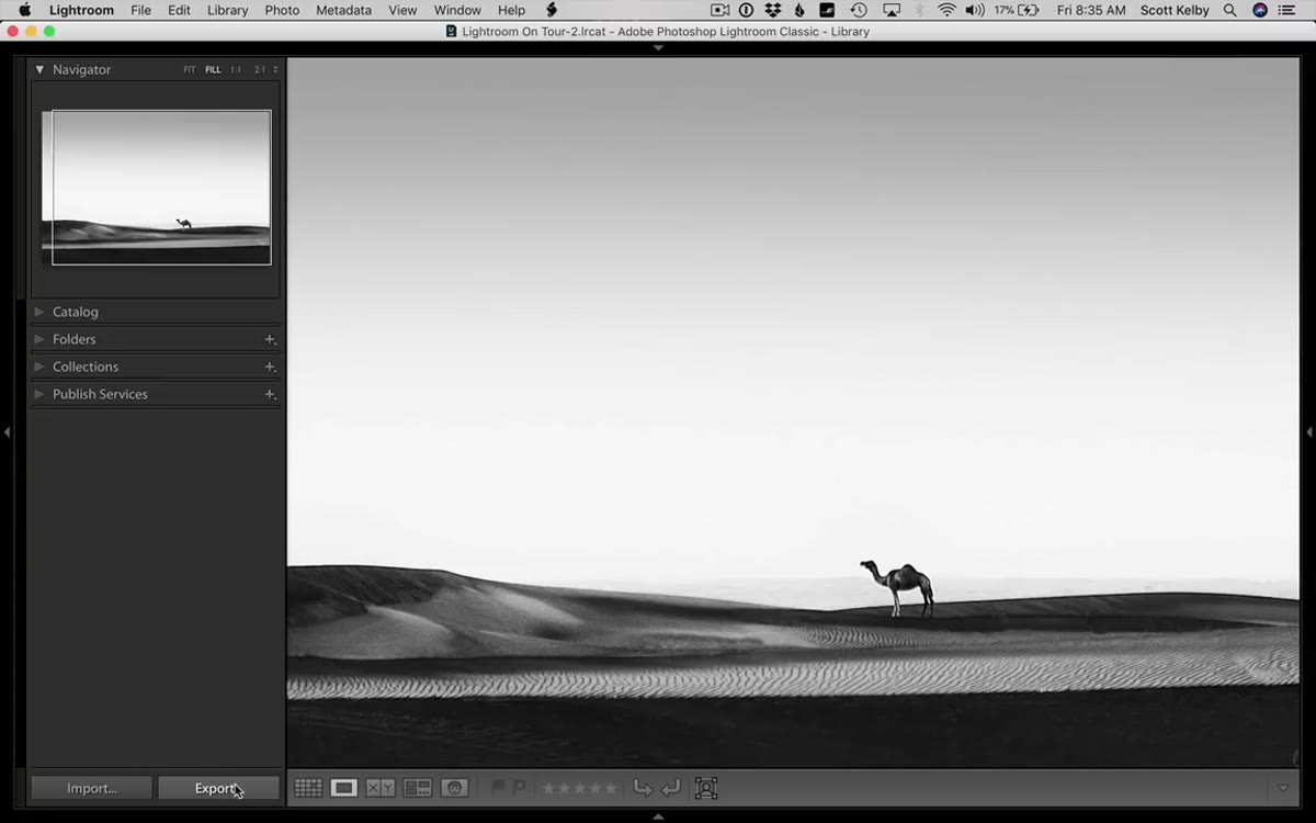 Export button in the bottom left of Lightroom’s Library module
Click the Export button in the bottom-left corner of the Library module. This opens Lightroom’s full export window, which has a lot going on. Scroll down through the panels until you see “Watermarking.” It can be collapsed by default, so look for the small triangle toggle on the left side of the panel header and click it open if needed. Check the watermarking checkbox to activate it.
Export button in the bottom left of Lightroom’s Library module
Click the Export button in the bottom-left corner of the Library module. This opens Lightroom’s full export window, which has a lot going on. Scroll down through the panels until you see “Watermarking.” It can be collapsed by default, so look for the small triangle toggle on the left side of the panel header and click it open if needed. Check the watermarking checkbox to activate it.
Step 2: Open the Watermark Editor
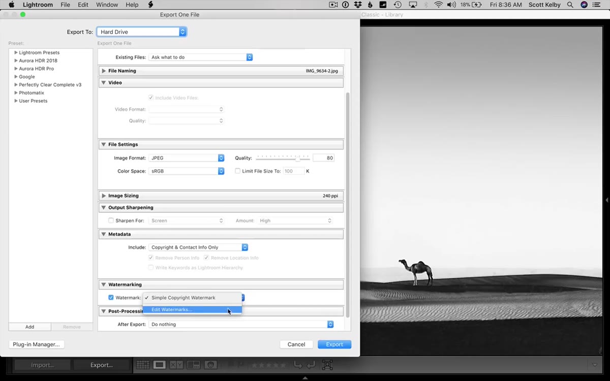 Edit Watermarks option selected in the watermark dropdown menu
Once watermarking is enabled, the dropdown next to it will default to a simple copyright stamp pulled from your Lightroom identity plate. That is fine for a quick export, but it gives you almost no control over placement or style. Instead, open the dropdown and choose “Edit Watermarks.” This launches the dedicated Watermark Editor, where the real work happens. You will see a live preview of your image with the watermark applied, and a panel of controls on the right side.
Edit Watermarks option selected in the watermark dropdown menu
Once watermarking is enabled, the dropdown next to it will default to a simple copyright stamp pulled from your Lightroom identity plate. That is fine for a quick export, but it gives you almost no control over placement or style. Instead, open the dropdown and choose “Edit Watermarks.” This launches the dedicated Watermark Editor, where the real work happens. You will see a live preview of your image with the watermark applied, and a panel of controls on the right side.
Step 3: Choose Your Watermark Style (Text or Graphic)
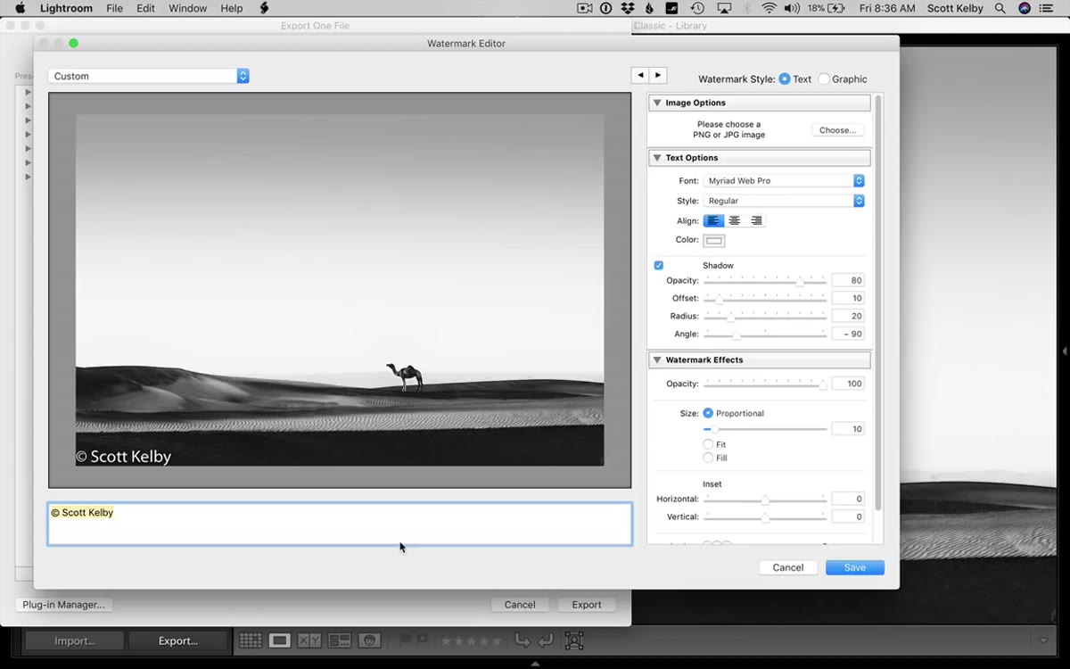 Watermark style options showing Text and Graphic radio buttons
In the top-right corner of the Watermark Editor, you will find two radio buttons: Text and Graphic. Text mode lets you type whatever you want directly into the preview, while Graphic mode lets you import an image file, typically your logo. Start with Text if you are setting this up for the first time. The editor will populate with your identity plate text by default, but you can click directly on the text field at the bottom of the preview and change it to whatever you need.
Watermark style options showing Text and Graphic radio buttons
In the top-right corner of the Watermark Editor, you will find two radio buttons: Text and Graphic. Text mode lets you type whatever you want directly into the preview, while Graphic mode lets you import an image file, typically your logo. Start with Text if you are setting this up for the first time. The editor will populate with your identity plate text by default, but you can click directly on the text field at the bottom of the preview and change it to whatever you need.
One thing worth knowing before you choose Graphic mode: your logo file needs to have a transparent background, saved as a PNG. If you import a JPG or a file with a white background, Lightroom will render it as a solid white rectangle sitting on top of your photo. Not a great look.
Step 4: Adjust Font, Color, and Drop Shadow
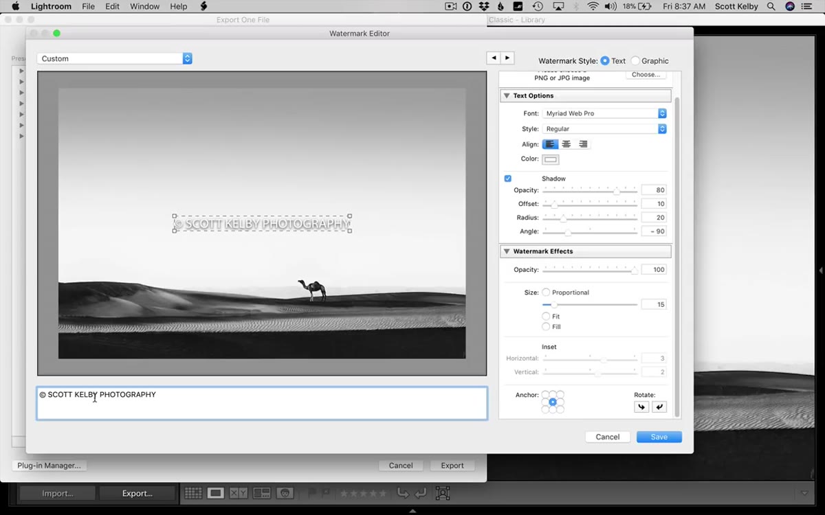 Font selector and text options panel on the right side of the editor
For text watermarks, the right-hand panel gives you font selection, style, alignment, color, and shadow controls. The default font is Myriad Web Pro, which is perfectly usable but worth swapping out for something that fits your brand. Highlight your text in the preview, then use the Font dropdown to change it.
Font selector and text options panel on the right side of the editor
For text watermarks, the right-hand panel gives you font selection, style, alignment, color, and shadow controls. The default font is Myriad Web Pro, which is perfectly usable but worth swapping out for something that fits your brand. Highlight your text in the preview, then use the Font dropdown to change it.
The drop shadow is enabled by default, and it can look heavy, especially if you move the watermark to the center of the frame. Scott points this out specifically, and he is right. Turn off the shadow checkbox if your text is sitting on a clean background, or dial it back. The color chip next to the shadow settings controls your text color. White reads well in the lower corners of most photos, but if you are centering a watermark over a light image, switch to a darker tone.
Step 5: Position the Watermark Using the Anchor Grid
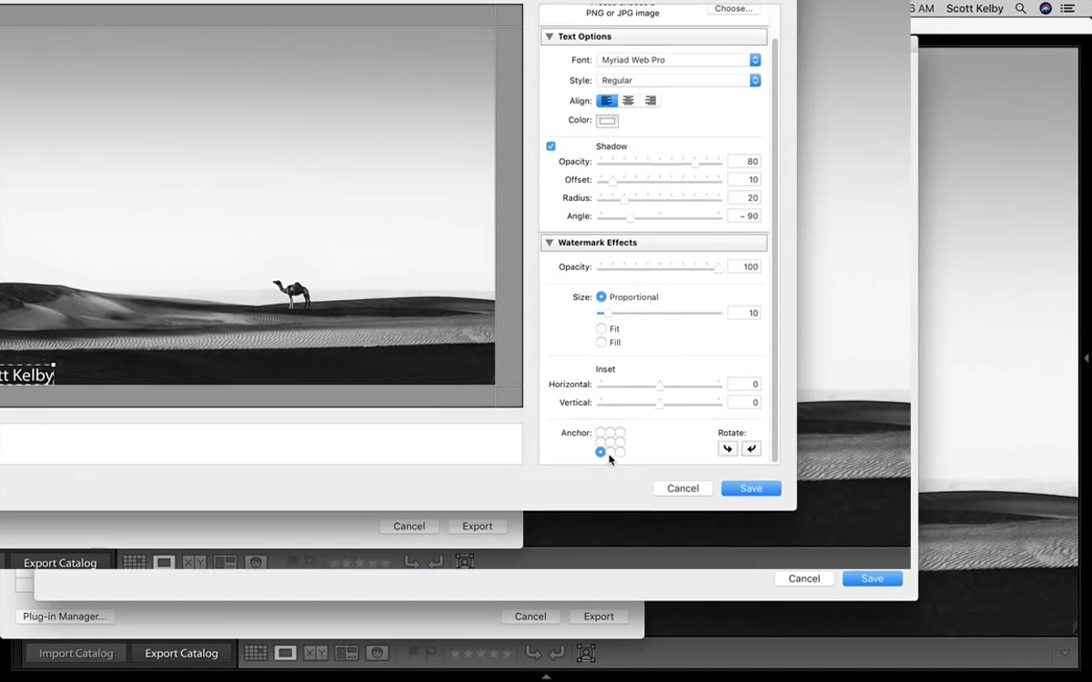 Anchor grid in the lower portion of the Watermark Editor panel
This is the part that trips most people up. You cannot drag your watermark around the preview. Instead, Lightroom uses a nine-point anchor grid at the bottom of the controls panel. Each point corresponds to a position on the image: corners, edge centers, and dead center. Click a point to snap your watermark to that region.
Anchor grid in the lower portion of the Watermark Editor panel
This is the part that trips most people up. You cannot drag your watermark around the preview. Instead, Lightroom uses a nine-point anchor grid at the bottom of the controls panel. Each point corresponds to a position on the image: corners, edge centers, and dead center. Click a point to snap your watermark to that region.
The default is bottom-left, which is where most watermarks live, but the anchor by itself places the text right against the edge of the frame with no breathing room. That is where the Inset sliders come in.
Step 6: Fine-Tune Position with Inset Sliders
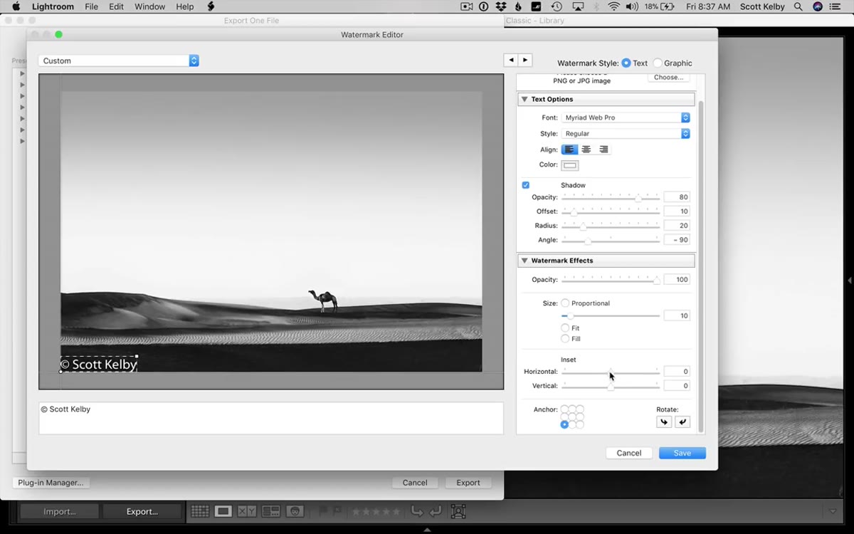 Horizontal and vertical inset sliders being adjusted in the panel
Directly below the anchor grid, you will find two sliders labeled Horizontal and Vertical. These control how far your watermark sits from the edges of the frame, measured as a percentage. Dragging the Horizontal slider to the right pushes the watermark in from the left edge. Vertical moves it up from the bottom. Lightroom shows guide lines in the preview while you drag, so you can see exactly where the text will land.
Horizontal and vertical inset sliders being adjusted in the panel
Directly below the anchor grid, you will find two sliders labeled Horizontal and Vertical. These control how far your watermark sits from the edges of the frame, measured as a percentage. Dragging the Horizontal slider to the right pushes the watermark in from the left edge. Vertical moves it up from the bottom. Lightroom shows guide lines in the preview while you drag, so you can see exactly where the text will land.
A value around 2 to 3 percent on both axes usually gives a clean, professional margin without eating too much of the image. Play with it against a few different test photos before you commit.
Step 7: Set Opacity and Size, Then Save as a Preset
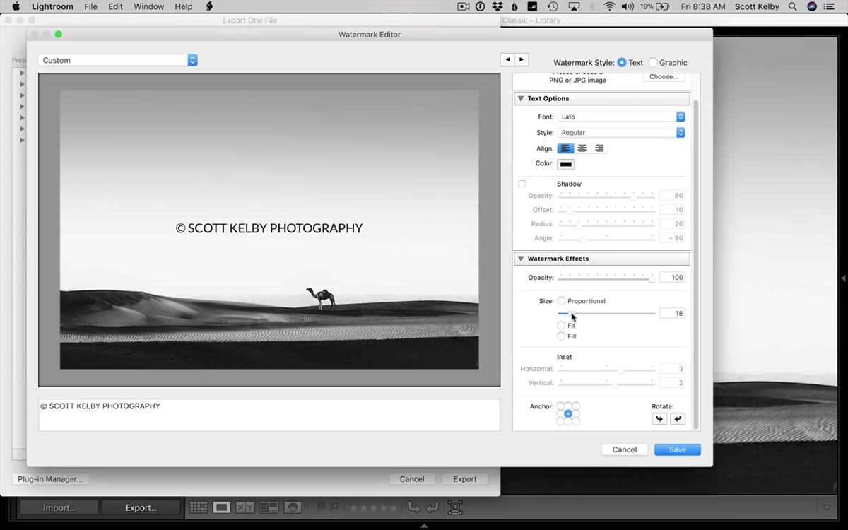 Opacity slider and size slider shown in the watermark options panel
The Size slider scales your watermark relative to the image, and the Opacity slider controls how visible it is. I almost always pull opacity back to somewhere between 40 and 70 percent. A fully opaque watermark draws the eye away from the actual photo, which defeats the purpose. The goal is visibility without distraction.
Opacity slider and size slider shown in the watermark options panel
The Size slider scales your watermark relative to the image, and the Opacity slider controls how visible it is. I almost always pull opacity back to somewhere between 40 and 70 percent. A fully opaque watermark draws the eye away from the actual photo, which defeats the purpose. The goal is visibility without distraction.
Once your watermark looks right, go to the top-left corner of the Watermark Editor and click the dropdown that currently reads “Custom.” Choose “Save Current Settings as New Preset,” give it a name, and click Create. From now on, that preset will appear in your watermark dropdown during every export, no setup required.
One Thing I Would Add: Test on Multiple Image Types Before You Commit
The Watermark Editor preview shows you one image, and it can be misleading. A white text watermark at 50 percent opacity looks great on a dark moody portrait and disappears completely on a bright overexposed sky. Before saving your preset, I test mine against at least three very different images: something dark, something bright, and something with a busy background in the corner where the watermark will sit.
I also keep two saved presets in my own library. One is for client galleries, a subtle low-opacity version in the lower right, and one is for social sharing, slightly larger and more visible. Scott’s walkthrough made it clear you can have as many presets as you need, which is something I wish I had known when I first started exporting work.
The single most important thing to take from this tutorial is that the Save Preset step is not optional. If you build the perfect watermark and close the editor without saving it, you will be rebuilding it from scratch on the next export. Save it the first time, name it something specific, and it becomes a permanent part of your Lightroom workflow.
Watch the full tutorial on YouTube to see Scott walk through the graphic logo option in particular. Watching him navigate the transparent background issue in real time is more instructive than reading about it.
Comments
Leave a Comment