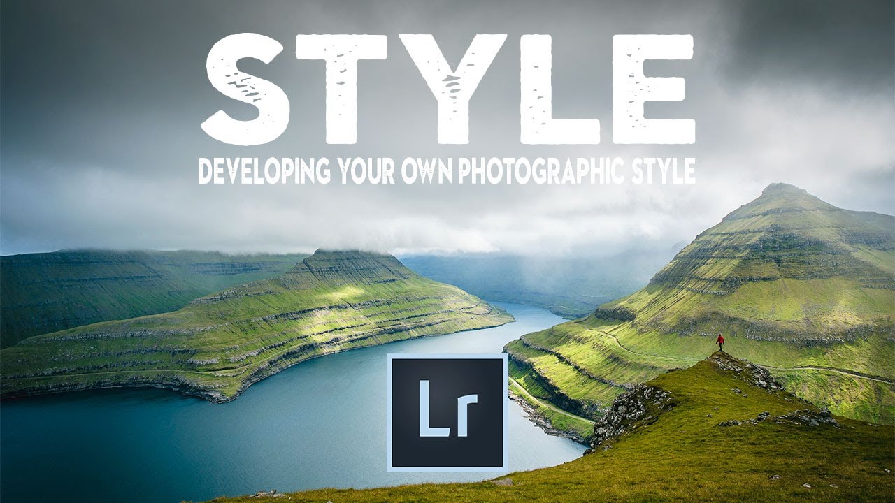
There’s a specific kind of frustration that hits when you open Instagram, scroll past three photographers whose work stops you cold, and then open your own Lightroom catalog and feel absolutely nothing. I spent a long time in that gap. I’d apply someone else’s preset, think “close enough,” and move on. The photos looked fine. They didn’t look like mine. The problem wasn’t technical skill. It was that I hadn’t done the work of figuring out what I actually wanted my images to feel like.
Watch the full tutorial on YouTube
In this Nigel Danson tutorial on developing a personal Lightroom style, Danson frames the problem in a way that finally made it click for me. He doesn’t tell you what your style should look like. He shows you how to reverse-engineer what you’re drawn to, then build toward it deliberately in Lightroom. That’s a meaningful distinction. What follows is a breakdown of the method, with the specific settings and decisions that make it practical.
Step 1: Study Photographers You Admire — But Look Past the Subject Matter
 Instagram grid of landscape photographer Randa Yunen’s work
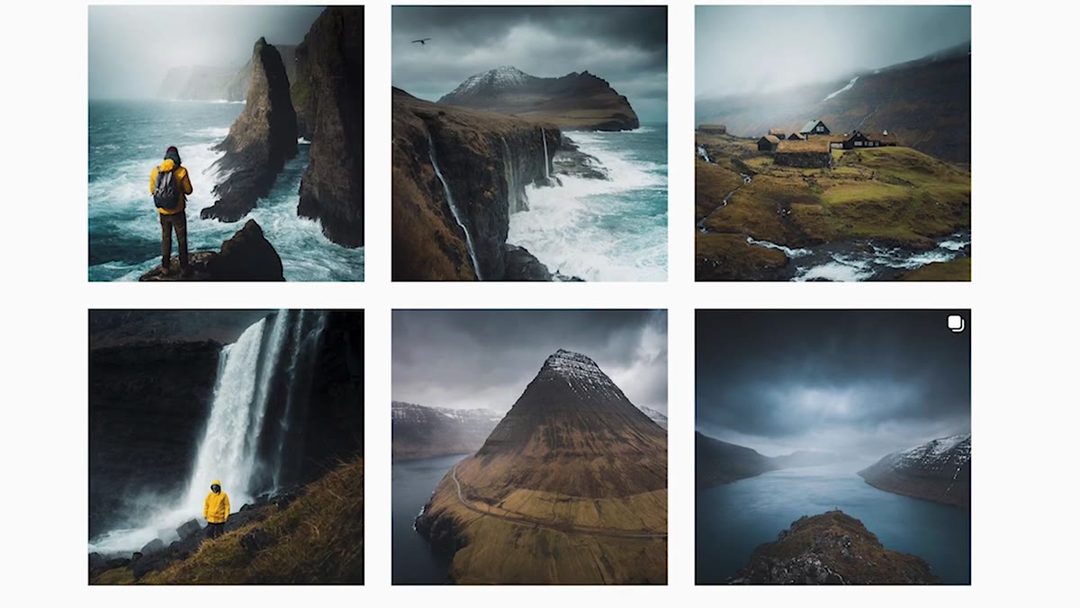
Before you touch a slider, Danson recommends spending real time with photographers whose work resonates with you. Not to copy them, but to dissect why their images feel cohesive. He walks through the work of Faroese photographer Randa Yunen as a case study. Her subject matter is consistent, yes, but that’s not the whole story. What actually unifies her feed are the tonal choices: lifted blacks, soft contrast, and a distinctive interplay between warm orange tones and cool blues. Danson’s point is that those choices are intentional, not accidental, and they hold across images regardless of lighting conditions.
Instagram grid of landscape photographer Randa Yunen’s work
Before you touch a slider, Danson recommends spending real time with photographers whose work resonates with you. Not to copy them, but to dissect why their images feel cohesive. He walks through the work of Faroese photographer Randa Yunen as a case study. Her subject matter is consistent, yes, but that’s not the whole story. What actually unifies her feed are the tonal choices: lifted blacks, soft contrast, and a distinctive interplay between warm orange tones and cool blues. Danson’s point is that those choices are intentional, not accidental, and they hold across images regardless of lighting conditions.
When you’re doing this analysis yourself, ask two questions: What’s happening in the shadows (are they deep or lifted)? And is there a color relationship being pushed, like cool highlights against warm midtones? Write it down. This becomes your reference point when you get into Lightroom.
Step 2: Understand That Contrast Drives Color More Than Saturation Does
 Lightroom develop panel showing contrast and saturation sliders
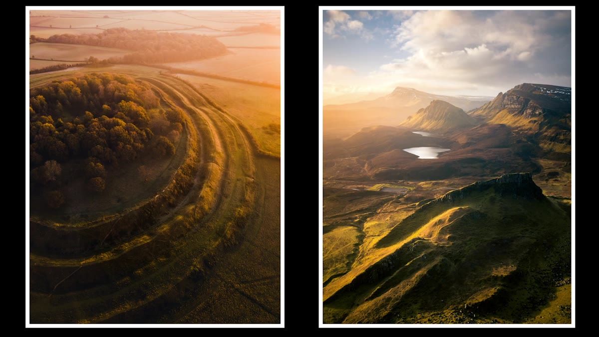
Danson shares a detail from photographer Dan Tucker that reframed how I think about color grading entirely. Tucker’s images are bold and saturated in a way that recalls Fuji Velvia film stock. But he doesn’t get there by cranking the saturation slider. He adds only about plus five on global saturation. The heavy lifting comes from contrast.
Lightroom develop panel showing contrast and saturation sliders
Danson shares a detail from photographer Dan Tucker that reframed how I think about color grading entirely. Tucker’s images are bold and saturated in a way that recalls Fuji Velvia film stock. But he doesn’t get there by cranking the saturation slider. He adds only about plus five on global saturation. The heavy lifting comes from contrast.
This is worth pausing on. When you increase contrast in Lightroom, you’re deepening shadows and brightening highlights, which naturally pushes colors further apart and makes them appear more vivid. Piling saturation on top of a flat image just makes everything look muddy and loud. Contrast-first color is richer and more controlled. Try setting your contrast before you touch any color tool. You’ll be surprised how much of the “look” is already there.
Step 3: Use the HSL Panel to Shift Colors Toward Your Palette, Not Just Boost Them
 HSL panel open with Hue sliders adjusted for greens and yellows
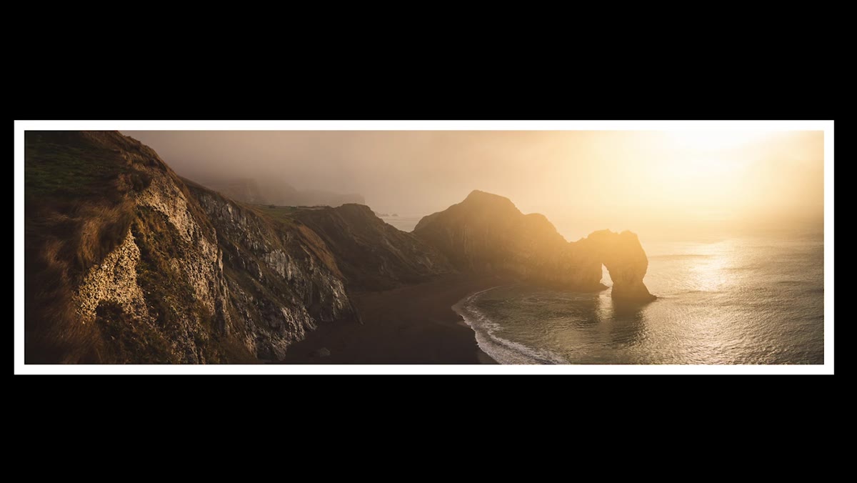
Tucker also mentioned that he dislikes the color green and pushes it toward yellow and orange in his edits. That’s an HSL panel move, and it’s one of the most underused tools for developing a consistent style. The Hue sliders in Lightroom let you shift individual colors without affecting everything else. Pushing greens toward yellow warms a landscape significantly. Pulling them toward teal cools it down.
HSL panel open with Hue sliders adjusted for greens and yellows
Tucker also mentioned that he dislikes the color green and pushes it toward yellow and orange in his edits. That’s an HSL panel move, and it’s one of the most underused tools for developing a consistent style. The Hue sliders in Lightroom let you shift individual colors without affecting everything else. Pushing greens toward yellow warms a landscape significantly. Pulling them toward teal cools it down.
The key here is restraint and repetition. Pick two or three HSL adjustments that push your images in the direction you want, and apply them consistently. Not every photo will need the same values, but the direction should stay the same. That repetition across your catalog is what creates the visual signature.
Step 4: Decide on Your Shadow Treatment and Protect It
 Tone curve panel with lifted shadow point creating a film-like fade
One of the clearest markers of a recognizable editing style is what a photographer does with their darkest tones. Danson points out that Randa Yunen’s images don’t have deep, true blacks. There’s a softness to the shadows, a slight lift that gives the images a painterly, almost matte quality. That’s typically done by pulling up the black point on the tone curve, preventing the shadows from going fully dark.
Tone curve panel with lifted shadow point creating a film-like fade
One of the clearest markers of a recognizable editing style is what a photographer does with their darkest tones. Danson points out that Randa Yunen’s images don’t have deep, true blacks. There’s a softness to the shadows, a slight lift that gives the images a painterly, almost matte quality. That’s typically done by pulling up the black point on the tone curve, preventing the shadows from going fully dark.
Contrast this with someone going for a cinematic or dramatic look who might crush the blacks intentionally. Neither is wrong. The point is to make a choice and commit to it. Once you know whether your shadows are lifted or deep, add it to the mental (or literal) checklist you apply to every image.
Step 5: Build a Test Preset and Apply It to 20 Different Images
 Lightroom filmstrip showing multiple landscape images with consistent edit applied
Once you’ve made your tonal and color decisions, build a starting-point preset that captures them. Don’t try to make it perfect. Make it directional. The real test isn’t how it looks on one hero image. It’s how it holds up across twenty images shot in different light.
Lightroom filmstrip showing multiple landscape images with consistent edit applied
Once you’ve made your tonal and color decisions, build a starting-point preset that captures them. Don’t try to make it perfect. Make it directional. The real test isn’t how it looks on one hero image. It’s how it holds up across twenty images shot in different light.
Apply your preset to a range of photos, including some that were shot in flat light, some in golden hour, some in shade. See where it breaks. Where it adds a weird color cast, that’s a hue shift you need to reconsider. Where it consistently makes images look flat, your contrast foundation might need rethinking. This testing phase is where your style actually gets refined. Most people skip it and wonder why their feed still looks inconsistent.
My Own Addition: Name Your Presets Like You Mean Them
I name every preset I build after a song. Not for branding reasons. It’s a memory trick. When I call a preset “Harvest Moon” versus “Landscape v3,” I actually remember what the intention behind it was. The name carries the mood. This sounds like a quirk (and it is), but it also forces you to articulate what a preset is for before you save it. If you can’t name it after a feeling or a reference, you probably haven’t made a strong enough decision yet.
It also helps when you’re revisiting your catalog six months later. You see “Harvest Moon” applied to a series and immediately know the warm, lifted, slightly golden direction you were going for. Preset names are part of your editing notes.
The single most important idea in Danson’s tutorial is this: style isn’t a filter you apply at the end. It’s a set of decisions you make deliberately and then repeat until they become instinct. The photographers with recognizable styles aren’t doing anything mystical. They made choices about shadows, color relationships, and saturation philosophy, and they held to those choices across hundreds of edits.
Pick one of those decisions this week. Just one. See how it changes what your catalog feels like.
Watch the full tutorial on YouTube to see Danson walk through the Lightroom panel work in real time with his own landscape images. His approach to the tone curve section alone is worth the watch.
Comments
Leave a Comment