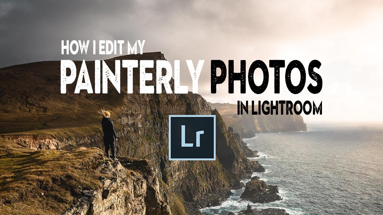
There’s a specific kind of photo that stops you mid-scroll. It doesn’t look like a photograph exactly. The light feels considered, the colors feel warm and unified, and there’s a softness to it that makes you think of a painting hanging in a gallery rather than a JPEG sitting in a Dropbox folder. I’ve been chasing that look for years, and I’ll be honest – most of my early attempts just looked like I’d cranked the fade slider and called it done.
What actually cracked it open for me was watching Nigel Danson work through his approach in this tutorial. Watch the full tutorial on YouTube. Danson is a landscape photographer based in the UK, and his work sits in this interesting space between classical painting and modern photography. He’s openly influenced by painters like Gainsborough, Constable, and Caspar David Friedrich, and when he explains his editing process, you can feel that lineage in every decision he makes. It’s not about filters. It’s about philosophy.
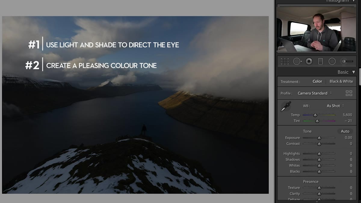
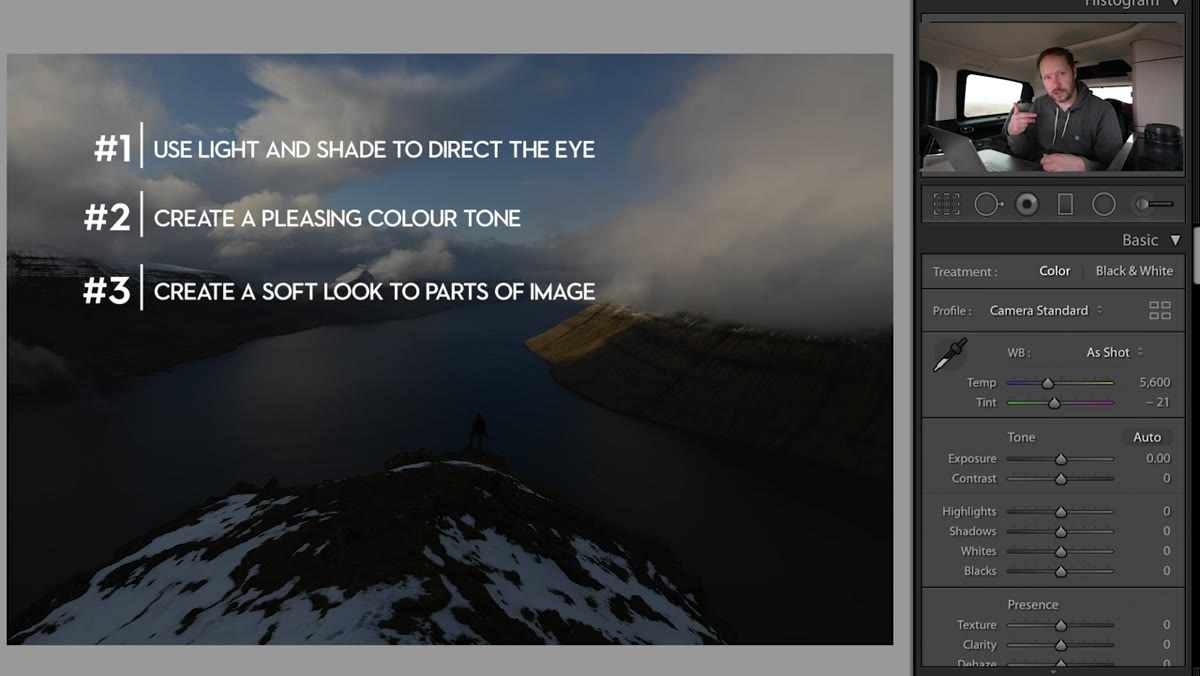
The workflow he walks through covers three core ideas: shaping light through dodging and burning, restraining your color palette to two dominant hues, and softening the image so it feels tactile rather than clinical. Each one is simple in isolation. Combined, they produce something that looks genuinely painterly, and all of it happens inside Lightroom, no plugins, no Photoshop, no external tools required.
Step 1: Set Your Base Exposure and Temperature
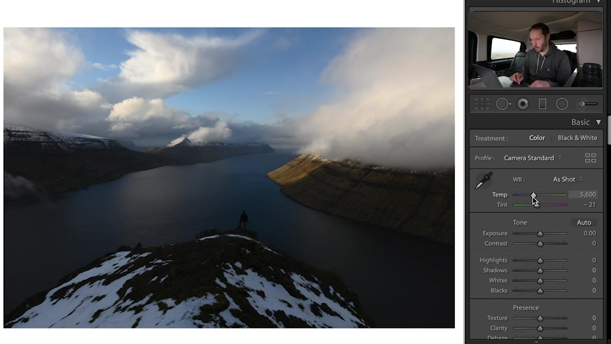 Warming temperature slider and raising exposure slightly in Basic panel
Before anything else, Danson establishes a warm foundation for the image. This isn’t dramatic – we’re talking a modest temperature shift toward the yellow-orange range, enough to push the scene away from the clinical coolness that raw files tend to carry. Paired with a small exposure lift to bring up overall luminosity, this gets the image into a zone where the editing decisions that follow will actually make sense. The goal here is to set the mood of the painting, not to nail the final look.
Warming temperature slider and raising exposure slightly in Basic panel
Before anything else, Danson establishes a warm foundation for the image. This isn’t dramatic – we’re talking a modest temperature shift toward the yellow-orange range, enough to push the scene away from the clinical coolness that raw files tend to carry. Paired with a small exposure lift to bring up overall luminosity, this gets the image into a zone where the editing decisions that follow will actually make sense. The goal here is to set the mood of the painting, not to nail the final look.
One thing worth noting: Lightroom’s workflow is designed to move top to bottom in the Basic panel, and Danson sticks to that structure. Resist the temptation to jump around. Getting your global settings right first means your local adjustments later will land in the right place rather than correcting mistakes you made earlier.
Step 2: Dodge the Foreground with a Graduated Filter
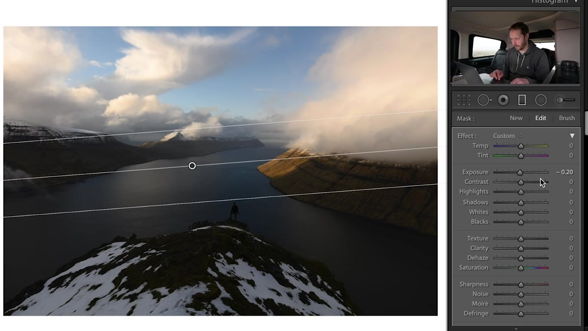 Graduated filter dragged across lower half of landscape image
This is where the painterly quality starts to take shape. Danson pulls in a graduated filter over the bottom portion of the frame and uses it to lift the exposure in the foreground. Painters have used foreground illumination for centuries to guide a viewer’s eye through a composition – think of the way light falls on the grass in a Constable – and this is the digital equivalent of that technique.
Graduated filter dragged across lower half of landscape image
This is where the painterly quality starts to take shape. Danson pulls in a graduated filter over the bottom portion of the frame and uses it to lift the exposure in the foreground. Painters have used foreground illumination for centuries to guide a viewer’s eye through a composition – think of the way light falls on the grass in a Constable – and this is the digital equivalent of that technique.
He also bumps the contrast inside that same graduated filter. This is a move that a lot of people skip, but contrast within a local adjustment creates depth without making the overall image feel heavy. The foreground becomes three-dimensional without competing with the sky or the subject in the middle ground. Use the “show overlay” toggle to make sure your gradient is covering exactly the area you intend.
Step 3: Burn the Edges to Frame the Scene
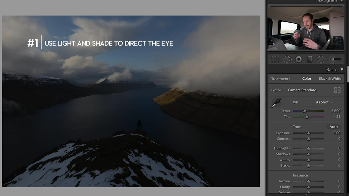 Dark vignette drawing viewer’s eye toward center of frame
The flipside of lifting the foreground is darkening the periphery. Danson uses additional graduated filters along the edges of the frame, essentially creating a custom vignette that directs the eye inward. Unlike Lightroom’s built-in vignette tool, this approach gives you full control over where the darkness falls and how severe it is.
Dark vignette drawing viewer’s eye toward center of frame
The flipside of lifting the foreground is darkening the periphery. Danson uses additional graduated filters along the edges of the frame, essentially creating a custom vignette that directs the eye inward. Unlike Lightroom’s built-in vignette tool, this approach gives you full control over where the darkness falls and how severe it is.
Think of it as matting a print. The darkened edges don’t call attention to themselves – they just make the center of the frame feel more luminous by comparison. This is one of the oldest tricks in painting, and it translates directly to photography. Keep the edge darkening subtle. If someone notices your vignette, it’s too strong.
Step 4: Reduce Your Color Palette
 HSL panel with blues reduced and warm tones emphasized
Danson is specific about this, and it’s the piece of advice I wish someone had given me earlier: limit yourself to two dominant colors in the image. His Faroe Islands example works in warm amber and green, with the blue aggressively pulled back in the HSL panel. Blue is a color he deliberately reduces in most of his landscape work because it tends to read as cold and photographic rather than painterly and warm.
HSL panel with blues reduced and warm tones emphasized
Danson is specific about this, and it’s the piece of advice I wish someone had given me earlier: limit yourself to two dominant colors in the image. His Faroe Islands example works in warm amber and green, with the blue aggressively pulled back in the HSL panel. Blue is a color he deliberately reduces in most of his landscape work because it tends to read as cold and photographic rather than painterly and warm.
In the HSL panel, pull down the saturation on blues and aquas. Then look at the hue sliders for your remaining colors – greens and yellows especially – and nudge them until they feel harmonious rather than competing. The goal isn’t accuracy, it’s cohesion. Two colors that feel like they belong together will always read more like a painting than six colors that are individually “correct.”
Step 5: Apply Negative Clarity for a Soft, Painterly Texture
 Clarity slider pulled into negative values in Basic panel
This one surprises people every time. Danson doesn’t add clarity – he removes it. A negative clarity value in Lightroom softens the midtone contrast across the image, which smooths out fine texture and gives the whole frame a quality that feels closer to paint on canvas than pixels on a sensor.
Clarity slider pulled into negative values in Basic panel
This one surprises people every time. Danson doesn’t add clarity – he removes it. A negative clarity value in Lightroom softens the midtone contrast across the image, which smooths out fine texture and gives the whole frame a quality that feels closer to paint on canvas than pixels on a sensor.
The amount varies by image, but even pulling clarity to somewhere between -10 and -25 makes a noticeable difference. Avoid going so far that the image looks hazy or unformed – you still want structure, just without the crunchy, over-sharpened look that high clarity produces. Danson mentions that this effect reads especially well in print, where excessive sharpness can make a landscape photo look harsh rather than inviting.
What I’d Add From My Own Workflow
After working through Danson’s approach on a batch of my own landscape shots, I found one additional move that reinforces everything he’s doing: use a color grade in the Lightroom Color Grading panel to tie the shadows and midtones together. Adding a very faint warm tone to the shadows – think a barely visible amber – keeps the dark areas of the image from going to a neutral gray, which tends to look flat and digital. Painters almost never paint black shadows. They mix in warm darks, and this panel lets you do exactly that without touching any other sliders.
It’s also worth experimenting with Danson’s approach on images you’ve already edited and been unhappy with. The soft clarity and limited palette approach has rescued a few of my shots that felt “almost there” but too photographic. Sometimes the edit isn’t wrong, it’s just too sharp and too colorful.
The single most important takeaway from Danson’s tutorial is this: painterly editing is mostly about restraint. Fewer colors, less sharpness, more deliberate light shaping. Every move he makes is subtractive in some way – pulling back blues, pulling back clarity, pulling back everything that makes a photo look like a photograph.
If you want to see the full process with Danson’s own images and his commentary on why each decision matters, don’t miss the original: Watch the full tutorial on YouTube. It’s one of those tutorials that changes how you see the edit before you even open Lightroom.
Comments (2)
This is going in my reference folder. Incredibly useful.
Would love to see a follow-up going deeper into this topic.
Leave a Comment