Every photographer I know has a watermark horror story. A client takes a proof image and sends it to the printer. A photo gets reposted on Instagram without credit. Someone uses a “for review only” shot as final delivery. I learned this lesson early, back when I was shooting press photos for local Nashville bands and handing over low-res JPEGs without a second thought. A watermark would have saved me more than one awkward conversation.
In this CreativeLive tutorial, Ben Willmore walks through the complete watermarking workflow inside Adobe Lightroom, covering both text-based watermarks and graphic logo watermarks. It’s a clean, no-fluff breakdown that covers more ground than most people expect from a single feature. Watch the full tutorial on YouTube if you want to follow along with a video running, but everything you need to replicate the results is laid out step by step below.
The beauty of Lightroom’s watermark system is that once you build it, it travels with every export you run. You’re not stamping each file manually. You set it once, save it as a preset, and it shows up in your export dialog every single time.
Step 1: Open the Watermark Editor
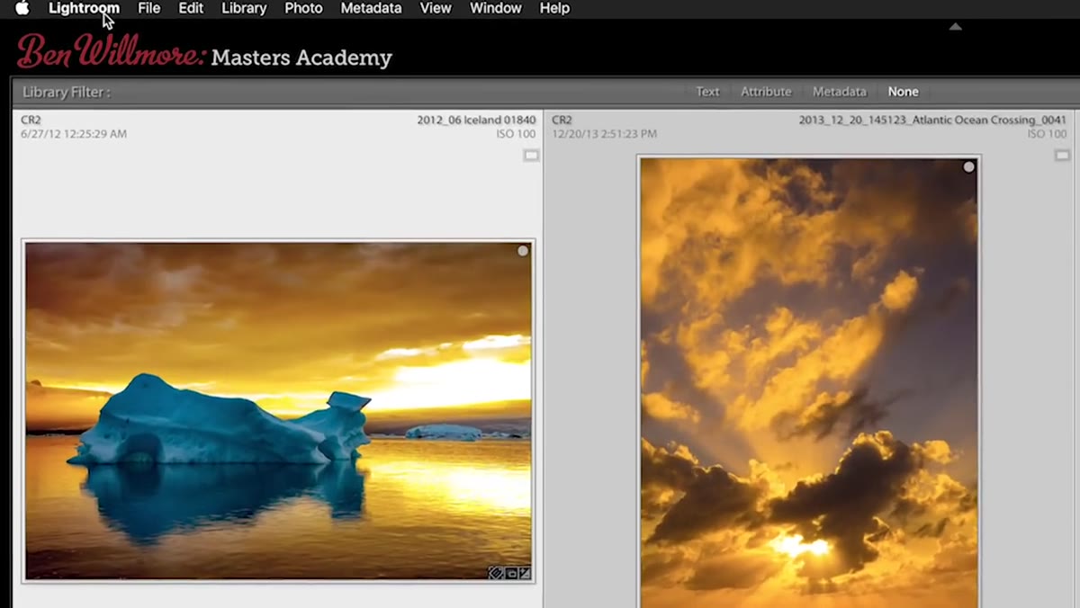 Navigating to the Edit Watermarks menu option in Lightroom
On a Mac, go to the Lightroom menu in the top navigation bar and select “Edit Watermarks.” On Windows, that same option lives under the Edit menu. Either way, you land in the same editor, which is a floating dialog with a preview of your watermark sitting on top of a sample image from your library.
Navigating to the Edit Watermarks menu option in Lightroom
On a Mac, go to the Lightroom menu in the top navigation bar and select “Edit Watermarks.” On Windows, that same option lives under the Edit menu. Either way, you land in the same editor, which is a floating dialog with a preview of your watermark sitting on top of a sample image from your library.
Before you touch anything else, look at the upper right of this dialog. There’s a dropdown that lets you choose between two watermark types: Text and Graphic. Start with Text, which is the default. You’ll build the graphic version in a later step once the workflow makes more sense.
Step 2: Type Your Watermark Text
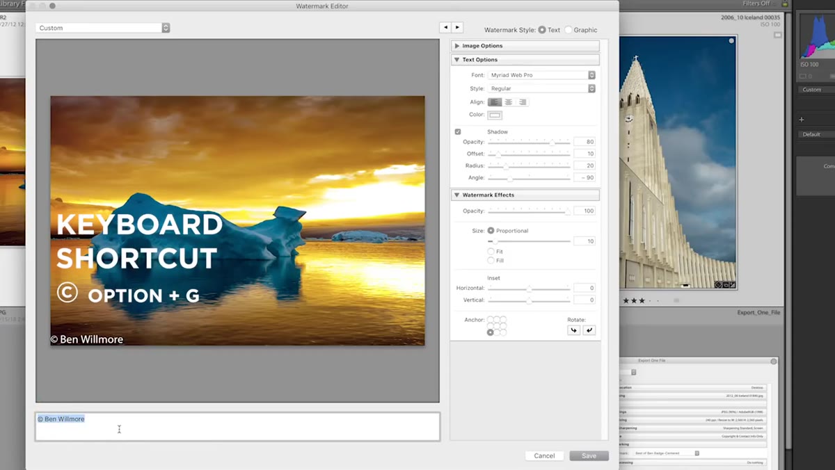 Typing watermark text in the lower-left text field
The text input field is in the lower left corner of the watermark editor, and it’s easy to miss. Click into it and type whatever you want your watermark to say. The most common choices are a copyright symbol followed by your name, your website URL, or something like “Proof Only” for client-facing work.
Typing watermark text in the lower-left text field
The text input field is in the lower left corner of the watermark editor, and it’s easy to miss. Click into it and type whatever you want your watermark to say. The most common choices are a copyright symbol followed by your name, your website URL, or something like “Proof Only” for client-facing work.
To get the copyright symbol on a Mac, press Option + G. On Windows, hold Alt and type 0169 on the numpad. Ben makes a good point here: if you’re delivering images to a client who might assume a proof is final, a watermark that says “Not for print use” or “In progress” is genuinely useful protection, not just branding.
Step 3: Style Your Text
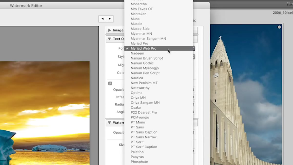 Choosing font, style, and color in the text options panel
Once your text is in place, the right side of the editor gives you font and style controls. You can choose any typeface installed on your system, set it to bold or italic, and adjust the size. The sizing method Ben recommends is surprisingly hands-on: look at the text overlay on the preview image and grab the small handle dot at the corner. Drag it out to scale up or in to scale down. It’s faster than typing a number.
Choosing font, style, and color in the text options panel
Once your text is in place, the right side of the editor gives you font and style controls. You can choose any typeface installed on your system, set it to bold or italic, and adjust the size. The sizing method Ben recommends is surprisingly hands-on: look at the text overlay on the preview image and grab the small handle dot at the corner. Drag it out to scale up or in to scale down. It’s faster than typing a number.
If you don’t see your text on the preview at all, the color is probably matching your image. Scroll down to the Color section, click the color rectangle, and pick something that stands out. White and light gray are the most practical choices because they read on dark backgrounds without competing with your actual image colors.
Step 4: Add a Drop Shadow
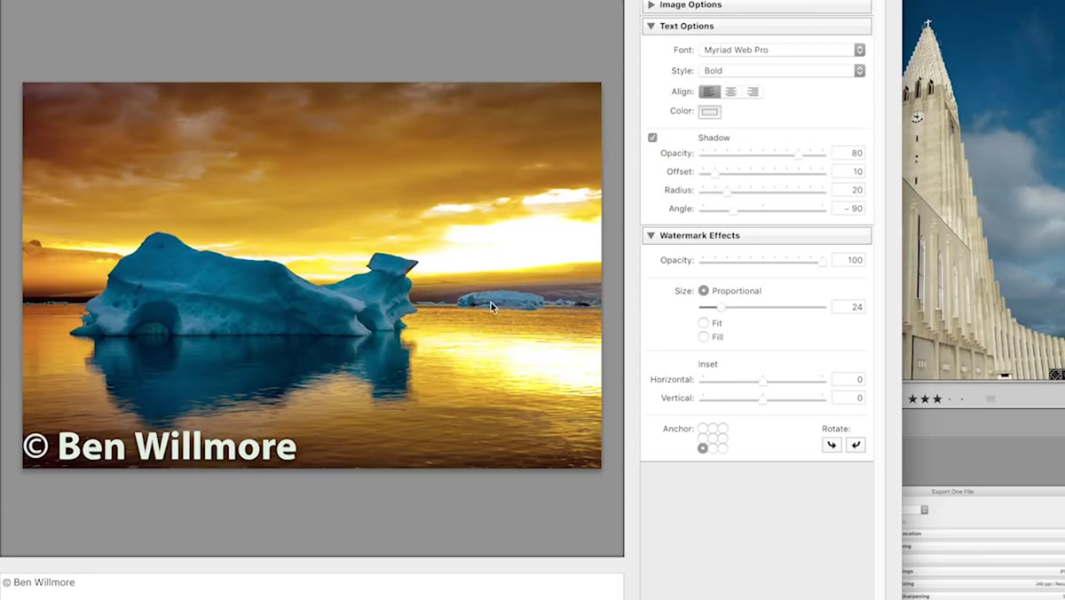 Shadow settings panel with opacity, offset, radius, and angle controls
This is the step most tutorials skip, and it’s the one that makes the biggest practical difference. A pure white watermark disappears on a bright sky. A pure dark watermark disappears on a black background. A drop shadow solves both problems at once.
Shadow settings panel with opacity, offset, radius, and angle controls
This is the step most tutorials skip, and it’s the one that makes the biggest practical difference. A pure white watermark disappears on a bright sky. A pure dark watermark disappears on a black background. A drop shadow solves both problems at once.
Check the Shadow box in the editor and four sliders appear: Opacity (how visible the shadow is), Offset (how far it sits from the text), Radius (how sharp or soft the shadow edge looks), and Angle (which direction the shadow falls). Ben keeps his shadow subtle because the goal isn’t a design statement, it’s legibility across wildly different image tones. I usually set Opacity around 70%, Offset at 50, Radius at 25, and leave the angle at the default 135 degrees.
Step 5: Adjust Watermark Effects
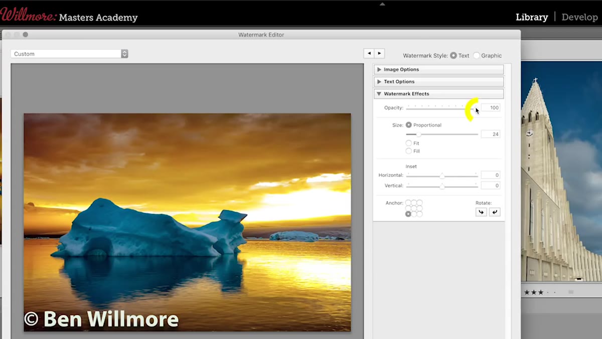 Watermark Effects panel showing opacity, size, and inset sliders
Below the shadow controls is the Watermark Effects section, which handles three key things: overall opacity, size behavior, and positioning. Dropping the watermark opacity to somewhere between 50% and 75% lets the image breathe underneath the text. A fully opaque watermark at 100% reads as aggressive, which is fine for proofs, but not ideal for portfolio shares.
Watermark Effects panel showing opacity, size, and inset sliders
Below the shadow controls is the Watermark Effects section, which handles three key things: overall opacity, size behavior, and positioning. Dropping the watermark opacity to somewhere between 50% and 75% lets the image breathe underneath the text. A fully opaque watermark at 100% reads as aggressive, which is fine for proofs, but not ideal for portfolio shares.
The Size setting gives you three options. Proportional scales the watermark relative to the image dimensions, which is the most flexible option for exporting different sizes. Fit and Fill are more aggressive and work better for graphic watermarks that are meant to cover a large portion of the image. The Inset slider controls how far the watermark sits from the edge of the frame. Bump this up if your watermark is getting clipped.
Step 6: Position the Watermark
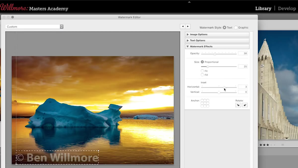 Anchor grid showing watermark placement options in the editor
The anchor grid in the lower right of the Watermark Effects panel is a 3x3 set of dots. Click any dot to snap your watermark to that position in the frame. Bottom left and bottom right are the most common placements for professional work because they stay out of the visual center of the image.
Anchor grid showing watermark placement options in the editor
The anchor grid in the lower right of the Watermark Effects panel is a 3x3 set of dots. Click any dot to snap your watermark to that position in the frame. Bottom left and bottom right are the most common placements for professional work because they stay out of the visual center of the image.
Once you’ve found a position you like, fine-tune it with the Inset sliders to push the watermark slightly away from the edge. This small adjustment gives the watermark some breathing room and makes it look intentional rather than crammed into a corner.
Step 7: Save as a Preset and Apply on Export
 Save preset dropdown at top of watermark editor dialog
Once your watermark looks right, save it. The dropdown menu in the upper left of the editor lets you save the current settings as a named preset. Give it a name you’ll recognize later. This saved preset then appears in your Export dialog under Watermarking, so you can toggle it on or off without re-entering the editor.
Save preset dropdown at top of watermark editor dialog
Once your watermark looks right, save it. The dropdown menu in the upper left of the editor lets you save the current settings as a named preset. Give it a name you’ll recognize later. This saved preset then appears in your Export dialog under Watermarking, so you can toggle it on or off without re-entering the editor.
For graphic watermarks, go back to the watermark type dropdown at the top and switch to Graphic. You’ll get a prompt to choose a PNG file from your computer. Transparent background PNGs work best here. The same effects controls apply, so you can size, position, and opacity your logo exactly the same way you did with text.
A Note on Watermark Strategy
I keep two saved watermark presets in Lightroom: one for proofs (high opacity, centered, reads “Proof - Not for Final Use”), and one for portfolio shares (low opacity, bottom right corner, just my website). Switching between them at export takes two seconds. The proof watermark has saved me from at least three situations where a client tried to pull a file straight from a preview gallery for print. The portfolio one is subtle enough that it doesn’t ruin the image, but persistent enough that anyone who reposts it is also reposting the credit.
Ben’s tutorial doesn’t make a big deal about this kind of preset strategy, but it’s the natural evolution of everything he covers. Build the tool once. Let it work for you on every export after that.
Lightroom’s watermark editor is one of those features that takes fifteen minutes to learn and saves hours over a career. Get your presets built, attach them to your export settings, and stop worrying about unattributed images showing up in the wrong places. That’s the whole game.
Watch the full tutorial on YouTube to see Ben walk through the graphic watermark workflow in real time.
Comments (4)
Finally someone explains this in a way that actually makes sense.
Couldn't agree more. I've seen this make a huge difference in landscape work specifically.
Been doing this wrong for years apparently. Thanks for the wake-up call.
This should be required reading for anyone starting out.
Leave a Comment