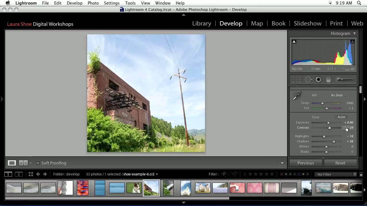
Every so often I come across a tutorial that cuts through the noise and just shows the work. No fluff, no five-minute intro, no sponsor reads before you’ve learned anything useful. Watch the full tutorial on YouTube from CreativeLive, and you’ll see what I mean. It’s a rapid-fire recap of the Develop Module — one photo, start to finish — and it covers more ground in a few minutes than most hour-long courses do.
I first learned Lightroom because my band couldn’t afford a photographer and someone had to edit the press shots. That forced me to actually understand the tools rather than just drag sliders until something looked right. This CreativeLive walkthrough hits that same nerve. It demonstrates a real editing session on a real photo — a landscape with a building, some clouds, tricky shadows — and shows the decisions behind every move. That’s what I want to unpack here.
What makes this tutorial especially useful is that it covers both Lightroom 3 and Lightroom 4 process versions. If you’ve ever opened a legacy catalog and seen that little exclamation point warning, you’ll know exactly what that means and how to handle it. Let’s walk through the whole sequence.
Step 1: Crop First, Ask Questions Later
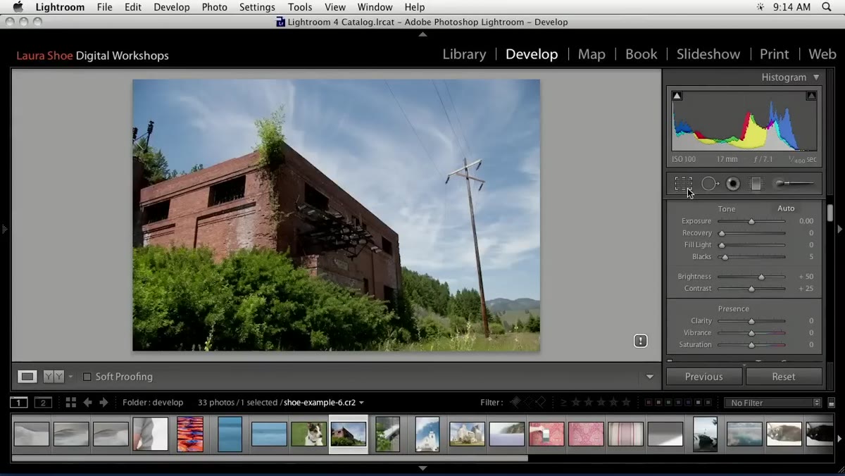 Crop tool being selected and applied to photo
Before touching a single tone slider, the tutorial opens with a crop. This is the right instinct and one I had to train myself into after years of jumping straight to exposure. The crop establishes your composition, and everything you do with light and color after that should serve the framing, not fight it.
Crop tool being selected and applied to photo
Before touching a single tone slider, the tutorial opens with a crop. This is the right instinct and one I had to train myself into after years of jumping straight to exposure. The crop establishes your composition, and everything you do with light and color after that should serve the framing, not fight it.
In this case, the instructor notices the crop is nearly square and commits to a 1:1 ratio by choosing it from the crop tool’s dropdown at the top of the panel. Once the ratio is locked, you can click and drag to reposition the frame and find the strongest version of the composition inside the original image. Hit Enter or click the crop tool icon again to close it out. Done. Move on.
Step 2: Understand Which Process Version You’re Working In
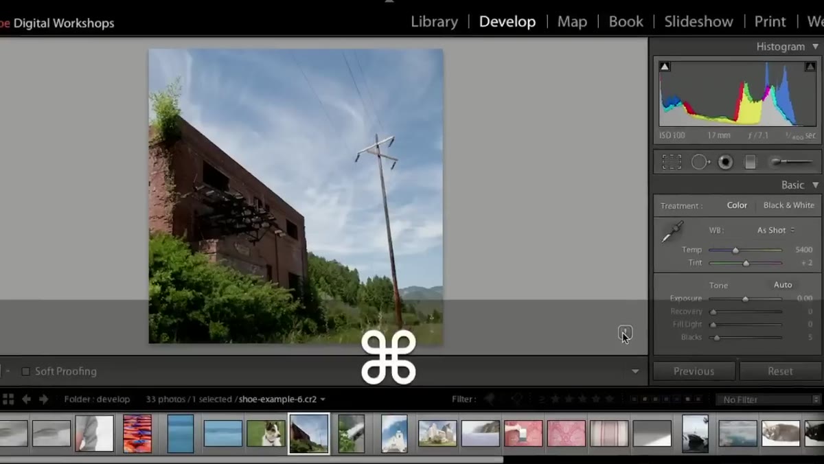 Exclamation point icon indicating Lightroom 3 process version
This is the moment most tutorials skip, and it causes so much confusion. When you see an exclamation point badge on your photo in the Develop Module, Lightroom is telling you that the image was processed using an older version - in this case, Lightroom 3’s process version - and hasn’t been updated to the current rendering engine.
Exclamation point icon indicating Lightroom 3 process version
This is the moment most tutorials skip, and it causes so much confusion. When you see an exclamation point badge on your photo in the Develop Module, Lightroom is telling you that the image was processed using an older version - in this case, Lightroom 3’s process version - and hasn’t been updated to the current rendering engine.
The instructor walks through the Lightroom 3 workflow first, then upgrades to Lightroom 4 technology using the update button. Once upgraded, the sliders change behavior significantly. Exposure in Lightroom 3 controls the white point - the brightest tones in the image. In Lightroom 4 and beyond, Exposure controls midtones. Same label, completely different function. If you’ve ever upgraded a catalog and wondered why everything looked slightly off, this is why.
Step 3: Set Exposure for the Right Target
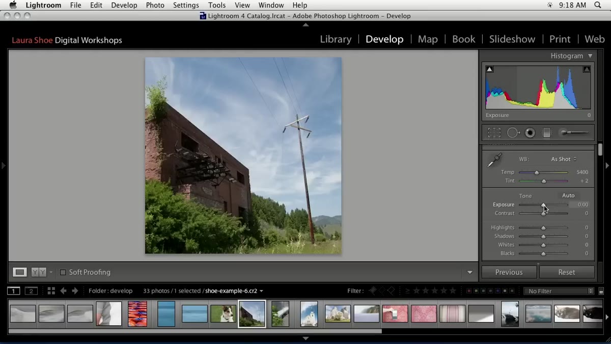 Exposure slider being adjusted in Lightroom 4 workflow
In the Lightroom 3 workflow, you set Exposure while watching the highlights in the histogram - you want to push brightness as far as you can without blowing out the brightest tones. In this photo, that means keeping an eye on the clouds.
Exposure slider being adjusted in Lightroom 4 workflow
In the Lightroom 3 workflow, you set Exposure while watching the highlights in the histogram - you want to push brightness as far as you can without blowing out the brightest tones. In this photo, that means keeping an eye on the clouds.
In Lightroom 4, you shift your attention inward. You’re setting Exposure for the middle values - the trees, the building facade, the areas with actual tonal information - rather than protecting the extremes. The extremes get handled by dedicated Highlights and Shadows sliders, which gives you much finer control. If you’re on a modern version of Lightroom, think of Exposure as your midtone brightness dial and leave the edges alone for now.
Step 4: Recover the Shadows Without Crushing the Blacks
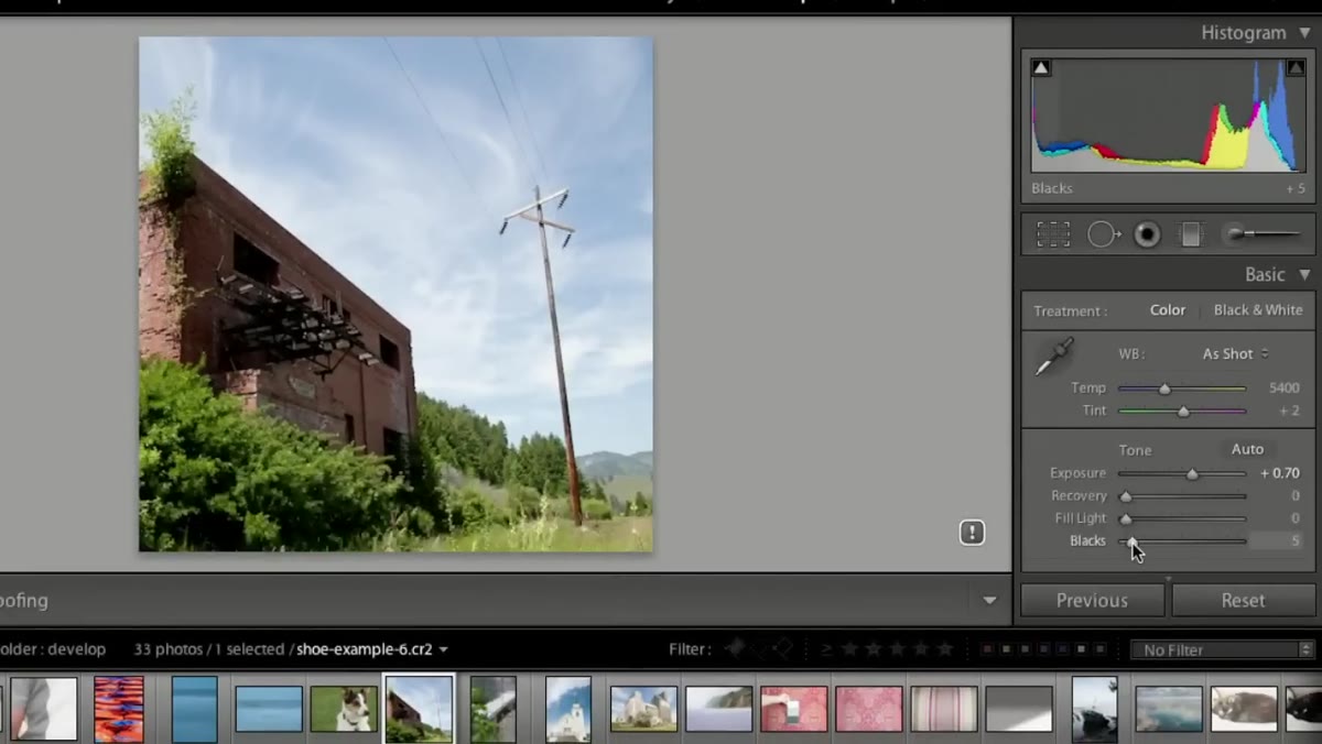 Blacks slider being pulled back to recover shadow detail
Shadow handling is where most landscape edits live or die. In the Lightroom 3 pass, the instructor shows the Blacks slider sitting too low, which results in blocked-up shadows with no detail. Pulling Blacks back toward zero recovers that information and opens up the darker parts of the frame.
Blacks slider being pulled back to recover shadow detail
Shadow handling is where most landscape edits live or die. In the Lightroom 3 pass, the instructor shows the Blacks slider sitting too low, which results in blocked-up shadows with no detail. Pulling Blacks back toward zero recovers that information and opens up the darker parts of the frame.
In Lightroom 4, this gets cleaner. The Shadows slider lets you lift the dark midtones - the inside of that building, areas under the eaves - without affecting the true blacks the way the old slider did. Add Shadows gradually. It’s easy to overshoot and make the image look flat and grey. The goal is visible detail, not a washed-out result.
Step 5: Use Clarity for Depth, Not Crunch
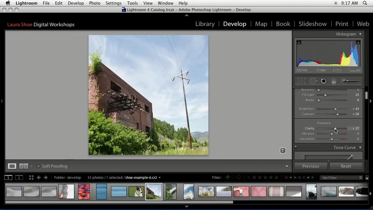 Clarity slider being added to increase midtone contrast
Clarity adds midtone contrast, which reads to the eye as three-dimensionality and texture. It’s one of my most-used sliders, but the tutorial makes a fair warning here: Lightroom 3’s Clarity algorithm tends to produce heavy, artificial-looking edge shadows if you push it too far. Go light.
Clarity slider being added to increase midtone contrast
Clarity adds midtone contrast, which reads to the eye as three-dimensionality and texture. It’s one of my most-used sliders, but the tutorial makes a fair warning here: Lightroom 3’s Clarity algorithm tends to produce heavy, artificial-looking edge shadows if you push it too far. Go light.
In modern Lightroom, Clarity is more refined, but the same principle applies. I usually start around +15 to +25 for landscapes and work up from there. If the edges of objects start to look like they have a halo or a dark outline, you’ve gone too far. Pull it back until the texture looks natural.
Step 6: When Global Saturation Fails, Go Per-Color
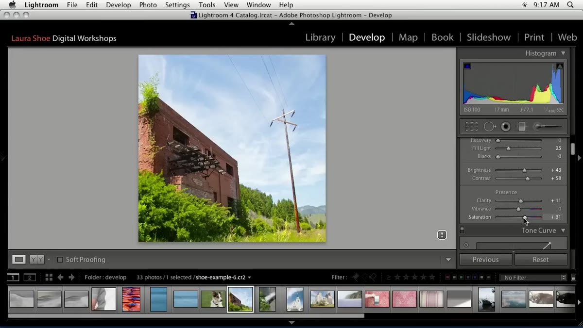 Vibrance slider being reset after affecting colors unevenly
Here’s where the tutorial gets interesting. The instructor tries adding Vibrance to boost the image’s color richness, but the greens in the grass push too far before the sky reaches the right saturation level. Rather than compromising, he resets Vibrance entirely and decides to work the colors individually in the HSL panel.
Vibrance slider being reset after affecting colors unevenly
Here’s where the tutorial gets interesting. The instructor tries adding Vibrance to boost the image’s color richness, but the greens in the grass push too far before the sky reaches the right saturation level. Rather than compromising, he resets Vibrance entirely and decides to work the colors individually in the HSL panel.
This is a real editing decision, not a workaround. Some photos have competing color ranges that need different treatment. When the sky and the foliage don’t want to cooperate with the same global adjustment, the HSL panel - Hue, Saturation, Luminance - lets you target blues and cyans separately from yellows and greens. That’s where this edit is headed next, and it’s the right call.
My Take: The Reset Habit That Changed How I Edit
The small move in this tutorial that I think deserves more attention is the double-click reset. The instructor uses it constantly to zero out sliders and start fresh, especially after upgrading from the Lightroom 3 process version. Double-clicking the label of any slider resets it to default. It sounds trivial, but building that habit - resetting cleanly rather than nudging back toward zero by feel - keeps your edits honest.
I spent years nudging sliders back manually, which meant I was always leaving a small residual adjustment I didn’t intend. Clean resets let you make deliberate choices rather than accumulated ones. It’s the editing equivalent of checking your tuning before you start playing rather than adjusting mid-song.
The single biggest thing this tutorial reinforces is that Lightroom’s Develop Module is a sequence, not a sandbox. Crop, then process version, then exposure, then shadows, then local adjustments. Work in order and each decision builds on the one before it. Skip around and you’ll spend twice as long chasing problems you created yourself.
Watch the full tutorial on YouTube to see the full color grade and the black and white conversion that follows - the second half of the session is worth the time on its own.
Comments
Leave a Comment