There’s a specific kind of frustration I know too well. You’re staring at a JPEG you edited on your phone six months ago, the tones are exactly right, the contrast sits perfectly, and you have absolutely no idea what you did to get there. No develop history. No settings to copy. Just a finished photo mocking you from across the catalog. For a long time, my only move was to squint at it and try to rebuild it from memory, which is about as reliable as it sounds.
That problem has a real solution now, and it showed up quietly in Lightroom CC version 2015.8. In this Matt Kloskowski tutorial, he walks through the new Reference View feature, a side-by-side comparison mode built directly into the Develop module. Watch the full tutorial on YouTube if you want to see him work through it live. But if you want a step-by-step breakdown you can follow without pausing and rewinding every thirty seconds, keep reading.
The use case Matt describes is the one that landed for me immediately: you have a photo whose look you want to match, but you don’t have the recipe. Maybe it’s a photo from a photographer you admire. Maybe it’s your own shot from an app that doesn’t export metadata. Reference View turns that comparison from guesswork into a visual feedback loop, right inside Lightroom.
Step 1: Install the Update
 Creative Cloud updater and Lightroom Help menu shown
Before anything else, you need to be running Lightroom CC 2015.8. You can grab it one of two ways. The fastest is through the Creative Cloud desktop app, which will show the update in your installed apps list. If you prefer staying inside Lightroom, go to Help and look for Updates in that dropdown. Once you’ve installed it and relaunch the app, Lightroom actually surfaces the new features for you on startup, which is a nice touch.
Creative Cloud updater and Lightroom Help menu shown
Before anything else, you need to be running Lightroom CC 2015.8. You can grab it one of two ways. The fastest is through the Creative Cloud desktop app, which will show the update in your installed apps list. If you prefer staying inside Lightroom, go to Help and look for Updates in that dropdown. Once you’ve installed it and relaunch the app, Lightroom actually surfaces the new features for you on startup, which is a nice touch.
Step 2: Switch to the Develop Module
 Develop module open with toolbar visible at bottom
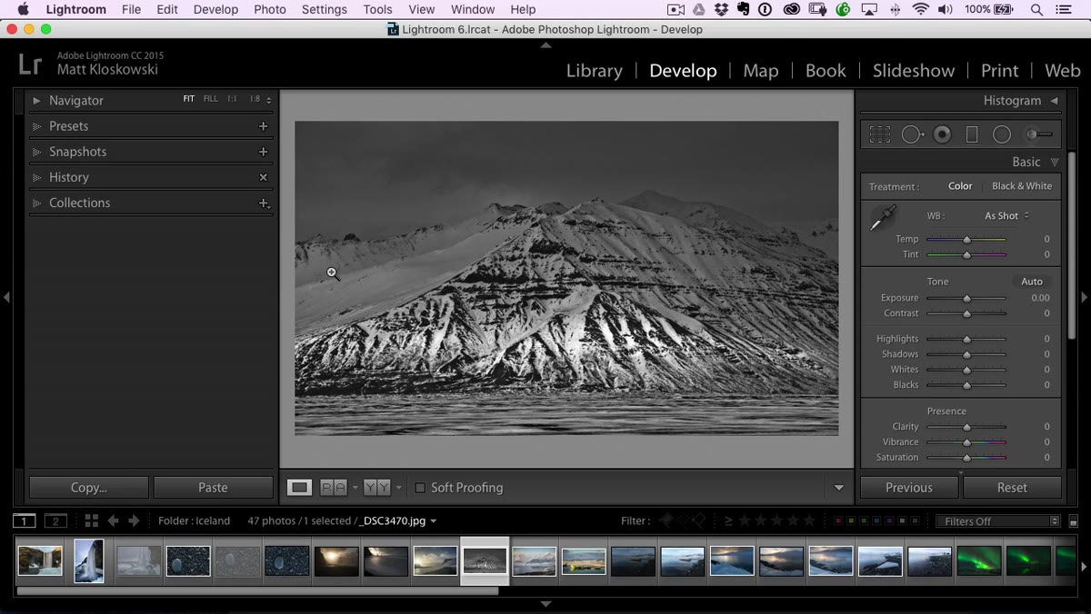
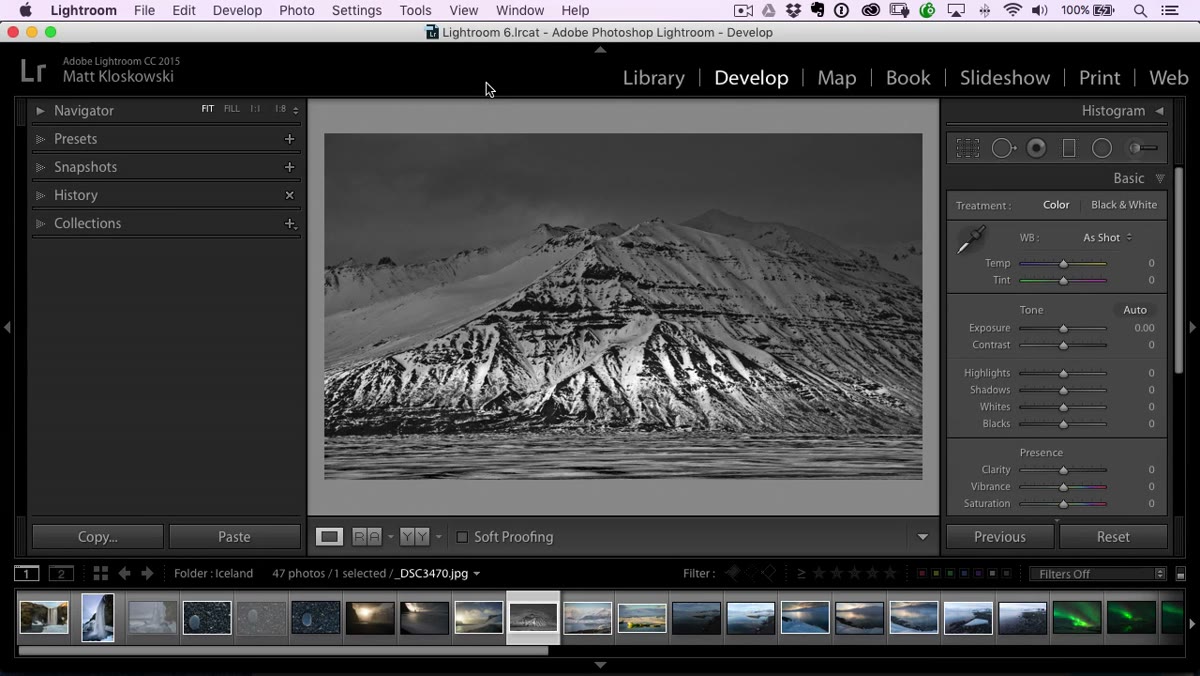
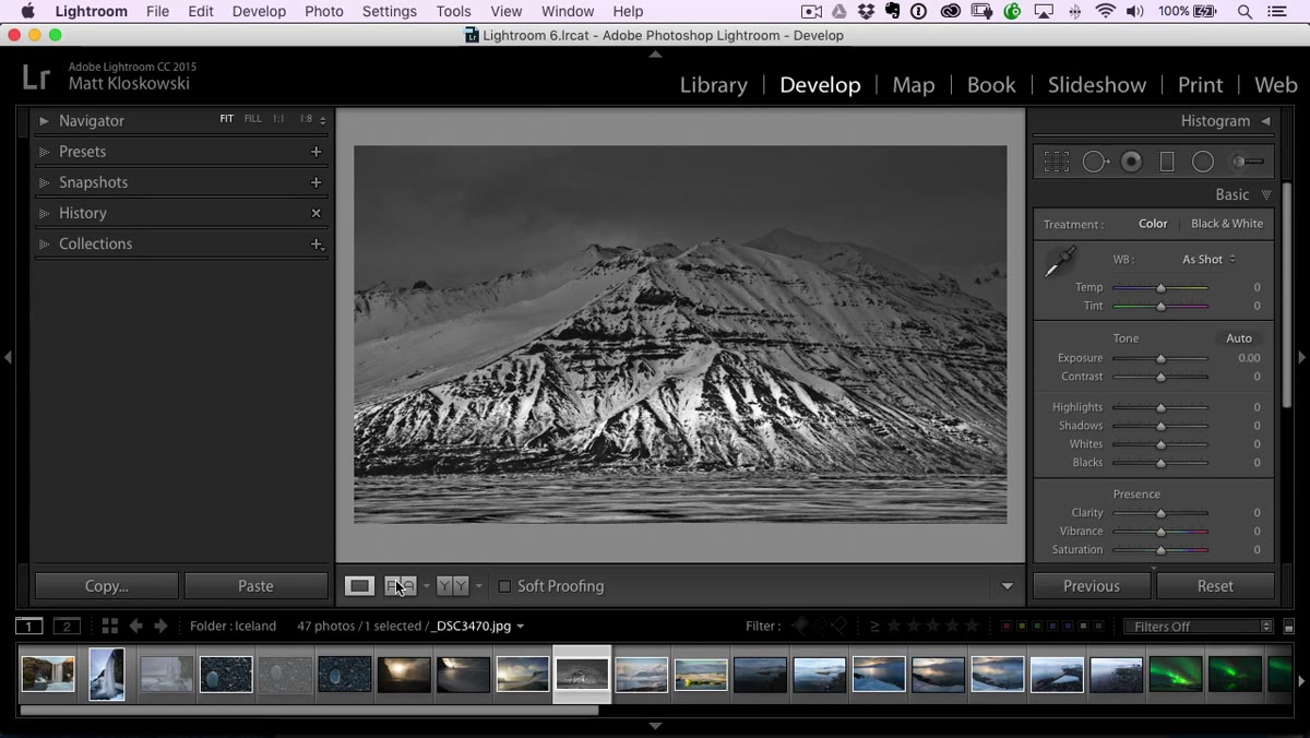
Reference View only lives in the Develop module, so head there first. Once you’re in, look at the toolbar that runs below your main image preview. If that toolbar isn’t visible, press the letter T on your keyboard to toggle it back on. It’s easy to hit T accidentally and then spend ten minutes wondering where your tools went. The Reference View icon sits in that toolbar, near your other view options like the standard loupe view.
Develop module open with toolbar visible at bottom
Reference View only lives in the Develop module, so head there first. Once you’re in, look at the toolbar that runs below your main image preview. If that toolbar isn’t visible, press the letter T on your keyboard to toggle it back on. It’s easy to hit T accidentally and then spend ten minutes wondering where your tools went. The Reference View icon sits in that toolbar, near your other view options like the standard loupe view.
Step 3: Open Reference View and Load Your Photos
 Reference View showing two-panel layout in Develop module
Click the Reference View icon in the toolbar and your workspace splits into two panels. The left side is your reference, the photo whose look you’re trying to match. The right side is your active photo, the one you’re actually editing. Drag your reference image onto the left panel and your working photo onto the right. Matt’s tip here is worth following: hide the left-hand panel column to give yourself more screen real estate. Press the F7 key or click the side panel arrow to collapse it.
Reference View showing two-panel layout in Develop module
Click the Reference View icon in the toolbar and your workspace splits into two panels. The left side is your reference, the photo whose look you’re trying to match. The right side is your active photo, the one you’re actually editing. Drag your reference image onto the left panel and your working photo onto the right. Matt’s tip here is worth following: hide the left-hand panel column to give yourself more screen real estate. Press the F7 key or click the side panel arrow to collapse it.
Step 4: Study the Reference Before You Touch a Slider
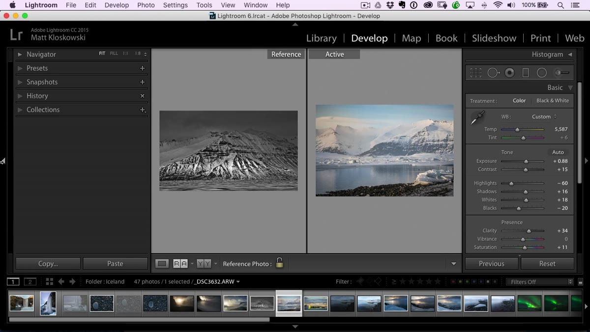 Two photos displayed side by side in Reference View
This is the step most people skip, and it’s the most important one. Before you reach for any slider, look at both images and take notes on what’s actually different. Matt runs through this process out loud in the tutorial and it’s genuinely useful to hear his eye working. Is the reference high contrast or flat? Where are the shadows landing? Are the highlights blown out or pulled back? Are the blacks deep and crushed, or lifted? Is there a vignette? What’s the color temperature doing? You’re building a mental checklist before you touch anything.
Two photos displayed side by side in Reference View
This is the step most people skip, and it’s the most important one. Before you reach for any slider, look at both images and take notes on what’s actually different. Matt runs through this process out loud in the tutorial and it’s genuinely useful to hear his eye working. Is the reference high contrast or flat? Where are the shadows landing? Are the highlights blown out or pulled back? Are the blacks deep and crushed, or lifted? Is there a vignette? What’s the color temperature doing? You’re building a mental checklist before you touch anything.
Step 5: Make Your Tonal Adjustments to Match
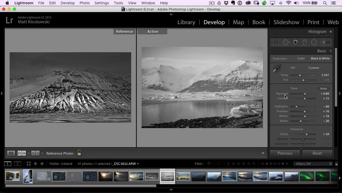 Blacks, whites, and contrast sliders being adjusted in Develop panel
Start with the broad tonal moves before anything else. In the tutorial example, Matt is matching a black and white conversion, so his first move is applying a black and white treatment to the active photo. From there he works through contrast, whites, blacks, and highlights in roughly that order, comparing his active photo against the reference after each adjustment. The left panel doesn’t update as you edit, which is exactly what you want. It stays locked as your target while the right side changes in real time.
Blacks, whites, and contrast sliders being adjusted in Develop panel
Start with the broad tonal moves before anything else. In the tutorial example, Matt is matching a black and white conversion, so his first move is applying a black and white treatment to the active photo. From there he works through contrast, whites, blacks, and highlights in roughly that order, comparing his active photo against the reference after each adjustment. The left panel doesn’t update as you edit, which is exactly what you want. It stays locked as your target while the right side changes in real time.
Pay particular attention to the blacks. It’s one of the easiest things to misjudge when you’re eyeballing a photo without a direct comparison next to it. Having both images side by side makes it immediately obvious when your shadows are about half a stop too shallow.
Step 6: Add Texture and Detail Adjustments
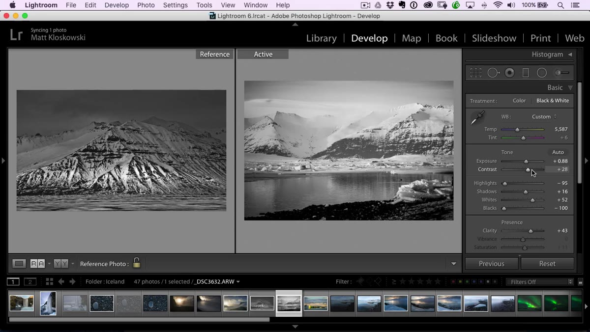 Clarity slider being increased in Develop module
Once the broad tones are in the right territory, move to clarity and texture. These are the tools that control the “feel” of a photo more than its exposure, and they’re often what separates a flat edit from one that looks intentional. In the example Matt works through, the reference photo has a strong clarity boost that adds crunch to the midtone contrast. You can feel it even before he matches it on the active side. Drag clarity up incrementally and keep checking across both panels.
Clarity slider being increased in Develop module
Once the broad tones are in the right territory, move to clarity and texture. These are the tools that control the “feel” of a photo more than its exposure, and they’re often what separates a flat edit from one that looks intentional. In the example Matt works through, the reference photo has a strong clarity boost that adds crunch to the midtone contrast. You can feel it even before he matches it on the active side. Drag clarity up incrementally and keep checking across both panels.
Step 7: Finish with Vignette and Local Refinements
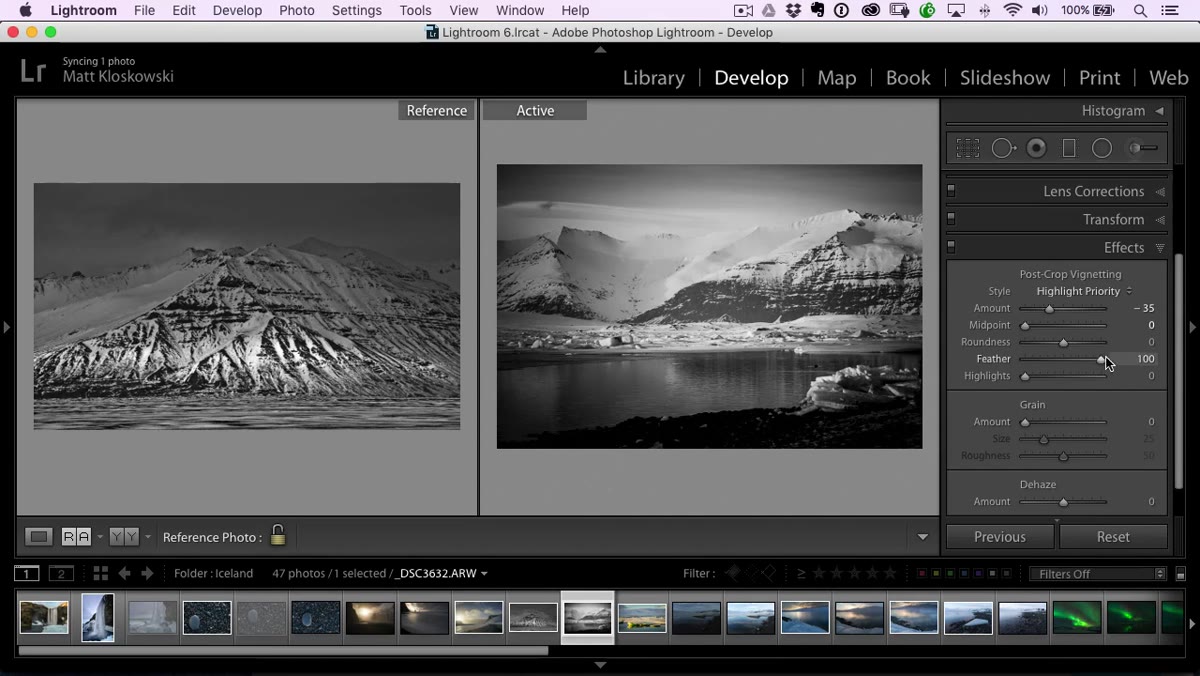 Vignette controls being adjusted in Effects panel
Vignettes are often the last thing people add and the thing that ties an edit together. In the tutorial, the reference photo has a noticeable darkening around the edges, which Matt replicates in the Effects panel using the Post-Crop Vignette. Feathering it so it’s gradual rather than harsh keeps it from looking like a filter slapped on top. Once the vignette is in, take one more pass comparing both panels at full width and check whether anything still feels off.
Vignette controls being adjusted in Effects panel
Vignettes are often the last thing people add and the thing that ties an edit together. In the tutorial, the reference photo has a noticeable darkening around the edges, which Matt replicates in the Effects panel using the Post-Crop Vignette. Feathering it so it’s gradual rather than harsh keeps it from looking like a filter slapped on top. Once the vignette is in, take one more pass comparing both panels at full width and check whether anything still feels off.
What I Actually Use Reference View For
Matt’s example focuses on matching black and white looks, but where I reach for Reference View most often is color grading consistency across a set. If I’ve color graded one anchor shot the way I want the whole gallery to feel, I’ll use it as the reference while I work through similar shots that were captured under slightly different light. It’s not a replacement for batch sync, but it gives me a visual sanity check while I’m building the edit, especially when the lighting shifted during a session and a straight settings copy won’t get me all the way there. I’ve also started using it when I’m recreating a look from a preset I liked but have since updated. I’ll export a reference JPEG, make the change to the preset, and use the old export as my comparison target. Keeps the aesthetic drift in check.
The single biggest thing Reference View does is take the guessing out of reverse engineering a look. Instead of toggling back and forth between windows or holding a printed photo up to your monitor like some kind of darkroom archaeologist, you have both images in the same space at the same time, with your editing tools live on one side. That feedback loop changes how fast and how accurately you can match a style.
Watch the full tutorial on YouTube to see Matt walk through the full workflow from start to finish, including his notes on the other changes in the 2015.8 update.
Comments
Leave a Comment