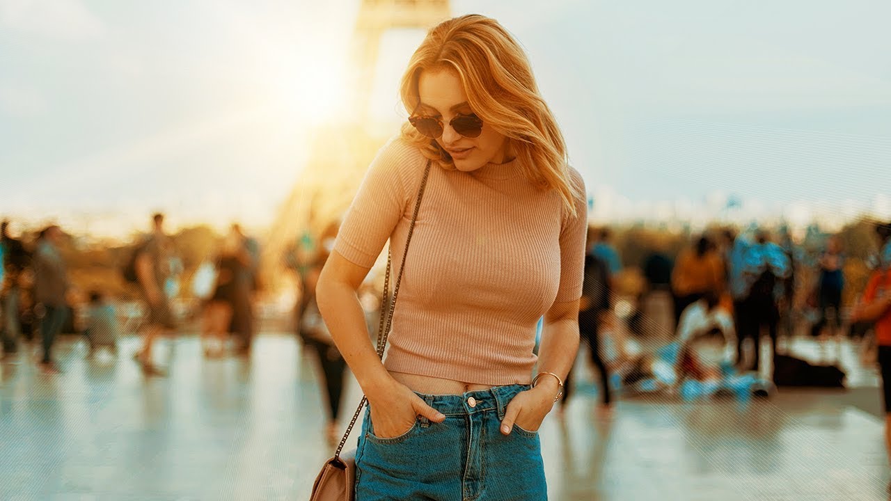
There’s a specific kind of photo that ends up in my reject pile not because it’s technically bad, but because it’s just… flat. Good light, decent composition, nothing wrong with it, and yet nothing is happening. For years I threw processing power at that problem. More contrast, more vibrance, heavier presets. The results were always a little blunt. What I actually needed was a stacked adjustment layer approach that builds color gradually, the way a good mix engineer layers frequencies instead of just cranking the volume.
Watch the full tutorial on YouTube
In this Jessica Kobeissi tutorial, she walks through exactly that kind of approach in Photoshop, using five adjustment layers working together to pull warm, cinematic color out of an otherwise unremarkable image. Each layer does a small thing. Together they do something that feels genuinely different from a one-knob fix. Here’s how to follow along, step by step.
Step 1: Start With an RGB Curves Layer
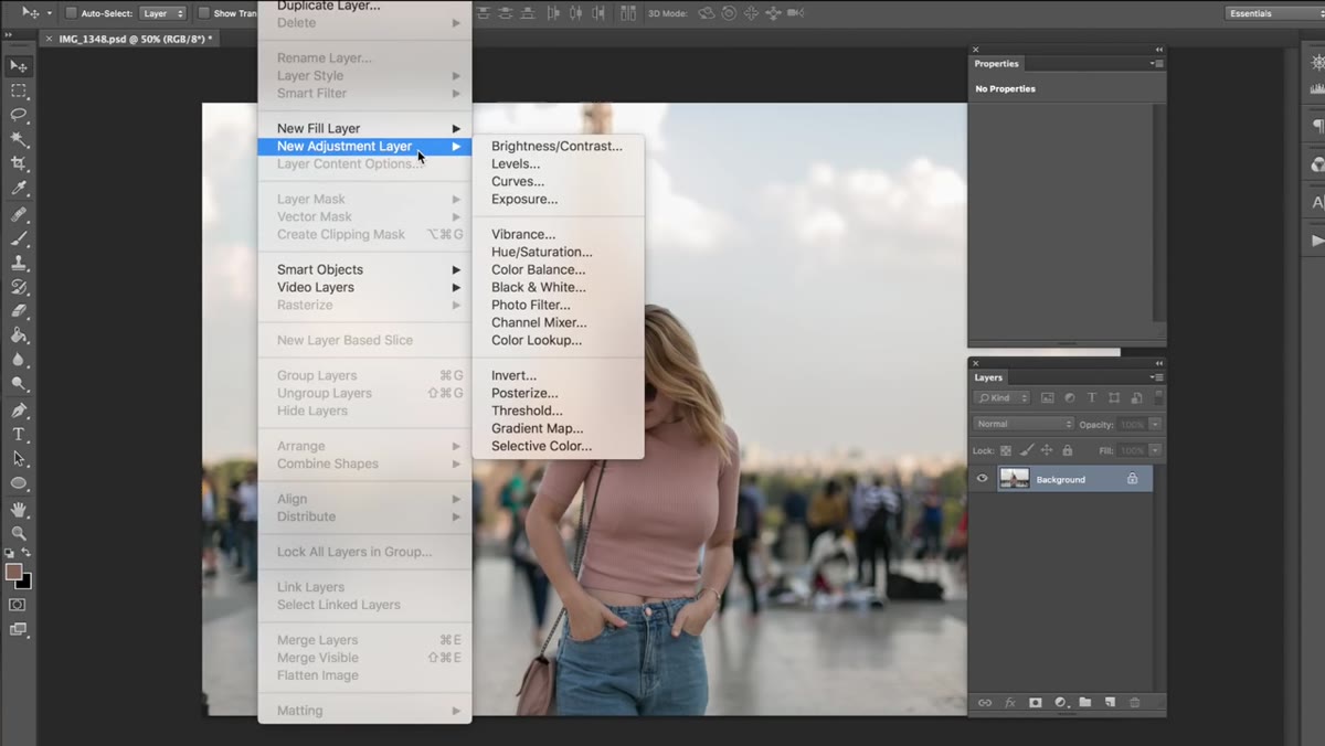 Curves adjustment layer panel open on RGB channel
Add a new adjustment layer and choose Curves. Start on the RGB composite channel and make a gentle S-curve, lifting the highlights slightly and pulling the shadows down just a touch. Jessica’s key principle here is restraint. You’re not trying to do the whole job with this one layer. A subtle S-shape adds just enough contrast to give the image some backbone before the color layers come in. If you find yourself making dramatic moves on this curve, pull back. The other layers will carry more weight than you expect.
Curves adjustment layer panel open on RGB channel
Add a new adjustment layer and choose Curves. Start on the RGB composite channel and make a gentle S-curve, lifting the highlights slightly and pulling the shadows down just a touch. Jessica’s key principle here is restraint. You’re not trying to do the whole job with this one layer. A subtle S-shape adds just enough contrast to give the image some backbone before the color layers come in. If you find yourself making dramatic moves on this curve, pull back. The other layers will carry more weight than you expect.
Step 2: Shift the Blue Channel Toward Yellow
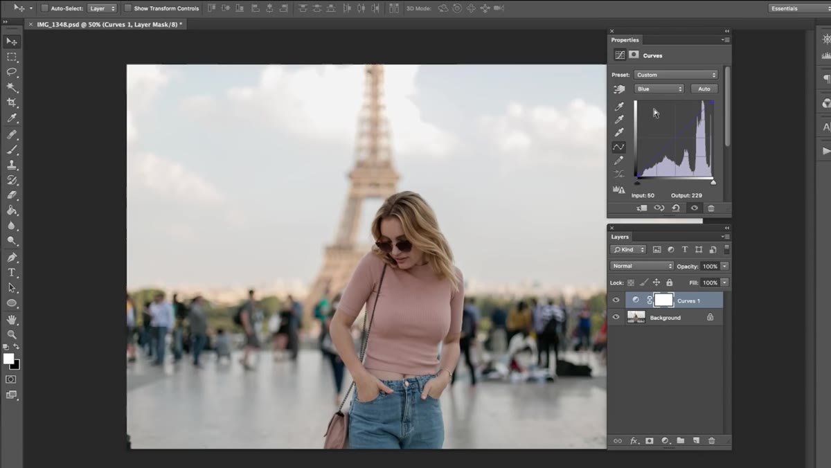 Curves panel switched to Blue channel, anchor point pulled downward
While still in the Curves adjustment, switch from RGB to the Blue channel. Pull the curve down slightly. Dropping the blue channel pushes the image toward yellow and orange tones, which is the foundation of the warm, golden look Jessica is building. You don’t need a dramatic pull here. A small downward drag in the midtone range of the blue curve is enough to start feeling the shift. Toggle the layer visibility on and off as you work so you can actually see what the adjustment is doing to the image rather than guessing.
Curves panel switched to Blue channel, anchor point pulled downward
While still in the Curves adjustment, switch from RGB to the Blue channel. Pull the curve down slightly. Dropping the blue channel pushes the image toward yellow and orange tones, which is the foundation of the warm, golden look Jessica is building. You don’t need a dramatic pull here. A small downward drag in the midtone range of the blue curve is enough to start feeling the shift. Toggle the layer visibility on and off as you work so you can actually see what the adjustment is doing to the image rather than guessing.
Step 3: Add a Black and White Layer in Soft Light Mode
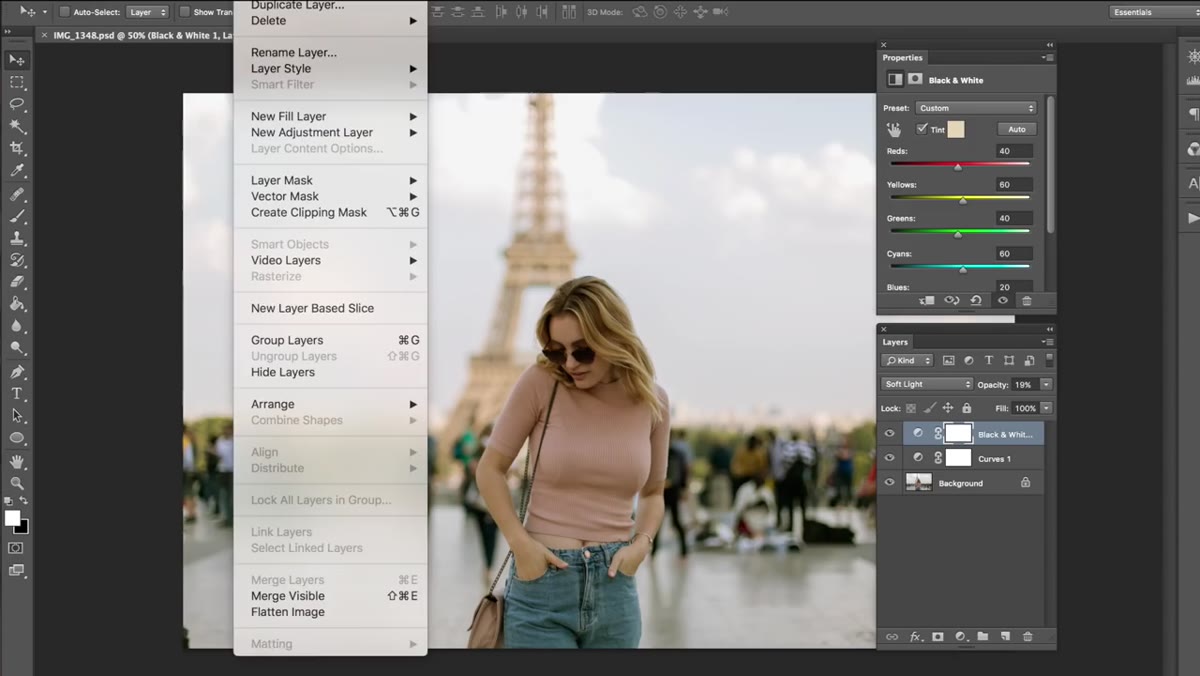
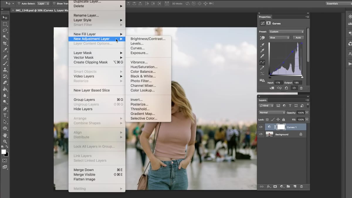 Black and White adjustment layer with Tint checkbox enabled, blend mode set to Soft Light
This one surprises people the first time. Add a Black and White adjustment layer, but don’t use it to make the image black and white. Instead, check the Tint box in the properties panel and then change the layer’s blend mode from Normal to Soft Light. Then bring the opacity down to around 19 or 20 percent. What this does is add a warm tone across the entire image in a way that feels organic rather than applied. Soft Light mode interacts with the luminosity values already in the photo, so brighter areas pick up the tone differently than shadow areas. It’s a classic darkroom trick translated into a digital layer, and it’s genuinely one of the more elegant moves in this whole technique.
Black and White adjustment layer with Tint checkbox enabled, blend mode set to Soft Light
This one surprises people the first time. Add a Black and White adjustment layer, but don’t use it to make the image black and white. Instead, check the Tint box in the properties panel and then change the layer’s blend mode from Normal to Soft Light. Then bring the opacity down to around 19 or 20 percent. What this does is add a warm tone across the entire image in a way that feels organic rather than applied. Soft Light mode interacts with the luminosity values already in the photo, so brighter areas pick up the tone differently than shadow areas. It’s a classic darkroom trick translated into a digital layer, and it’s genuinely one of the more elegant moves in this whole technique.
Step 4: Use Levels to Lift and Soften the Image
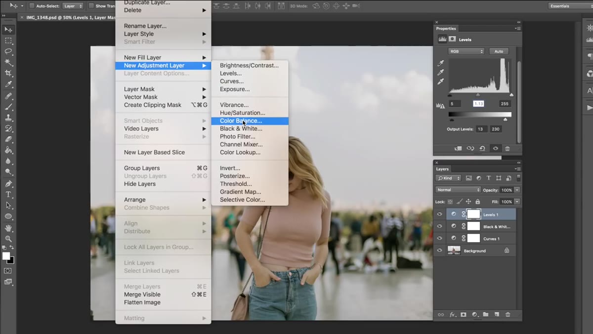
 Levels panel showing black input slider at 5, midtone at 1.13, output level pulled to 230
Open a new Levels adjustment layer. On the input side, bring the black point slider up to around 5, and nudge the midtone (the gray slider in the middle) up to about 1.13. Leave the white input point alone. Then on the Output Levels bar at the bottom of the panel, drag the white output down to around 230, and bring the black output up to 12 or 13. This combination lifts the image slightly and takes the harsh edge off the contrast. You’re essentially compressing the tonal range in a very controlled way, which is what gives color-graded images that slightly hazy, film-influenced quality without making things look washed out.
Levels panel showing black input slider at 5, midtone at 1.13, output level pulled to 230
Open a new Levels adjustment layer. On the input side, bring the black point slider up to around 5, and nudge the midtone (the gray slider in the middle) up to about 1.13. Leave the white input point alone. Then on the Output Levels bar at the bottom of the panel, drag the white output down to around 230, and bring the black output up to 12 or 13. This combination lifts the image slightly and takes the harsh edge off the contrast. You’re essentially compressing the tonal range in a very controlled way, which is what gives color-graded images that slightly hazy, film-influenced quality without making things look washed out.
Step 5: Warm the Midtones and Shadows With Color Balance
 Color Balance panel on Midtones, red and yellow sliders pulled right
Add a Color Balance adjustment layer. Working first in the Midtones section, push the slider toward Red and then toward Yellow. The exact values matter less than the direction. Jessica keeps these moves subtle, just a few points in each direction. Then switch to the Shadows section and apply a similar shift, again adding a little red and a little yellow into the darker parts of the image. This reinforces the warm palette that the curves and levels layers started building. Color Balance is underrated for this kind of work because it lets you target highlights, midtones, and shadows independently without touching anything else.
Color Balance panel on Midtones, red and yellow sliders pulled right
Add a Color Balance adjustment layer. Working first in the Midtones section, push the slider toward Red and then toward Yellow. The exact values matter less than the direction. Jessica keeps these moves subtle, just a few points in each direction. Then switch to the Shadows section and apply a similar shift, again adding a little red and a little yellow into the darker parts of the image. This reinforces the warm palette that the curves and levels layers started building. Color Balance is underrated for this kind of work because it lets you target highlights, midtones, and shadows independently without touching anything else.
Step 6: Mask Specific Areas to Protect Color Contrast
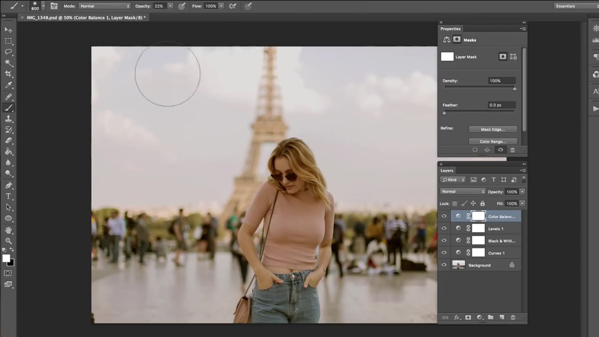 Color Balance layer mask selected, brush tool active with black foreground color
Once your Color Balance layer is set, look at the image and identify any areas where the warmth is working against you. In the tutorial, Jessica masks the clouds out of the Color Balance layer because she wants them to stay cooler and more blue, creating contrast against the warm tones in the rest of the frame. To do this, select the layer mask thumbnail on the Color Balance layer, set your foreground color to black, pick a soft brush, and paint over the areas you want to protect from the adjustment. Black hides the effect, white reveals it. This step is what separates a sloppy grade from a considered one.
Color Balance layer mask selected, brush tool active with black foreground color
Once your Color Balance layer is set, look at the image and identify any areas where the warmth is working against you. In the tutorial, Jessica masks the clouds out of the Color Balance layer because she wants them to stay cooler and more blue, creating contrast against the warm tones in the rest of the frame. To do this, select the layer mask thumbnail on the Color Balance layer, set your foreground color to black, pick a soft brush, and paint over the areas you want to protect from the adjustment. Black hides the effect, white reveals it. This step is what separates a sloppy grade from a considered one.
My Extension: Build This as a Reusable Template
What I started doing after working through this technique is saving the whole layer stack as a Photoshop action. Every session I run the action first, which drops all five adjustment layers in at their neutral defaults, and then I tune each one to the specific image. It cuts setup time in half and keeps me from skipping steps when I’m tired. If you want to go further, you can save a version of the stack with your preferred starting values as a flattened preset and use it as a base the way you’d use a Lightroom preset. The layer structure is the same every time. Only the values change.
The other thing worth knowing: this technique translates to Lightroom with some substitution. The Tone Curve covers Steps 1 and 2. The Color Grading panel (formerly Split Toning) does a version of Step 5. You lose some of the precision of individual opacity controls, but the logic of building warm color through layered small adjustments holds up in any tool.
The biggest thing this tutorial taught me is that color grading is additive, not corrective. You’re not fixing something wrong. You’re building something that wasn’t there. Doing that with five layers at low opacity consistently beats doing it with one heavy-handed slider. Each layer does 20 percent of the work, and the total is more convincing than any single adjustment could be.
Watch the full tutorial on YouTube to see Jessica work through the image in real time. Watching the before/after toggles she does at each step is genuinely useful for understanding how much each individual layer contributes.
Comments (2)
Just used this on a wedding shoot edit. Client was thrilled.
Excellent tutorial. I'd add that from a photoshop standpoint, this technique is incredibly versatile.
Leave a Comment