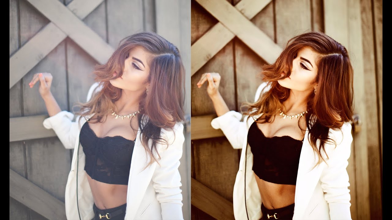
Most of my workflow lives inside Lightroom. That’s no secret. But every once in a while, a Photoshop technique comes along that makes me stop what I’m doing, close my preset panel, and actually pay attention. This is one of those techniques.
Watch the full tutorial on YouTube
In this Jessica Kobeissi tutorial, she walks through a warm-toned color grading effect using just four adjustment layers in Photoshop. No plugins, no complicated masking, no frequency separation rabbit holes. The transformation is dramatic enough to stop a scroll, but the process is surprisingly straightforward once you see it broken down. I’ve started borrowing elements of this approach when I need a warmer, more stylized grade than Lightroom’s HSL panel wants to give me.
What I find genuinely useful about this method is that each layer has a clear job. Nothing overlaps in a vague “just add vibes” way. You can dial any individual layer back and understand exactly what you’re losing. That kind of transparency is rare in color grading tutorials, and it’s the main reason I kept coming back to this one.
Step 1: Add a Gradient Map Adjustment Layer
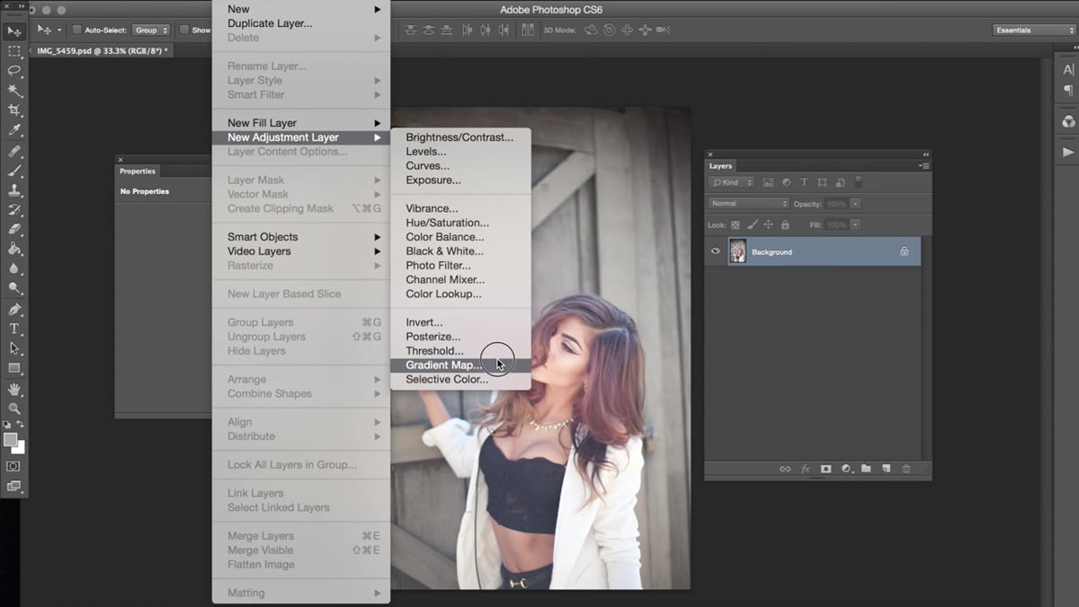 Navigating to Layer, New Adjustment Layer, Gradient Map
Start by going to Layer, then New Adjustment Layer, then Gradient Map. This is the foundation of the whole effect. Once the layer is open, you need to build a custom gradient rather than grabbing one of the defaults. Jessica uses a progression that moves from blue on the shadow end, through green in the midrange, and finishes at a pale, almost yellow-green on the highlight end. It sounds unusual, but this combination is what gives the final image that organic, slightly analog warmth.
Navigating to Layer, New Adjustment Layer, Gradient Map
Start by going to Layer, then New Adjustment Layer, then Gradient Map. This is the foundation of the whole effect. Once the layer is open, you need to build a custom gradient rather than grabbing one of the defaults. Jessica uses a progression that moves from blue on the shadow end, through green in the midrange, and finishes at a pale, almost yellow-green on the highlight end. It sounds unusual, but this combination is what gives the final image that organic, slightly analog warmth.
After building the gradient, change the layer blending mode from Normal to Overlay. This is what stops the effect from looking like you threw a green filter over everything. In Overlay mode, the gradient interacts with the luminosity of the image rather than replacing it, which means your highlights and shadows respond differently. The result feels graded, not tinted. If it reads as too heavy, just pull the layer opacity down. Even at 60 or 70 percent, this layer is doing meaningful work.
Step 2: Add a Selective Color Adjustment Layer
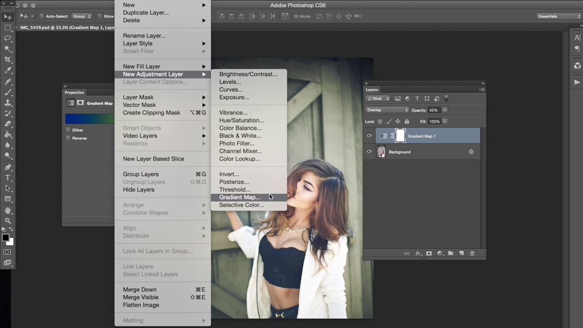 Selective Color adjustment layer panel open in Photoshop
Next, go to Layer, New Adjustment Layer, Selective Color. Leave the blending mode at Normal for this one. Selective Color lets you push individual color channels within specific tonal ranges, which is a level of precision that most Lightroom users underestimate until they try it.
Selective Color adjustment layer panel open in Photoshop
Next, go to Layer, New Adjustment Layer, Selective Color. Leave the blending mode at Normal for this one. Selective Color lets you push individual color channels within specific tonal ranges, which is a level of precision that most Lightroom users underestimate until they try it.
Jessica focuses primarily on the Blacks and Neutrals ranges here. In the Blacks, she adds a small amount of Magenta, just a nudge. In the Neutrals, she makes similarly minor adjustments, pulling the image slightly warmer without overcooking it. The Whites range she touches only lightly, noting that heavy adjustments there tend to make images look overly soft. That note is worth taking seriously. Whites in Selective Color can go wrong fast. Make small moves, check the overall tone, and stop before it starts looking like a diffusion filter you didn’t ask for.
Step 3: Add a Black and White Adjustment Layer Set to Soft Light
 Black and White adjustment layer with Tint option checked
This is the layer that controls how intense the overall effect looks, and it surprised me the first time I saw it used this way. Add a Black and White adjustment layer via Layer, New Adjustment Layer, Black and White. Inside the panel, check the Tint box. This applies a color tone across the image using the adjustment layer’s built-in tint picker.
Black and White adjustment layer with Tint option checked
This is the layer that controls how intense the overall effect looks, and it surprised me the first time I saw it used this way. Add a Black and White adjustment layer via Layer, New Adjustment Layer, Black and White. Inside the panel, check the Tint box. This applies a color tone across the image using the adjustment layer’s built-in tint picker.
Then change the blending mode from Normal to Soft Light and leave the opacity at 100 percent. Soft Light increases contrast and saturation in a way that feels like it’s coming from inside the image rather than being applied on top. The tint you select here will influence the overall color cast, so experiment with warmer hues to stay consistent with the gradient map below. If the effect feels too punchy or the skin tones start looking strange, this is the layer to pull back first. Drop the opacity to 70 or 80 percent and the image tends to settle into something more believable.
Step 4: Add a Color Balance Adjustment Layer
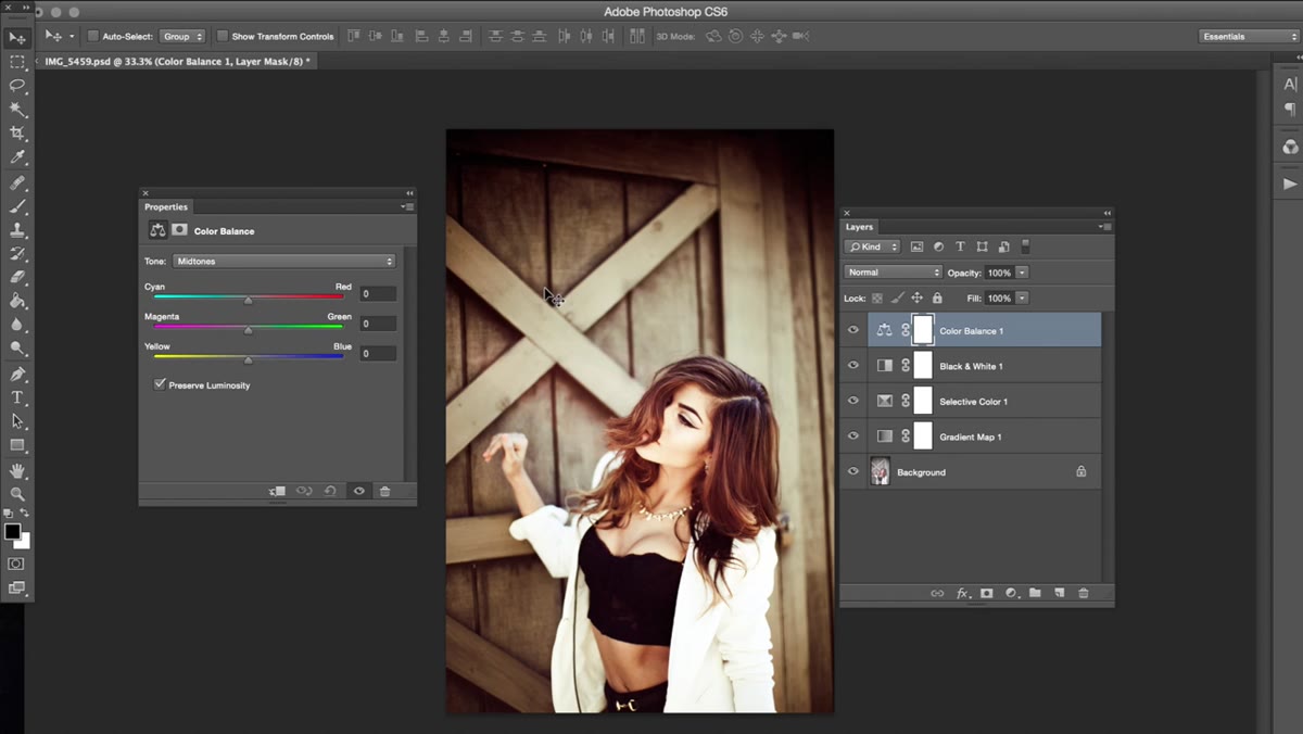 Color Balance panel showing Midtones, Highlights, Shadows tabs
The final layer is Color Balance, added through Layer, New Adjustment Layer, Color Balance. This tool lets you shift the color temperature of your shadows, midtones, and highlights independently, which is where you make the image actually feel warm rather than just look like it’s wearing a warm filter.
Color Balance panel showing Midtones, Highlights, Shadows tabs
The final layer is Color Balance, added through Layer, New Adjustment Layer, Color Balance. This tool lets you shift the color temperature of your shadows, midtones, and highlights independently, which is where you make the image actually feel warm rather than just look like it’s wearing a warm filter.
Jessica works through all three tonal ranges. In the Midtones, she nudges the Yellow slider. In the Highlights, she makes a small adjustment to reinforce the warmth without blowing out the lightest parts of the frame. In the Shadows, she pulls back around 10 points, keeping the dark areas from going too green or too flat. These are subtle moves, but layered on top of everything below, they’re what push the grade from interesting to cohesive. The whole image starts reading as a single visual idea rather than a stack of random adjustments.
How I’d Adapt This in a Lightroom-First Workflow
I don’t do every edit in Photoshop. Most of my work starts and ends in Lightroom, and I’ve found ways to approximate this approach without jumping between applications constantly. The gradient map step is the hardest to replicate natively in Lightroom, but you can get close by using a strong Color Grading setup where the shadows push cool and the highlights push warm. It’s not identical, but it gives you that cross-processed tension that makes this effect interesting.
The Selective Color and Color Balance steps translate more directly. Lightroom’s HSL panel and Color Grading sliders cover a lot of the same territory if you’re patient with them. I’ve built presets using this logic, actually, and they’ve become some of my more-used starting points for editorial work. The real lesson from Jessica’s approach isn’t about any single setting. It’s about building a grade in layers where each one has a specific purpose, so you’re not endlessly chasing a vibe you can’t describe or reproduce.
The single most important thing this tutorial demonstrates is that dramatic color grading doesn’t require complicated techniques. It requires intentional layering. Four adjustment layers, each with a clear function, producing a result that looks like you spent twice as long getting there.
Watch the full tutorial on YouTube and pay attention to how Jessica describes pulling individual layer opacity back when the effect reads as too intense. That instinct, knowing which layer to dial back and why, is the skill this technique is really teaching.
Comments
Leave a Comment