Portrait editing is one of those things where the gap between “technically correct” and “actually good” is enormous. I spent years closing that gap by watching tutorials, breaking them down, and rebuilding the techniques in my own workflow. One tutorial that keeps earning its place in my rotation is Chelsea Northrup’s portrait editing walkthrough from the Tony & Chelsea Northrup channel. It’s a practical, no-fluff demonstration that covers Lightroom color work and a couple of targeted Photoshop moves that make a real difference on skin and hair.
Watch the full tutorial on YouTube
What I like about this one is that Chelsea isn’t editing a pristine studio portrait under perfect controlled light. She’s working with a backlit beach photo where the subject’s face is partially in shadow and flyaway hair is catching all the sun. That’s a real situation. That’s a Tuesday. Here’s how she works through it, step by step.
Step 1: Crop for Composition Before You Touch Anything Else
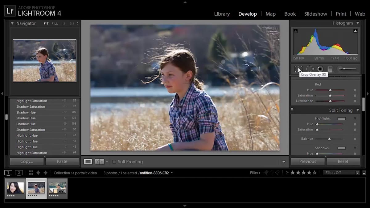 Crop tool active, subject being moved off center
Before any tonal or color adjustments, Chelsea crops the photo. Her subject is centered in the frame, and she doesn’t want that. She drags the crop to pull the subject into the corner, following the rule of thirds. This sounds basic, but the order matters. Cropping first means every exposure and color decision you make afterward is based on the actual final framing, not a wider version of the image that you’re going to throw away anyway. Crop early, commit to the composition, then edit what you’re keeping.
Crop tool active, subject being moved off center
Before any tonal or color adjustments, Chelsea crops the photo. Her subject is centered in the frame, and she doesn’t want that. She drags the crop to pull the subject into the corner, following the rule of thirds. This sounds basic, but the order matters. Cropping first means every exposure and color decision you make afterward is based on the actual final framing, not a wider version of the image that you’re going to throw away anyway. Crop early, commit to the composition, then edit what you’re keeping.
Step 2: Lift the Blacks to Rescue Shadow Detail
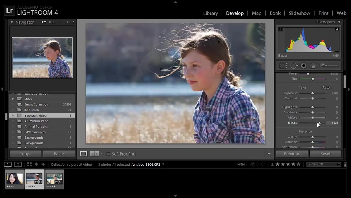 Blacks slider being raised, shadow detail appearing in face
The photo was shot with backlighting, which looks gorgeous on hair but tends to push facial skin into shadow. Chelsea’s fix isn’t to crank the exposure slider, which would blow out the bright areas. Instead, she raises the Blacks slider in the Basic panel. Lifting the black point compresses the tonal range from the bottom up, which brings up the darkest shadow values without touching the highlights. It’s also what creates that matte, low-contrast look that works well for this kind of atmospheric portrait. If you want to preserve the warmth of the backlighting while still seeing the subject’s face, this is the move.
Blacks slider being raised, shadow detail appearing in face
The photo was shot with backlighting, which looks gorgeous on hair but tends to push facial skin into shadow. Chelsea’s fix isn’t to crank the exposure slider, which would blow out the bright areas. Instead, she raises the Blacks slider in the Basic panel. Lifting the black point compresses the tonal range from the bottom up, which brings up the darkest shadow values without touching the highlights. It’s also what creates that matte, low-contrast look that works well for this kind of atmospheric portrait. If you want to preserve the warmth of the backlighting while still seeing the subject’s face, this is the move.
Step 3: Add Mood With Split Toning
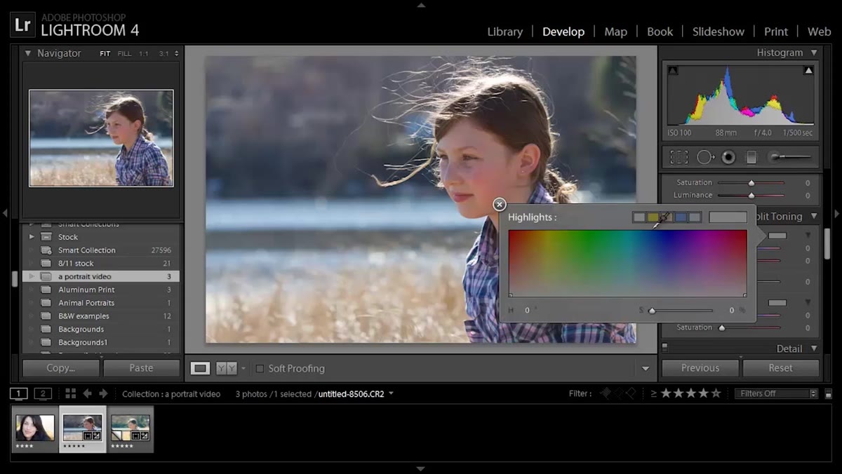 Split Toning panel open, hue selected for highlights
This is where the image gets its character. In the Split Toning panel (now called Color Grading in Lightroom’s current layout), Chelsea assigns a yellow-warm hue to the highlights and a blue hue to the shadows. The effect reinforces what the backlighting was already doing naturally. The highlights stay golden and warm, the shadows get a cooler, slightly cinematic quality.
Split Toning panel open, hue selected for highlights
This is where the image gets its character. In the Split Toning panel (now called Color Grading in Lightroom’s current layout), Chelsea assigns a yellow-warm hue to the highlights and a blue hue to the shadows. The effect reinforces what the backlighting was already doing naturally. The highlights stay golden and warm, the shadows get a cooler, slightly cinematic quality.
The key detail she emphasizes is to dial back the saturation on both the highlights and shadows after selecting the hues. Push the saturation too far and the effect looks like a filter slapped on at the end. Pull it back to a subtle level and it reads as the light itself. Think of it less as “adding a color effect” and more as “reinforcing what was already in the scene.” The difference in how those read to a viewer is significant.
Step 4: Fine-Tune Exposure and Shadows to Finish the Tone
 Exposure and Shadows sliders being adjusted upward
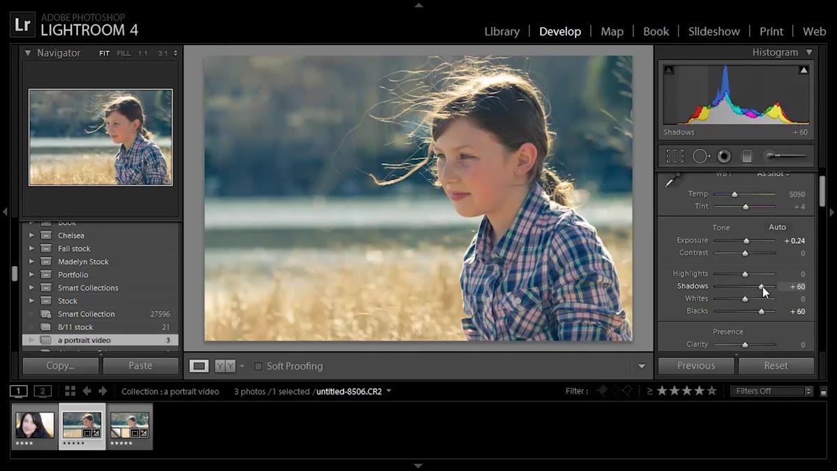
Once the color split is in place, Chelsea makes small upward adjustments to both the Exposure and Shadows sliders. The exposure nudge brightens the image overall, and the shadows lift further lifts the midtones and darker areas. These are small moves at this stage. The heavy lifting on the shadows was already done by lifting the Blacks in Step 2. These final adjustments are about making the image feel open and light rather than muddy or underexposed. Keep these moves subtle, check your histogram, and don’t let the highlights clip.
Exposure and Shadows sliders being adjusted upward
Once the color split is in place, Chelsea makes small upward adjustments to both the Exposure and Shadows sliders. The exposure nudge brightens the image overall, and the shadows lift further lifts the midtones and darker areas. These are small moves at this stage. The heavy lifting on the shadows was already done by lifting the Blacks in Step 2. These final adjustments are about making the image feel open and light rather than muddy or underexposed. Keep these moves subtle, check your histogram, and don’t let the highlights clip.
Step 5: Send to Photoshop for Targeted Retouching
 Right-click menu open, “Edit in Photoshop” option selected
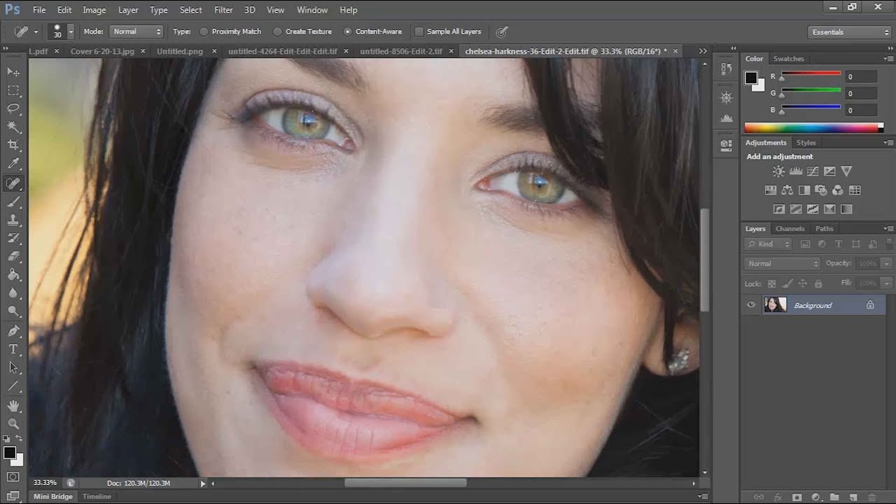
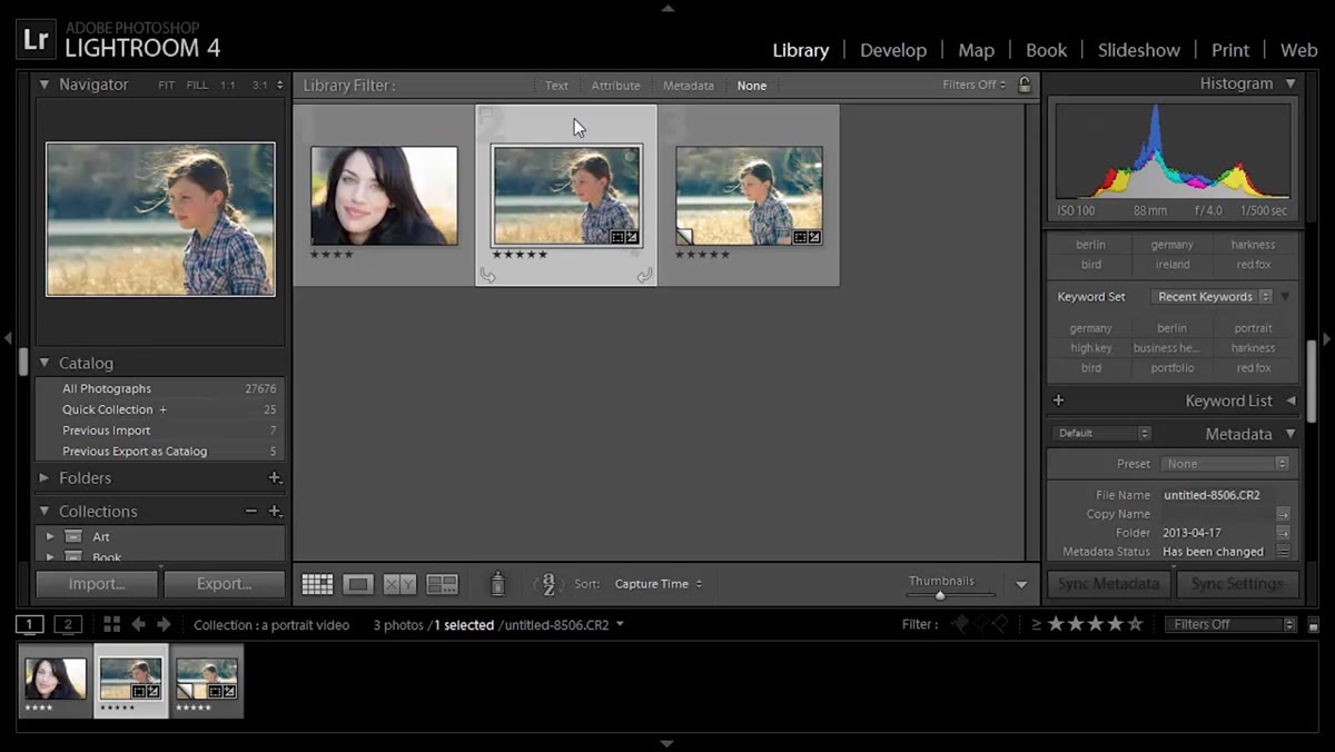
From Lightroom’s Library module, Chelsea right-clicks the image and selects Edit In - Adobe Photoshop. Once open in Photoshop, she uses the Healing Brush tool (what she calls the Band-Aid tool) to remove a specific flyaway hair that’s pulling attention away from the face. The important point here: she doesn’t try to eliminate every flyaway. The loose hair is part of the image’s energy and the light catching it is part of what makes the shot work. She targets only the one or two strands that are genuinely distracting. Retouching with restraint is a skill that takes practice to develop, and she names the mistake directly so you know what to watch for.
Right-click menu open, “Edit in Photoshop” option selected
From Lightroom’s Library module, Chelsea right-clicks the image and selects Edit In - Adobe Photoshop. Once open in Photoshop, she uses the Healing Brush tool (what she calls the Band-Aid tool) to remove a specific flyaway hair that’s pulling attention away from the face. The important point here: she doesn’t try to eliminate every flyaway. The loose hair is part of the image’s energy and the light catching it is part of what makes the shot work. She targets only the one or two strands that are genuinely distracting. Retouching with restraint is a skill that takes practice to develop, and she names the mistake directly so you know what to watch for.
Step 6: Use the Dodge Tool to Brighten Eyes - Carefully
 Dodge tool active, zoomed in on subject’s eye
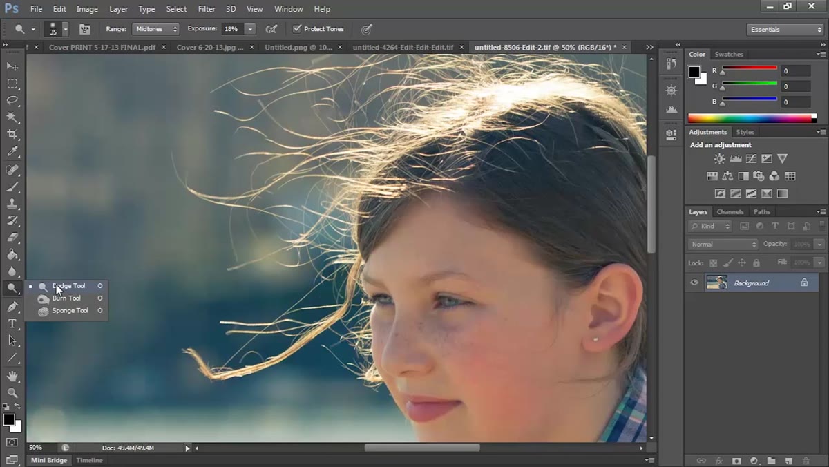
The last step is one of the most commonly botched moves in portrait editing. Chelsea uses the Dodge tool to brighten the subject’s eyes, but the settings matter a lot here. Range set to Midtones. Exposure set to around 10 to 11 percent. Zoomed in close. She makes a pass or two at most. Then she shows what happens when you overdo it: the eyes look bright in a wrong way, almost glowing, and it becomes the first thing anyone notices in the photo. That’s not a compliment. The goal is eyes that look clear and alive, not eyes that look like someone applied a filter called “alien.” Low opacity, midtone range, and a light touch are the rules.
Dodge tool active, zoomed in on subject’s eye
The last step is one of the most commonly botched moves in portrait editing. Chelsea uses the Dodge tool to brighten the subject’s eyes, but the settings matter a lot here. Range set to Midtones. Exposure set to around 10 to 11 percent. Zoomed in close. She makes a pass or two at most. Then she shows what happens when you overdo it: the eyes look bright in a wrong way, almost glowing, and it becomes the first thing anyone notices in the photo. That’s not a compliment. The goal is eyes that look clear and alive, not eyes that look like someone applied a filter called “alien.” Low opacity, midtone range, and a light touch are the rules.
One Thing I’d Add From My Own Work
Chelsea’s split toning approach here works beautifully for warm, outdoor, natural-light portraits. In my own work, I’ve found the same technique can tip the wrong direction on cooler, overcast-day portraits where the light is already flat and blue-leaning. If you’re applying this to an outdoor portrait shot under cloud cover or in open shade, consider reversing the color temperature logic entirely. Try pulling the shadow tones toward a warmer amber and leaving the highlights closer to neutral. The structural technique is identical, just pointed in the opposite direction. The underlying principle, which is using split toning to reinforce the existing light rather than fight it, holds in both cases.
The single most important takeaway from this tutorial is something that sounds obvious but isn’t: every adjustment should serve the light that was already in the photo when you pressed the shutter. Chelsea isn’t manufacturing a mood from scratch. She’s reading what the backlight gave her and building every slider move around it. That’s the difference between editing that looks intentional and editing that just looks processed.
Watch the full tutorial on YouTube and pay particular attention to the before-and-after she shows around the two-minute mark. Seeing the original file next to the edited version makes the impact of the Blacks and split toning adjustments click in a way that’s hard to describe in text.
Comments (3)
The before and after really sells it. Incredible difference.
This is going in my reference folder. Incredibly useful.
Really solid breakdown. This pairs perfectly with the retouching work I've been writing about.
Leave a Comment