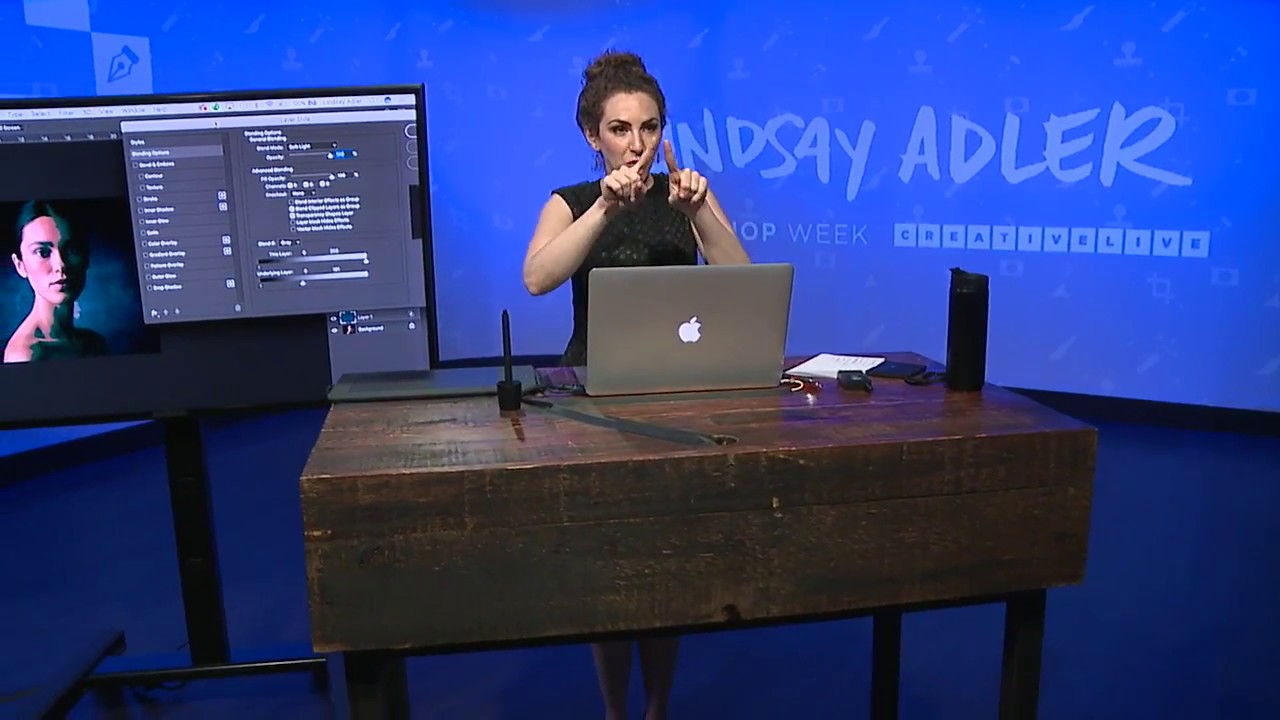
I have a complicated relationship with split toning in Lightroom. I use it constantly, I’ve named half my presets after it, and I also quietly resent how little control it gives me. You set a hue for the highlights, a hue for the shadows, and then Lightroom just… does it. Everywhere. On skin, on backgrounds, on the whites of someone’s eyes. There’s no telling it where to apply and where to back off. For a lot of looks that works fine. For anything precise, it starts to feel like painting with a roller brush when you needed a detail brush.
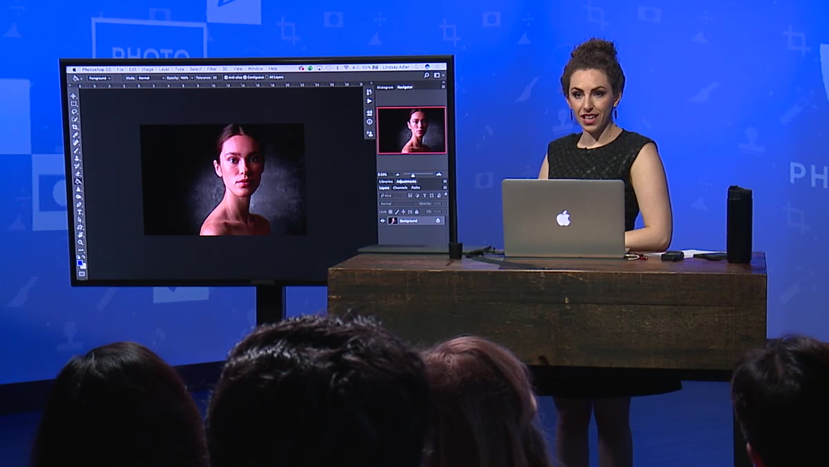
That’s exactly why this CreativeLive tutorial with Lindsay Adler stopped me mid-scroll. Watch the full tutorial on YouTube — it’s compact, practical, and covers a Photoshop technique I wish someone had shown me years earlier. The core idea is this: instead of using Lightroom’s split toning panel, you build individual solid color layers in Photoshop and use Blend If to control exactly where those colors land in the tonal range of your image. Shadows get one color, highlights get another, and you decide how hard or soft the transition is between them. That’s real control.
What follows is a step-by-step breakdown of the technique Lindsay walks through, with enough detail that you can follow along without the video open — though I’d still recommend watching it after you read this.
Step 1: Create a New Blank Layer
 Empty new layer created in Photoshop layers panel
Start in Photoshop with your photo open and your layers panel visible. Create a new blank layer by clicking the new layer icon, which sits just to the left of the trash can at the bottom of the layers panel. Don’t fill it, don’t add an adjustment, just leave it completely empty. This layer is going to hold a solid color that you’ll paint in next.
Empty new layer created in Photoshop layers panel
Start in Photoshop with your photo open and your layers panel visible. Create a new blank layer by clicking the new layer icon, which sits just to the left of the trash can at the bottom of the layers panel. Don’t fill it, don’t add an adjustment, just leave it completely empty. This layer is going to hold a solid color that you’ll paint in next.
Step 2: Choose Your Shadow Color and Fill the Layer
 Teal color selected in color picker for shadow tone
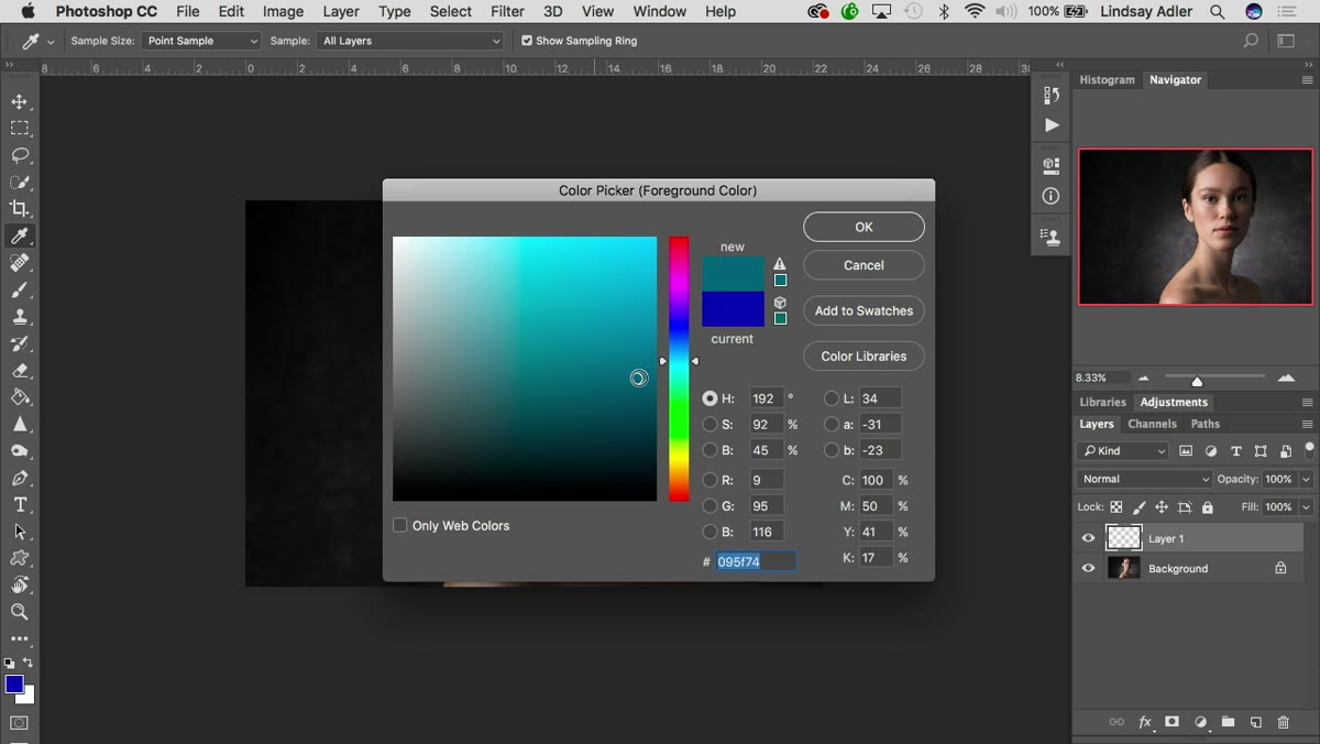
Pick the color you want to appear in the shadows of your image. This is a creative choice, and it’s worth thinking about intentionally. Lindsay goes with a teal because she’s building toward a teal-orange grade, which is one of the most reliably cinematic pairings in portrait photography. If you want something warmer and more organic, a muted yellow-green the kind you see in Annie Leibovitz’s portrait work is a great reference point. A deep blue reads as moody and cool. A green can push things into a Matrix-style stylized territory.
Teal color selected in color picker for shadow tone
Pick the color you want to appear in the shadows of your image. This is a creative choice, and it’s worth thinking about intentionally. Lindsay goes with a teal because she’s building toward a teal-orange grade, which is one of the most reliably cinematic pairings in portrait photography. If you want something warmer and more organic, a muted yellow-green the kind you see in Annie Leibovitz’s portrait work is a great reference point. A deep blue reads as moody and cool. A green can push things into a Matrix-style stylized territory.
Once you’ve landed on your color, fill the entire layer with it. You’ll have a flat, solid color sitting over your photo. It looks wrong. That’s expected. Keep going.
Step 3: Change the Layer Blend Mode to Soft Light
 Blend mode dropdown set to Soft Light in layers panel
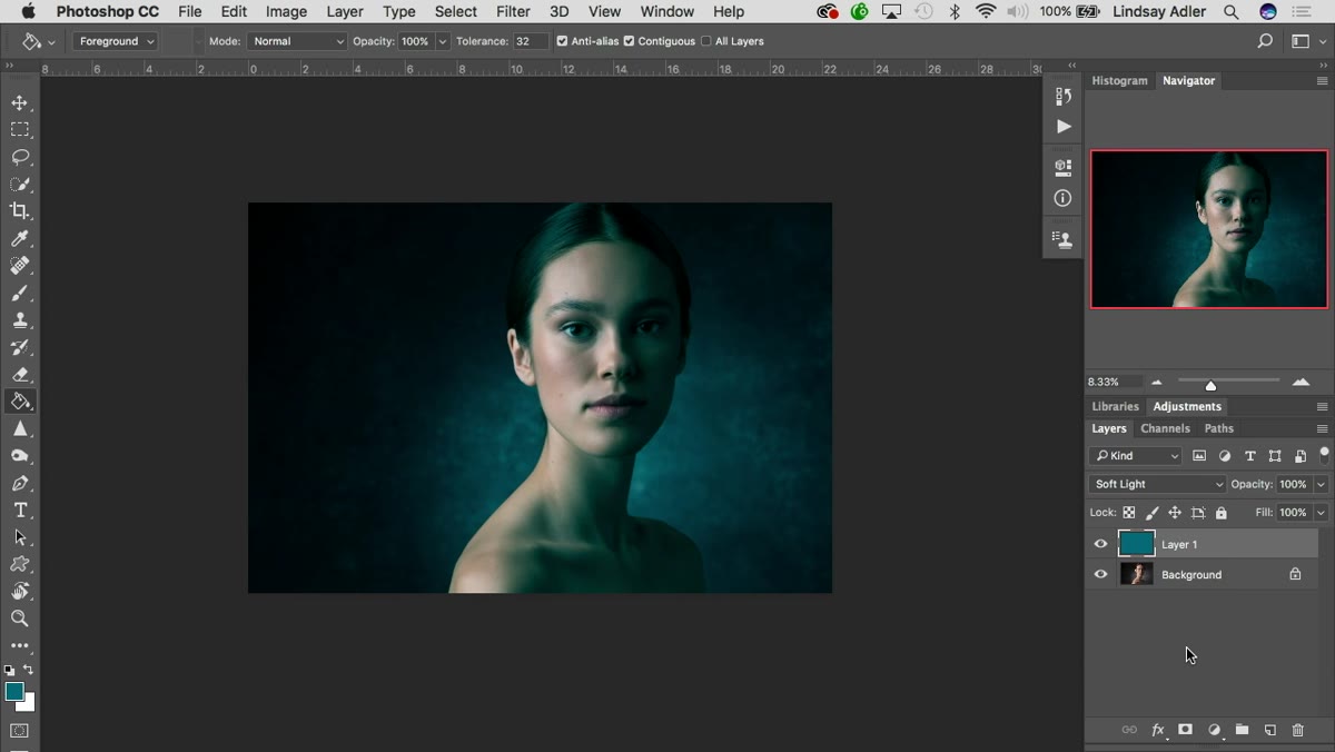
At the top of the layers panel, click the blend mode dropdown, which defaults to Normal, and switch it to Soft Light. This immediately changes how the color layer interacts with the image underneath. Instead of sitting on top like a flat block, it starts to pick up the highlight and shadow information from your photo and tone the image with the color you’ve chosen. You’ll see it across the whole image now, which is closer to what you want, but it’s still too broad. The next steps narrow it down.
Blend mode dropdown set to Soft Light in layers panel
At the top of the layers panel, click the blend mode dropdown, which defaults to Normal, and switch it to Soft Light. This immediately changes how the color layer interacts with the image underneath. Instead of sitting on top like a flat block, it starts to pick up the highlight and shadow information from your photo and tone the image with the color you’ve chosen. You’ll see it across the whole image now, which is closer to what you want, but it’s still too broad. The next steps narrow it down.
Step 4: Open Blending Options
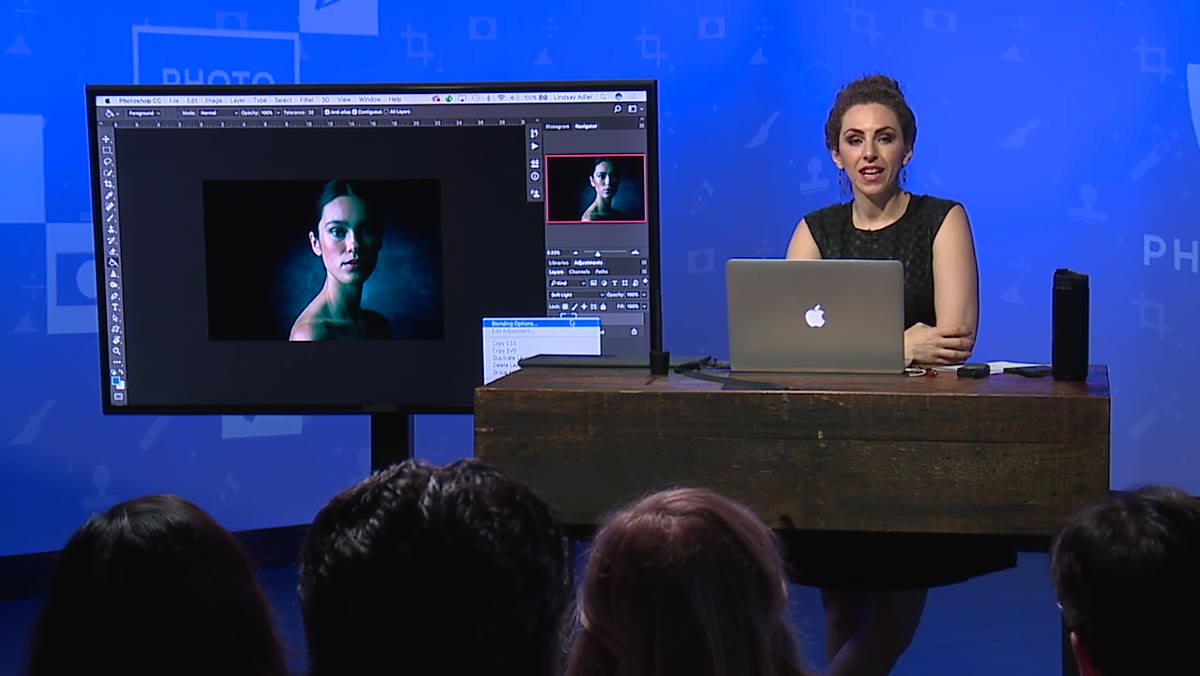 Right-click context menu showing Blending Options selection
Right-click on the color layer in the layers panel and select Blending Options from the context menu. This opens the Layer Style dialog box. At the top you’ll see that your blend mode is already set to Soft Light, confirming the change you made in the previous step. Scroll past the checkboxes and style options at the left side of the panel. You’re heading to the bottom of the dialog, where the real work happens.
Right-click context menu showing Blending Options selection
Right-click on the color layer in the layers panel and select Blending Options from the context menu. This opens the Layer Style dialog box. At the top you’ll see that your blend mode is already set to Soft Light, confirming the change you made in the previous step. Scroll past the checkboxes and style options at the left side of the panel. You’re heading to the bottom of the dialog, where the real work happens.
Step 5: Find the Blend If Sliders
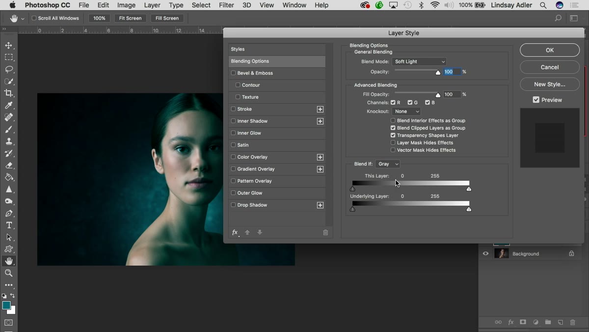 Blend If section visible at bottom of Layer Style dialog
Near the bottom of the Layer Style dialog, you’ll find a section labeled Blend If with two gradient sliders underneath it: one labeled This Layer and one labeled Underlying Layer. You’re working with the Underlying Layer slider. This slider tells Photoshop which tones in the image below should receive the color you’re applying. Drag the right-side handle of the Underlying Layer slider inward toward the left, and you’ll see the color start to pull back from the brighter areas of the image, leaving only the shadow regions toned. The effect is noticeable almost immediately.
Blend If section visible at bottom of Layer Style dialog
Near the bottom of the Layer Style dialog, you’ll find a section labeled Blend If with two gradient sliders underneath it: one labeled This Layer and one labeled Underlying Layer. You’re working with the Underlying Layer slider. This slider tells Photoshop which tones in the image below should receive the color you’re applying. Drag the right-side handle of the Underlying Layer slider inward toward the left, and you’ll see the color start to pull back from the brighter areas of the image, leaving only the shadow regions toned. The effect is noticeable almost immediately.
Step 6: Split the Slider for a Smooth Transition
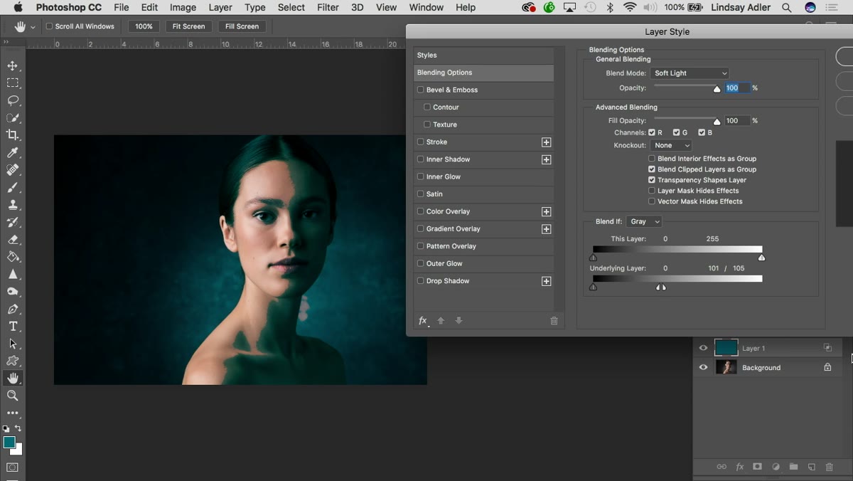 Alt-click splitting the Blend If slider into two handles
Here’s the part that makes the whole technique work properly. If you leave the slider as a single handle, the transition between toned and untoned areas is harsh and obvious, almost like a threshold cutoff. It looks unnatural on skin especially. To fix that, hold Alt on Windows or Option on Mac and click directly on the right-side handle of the Underlying Layer slider. It splits into two separate handles.
Alt-click splitting the Blend If slider into two handles
Here’s the part that makes the whole technique work properly. If you leave the slider as a single handle, the transition between toned and untoned areas is harsh and obvious, almost like a threshold cutoff. It looks unnatural on skin especially. To fix that, hold Alt on Windows or Option on Mac and click directly on the right-side handle of the Underlying Layer slider. It splits into two separate handles.
Now you can drag those two handles apart from each other. The distance between them defines the softness of the transition zone. A narrow gap means the color fades out quickly. A wider gap gives you a long, gradual fade from full color effect to no color effect. For portrait work, you generally want that gap wide enough that the toning looks like it belongs in the photo rather than painted on top of it. Spend time here. This slider is where the difference between amateur and professional color grading actually lives.
Why I’d Stack Two Layers With This Method
The tutorial covers the shadow layer, which is the foundation, but the technique gets significantly more interesting when you repeat the entire process for a highlights layer using a complementary color. If your shadows are teal, paint a warm orange or amber for your highlights layer and use the left-side slider handle in Blend If to restrict that color to the brighter tonal range. Now you have a proper two-tone grade built from scratch, with independent control over how far each color reaches into the midtones.
I’ve started using this approach as a finishing step after I do my primary grading in Lightroom, which keeps my Lightroom workflow fast and exports the heavier creative decisions into Photoshop where they belong. One thing I’ll add from experience: keep the opacity of each color layer between 30 and 60 percent. Full opacity, even with Soft Light, tends to oversaturate and flatten the image. Pulling it back a bit keeps the toning visible without making the photo look processed.
The single most important thing this tutorial teaches is that Blend If is not a scary, technical filter. It’s a precision tool for saying “apply this effect here, not there, and blend between them.” Once that clicks, you’ll find yourself reaching for it constantly.
Watch the full tutorial on YouTube and follow along with Lindsay’s walkthrough directly in Photoshop. The technique takes less than ten minutes once you know the steps.
Comments (1)
Never thought of approaching it this way. Really creative.
Leave a Comment