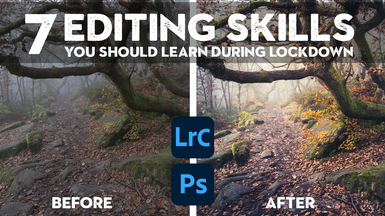
There’s a version of me that used to think editing was the boring part. Shooting was the job. Editing was the chore you did afterward so you could post something. Then I spent a rainy Nashville weekend going deep on color grading and came out the other side with a completely different understanding of what a photograph actually is. The edit isn’t the afterthought. It’s the second half of the creative decision.
That shift in thinking is exactly what Nigel Danson captures in this tutorial, which he filmed during the UK’s third lockdown when getting outside to shoot wasn’t really an option. The premise is smart: you can’t control the weather or your location, but you can spend that grounded time building the editing skills that will make every future photo better. Watch the full tutorial on YouTube and follow along here, because I’m going to break down each technique with enough detail that you can actually apply it without pausing the video every thirty seconds.
Danson opens with a reference to Ansel Adams that stopped me cold the first time I heard it. Adams wrote an entire book dedicated to the print. By some accounts he considered the darkroom work to be half the creative process, the place where dodging and burning brought a raw negative to life. The tools have changed dramatically. The philosophy hasn’t moved an inch.
Step 1: Shift the Mood With White Balance Before You Touch Anything Else
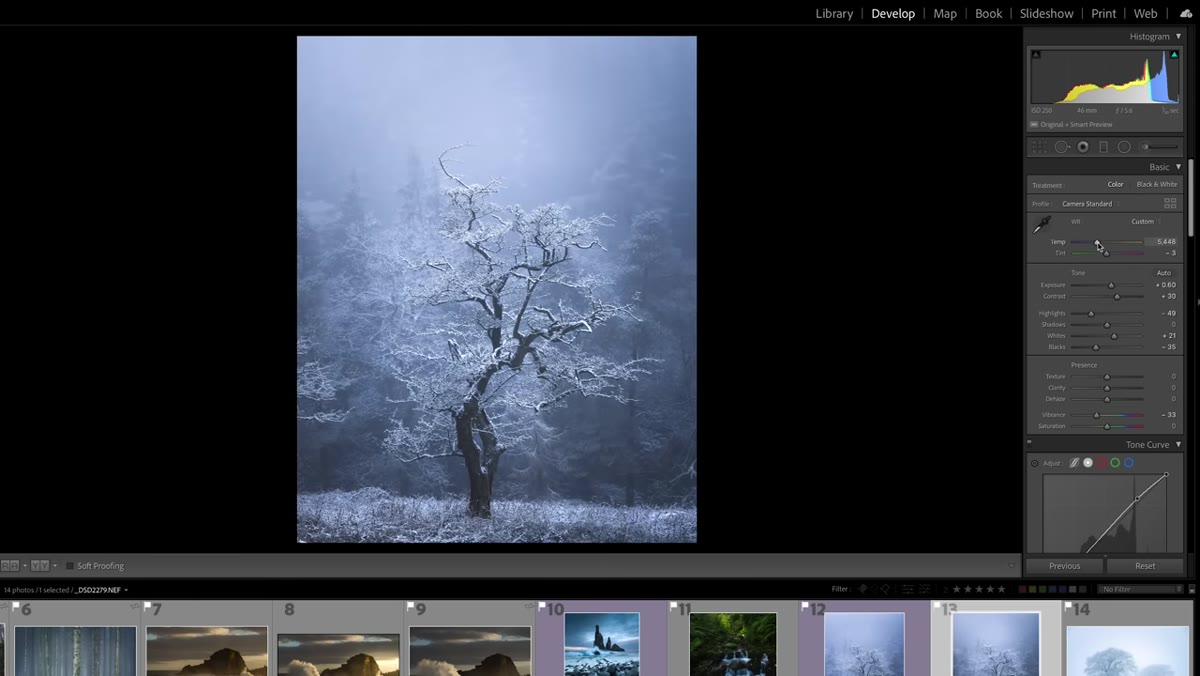 White balance slider being adjusted on a snowy winter landscape
Before you reach for the tone sliders or start painting masks, check your white balance. Danson demonstrates this with a snow and mist landscape that looks fine straight out of camera but feels warm in a way that fights the subject. A cold, frosty scene should feel cold. Pulling the temperature slider toward the blue end of the scale is often the first and fastest way to align the emotional tone of the edit with what was actually happening at the scene.
White balance slider being adjusted on a snowy winter landscape
Before you reach for the tone sliders or start painting masks, check your white balance. Danson demonstrates this with a snow and mist landscape that looks fine straight out of camera but feels warm in a way that fights the subject. A cold, frosty scene should feel cold. Pulling the temperature slider toward the blue end of the scale is often the first and fastest way to align the emotional tone of the edit with what was actually happening at the scene.
This sounds obvious, but most people set white balance once and leave it. Treat it as a creative lever, not a technical correction. A slight cool shift on a winter image does more atmospheric work than almost any other single adjustment.
Step 2: Use the HSL Panel to Target Specific Colors, Not the Whole Image
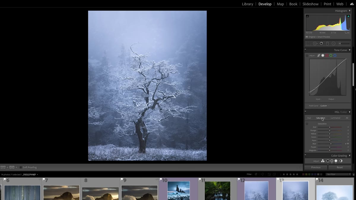 HSL saturation panel open with blue channel being adjusted
Once the overall temperature is in the right neighborhood, go into the HSL panel and work on individual color channels. Danson targets the blue channel specifically on this winter shot, nudging both the saturation and the hue of the blue tones to deepen the sense of cold without making the image look filtered or fake.
HSL saturation panel open with blue channel being adjusted
Once the overall temperature is in the right neighborhood, go into the HSL panel and work on individual color channels. Danson targets the blue channel specifically on this winter shot, nudging both the saturation and the hue of the blue tones to deepen the sense of cold without making the image look filtered or fake.
The key distinction here is surgical versus broad. Dragging the global saturation slider is easy and blunt. Pulling up the HSL panel and isolating just the blues, or just the aquas, lets you shape how a single part of the color spectrum behaves without touching anything else. On a landscape with a pale winter sky, this is the difference between a photo that feels considered and one that just feels processed.
Step 3: Add Color to Highlights and Shadows Separately Using Color Grading
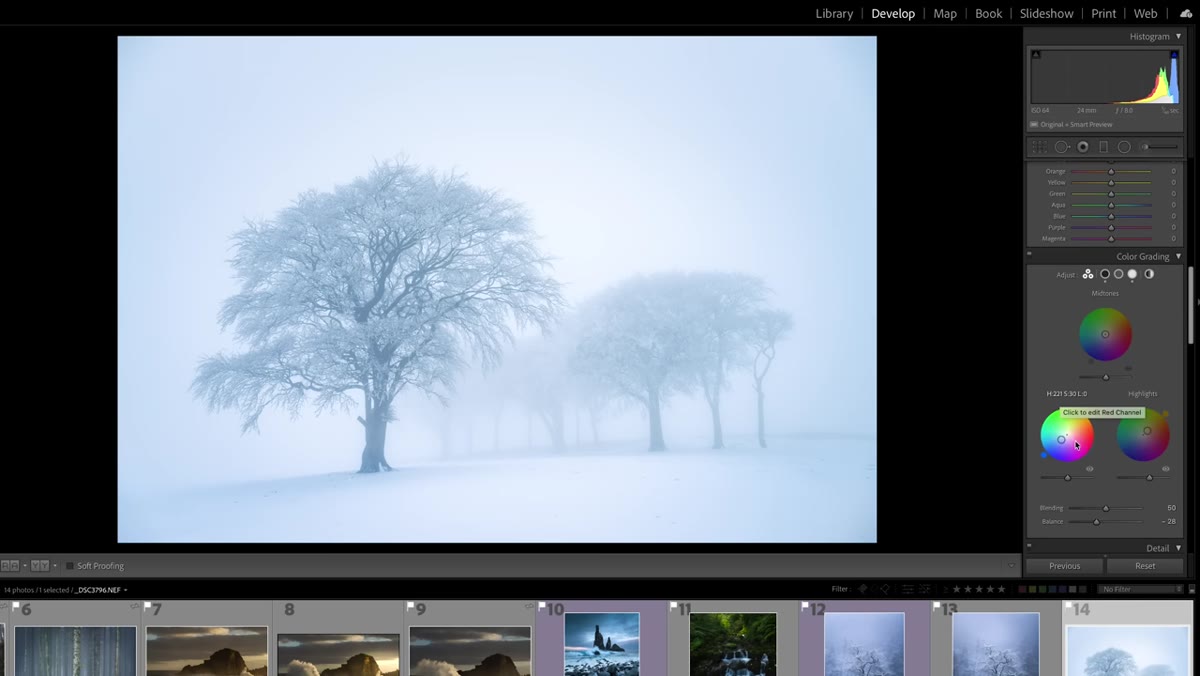 Color grading panel showing blue tones added to shadows and warm tones in highlights
This is where the edit gets interesting. Danson uses the Color Grading panel (previously called Split Toning in older Lightroom versions) to push blue into the shadows while adding a touch of warmth to the highlights. He’s very deliberate about leaving the midtones mostly alone.
Color grading panel showing blue tones added to shadows and warm tones in highlights
This is where the edit gets interesting. Danson uses the Color Grading panel (previously called Split Toning in older Lightroom versions) to push blue into the shadows while adding a touch of warmth to the highlights. He’s very deliberate about leaving the midtones mostly alone.
On a flat, overcast landscape shot, this technique creates the illusion of dimension. The warm highlights suggest light breaking through even when none was actually present. The blue shadows give depth and atmosphere. Used subtly, this combination reads as natural. Push it too far and it looks like a movie poster. Start with low saturation values in each wheel, around 10 to 15 percent, and increase slowly until you can just feel it rather than see it.
Step 4: Pull Highlights Down and Lift Shadows to Manage Exposure Range
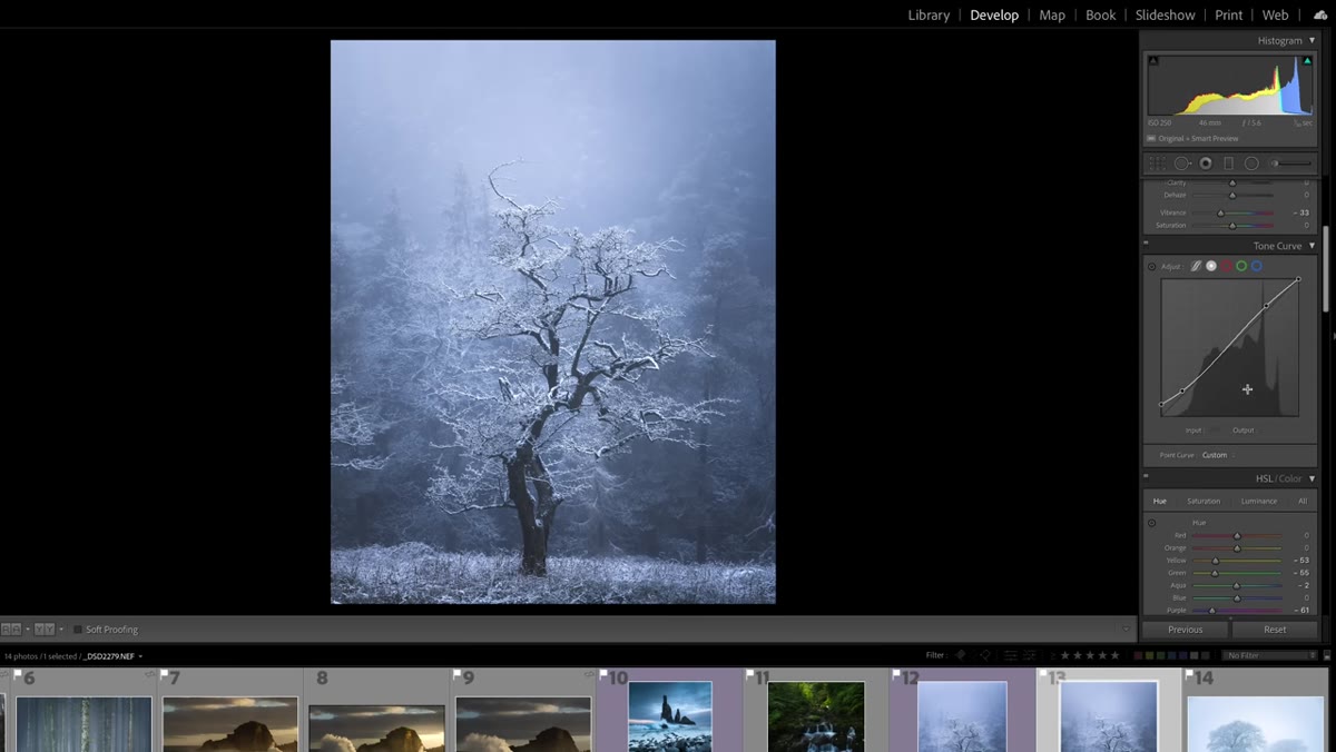 Basic panel showing highlights pulled down and shadows lifted on landscape image
Before you grade, make sure your tonal foundation is solid. Danson adjusts highlights and shadows on his snow scene specifically to recover detail in the bright areas without crushing the darker parts of the frame. In a high-contrast winter scene, this is essential groundwork.
Basic panel showing highlights pulled down and shadows lifted on landscape image
Before you grade, make sure your tonal foundation is solid. Danson adjusts highlights and shadows on his snow scene specifically to recover detail in the bright areas without crushing the darker parts of the frame. In a high-contrast winter scene, this is essential groundwork.
In Lightroom, pulling highlights down and pushing shadows up compresses the dynamic range of the image toward the midtones, which gives the color grading step cleaner material to work with. Think of it as priming a wall before you paint it. If you skip this and go straight to color grading on a blown-out sky or a blocked-up shadow, you’re decorating a mess.
Step 5: Match Your Edit to the Emotional Truth of the Scene, Not Just the Technical Reality
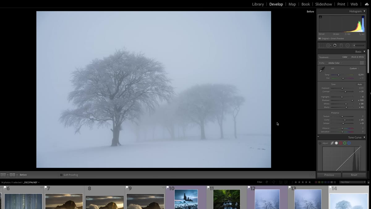 Before and after view of drab landscape versus color-graded version with warm and cool tones
Danson shows a second image, a fairly drab overcast shot with no dramatic light, and uses it to make a point about intent. The camera captured what was there. The edit captures what it felt like. He uses the same blue shadows and warm highlights approach on this second image, and the result reads like soft golden-hour light on the edge of frame even though none was present.
Before and after view of drab landscape versus color-graded version with warm and cool tones
Danson shows a second image, a fairly drab overcast shot with no dramatic light, and uses it to make a point about intent. The camera captured what was there. The edit captures what it felt like. He uses the same blue shadows and warm highlights approach on this second image, and the result reads like soft golden-hour light on the edge of frame even though none was present.
This is the conceptual step that most tutorials skip because it’s harder to quantify. Ask yourself before you edit: what was the mood of this moment? Was it cold and quiet? Warm and golden? Unsettling? Peaceful? Then use your tools to reinforce that answer. Color grading in service of feeling is always more powerful than color grading in service of trends.
My Own Take: The Danger of Borrowing Someone Else’s Color Vision
I name my presets after songs, which means I’ve built up a library of starting points that each have a specific emotional fingerprint. The temptation when watching a tutorial like this one is to copy the exact values Danson uses and call it a day. Resist that.
His blue-shadow, warm-highlight combination works beautifully on cold UK landscapes. When I tried to apply the same logic to golden-hour shots I took along the Cumberland River, the shadows fought the existing warm light and the whole thing looked confused. The technique is transferable. The specific values aren’t always. Use this tutorial as a framework for thinking, then develop your own color intuition by experimenting on images that mean something to you.
The single most important thing I took from this tutorial is the Ansel Adams framing at the start. Editing is not a shortcut or a fix. It is half the creative work, always has been, and getting better at it during the times when you can’t shoot is one of the most useful investments you can make as a photographer.
Watch the full tutorial on YouTube to see Danson walk through all seven skills with his own images. The remaining techniques cover areas like local adjustments and dodging and burning, and they’re worth your time.
Comments (1)
Would love to see a follow-up going deeper into this topic.
Leave a Comment