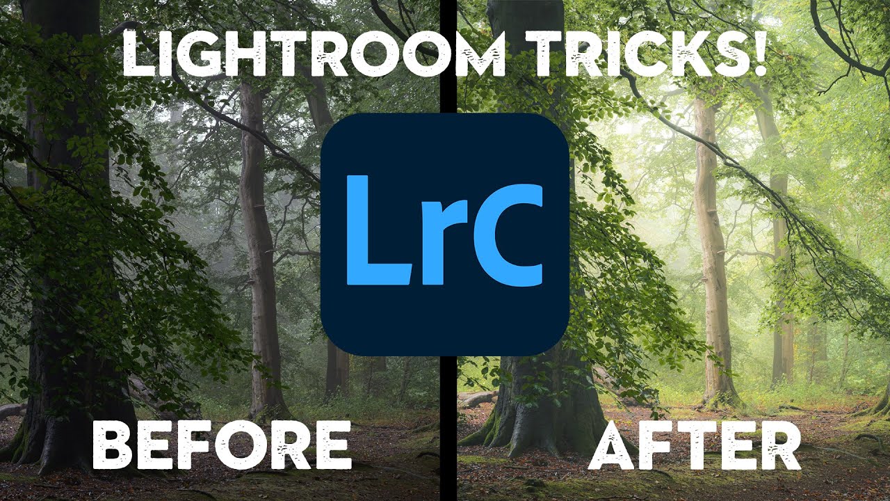
Fog-filled woodland shots are one of those subjects where the camera almost always lies. You’re standing in this genuinely atmospheric scene, the light is doing something magical, and then you pull up the raw file and it looks flat, a little muddy, and about as painterly as a screenshot from Google Maps. I’ve been editing nature photos long enough to know that the gap between what you saw and what the sensor captured is real — and closing that gap is entirely an editing problem.
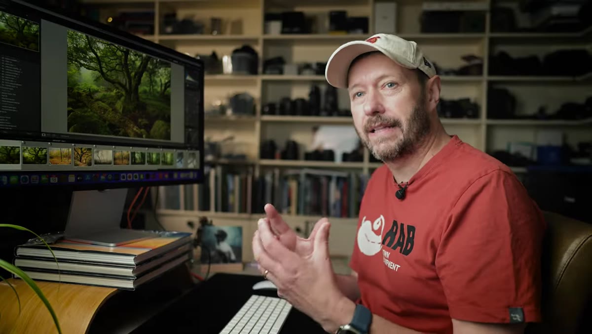
In this Nigel Danson tutorial, Watch the full tutorial on YouTube, Danson walks through his Lightroom workflow for turning woodland raw files into images that look closer to oil paintings than photographs. He shoots in the Peak District, and his editing philosophy is refreshingly unfussy: no Photoshop, no heavy compositing, just a smart sequence of adjustments inside Lightroom that most people are already skipping or doing in the wrong order. What follows is my breakdown of that sequence, with the specific values and reasoning you need to actually replicate it.
Step 1: Choose Your Starting Profile Intentionally
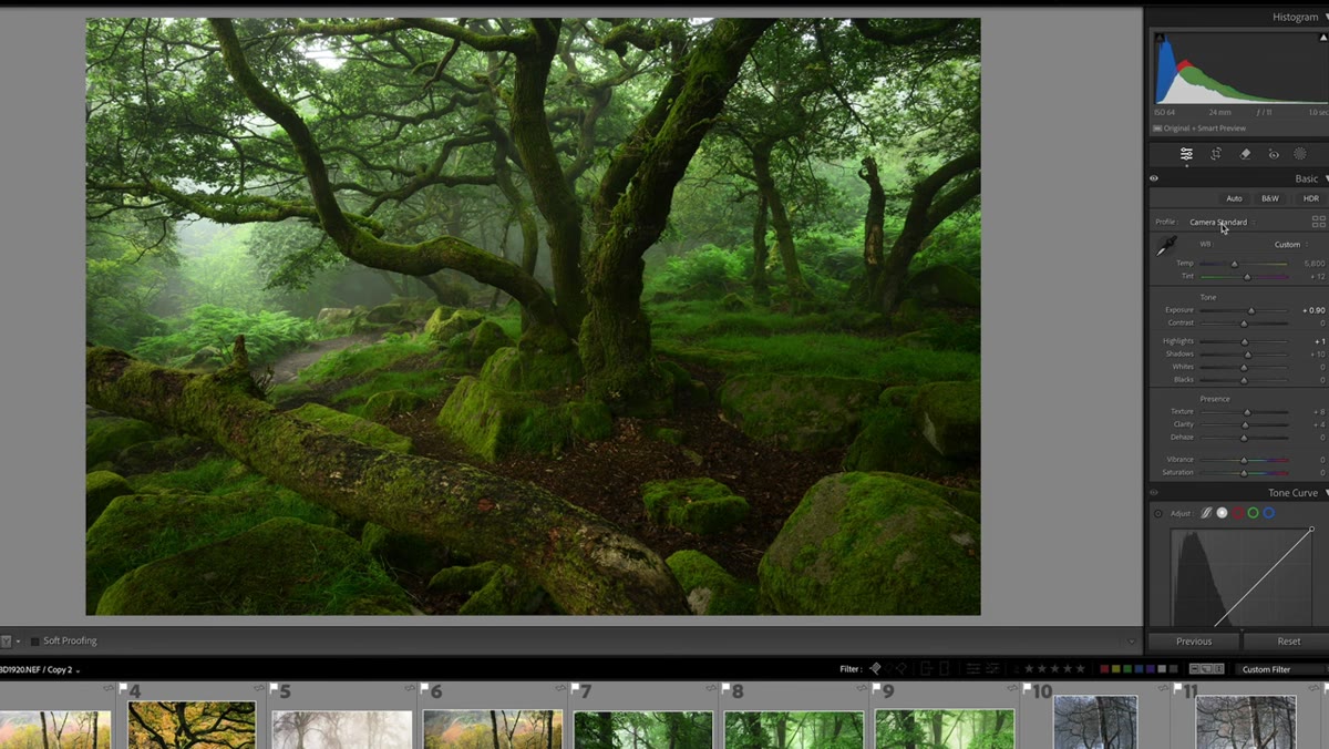 Lightroom profile dropdown open showing camera standard option
Before touching a single slider, Danson picks his camera profile, and he’s deliberate about it. He defaults to Camera Standard, but he points out that starting with Landscape pushes vibrancy and contrast immediately, while Neutral gives you a flatter, more malleable base. Think of the profile as the canvas texture before you paint. If you want that painterly, slightly muted quality, Camera Standard or Neutral is a better launch point than Landscape, which can make colors feel synthetic before you’ve even started.
Lightroom profile dropdown open showing camera standard option
Before touching a single slider, Danson picks his camera profile, and he’s deliberate about it. He defaults to Camera Standard, but he points out that starting with Landscape pushes vibrancy and contrast immediately, while Neutral gives you a flatter, more malleable base. Think of the profile as the canvas texture before you paint. If you want that painterly, slightly muted quality, Camera Standard or Neutral is a better launch point than Landscape, which can make colors feel synthetic before you’ve even started.
Step 2: Dial in White Balance for Mood, Not Accuracy
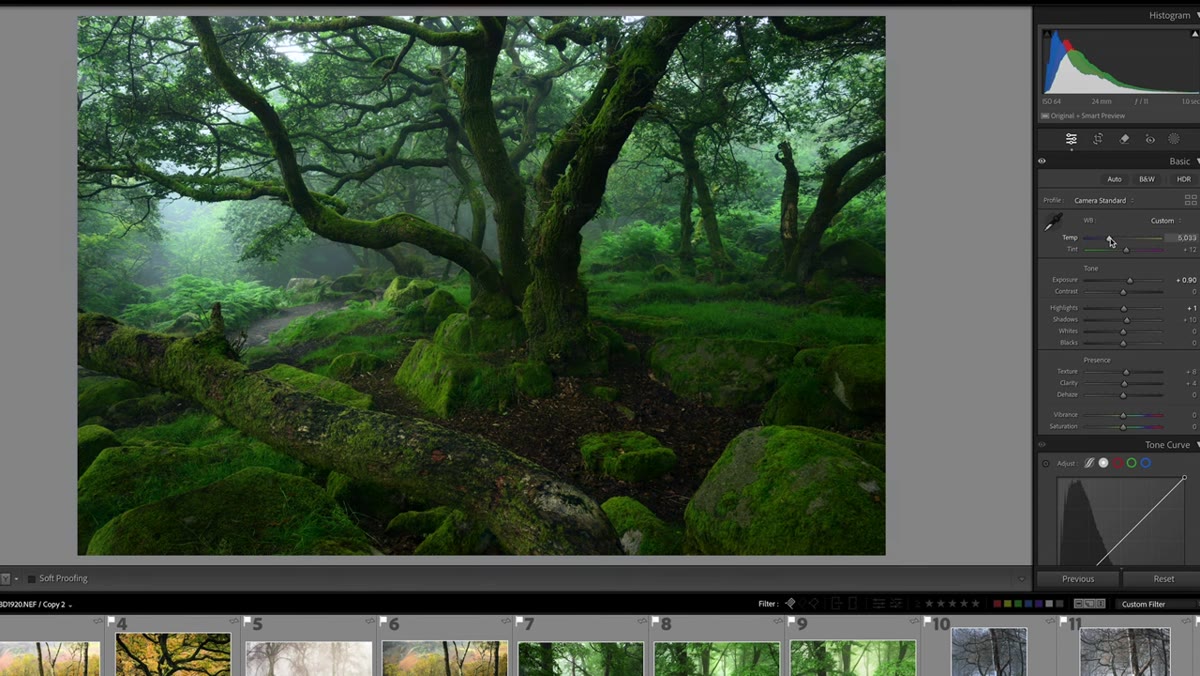 White balance and tint sliders being adjusted in Basic panel
Danson doesn’t try to achieve “correct” white balance. He drags the temperature slider around and watches the image respond, then lands where the mood feels right. For this woodland scene, that means leaning warm rather than cool. The tint slider gets equal attention: he nudges it toward magenta (away from green) to pull out the reddish tones in the bark. In a scene that’s already saturated with green foliage, a slight magenta push creates separation and warmth without making anything look unnatural. If your forest shots always feel monotone green, this tint adjustment alone is worth the price of admission.
White balance and tint sliders being adjusted in Basic panel
Danson doesn’t try to achieve “correct” white balance. He drags the temperature slider around and watches the image respond, then lands where the mood feels right. For this woodland scene, that means leaning warm rather than cool. The tint slider gets equal attention: he nudges it toward magenta (away from green) to pull out the reddish tones in the bark. In a scene that’s already saturated with green foliage, a slight magenta push creates separation and warmth without making anything look unnatural. If your forest shots always feel monotone green, this tint adjustment alone is worth the price of admission.
Step 3: Use Exposure as a Diagnostic Tool Before Committing
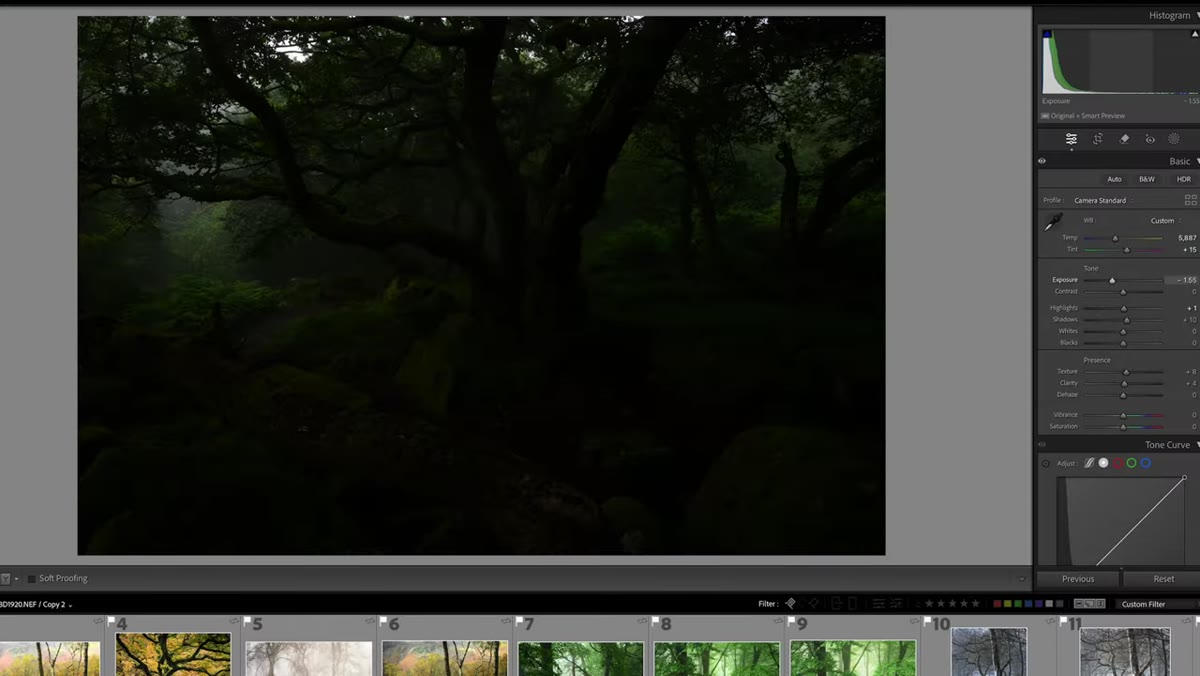 Exposure slider pulled very low revealing highlight clipping in image
Here’s a move I don’t see enough people doing. Danson temporarily drags exposure way down to identify distracting bright spots, particularly any sky peeking through the canopy. At very low exposure, those highlights become obvious and you can plan your masking or cropping before you’ve committed to a final exposure value. Then he swings the slider far in the opposite direction to inspect the shadows for noise and hidden detail. Once he’s mapped the full tonal range of the file, he sets exposure to taste. He underexposed slightly in-camera, so his final value sits just a touch below zero.
Exposure slider pulled very low revealing highlight clipping in image
Here’s a move I don’t see enough people doing. Danson temporarily drags exposure way down to identify distracting bright spots, particularly any sky peeking through the canopy. At very low exposure, those highlights become obvious and you can plan your masking or cropping before you’ve committed to a final exposure value. Then he swings the slider far in the opposite direction to inspect the shadows for noise and hidden detail. Once he’s mapped the full tonal range of the file, he sets exposure to taste. He underexposed slightly in-camera, so his final value sits just a touch below zero.
Step 4: Lift the Blacks to Create That Painterly Compression
 Blacks slider being pushed right reducing pure black areas in histogram
This is the core of the whole technique, and it’s the adjustment most beginners either skip or do backwards. True black in a woodland photo reads as graphic and harsh. Painterly images tend to compress the shadows upward so the darkest tones land in a dark gray rather than absolute black. Danson shows the histogram clearly here: when blacks are crushed to the left, you see sharp peaks hugging the left wall. As he lifts the blacks slider, that wall of data shifts right and the image softens. He combines this with a moderate whites lift to maintain overall contrast without reintroducing harsh dark tones. The result is a compressed tonal range that mimics the way paint handles shadow.
Blacks slider being pushed right reducing pure black areas in histogram
This is the core of the whole technique, and it’s the adjustment most beginners either skip or do backwards. True black in a woodland photo reads as graphic and harsh. Painterly images tend to compress the shadows upward so the darkest tones land in a dark gray rather than absolute black. Danson shows the histogram clearly here: when blacks are crushed to the left, you see sharp peaks hugging the left wall. As he lifts the blacks slider, that wall of data shifts right and the image softens. He combines this with a moderate whites lift to maintain overall contrast without reintroducing harsh dark tones. The result is a compressed tonal range that mimics the way paint handles shadow.
Step 5: Set Texture and Clarity to Zero (For Now)
 Texture and Clarity sliders both set to zero in Basic panel
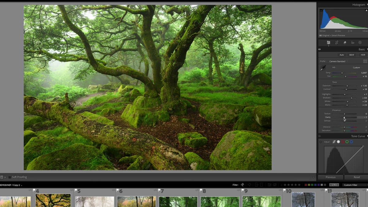
This one runs counter to what a lot of tutorials teach. Danson zeros out both Texture and Clarity early in the process, not because he won’t use them, but because he wants to make his curve and color decisions without those sharpening effects influencing his perception of the image. Clarity in particular changes how contrast reads mid-tone, so having it active while you’re still adjusting the curve can lead you astray. Think of it as working with a clean signal before you add effects. He revisits these sliders later once the tonal foundation is set.
Texture and Clarity sliders both set to zero in Basic panel
This one runs counter to what a lot of tutorials teach. Danson zeros out both Texture and Clarity early in the process, not because he won’t use them, but because he wants to make his curve and color decisions without those sharpening effects influencing his perception of the image. Clarity in particular changes how contrast reads mid-tone, so having it active while you’re still adjusting the curve can lead you astray. Think of it as working with a clean signal before you add effects. He revisits these sliders later once the tonal foundation is set.
Step 6: Reduce Vibrance and Saturation Slightly
 Vibrance and Saturation both pulled down to around negative six
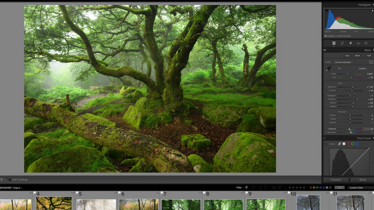
Danson pulls both Vibrance and Saturation down to around minus six. This seems counterintuitive for landscape photography, but it’s actually central to the painterly look. Hyper-saturated woodland images feel like travel brochures. Pulling the color back slightly, even by that small an amount, gives the image a quieter, more artistic quality. The colors still read as rich and present, but they don’t compete for attention. Combined with the lifted blacks, the overall effect starts to feel less photographic and more illustrative.
Vibrance and Saturation both pulled down to around negative six
Danson pulls both Vibrance and Saturation down to around minus six. This seems counterintuitive for landscape photography, but it’s actually central to the painterly look. Hyper-saturated woodland images feel like travel brochures. Pulling the color back slightly, even by that small an amount, gives the image a quieter, more artistic quality. The colors still read as rich and present, but they don’t compete for attention. Combined with the lifted blacks, the overall effect starts to feel less photographic and more illustrative.
A Note From My Own Editing Practice
Danson’s workflow is built around the idea that you establish your tonal foundation before you add any punch, and that’s a discipline I wish I’d learned earlier. For years I was reaching for Clarity and the HSL panel before I’d even sorted out my exposure and shadow values. I was essentially decorating a wall before the plaster had dried.
One thing I’d add to his approach: if you’re working on images without fog, the lifted blacks technique becomes even more important. Fog naturally compresses the tonal range in the scene, doing some of this work for you in-camera. On a clear day in the woods, your raw file will have much deeper shadows and brighter highlights, so you need to manually recreate that compression using the blacks, whites, and tone curve together. It takes a bit more work, but the principle is identical.
I also find it useful to save a snapshot in Lightroom right after Step 5, once the foundation is set but before any texture or local adjustments. That gives you a clean reference point to return to if you go too far with later adjustments. Danson doesn’t mention this in the video, but it fits naturally with his methodical approach.
The single most important idea in this entire workflow is that the painterly look comes from tonal compression, not from adding effects. Lifting the blacks, keeping saturation restrained, and working the whites into a controlled range creates images that feel soft and dimensional rather than sharp and photographic. Everything else is refinement.
Watch the full tutorial on YouTube to see Danson apply these steps across multiple images, including a before-and-after that makes the transformation immediately clear.
Comments (2)
Tried this technique this morning. Game changer for real.
Love this. I referenced a similar technique in one of my recent posts. Always good to see other perspectives.
Leave a Comment