Open Instagram, scroll through travel photography, and count how many photos use some variation of teal shadows and warm orange highlights. It’s the dominant color grade of social media photography, and there’s a reason it works so well.
Why Teal and Orange Works
Color Theory
Teal and orange are complementary colors — they sit on opposite sides of the color wheel. Complementary color combinations create maximum visual contrast, making images feel vibrant and dynamic even at moderate saturation levels.
Skin Tone Separation
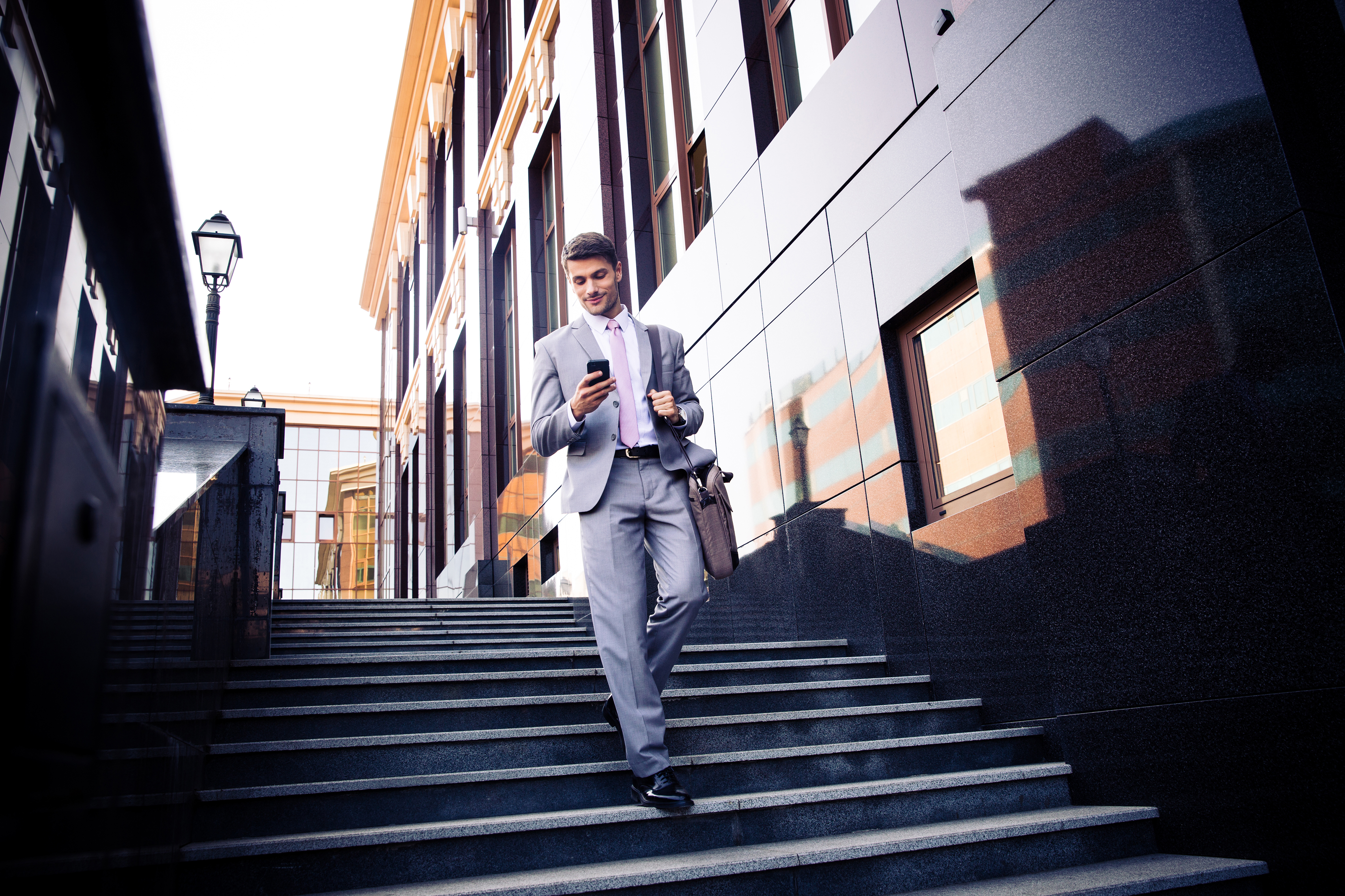
Here’s the practical reason this grade dominates portrait and travel photography: human skin tones fall in the orange/warm range. When you push shadows toward teal and highlights toward orange, skin tones pop against the background. The subject separates from the environment naturally.
This works across all skin tones. Lighter skin lands in the warm highlight range. Darker skin contains warm undertones that contrast beautifully with teal shadows.
Hollywood Started It
The teal-and-orange look became ubiquitous in Hollywood color grading in the 2000s — Transformers, Mad Max, virtually every action movie. Cinematographers discovered that this grade makes daylight scenes feel cinematic and adds visual energy to otherwise ordinary footage. Social media photographers adopted the same look.
How to Create It in Lightroom
Method 1: Split Toning (Color Grading Panel)
The quickest approach:
- Open the Color Grading panel
- Shadows: Set hue to approximately 190-210 (teal/cyan range), saturation 20-40
- Highlights: Set hue to approximately 30-45 (orange/amber range), saturation 15-30
- Midtones: Leave neutral or add a very subtle warm shift
- Adjust the Balance slider to control where the transition between shadows and highlights occurs
Keep saturation restrained. The most common mistake is cranking both shadow and highlight saturation too high, creating an aggressive, artificial look. Subtle teal-orange is cinematic. Heavy teal-orange is a cliche.
Method 2: HSL/Color Panel
For more precise control:
- In the HSL panel, shift the Blue and Aqua hues toward teal (shift them slightly toward green)
- Increase Blue and Aqua saturation by 10-20
- Shift Orange and Yellow hues slightly toward orange
- Increase Orange saturation by 5-15
- Decrease Green saturation by 10-20 (this removes competing colors)
This method affects the actual colors in the image rather than adding a color overlay, which produces a more natural-looking result.
Method 3: Tone Curve (RGB Channels)
For the most control and the most cinematic result:
- Select the Blue channel in the Tone Curve
- Lift the shadow point slightly (adds blue/teal to shadows)
- Pull down the highlight point slightly (removes blue from highlights, adding warmth)
- Select the Red channel
- Lift the shadow point very slightly (warms the deepest shadows to prevent them from going too cyan)
- Optionally lift the highlight point slightly (adds warmth to highlights)
This creates a color grade that’s embedded in the tonal range of the image, which looks more organic than a flat color overlay.
When to Use It
Teal and orange works best with:
- Travel and landscape photography with warm subjects (sunlit scenes, golden hour)
- Portraits shot in natural light
- Urban and street photography
- Beach and ocean scenes (where teal is already present)
When to Skip It
- Food photography (teal cast makes food look unappetizing)
- Product photography (colors need to be accurate)
- Autumn/fall scenes (they already have warm tones; adding teal can fight the natural palette)
- Any situation where color accuracy matters
Moving Beyond the Trend
Teal and orange is effective, but it’s also overused. Once you understand why it works (complementary colors + skin tone separation), you can apply the same principle with different color pairs:
- Purple and gold — moody, luxurious
- Green and magenta — earthy, editorial
- Blue and amber — classic, timeless
The principle is the same: push shadows and highlights toward complementary colors. Teal and orange is just the most popular execution.
Comments (3)
Just spent an hour experimenting with this approach. Worth every minute.
Subscribed after reading this. Looking forward to more content like this.
Printing this out and pinning it to my studio wall. That good.
Leave a Comment