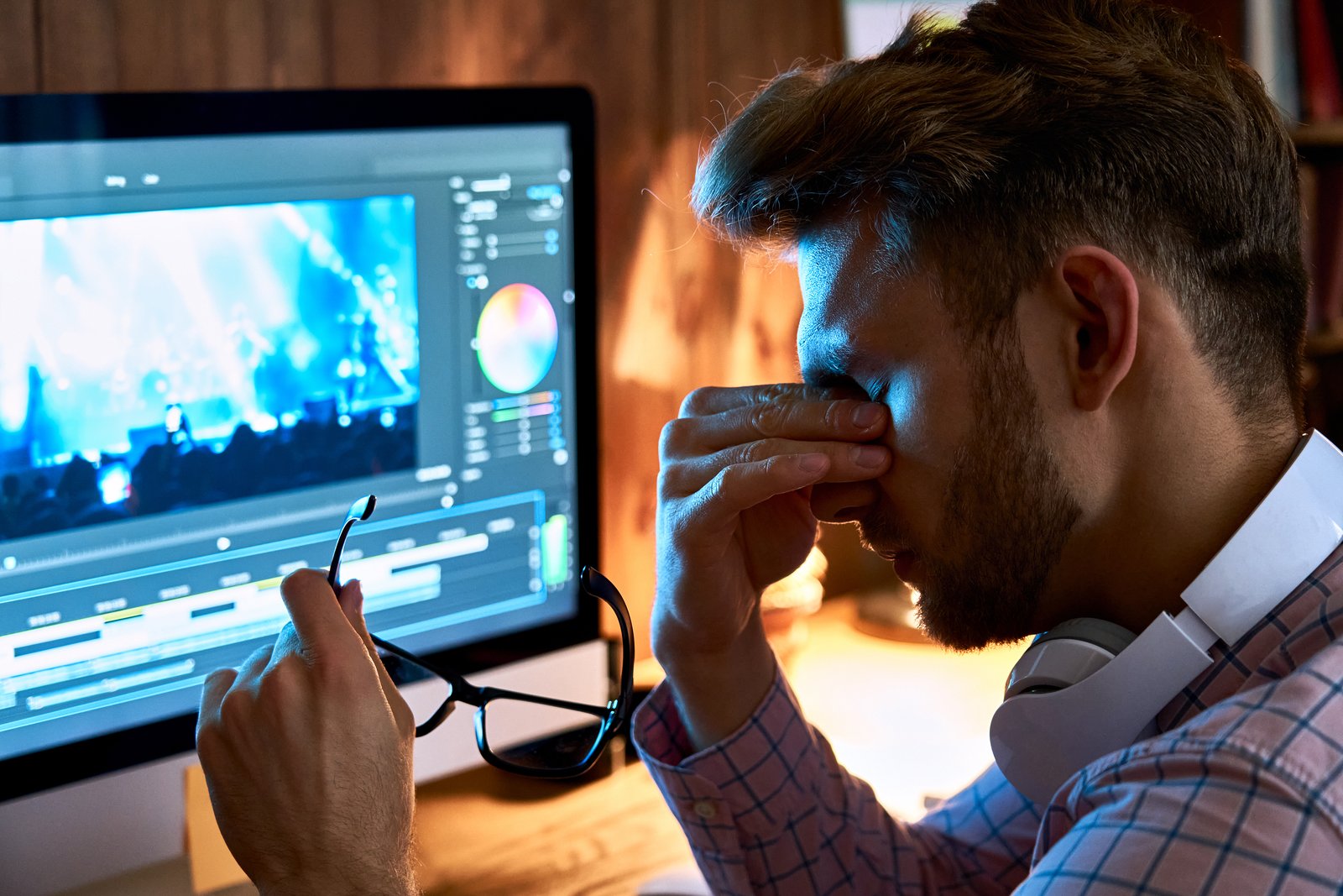
I had a client email me once asking why the headshots I delivered looked “washed out and kind of gray” compared to the previews I’d sent over iMessage. I’d spent two hours on those edits. Warm shadows, lifted blacks, a custom preset I’d built around a Gillian Welch record. They looked perfect on my screen. On hers, they looked like they’d been run through a photocopy machine.
The edit wasn’t broken. The export was.
This is one of the most common and most fixable problems in a Lightroom workflow, and it almost never gets the attention it deserves. Everyone wants to talk about HSL panels and tone curves. Nobody wants to talk about the Export dialog, which is honestly where a lot of your hard work either survives the trip or dies quietly.
The Color Profile Problem Nobody Warns You About
Here’s what’s actually happening when your photos shift on export. Lightroom works in a large-gamut color space by default while you’re editing. When you export, you’re making a decision, whether you know it or not, about how that color information gets compressed into a file someone else’s screen can read.
The three options you’ll encounter most are sRGB, AdobeRGB, and ProPhoto RGB. ProPhoto RGB is enormous. It contains colors that don’t exist on any current display, which makes it great for archiving and terrible for sharing. AdobeRGB is a solid middle-ground for print work. But for anything going to a website, a phone, Instagram, a client’s email inbox, or basically any screen that isn’t a calibrated wide-gamut monitor, you want sRGB.
When you export in AdobeRGB or ProPhoto and the receiving app doesn’t know how to interpret that color profile, it strips the tag or misreads it. That’s the gray, muddy, desaturated look. Your edit is still technically there. The viewer just can’t see it correctly.
Fix: In the Export dialog, under File Settings, set Color Space to sRGB. Every time. For web and client delivery, this is not a conversation.
The Resolution Trap and What DPI Actually Means for Screens
DPI trips people up constantly. The short version: DPI is a print concept. Screens don’t care about it. A 72 DPI file and a 300 DPI file displayed on a monitor look identical if they have the same pixel dimensions.
What matters for screen delivery is pixel count. For most web use and client galleries, I export at the long edge set to 2048 pixels. That’s large enough to look sharp on a Retina display, small enough to load quickly, and not so massive that a client can print it at poster size without asking first. For full-resolution delivery, I export at original dimensions with no resizing.
If you’re exporting for Instagram specifically, 1080 pixels on the long edge is the platform’s native display resolution. Anything larger gets downsampled by their compression algorithm, which can introduce its own color and sharpness artifacts. Giving Instagram exactly what it needs reduces the damage.
Sharpening, Compression, and the Settings Most People Leave on Default
Output sharpening in Lightroom’s Export dialog is separate from the sharpening you’ve applied in the Develop module. It’s designed to compensate for the softening that happens when an image gets resized. Set it to Screen for digital delivery, Standard amount. If you’re exporting for print, switch to the appropriate media type. Leaving it on None when you’re resizing is one of the quiet reasons exported images look slightly softer than they do in Lightroom.
For JPEG quality, I use 85. Not 100. Exporting at 100 JPEG quality produces files that are sometimes three to four times larger than an 85-quality export, with no perceptible visual difference in normal viewing conditions. An 85-quality JPEG of a well-exposed image at 2048 pixels typically comes in around 1.5 to 2.5 MB. At 100, that same file can hit 7 or 8 MB. For a client gallery of 80 images, that’s the difference between a 150 MB download and a 600 MB one.
When to Use TIFF and When JPEG Is Enough
The format debate is simpler than people make it. JPEG is lossy, meaning it discards some data every time you save it. TIFF is lossless. If you’re handing off files to a retoucher, a designer, or anyone who’s going to re-edit and re-export, use TIFF. If you’re delivering finals to a client who just wants to post them online or get them printed at a drugstore, JPEG at 85 is fine.
The caveat is print labs. A lot of professional print labs, including WHCC and Mpix, request sRGB JPEG for standard prints and sRGB TIFF for large-format or fine art work. Check the lab’s spec sheet before you build an export preset for them. I have separate export presets saved in Lightroom for every lab I use regularly, named after the lab so I’m not guessing at 11pm when a client needs to order before a deadline.
The Weekend I Broke 50,000 Downloads
A few years ago I built a preset pack over a long weekend, mostly to solve my own problems. I’d been shooting live music and the standard presets weren’t handling mixed stage lighting well. I named every preset after a song, which is just what I do, and ended up posting the pack for free because I didn’t think it was polished enough to sell.
It got 50,000 downloads. The number that surprised me wasn’t the presets. It was how many people emailed me saying the exports from those presets looked different than the in-app previews. Every single time, the answer was the same: wrong color profile on export.
Good editing work deserves a clean exit. Get the export settings right once, save them as a preset, and stop letting a dropdown menu quietly undo everything you did in the Develop module.
Comments (8)
Simple but effective. Sometimes that's all you need.
Love how you break down complex stuff into manageable steps.
Couldn't agree more. I've seen this make a huge difference in workflows work specifically.
This should be required reading for anyone starting out.
Shared this with my photography group. Everyone loved it.
Quality content like this is rare. Keep it up.
The before and after really sells it. Incredible difference.
Well explained. I think my audience would really benefit from this — mind if I link to it?
Leave a Comment